Tag Archives: comic book pages
December 7, 2015 Analyzing Comics 101: Layout
I first drafted this post back in 2015, and much of it ended up in Superhero Comics (2017) — with new layout diagrams and other hopefully helpful additions. I’ve since revised the approach twice: first in Creating Comics (2021), which I co-authored with Leigh Ann Beavers based on the course we teach together, and then The Comics Form (2022) analyzes layout as a kind of secondary story-world (panels are like overlapping playing cards on an ambiguous surface). All three offer deep dives into visual analysis, but this is a good place to wade in first.

I updated my “Layouts & Paths” presentation for my Making Comics course again in spring 2023 — and so I’ll update this blog too by uploading the slides. I think they are visually self-explanatory, giving an overview of common layouts and the viewing paths through them.


For Creating Comics, we included eight example layouts from our students:

1. Emily draws a 5×3 regular grid. The square panels and rigid form echo the repeated image content of the cube on the bookshelf.
2. Mims’ 2×2 grid includes such loose framing lines that it doesn’t have the feel of a regular grid, even though the four panels are roughly identical.
3. Henry draws an irregular 2×3 grid, with the second panel of each row roughly twice the size of the first. Also notice how the gestalt effect of the descending staircase in the second panels effectively hinges them into their own column despite the Z path layout.)
4. Daisy’s layout is irregular, with three rows of varying heights and unframed image content and words in the horizontal gutters. The first two rows are divided into panels, including an overlapping, circular one, while the single frame of the third row encloses three images.
5. Maddie’s regular three-row layout consists of a full-width panel at the top and bottom and a middle row of three equally sized panels. Rather than creating gutters, Maddie uses a single frame line between images, pulling the underwater content closer together.
6. Though Katie’s images are all unframed, they suggest a four-row layout divided into two and three panels each. The absence of frames parallels the absence of a definite reading path since the top caption suggests a thematic but not necessarily sequenced connection between the images. The character may have experienced the story content in any order, and so the viewer can too.
7. Coleman draws a regular four-row, with two panels divided equally in half, and the two full-width panels feature vertical caption boxes at opposite edges. The four other horizontal captions boxes mirror each other too, creating an orderly quality to the overall layout—a sharp contrast to the disorder of the family trauma building in the story. 8. Anna’s two-page spread was inspired by the center fold of Alan Moore and Dave Gibbon’s “Fearful Symmetry” in Watchmen #5 (1987), with their four irregular columns creating an N path. Although the juxtaposed images of the firing gun appear to take place within a second of each other, the middle gutter actually hinges two different races months apart, making the two arms only thematically recurrent since they presumably belong to two different people.
We also included four pages with reading paths that avoid standard Z and N paths:
Although the first page features a regular 5×3 grid, Grace avoids a Z-path by using gestalt hinges to pull the eye along an alternating path created by the abstract leaf shapes that move first left-to-right but then right-to-left as they descend the page.
The second page could be read as three rows, but Leigh Ann’s image content produces no hinges, allowing the eye instead to wander freely and so in no set order and reading path.
The third page has no path either, but Katie draws no panels but instead a set of unframed images that makes the absence of an order immediately apparent.
Readers will likely attempt to find a reading path for Leigh Ann’s images in the fourth page, but Chris’s seemingly three-dimensional layout also resists any clear order.

In Chapter 3 of The Comics Form, I also discuss layout in terms of what I term “pseudo-depth:”
“While representational images often create an illusion of three dimensions within a story world, works in the comics medium also often rely on an additional illusion of depth produced by images that appear to overlap or rest atop the background of another image or the otherwise unmarked white of a page, with the edges of drawn frames shaping intermediary negative spaces.”
“The pseudo-depth effect is distinct from the illusion of depth produced by most diegetic images through naturalistic techniques such as vanishing points and light-sourced shadowing because the depth appears to be discursive: it’s as if physical card-like images sit atop the actual page.”
“Pseudo-depth is a drawn effect no different from other drawn effects and so is a diegetic quality. However, pseudo-formal details are typically understood to be distinct from the story world of the representational images in the same work. Unless also metafictional, characters in a story are unaware of the nominal manipulability of a pair of seemingly overlapping images, just as they are unaware of the frame edges of seemingly non-overlapping images.”
Pseudo-depth reveals that layout generally is pseudo-formal, because if “a single physically undivided visual field is interpreted as multiple images, the juxtaposition cannot be defined formally.”
“The pseudo-formal effect is so pervasive, Chute describes drawn frames as if they were physical boundaries, asserting that “comics claims and uses the space surrounding its material, marked frames in a way that, say, painting cannot” (2010: 8). Painting, however, can claim and use interior space in exactly the same way as works in the comics medium; the only “material” frames are the edges of the page or canvas.”
Consider two examples of image arrangements that use actual depth:
“Donald Baechler’s 2000 Cone (A Feat of Strength) includes over a dozen images on separate sheets of paper affixed to a canvas with a painting of an ice-cream cone placed on top of them. The juxtapositions do not create pseudo-depth since the overlap of collaged materials is actual. The ice-cream cone and other images are physically layered and so have actual rather than illusory depth.”
“Frank Santoro’s 2019 Pittsburgh pushes the technique further, using thicker tape and overlapping cut-outs affixed to what appears to be yellow sheets of warped and wrinkled paper.”
But when I copy and paste photos of Santoro and Baechler’s art here, the reproductions of course have only pseudo-depth:

This differs from artists working in the comics medium who instead draw pseudo-depth effects. Julie Maroh draws her protagonist as if curled atop an otherwise traditional layout of panels in Blue is the Warmest Color (2010), and Kristin Emanuel draws a coffee stain as if it were on the surface of the other artwork in “Mothra x Godzilla” (2021).

And if you’re interested in even more layout examples, here’s the original 2015 version of this blog (apologies for erratic sizes and expired links):
The downside to teaching a course on comics is discovering that no textbook quite matches the way you want to teach it. The upside is writing the textbook yourself. And so here’s the first draft of an intended series of “Analyzing Comics 101” blogs. My actual course is called “Superhero Comics,” but I’m hoping this will be useful to other students, teachers, fans, etc.
So here goes . . .
ANALYZING LAYOUT
Layout: the arrangement of images on a page, usually in discrete panels (frames of any shape, though typically rectangular) with gutters (traditionally white space) between them, though images may also be insets or interpenetrating images. Page layouts influence the way images interact by controlling their number, shapes, sizes, and arrangement on the page, giving more meaning to the images than they would have if viewed individually. Layouts are the most distinctive and defining element of graphic narratives.
Layouts tend to be designed and read in one of two ways, in rows or in columns.
Rows: panels are read horizontally (from left to right for Anglophone comics, but right to left for Manga).
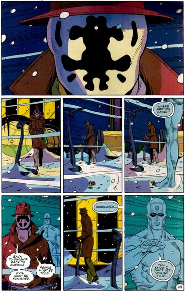
Regular grid (2×2, 2×3, etc.; 3×2, 3×3, etc.; 4×2, 4×3, etc.): rows are divided into the same number of panels, and panels are the same size and shape. 3×3, 3×2, and 4×2 are the most common regular grids.
Regular 3×3:


Regular 3×2:


Regular 4×2:

Regular 2×3:

Regular 2×4:

Regular 4×3:

Regular 3×4:

Regular 4×4:

Irregular grid: rows are divided into the same number of panels, but panels are not the same size and shape.
Irregular 3×2


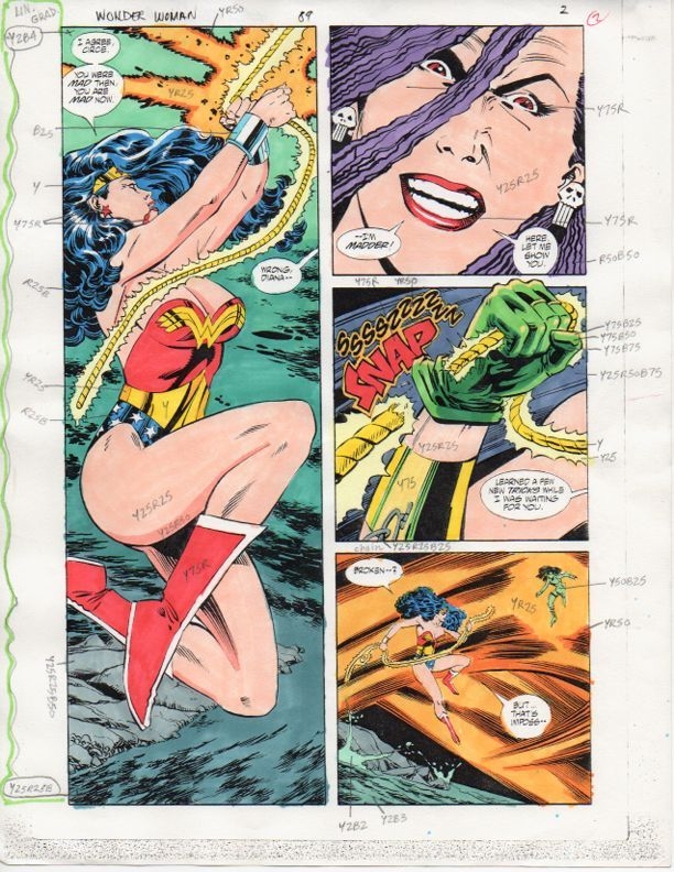
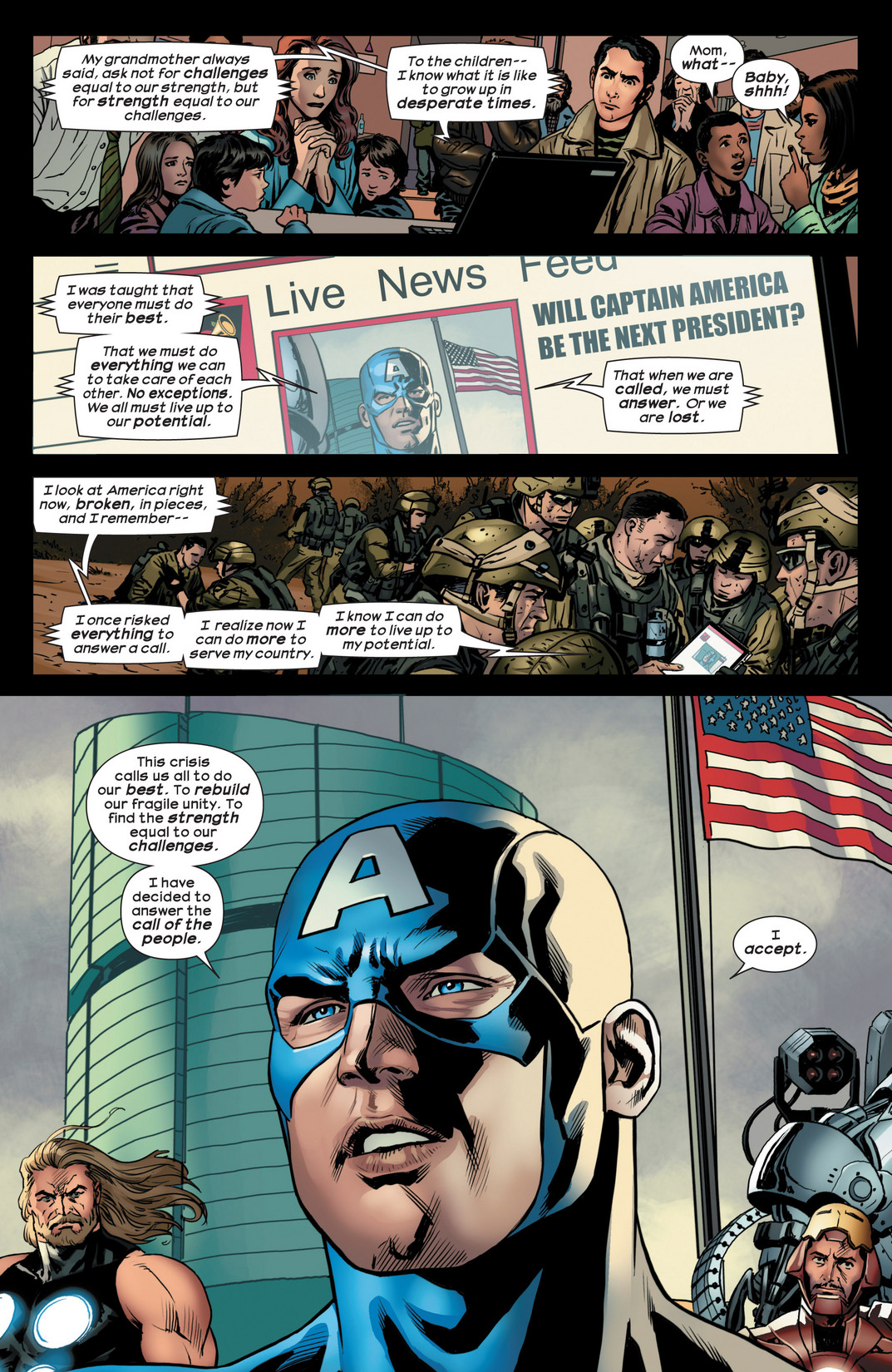
2-row, 3-row, 4-row, etc.: rows are divided into a different number of panels. One of more rows may feature a full-width panel extending horizontally across the whole page. 3-row layouts are among the most common, followed by 4-row and 2-row.
Regular 2-row, 3-row, 4-row, etc.: rows are the same height.
Regular 2-row:


Regular 3-row:


Regular 4-row:


Irregular 2-row, 3-row, 4-row, etc.: rows are different heights.
Irregular 2-row:


Irregular 3-row:


Irregular 4-row:


Columns: panels are read vertically, from top to bottom. Because of the Anglophone tendency to read horizontally before vertically, columns are less common in Anglophone comics.
Although columns can be divided into grids, row and column patterns are indistinguishable without content to determine reading direction. A 4×2 layout, for example, may be read as four rows divided into two panels each, or it may be read as two columns divided into four panels each. However, because Z-path reading (first right then down) is the norm for Anglophone comics, 4×2 is typically read as a 4-row layout not a 2-column.

Because Anglophone comics are read horizontally before vertically, column grids are limited almost exclusively to full-height panels extending vertically down the whole page to prevent reading path confusion.
Regular column grid: columns are undivided and so are the same size shape as full-height panels.
Regular 1×4 grid:

Regular 1×3 grid:

Irregular column grid: columns are undivided, but they are different sizes and shapes.
Irregular 1×2 grid:

Irregular 1×3 grid:

2-column, 3-column, 4-column, etc.: columns are divided into a different number of panels. To break horizontal reading, a full-height panel often establishes column layout, with a second column divided into multiple panels. 2-columns are the most common column layout.
Regular 2-column, 3-column, 4-column, etc.: columns are the same width.
Regular 2-column:


Irregular 2-column, 3-column, 4-column, etc.: columns are different widths.
Irregular 2-column:


.jpg)

Rows and columns can also be merged by including only full-width panels within a single column.
Irregular 3×1:


Regular 4×1:

Irregular 4×1:


Irregular 5×1:

Regular 6×1:
Combinations: panels must be read both horizontally and vertically, combining rows and columns on a single page.
Combination layouts typically feature one or more paired sub-columns: two side-by-side columns shorter than that page height, usually with the first undivided to establish vertical reading.


A single sub-column, however, does not trigger vertical reading when followed by panels that can be read as rows:

And ambiguous combinations provide more than one reading path:

Horizontal columns: If a row of three or more panels occupies half or more of the page, the panels are effectively columns, though they do not break the horizontal reading path.


Diagonal layouts: panels do not follow vertical or horizontal divisions, and so are neither clearly rows nor columns:


Diagnals may also intersect:

Caption panel: a panel that contains only words. These tend to be smaller, subdivided panels.

Inset: a panel surrounded entirely by another image.


Overlapping panels: a framed panel edge appears to intrude into or to be placed over top another framed panel, with no gutter dividing them.


Broken Frames: image elements of one panel extend beyond its frame into the gutter and/or into the frame of an adjacent panel.


Insets, overlapping panels, and broken frames are often combined:


Interpenetrating images: two or more unframed images with no distinct gutters or borders so that elements of separate images appear to overlap.


Page panel: A page-sized panel, typically visible in the gutters between smaller panels. When white, black, or otherwise uniform, the page panel appears as the page itself and so as a neutral space outside of the actions and events of the drawn images. All other panels are insets superimposed over the page panel. If the page panel includes drawn images, those images should be understood as the underlying and so in some way dominating background element to all other images on the page. If one panel is unframed, its content may be understood as part of the larger page panel.


A page panel with no insets and a single unified image is a full-page panel:

A full-page panel with author credits is a splash page.

Two-page panel: two facing pages designed to be read as a unit. A two-page spread are two facing pages not designed as a unit.


Panel accentuation: a panel may be formally differentiated and therefore given greater importance by its size, frame (including shape, thickness, and color, and by being unframed) or position on the page (first, center, and last panels tend to dominate).
Panels accentuated by border shapes:


Base Layout Pattern: a panel arrangement repeated on multiple pages.
Strict: repetitions from page to page contain no variations in a base pattern.
For the Superman episode of Action Comics #10, Joe Shuster uses a strict 4×2 regular grid, as does Fletcher Hanks for “Stardust the Super Wizard” in Fantastic Comics #12:


Flexible: some variations, especially through combined panels and divided panels. Often the base pattern is only implied.
Watchmen is the best known example of a flexible 3×3 regular base:


Comics more often use a flexible 3-row regular base. Steve Ditko fluctuates between rows of three and two panels in Amazing Spider-Man:

 .
.


Open: no base pattern.
The Avengers #174 fluctuates between 3-row and 4-row layouts.
Regular 3-row:
S(5dhqryzjtk4qcdgjv1lbpdjy))/superhero-library/Img/Pages/A1/A1-174-page-004-l.jpg)
Irregular 4-row:
S(5dhqryzjtk4qcdgjv1lbpdjy))/superhero-library/Img/Pages/A1/A1-174-page-003-l.jpg)
Regular 3-row:
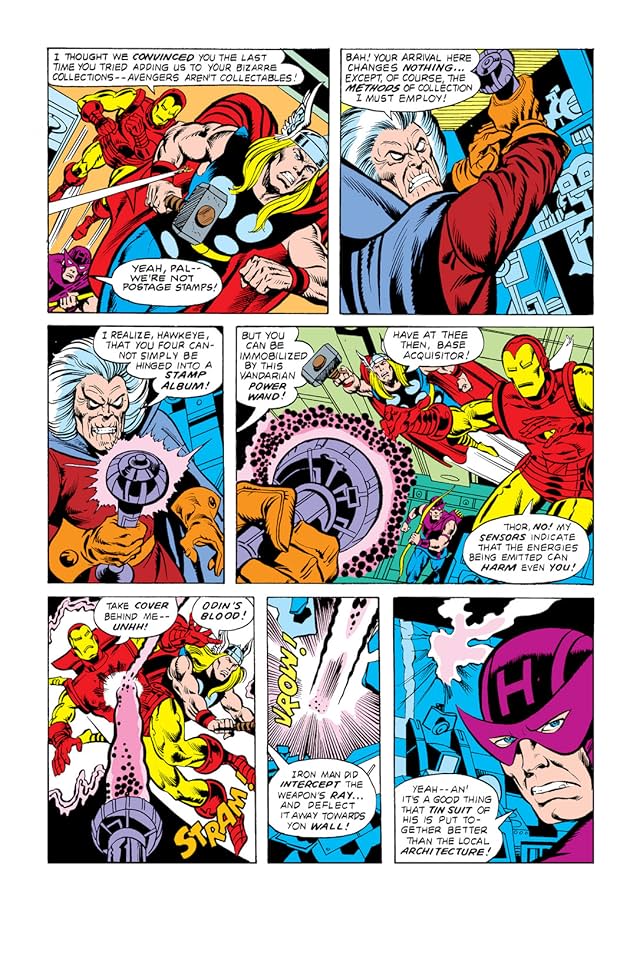
Irregular 4-row:

Regular 3-row:

Irregular 2×1:

If more than one arrangement repeats, each pattern may be distinguished descriptively (3×3, 2-column, etc.) or by chronological appearance (layout A, B, C, etc.). Pages that repeat earlier layouts may be said to rhyme. A comic book’s page scheme may be analyzed for layout repetitions, creating a page scheme. But let’s save that topic for later . . .
.
Tags: breaking frames, columns, comic book pages, grids, gutters, insets, layouts, panels, rows
- 2 comments
- Posted under Analyzing Comics 101


