June 12, 2023 Designing a Comics Page: Frames, Accents & Phrases
I asked my Creating Comics class which version of this panel they preferred, unframed or framed:
It’s from a comic I’ve been working on, and I think everyone agreed on the first. The framed version, they said, felt too claustrophobic — though if that’s the effect I wanted the scene to evoke, they said, then definitely go with that (it’s not, and I’m not).
I showed versions of the full page next:
Most still went with unframed, though there were some who preferred framed this time. I like unframed, but only after living with the framed version for awhile first.
The next round (of a different but related page) included three options:
More debate, but a clear majority (myself included) settled on the vacillating half-framed. That principle didn’t hold for the next though:
Way more debate and no consensus, but no frames finished first this time. I could hypothesize rationales, but clearly personal aesthetics are in play — which is the point of the conversation. The class was about to start designing their own comics.
All of the above examples have consistent panel sizes, so I projected an irregular layout (from an older series of mine):
Unframed won again. But this time I was more interested in the effects of framing only one image — or all but one:
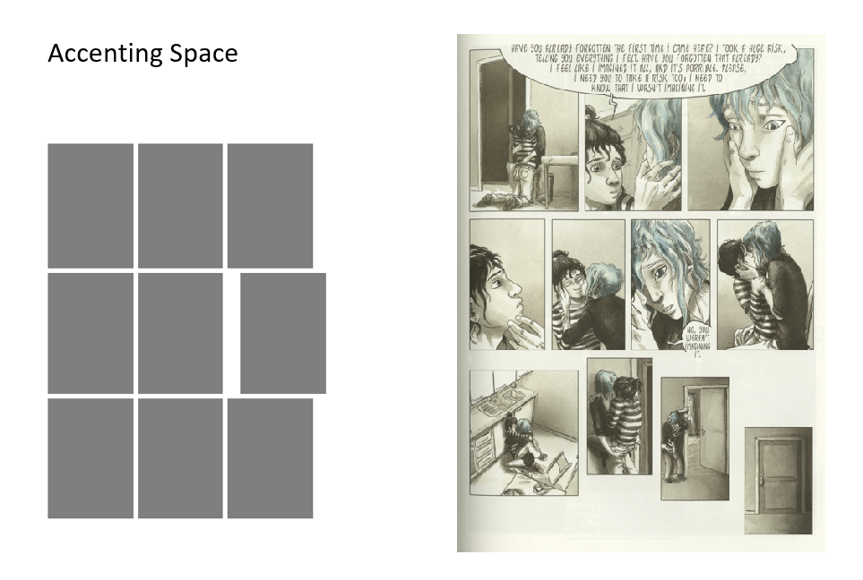
I call that an “accent,” and it’s a key tool when designing a comics page because it allows you to control what viewers will experience as the most important image and therefore narrative moment.
Once I established an unframed accent on the first page for another of my comics, I kept it up for subsequent pages too:
On the left page, the fourth panel is accented. On the right, it’s the first (if the directional flow of the recurrent figure convinces your eye to begin the page in that atypical spot).
Returning to my current comic-in-progress, I accent the last image by changing its background color:
And here the penultimate image draws the most attention because it breaks frame and extends into what would normally be the final frame — but instead the comic ends atypically in the bottom left corner (something Matt Baker did a lot in the late 1940s, but let’s not dive into that now):
I wrote a whole article about accents (“Undemocratic Layout: Eight Methods of Accenting Images“), and there’s a chapter section in Creating Comics too.
Here’s a quick rundown from my class slides:
Accents can combine strategies too:
The first combines size, tilt, and content (photographic in an otherwise cartoon context). The second combines shape, size, and content (red in an otherwise gray context).
But some combinations produce no accent because every image includes some highlighting element:
If we were in my class right now, we would pause for the following assignment:
Then we would move onto “phrases”: images grouped (often by an accenting technique) so viewers experience them as a unit within the larger page.
There are lots of approaches:
A page can have more than one phrase:
Returning to my comic-in-progress from above, the half-framed pattern creates two crisscrossing phrases:
Which brings us to the final slide:
That’s the end of the PowerPoint, the last I presented before we gave over the rest of spring term to individual studio work, but if you’re looking for more lessons, there’s plenty here:
- 1 comment
- Posted under Uncategorized


Permalink # Lesley Wheeler
said
My preferences are the same as your students’, for whatever that’s worth.