Monthly Archives: June 2016
27/06/16 Queen Kong vs. Ms. Jones
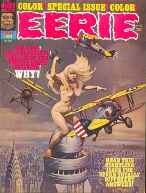
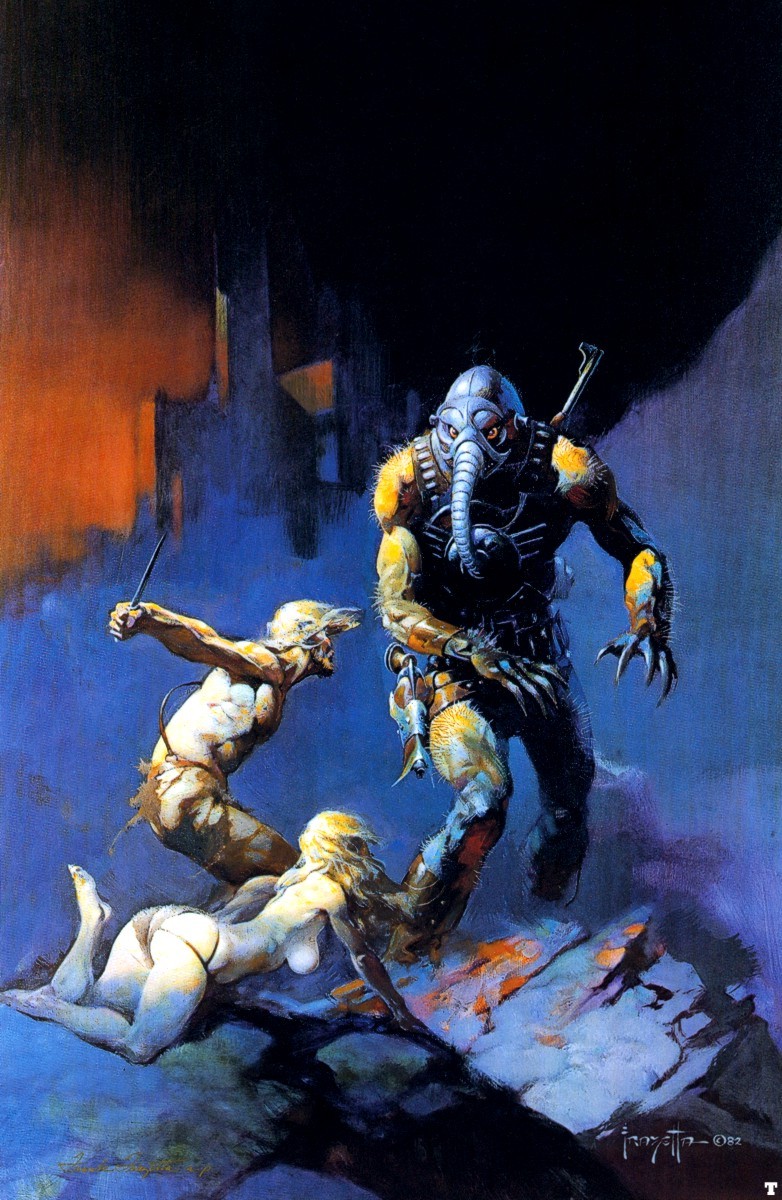
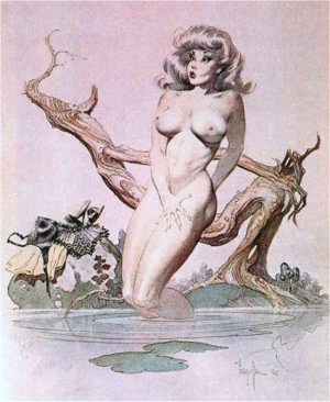
I don’t know what Warren Publishing had in mind when they commissioned Frank Frazetta’s “Queen Kong” in 1971, but Eerie devoted an entire issue to the image in in 1977. The cover of No. 81 declares: “SHE’S BIG! SHE’S BEAUTIFUL! SHE’S ATOP THE EMPIRE STATE BUILDING! WHY? READ THIS STARTLING ISSUE FOR SEVEN TOTALLY DIFFERENT ANSWERS!”
Each of the 5-10 page comics offers an explanation for Frazetta’s giant naked woman:
a) breast enlargement injections gone terribly wrong
b) espionage at the 2090 Worlds Fair
c) King Kong blood transfusion
d) “physiological freak”
e) lab-grown mutant engineered to terraform alien planets for colonization
f) giant robot suit
g) Little New York populated by tiny, human-imitating aliens
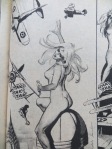
Explaining the ape in her fist proved even harder, but Queen Kong’s size isn’t her most fantastical quality. It’s her breasts, because a) perfect circles are only possible in space, and b) no nipples. The issue’s other artists offered their Frazetta imitations:


The first tale, “Goodbye, Bambi Boone,” I remember best, perhaps because the artistic style was so familiar. Carmine Infantino and Dick Giordano were renown artists at DC in the 70s, and both had just contributed to the 1976 DC-Marvel team-up, Superman vs The Amazing Spider-Man. The two heroes also battle atop the Empire State Building.

My copy was supposed to be signed by the two companies’ top editors, but it arrived with only Stan Lee’s faux-scribble on the cover because DC had just dethroned Infantino. He went from DC publisher to Warren freelancer. Giordano would become editor a few years later, but meanwhile both were earning extra paychecks by drawing naked women on skyscrapers.
Infantino pencilled writer Bill DuBay’s “The Bride of Congo: The Untold Story,” the most comically subversive of the seven stories. Like Peter Jackson in his 2005 King Kong remake, DuBay depicts a Fay Wray deeply in love with her giant ape, and the two even elope and raise a family. Louise Jones and David Micheline give their Queen Kong a happy ending too, sending the colonizing starships away so the narrator’s genetically engineered mutant sister can live a peaceful life alone with her little monkey friends.
And that’s it for Queen Kong survivors. Roger McKenzie’s is just a machine operated by a thug for power and profit–which is as close to feminist allegory as Eerie gets. The rest of the writing staff murder their heroines, some more misogynistically than others. Cary Bates’ teary-eyed manager replaces biplane blanks with real bullets because his beloved actress was dying anyway. Bruce Jones’ mother-exploding freak dies unloved and alone after growing so large she displaces the Earth from its orbit. But Nicola Cuti’s finale is the worst of the batch–a tale of a money-obsessed “Golden Girl” whom aliens kill and then erect as a gold-embalmed statue of liberty.
The stories strip Frazetta’s painting of any quasi-feminist edge by punishing its female hero-victim for her uppityiness. But Eerie and Ms. weren’t the only 70s magazines with nakedly revolting women on their covers. Newsweek began the trend in 1971, the year before Frazetta painted “Queen Kong.”

“Women in Revolt” triggered the first female class action suit when 46 Newsweek employees sued for sex discrimination the day the issue hit newsstands. The magazine allowed no women on its writing staff. A second suit followed in 1972, but this time the owner of the parent company, Katherine Graham, stepped in. Graham was friends with Gloria Steinem and the giant Wonder Woman who appeared on the cover of Ms the same year. Newsweek agreed that by 1976 a third of its reporters would be women, including a senior editor.
James Warren, the king sitting atop Eerie‘s 1977 masthead, made no such agreement. Of the sixteen writers and artists in No. 81, Senior Editor Louise “Weezie” Jones is the lone woman–Gloria Steinem was long gone. Jones entered comics in 1971 as the model for Bernie Wrightson’s cover for House of Secrets No. 92, edited by her first husband, artist Jeff Jones. She is fully clothed and only somewhat imperiled since hero and threat are ambiguously merged into the monstrous first appearance of Swamp Thing.

According to the Eerie bio page, she “worked in advertising/promotion before moving to Warren, where the thirty-year-old editor scripts an occasional story. She lives in Manhattan with her daughter.” “I was willing to work in any kind of publishing,” she told CBR. “One of my friends said there was an opening at a comic book company that paid more than the job I had!”
Jones (originally Alexander, later Simonson) was hired in 1974. She described the process of scaling the Warren skyscraper to Bleeding Cool: “I essentially twisted James Warren’s arm into giving me the line of books as an editor. . . . Warren said to me ‘Girls can’t do superhero comics.’. . . I just kind of rolled my eyes and said, Look, I will edit the line for six months on my Assistant Editor salary . . . So of course I did it and then he made me the editor of the line, then he made me a Vice President.”
In 1980, Jim Shooter hired Jones for Marvel, where she edited The Uncanny X-Men and New Mutants and created the supervillain Apocalypse (featured in the latest X-Men film). Marvel in the early 80s was still a “boys club,” she said, but “I was always kind of one of the guys.” Her pay was “as good as the guys around me,” she said, “as far as I knew.” Ultimately, she concluded, “gender doesn’t come into play if [your work is] good enough.”
After moving to DC in the 90s she was instrumental in the Death of Superman and the Reign of the Supermen story arcs, but aside from Red Sonja, she never worked on superheroines: “I had generally avoided doing female characters and being put on female character books — in part because I felt it was a great way to get stereotyped as a person who does female characters, and that’s all you do. . . . I kind of regretted that I hadn’t gone more in that direction when I was younger, because it was so much fun. But you do what you do.”
In Jones’ Eerie story “Starchild,” the mutated giant Janey does her job too, builds a city on a suitable planet for Earth’s growing multitude. But after a week of biblically hard work, she finds “acceptance” and “friendship”: “‘Cause y’see, Janey’d never had friends before. And those tittering monkey-things filled a gap in her childlike heart she never knew existed. . . . And for the first time in her prearranged life, she had fun. . . ”


“Starchild” offers Frazetta’s Queen Kong a happy ending, but unlike “The Bride of Congo,” the revolting giantess escapes even the fetters of marriage to live as a nurturing and playful God to the “monkey-things” of her adopted planet. Unlike King Kong, she is not a monster but the narrator’s secretly beloved sister. Her telling, however, receives only five pages, and so is the shortest of the issue’s tales. It is also fifth in sequence, denied the privileged positions of opening, closing, or colored middle story–all of which feature Queen Kong’s cathartic and/or admonitory deaths. “Starchild” is the best in the book.
“I think the women who make it in superhero comics don’t make it because they’re as good as the guys,” said Jones, “they make it because they’re better than the guys.”

Tags: Carmine Infantino, Dick Giordano, Eerie No. 81, Frank Frazetta, King Kong 1976, Louise Jones, Newsweek women in revolt, Queen Kong, Weezie Simonson
- Leave a comment
- Posted under Uncategorized
20/06/16 My Favorite Childhood Softporn
It’s 1977, so I’m eleven, older if the magazine I found in one of my cousins’ bedrooms wasn’t his most recent newsstand purchase. The cover price is $1.50. I paid $8 after pulling it from a vendor’s long box at the Roanoke Comicon. Frank Frazetta painted it in 1971 for Warren Publishing’s planned POW!, a magazine that was never published. I don’t know what his fee was, but Warren must have paid it, since they used it six years later for Eerie.
The timing is no mystery. No. 81 is cover-dated February, so it was on newsstands after the Christmas release of King Kong. My father probably took me to see the remake that same month. I was annoyed that the promotional poster featured King Kong straddling the twin towers, while in the movie he has to take a running leap. The poster hung on my bedroom wall for years. It’s also on the Eerie back cover.

I was a Frazetta fan in middle school and high school, but I doubt I recognized the artist as a sixth grader. “Queen Kong,” like most of his other artwork, is about titillation. It’s a picture of a giant naked woman. Warren Publishing used it on the cover to sell copies of the issue to heterosexual males. My eleven-year-old self felt it too–but I was puzzled by the nonchalant placement of the magazine on my cousin’s bed, his bedroom door left wide open. Where was the Catholic shame? I apparently still felt enough residual embarrassment that, after giving into nostalgic urges, I did not share my new purchase with my fourteen-year-old son on our drive home from Roanoke.
And yet if you’re going to indulge in softporn, it’s not the worst choice. Type a Google search, and you’ll find Caroline Liddell includes “Queen Kong” on her Pinterest page “Images of Powerful Women,” explaining: “The male fear of what happens when women refuse to behave according to expected gender stereotypes–they run amok! It’s a wonder we all haven’t climbed up the Empire State building, swatting away annoying little gnat like buzzing planes since the vote made us all too big for our britches!!”
Maybe Frazetta was influenced by Dick Giordana’s Gulliver-esque cover art for the July 1971 issue of Lois Lane.
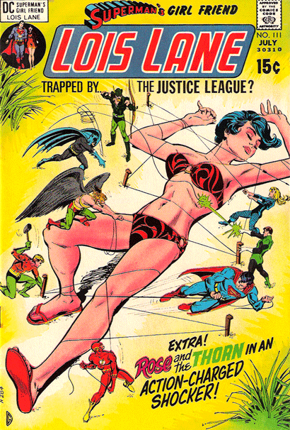
Those are actually tiny Justice League clones tying her down, but the effect is the same. Gloria Steinem, a former assistant at Warren’s Help! magazine, also featured a Kong-sized Wonder Woman on a 1972 Ms. cover:

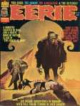
But not even a titillated eleven-year-old could mistake Eerie for second-wave feminism. Look over the previous year of covers, and all of the women are damsels in distress incapable of saving themselves from the monster of the month.


Rape is a thinly-coated subtext.


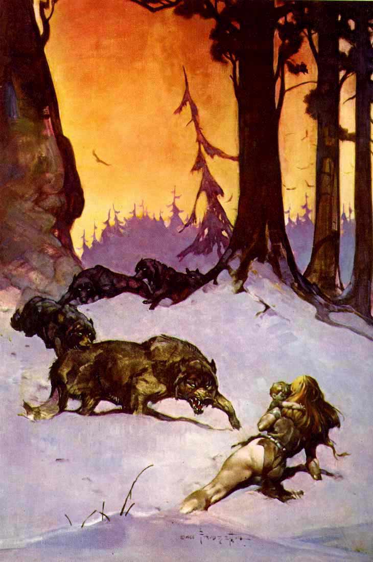
Frazetta, one of Warren’s most employed cover artists, was a big fan of women-in-peril. Each sprawls uselessly on the ground while a muscular hero battles to protect her. In terms of composition, the women are foreground, the heroes are central, and the on-coming threats are furthest from the viewer. In order to be heroic, the hero must be smaller than the threat, and so the woman crouches to give him comparative stature. The pose is inherently absurd, but the repetition is comic.


But Frazetta was okay with women-in-peril minus the heroes too. That sometimes requires her to take a more active position, occasionally substituting twirling hair for the missing hero’s combat gestures. Sometimes Frazetta even reverses angles.

When not in peril, Frazetta women fall into typical good girl and bad girl poses, the eroticism unmitigated by other action. Rather than presenting their backs, they face the viewer, though only a seductress offers direct eye contact.


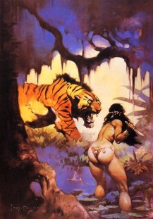
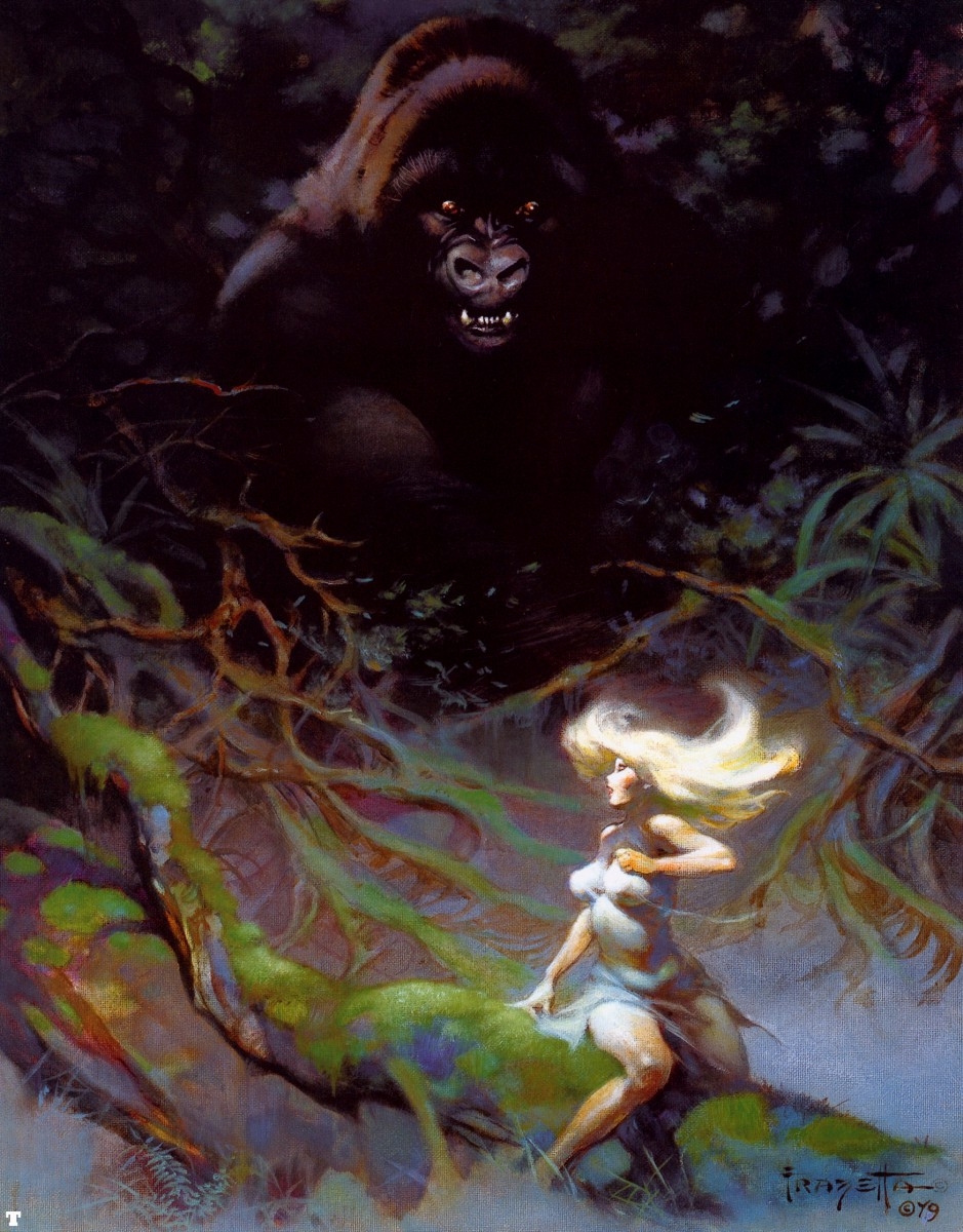
Though all of Frazetta’s women are sexualized, and many are imperiled, not all are powerless–or their power is not always exclusively sexual. Erase the heroes, and the threatening animals can become an extension of the woman’s power.


Although the body of a Frazetta woman is too idealized to be monstrous in itself, she can command other larger and more monstrous bodies.


Which is why “Queen Kong” is unique. When not climbing the Empire State Building, Frazetta’s Fay Wray is just another seductress or imperiled-woman-sans-hero.
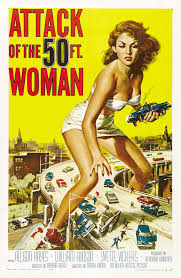
But Queen Kong is the monster herself. She follows the gender-flipping impulse of Attack of the 50 Foot Woman, the 1958 knock-off of The Amazing Colossal Man. Although previews warned that actress Allison Hayes, “once a beautifully voluptuous woman,” would become “the Most Grotesque Monstrosity of All,” Hayes appears no different after her transformation. It is simply the sight of a giant woman (even an initially unconscious one) that produces Horror, Shock, Frenzy, and Devastation!
Queen Kong is beautiful and revolting too. Since all Frazetta women are first and foremost sexual objects, her body remains proportionally unchanged, but the context establishes her monstrous size. Her twirling hair isn’t emblematic of her gendered helplessness anymore. It is an extension of her combat pose, a nearer equivalent to a hero’s bow or sword. And though the foregrounded biplane is nearly her size, she is larger than the threats circling her–and so compositionally larger than Frazetta’s typical heroes.
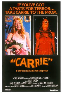
Queen Kong embodies what Carol J. Clover terms “the female victim-hero,” that gender-disrupting monstrosity born from Stephen King’s 1974 Carrie and first embodied by Sissy Spacek in the 1976 film adaptation–both still popular when Eerie No. 81 shipped. We’re happy when Carrie kills all those high school bullies–just like we rooted for Kong against those pesky biplanes.
Provided, of course, the sympathetic monster knows when to die. “Monster” shares its etymology with “warn” and “demonstrate,” and a giant woman usurping King Kong’s crowning spectacle is a warning against and a demonstration of 70s gender revolution. Frazetta doesn’t paint her corpse after its plummet, but her death is implied. Queen Kong’s beautiful revolt must fail. Even a titillated eleven-year-old reading softporn comics on his cousin’s bed understood that.

Tags: Eerie, Frank Frazetta, Warren
- Leave a comment
- Posted under Uncategorized
13/06/16 Is This a Story?

I’m going to say yes. And not just because the four-panel comic strip is titled “I rowed my father’s boat to sea.” The sequence tells a visual story whether those words are included or not. And the best way I know of discussing wordless storytelling is Neil Cohn’s visual grammar, which includes five types of narrative panels.
My first panel is an Establisher, which “sets up an interaction without acting upon it.” I’m not entirely clear what Cohn means (how is a set-up interaction not itself an interaction? if the panel content is the interaction, then how does the panel content also act upon the interaction?), but the panel does establish the two main visual elements: the boat and the dock. There’s also minimal tension between them. The panel by itself would not imply a story. If instead the rope were taut and the boat were pointed away from the dock, then there would be a plot.
My second panel is an Initial, which “initiates the tension of the narrative arc.” I’m not sure an awareness of the future arc is technically possible, but the panel has tension. The boat and the dock are now much further apart–presumably because someone in the boat is rowing it away. A lot of narrative information occurs between panels: the rower climbed into the boat, untethered it, and began rowing. All of that could be a visual sentence too, using the same panel one as an Orienter, which “provides subordinate information, such as a setting.” Instead, the rower is undrawn, and so the visual sentence is only between the boat and the dock. This second panel might instead be a Prolongation, which depicts a “medial state of extension.” If so, the Initial is implied as the sequence leaps to a later a moment in which the tension is already extended.
My third panel is either a Peak, the “height of narrative tension,” or it is the Release, which of course “releases the tension of the interaction.” Personally, I think the Peak, like the Initial, occurs in the gutter. The boat has already rowed out of sight, and so the tension is over. Alternatively, the boat and the dock are still interacting, because we project the existence of the still moving boat beyond the panel frame. Either way, the story is basically over.
My fourth panel is more clearly a Release, either of the third panel’s Peak or as a secondary Release which extends the third panel’s Release further. The blue is ambiguous. Has our perspective continued to move higher and so now the dock is so small it is effectively invisible? Regardless, the boat and now the dock are out of the image and so there is no tension.
That’s all pretty straightforward. But notice that it all works on the assumption that pictures are pictorial. They picture something. While they are actually pixels on a screen, they are also representations of objects that are not pixels on a screen. So the story is about something that’s not actually present. The images are a little like words that way. Although, unlike words, pictures do to some extent resemble what they represent, they are also dissimilar to them. Even radically dissimilar. The “sea” is a blue square. The “boat” is an outline in negative space. The “dock” in panel two and three are recognizable only because they vaguely resemble the dock in panel one.
But what happens if there are no representational elements? If I replace the “boat,” the “dock,” and the “rope” with different visuals, do the four panels still tell a story?

The content of the revised panel one is now entirely abstract. Does Cohn’s Establisher panel type still apply? I want to say yes. The diamond in the upper left area and the random shapes along the right edge are still “set up,” and the overlapping circle between them suggests little or no compositional tension. The image is roughly balanced.

The second panel shrinks the first two elements, adding a few shapes to the diamond cluster, and doubling by mirroring and then simplifying and shrinking the second cluster of shapes. Are the two clusters interacting? Again, I want to say yes. The compositional tension is still low–but this was true in the representational version too. Although abstract, the tension is prolonged but waning.

The third panel is still either a Peak or Release–though now the diamond cluster can not be understood as having traveled out of frame. It simply does not appear. Also the former “dock” is not shrinking because are perspective is higher. There is no perspective. The shape is simply reduced in size.

The final panel again is all Release–no visual elements but the solid blue square and the white surrounding it. There is no tension. The image is perfectly balanced.
So the two versions of the four-panel sequence both follow the same visual grammar. Does that mean they tell the same “story”? Probably not. The first visual sentence is about a boat and a dock and someone rowing the boat out to sea. Things happen in time and space. The second visual sentence is about clusters of pixels. The only space is the space of the screen, and the only time is the time experienced by the viewer.
I’m not certain a “story” is possible without some kind of representation of time and spatial subject matter, but if it is, the second story is not the first story. They do, however, overlap. The abstract sequence and the representational sequence have the same arc. Is this inevitable? Since all representational images are also abstract marks (ink or pixels), do the two visual sentences always overlap?
Maybe. Unlike the above example, there would only be one set of images–whether analyzed abstractly or representationally. But that’s true of “I rowed my father’s boat to sea” too. The second just illustrates the innately abstract qualities of the first. Delete the second, and the first sequence is still open to both readings.
In both, blue dominates each successive panel until all white elements stop repeating. If blue is “water,” then the water dominates as the white of the “boat” and “dock” decrease in presence. In representational terms, this is because the boat rows out of frame as the viewer’s perspective grows higher until the dock is too small to see too. That’s not how I originally summarized the story though.
Using the grammar of the visuals as abstractions, blue has overwhelmed everything else. Not only has the boat moved far from the dock, the dock has shrunk away too. Since both decrease in size and then vanish, both are in visual tension with the water. I think Cohn would call the water “subordinate information, such as a setting,” but it actually serves as the sequence’s most dominant visual element. If this were a superhero comic, we might say the blue vanquishes the white. And since we begin the sequence identifying with the only human character, the implied rower of the boat, the blue is the villain. It destroys everything.
This reading occurs mostly at the abstract level. If we rely only on the representational qualities of the images, the water’s increase is primarily a side effect of the perspective and framing of the boat and dock. We are more prone to dismiss the blue as mere setting. Read abstractly, the blue is the story. The two visual sentences are not the same.
Does this mean that the meaning of any comic is incomplete if its content is read entirely or primarily in representational terms? Shapes and colors can be characters in a story–but aren’t all comic characters just shapes and colors?

- Leave a comment
- Posted under Uncategorized
06/06/16 Re: Superheroes and the curse of superpowers
Dear Professor Gavaler,
I am a biologist at the University of Oklahoma, currently writing a review paper about our research on sensory processing by weakly electric fish in South America and Africa (a major focus of my research program). In this review, I have drawn an analogy between the electrosensory abilities of weakly electric fish and X-ray vision in superheroes like Superman. One of the points that I am trying to make is that extraordinary sensory capabilities also carry high liabilities. In the case of electric fish, the metabolic demands of generating electric fields leaves them extremely vulnerable to low oxygen and low food availability.
I would like to complete the analogy by referring to the costs/curses that usually come with the superpowers possessed by superhero characters, but I need a scholarly source(s) to back up this claim. My initial literature review has turned you up as the leading expert on superheroes in literature and pop culture. So, I’m writing to ask it you could refer me to any work of your own or work by others that discusses the sometimes costly tradeoffs that come with superpowers.
You can find more about electric fish and our research at my lab website if you are interested.
Thanks in advance for any help you can offer. I was fascinated by the reading I did from your most recent book!
Sincerely,
Michael

Michael,
You have an interesting project, and your analogy is apt. The notion that a superhero’s powers are also a curse has been a standard of the genre since the early 60s. I don’t believe it applies to Superman or most other WWII-era heroes, but Marvel Comics popularized the idea with characters like the Fantastic Four, Spider-Man, and the X-Men. Often the curse is more psychological–the moral obligation that, as Stan Lee phrased it, “with great power there must also come–great responsibility!” The self-sacrificing curse comes in other forms too. The Thing, for example, routinely saves the world, but his powers also make him look like a grotesque monster.
Since your analogy is biological, Daredevil may be a better example. In the 1964 premiere, Matt Murdock saves a pedestrian from being struck by a truck carrying radioactive material. As a result of the exposure, Murdock gains bat-like radar but he’s also blind. He can’t have one trait without the other. In some sense, this does apply to Superman then–if you think of kryptonite as his liability. Being from Krypton gives him a range of extraordinary powers, but it also means he’s extremely vulnerable in this one area, while normal humans are unaffected by kryptonite. The film Unbreakable does the same thing with Bruce Willis’ character, who is invulnerable–except he can easily drown.
If you need a citable source, I touch on this briefly in On the Origin of Superheroes. On page 38: “And the whole tragic twist of Marvel’s Silver Age heroes–that superpowers are both blessing and a curse–comes down to one word, “barak,” from Job 1:5. It means both ‘bless’ and ‘curse.'” I also spoke a year ago with journalist Jim Rendon about a similar idea for his book on post-traumatic growth syndrome. I don’t know if his book is published yet, but I wrote about it in more detail here.
Let me know if any of that helps.
Best,
Chris

Hi Chris,
This is very helpful. Thanks so much for sharing your perspective on this issue. I think you’re right that Daredevil is probably a better example (I just started mass-consuming the Netflix version a couple weeks ago). But, I think we will still stick with Superman just because he is an example more familiar to a general audience. Your pinpointing of the tradeoff for Superman is spot on.
I ordered a copy of your book (it was released too recently for our library to have a copy) and I look forward to reading it. We will probably cite it as a reference for our paper, and may include a personal communication reference based on your email (I will get your permission first if that is the case). I will definitely send you a copy of our paper when we have it completed.
Thanks again for your help! Much appreciated.
Best,
Michael

Glad I could help, Michael. And, yes, you have my permission to quote our email correspondence too. And would you mind if I included our correspondence in a blog post?
Btw, the Netflix Jessica Jones is even better than the Daredevil (and her powers create some major liabilities).
Chris

Hi Chris,
It would be absolutely fine to include our correspondence in your blog. I will follow up in a couple weeks when we finish the paper we are currently writing. This project has me intrigued by the parallels between superheroes and animals with extreme adaptations in biology. A core principle in evolutionary biology is the notion of the adaptive tradeoff – traits that carry a large adaptive advantage in one capacity also come at high costs (e.g., metabolic, reproductive, or survival).
Best,
Michael

- Leave a comment
- Posted under Uncategorized
01/06/16 Is This a Comic?

I’m going to say no. Though why, I’m less sure. The image does include three panels, and if you read then sequentially, then that’s a comic. It’s even a kind of narrative: a short page’s descent into black. The three panels of color might even take on metaphorical meaning.
The problem is whether that descent from light blue to red to black really is sequential, or if you read the three blocks of color simultaneously, like a flag:

The French flag is not a comic strip. It’s also not a narrative. Though I’m not sure whether narrative is a requirement for a comic. Comics can be abstract, but can an abstract image still have a narrative? Does narrative require representational imagery in order to divide the page into a sequence? Can a purely abstract image even have sequence?
If I rearrange “a short page’s descent into black” into “a wide strip’s left-to-right progression into black,” is it more narrative-ish?

Not really. But if I add minimal representational elements, do the same three blocks of color become a narrative?

Each block has its own partial white circle, and those circles have iconic meaning. So instead of a progression into generic black, is it now a progression into “night”? Is the blue also “day” and the red “evening”?
Read that way, the three panels are not only representational, they now represent the same space. Though your eye moves left to right to read them, your brain understands that within the world of the image your eye is stationary as you blink through three snapshots, each divided by a time span of something like six hours. The bottom edge of the frames also becomes a repeated horizon line.
Which is a lot of information for just three partial circles to convey. So what if I include only one of the circles? What exactly is the minimal requirement for an image to be representational?

Of course now that you “know” the middle circle is the sun, it’s probably impossible not to read the image representationally, and therefore narratively. I could instead leave out all of the partial circles and include some other detail to establish a representational setting.

Now we’re looking at the changing sky beyond a seaside dock. The noon sun is “above” the top frame of the first panel; the newly set sun is “beneath” the horizon line of the middle panel, and the sun is even further “beneath” the same internal line in the last panel. Compared to the water and the blocks of sky, the boards of the dock are teeming with detail. But if that’s still too abstract, drop the partial circles back in.

I could call the three-panel strip “Dock Sunset.”
More weirdly, I could call the first flag-like sequence the same thing. The three formerly abstract rectangles of color are now both representational and fully narrative.
- Leave a comment
- Posted under Analyzing Comics 101


