Monthly Archives: April 2019
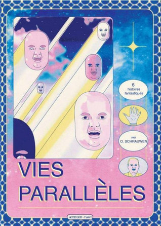
29/04/19 Stories of O

The “O” is for “Olivier”—or possibly “Olver,” or the nickname “Oly,” or even “Ooh-lee,” depending on which of O. Schrauwen’s Parallel Lives you’re inclined to believe. The Flemish artist-writer goes by “Ollie” at his blog, but that real-world identity isn’t one of the six featured in his (or sometimes her) collection of genre-interrogating science fiction tales. These varied Schaurwens are abducted by aliens, cryogenically frozen and reanimated, stalked by a mysterious Mr. Yellow, contacted through time-travel video broadcasts, and cartoonified and later trolled via cerebral cortex nanocomputers.
They also have a lot of sex. One futuristic Schrauwen experiences an alien “miniature iron maiden” designed to collect his semen to breed hybrid alien-human children. Another has sex with his estranged girlfriend while running a Cartoonify program that makes him feel like a “virtuoso balloon animal artist, showing off his tricks.” Yet another, stranded on an alien planet without their hormone-regulating meditrons and hypersexual-field group sexotron, tries two-person, genitalic sex, which they and their partner find “far inferior” with an “uneventful build-up” and a “superficial” orgasm.
Despite the sometimes literal focus on genitalia, these stories of “O” are far from erotica. The actual Schrauwen is playfully undermining not just genre, but gender too. Though the large-breasted Ooh-lee has a penis, she is a she, and though the reanimated Olivier is exploring the “archaic notion of the self,” they and their companions understand themselves as sexual and yet genderless “organs in a body.”

If these future worlds sound dystopic, the effect is more utopic—at least in contrast to the contemporary norms they critique. While lampooning sex, Schrauwen also mocks the related gender roles of traditional science fiction tropes. The sixth and longest tale is a riff on Tarzan, with Olivier having to explain to his girlfriend, “I am the hero here; you’re a woman with an uneven chest, and of no consequence to the story.” They both laugh uproariously, before she remarks how odd it is that the hero in “ancient adventure stories” is so often alone, since “group-heroism seems more enjoyable and meaningful.”

Schrauwen delves even deeper into the comics form, using each story to interrogate some norm readers otherwise take for granted. While “Greys” refers to grey-skinned aliens, the story is rendered entirely in grey tones, as Schrauwen introduces himself as a graphic novelist presenting a personal memoir using yet another kind of grey: “I chose to tell this story in the comics form [because] I believe that precisely in this grey area—the overlap between what can be said with words and what’s best shown with images—lies the language that can truly convey the profound mystery of the events.” Of course, Schaurwen—meaning either his narrating pseudo-self or the actual author—conveys nothing of the sort, offering an absurdly abstract sketch as a supposed “visual approximation of the fear he felt” because his emotions are “best expressed in a more abstract way.” He also enjoys the occasional visual metaphor, with an erupting volcano illustrating “I came.” Despite drawing correspondingly blank panels for gaps in his memory, he still concludes with the ”hope that by working in the comics medium I have managed to shed light on particularities that would be impossible to convey in any other medium.”

“Cartoonify” pushes the stylistic norms of that medium further by literalizing artistic effects through the sci-fi premise of a downloadable brain app. When Schrauwen is running Cartoonify, “small details—moles, dimples—have disappeared. Other, more pronounced physical traits seem exaggerated,” making it “much easier to find his way around this simplified body.” The images vary according to how high a “level of cartoonishness” each character prefers, reducing dangerous physical injuries to bloodless bumps and emotional relationships to superficial entertainment. The analysis can be applied to any comic drawn anywhere along the continuum of extreme caricature to photorealism, with each artistic choice defining the psychological effect of its content on a reader.

“The Scatman” offers a similar sci-fi analysis of the word-half of comics image-texts. The transgender Schrauwen suffers from a troll who hacks into her brain hardware and “acts like a narrator. Like a writer telling my life story.” When her friend responds, “So it’s telling you what you’re doing, while you’re doing it, in a prosaic way?” Schrauwen is critiquing the redundancy of comics that use words and images to express the same idea simultaneously—a norm of Golden Age comics and often an unfortunately continuous trend in many since. It’s no coincidence that this Schrauwen unmasks her tormenter while singing nonsense syllables on stage.

“Space Bodies” continues the critique, as the next narrating Schrauwen explains that he is “Storytelling”: “I’m relaying what is happening to me in the form of a first-person narrative,” which is recorded by an omni-cam and sent “back in time and converted to an ancient medium”—literally the comic book in the reader’s hand. “Hello” interrogates the comics grid by using a gutterless 6×4 layout that variously expands into larger panels by eliminating the single frame line separating images. “Mister Yellow” instead employs a similar but rigid 10×7 grid, telling its entire story in 140 panels that span only two pages. “Cartoonify,” in contrast, includes only 90 panels, but spreads them across ten pages.
Taken together, Schrauwen literally draws attention to the basic building blocks of comics, science fiction, and our cultural sexual norms. While it’s rare for a creator to address even one of these underlying structures of form, genre, or gender, Schrauwen and his team of parallel selves tackle all three.
[A version of this post and my other recent reviews appear in the Comics section of PopMatters.]
- Leave a comment
- Posted under Uncategorized
22/04/19 Strolling in a Meta-Garden of Not-Quite Abstraction
It’s difficult to describe the exceptional weirdness of Patrick Kyle’s Roaming Foliage. For once, the adjective “unique” is accurate. I’ve literally never read anything like it. Explaining why that’s such a wonderful thing, not just for Kyle but for comics generally, will take some explaining.

First, consider the physical book. It’s the height of a standard graphic novel (picture anything from Marvel, DC, Image, etc.), but it’s oddly wider—which, for me, recalls the dimensions of a children’s puzzle book. Or maybe that’s just the paper quality. It looks cheap. I mean really cheap—the pulp grade that defined comics until the 1990s. This is atypical even for an atypical publisher like Koyama Press (who tweeted after reading an earlier version of this review that, no, I was completely wrong, this paper is actually more expensive–which adds to the deliberateness). Compare it to the luxuriously thick, white pages of Nathan Gelgud’s A House in the Jungle or Britt Wilson’s Ghost Queen released by Koyama at about the same time, and you’ll understand that Kyle and the press made a deliberate, aesthetic choice for Roaming Foliage. The feel of those grainy, gray pages is part of the intended reading experience—one that conjures a time before not only webcomics, but the Internet. And, if this doesn’t strain interpretation too far, I can’t help but think of the recycled paper as a nod to the “foliage” of the title: you’re holding what was once literally foliage that has roamed remarkably far.
The other reason I think of children’s puzzle books is Kyle’s drawing style. At first glance it looks like a kindergartener with little respect for stay-inside-the-lines conformity scribbled over the cover and contents. That’s a compliment. Closer inspection reveals how those scribbles are artfully and probably meticulously achieved. I especially admire the variation in line quality. Though the same pen may have made most of the marks, Kyle appears to shrink and enlarge his images, at times accenting the thickness of a scraggly line, other times creating thinly miniaturized precision.

How those lines combine is weirder still. Most comics pages can be analyzed in terms of layout, with framed rectangular panels spaced to create gutters that then form rows and columns for easy reading flow. Not here. While Kyle draws some frames, they are usually inset into other images, and there’s not a traditional gutter to be found anywhere in the book. Though Kyle’s reading paths do follow a standard left-to-right, top-to-bottom format, there’s nothing easy about that flow. At least not until you acclimate to his pastiche environment of borderless overlap that defines his approach to image juxtaposition. Where does one image stop and the next begin? Hard to say. Since comics are defined by the juxtaposition of discrete images, that lack of division digs at the roots of the entire form.

Those line and image combinations also represent a story world, one described on the back cover as “the wild overgrowth of a mysterious and magical garden.” Those words probably conjure an image in your head, something roughly naturalistic in style, with clearly defined trees, leaves, bushes, paths, maybe some sky visible above the treetops. Wrong garden. Actually, wrong universe. Though Kyle does draw a variety of vegetation, the drawn elements don’t combine according to the rules of three-dimensional representation. Kyle’s world isn’t necessarily flat (some shapes are drawn as if in front of other shapes), and he doesn’t abandon perspective entirely either (a branch, for instance, leans above another branch to suggest a specific angle of observation). But in comics, even ones drawn in the most minimalistic and exaggerated style of cartooning, we expect a stable setting. Cartoon humor often violates the rules of a stable universe: Calvin’s body flies apart as he yelps in his surprise, Coyote hovers mid-air before plummeting down a ravine. But these violations of physics are only possible because the story world has a mostly stable set of physical laws. Kyle’s has none—or at least surprisingly few. Both his readers and his characters wander through his semi-representational ink marks, searching for meaningful paths.
And those characters, the most central and repeatedly drawn objects in the garden and graphic novel, are perhaps the weirdest of all. Again, according to the back cover, the cast should be clear enough: “two boys, a girl, a small head without a body, a humanoid robot and a pumpkin.” Okay, so even in a naturalistic style that would be pretty damn weird, but in Kyle’s hands, it unearths yet another root of the comics form. According to some definitions, a comic has to include a continuing character (Colton Waugh) or a set of recurring characters (M. Thomas Inge) or simply recurrent characters (Bill Blackbeard)—all of which require recurrence: the experience of a viewer understanding that a cluster of lines in one panel or page represents the same thing as represented by a similar but inevitably different cluster of lines somewhere else. That’s so utterly basic an expectation, readers rarely make it conscious—until you’re reading Roaming Foliage.

The novel opens with a turnip-like head drawn above two lines (which could either be a bodiless neck or two very thin legs) standing before a set of flowing lines that (we learn later from the text) represent a suit of clothes (why the clothes appear to be partially levitating is one of many physical phenomena that goes unaddressed). In the next (in this case clearly divided) image a pair of arms materializes below the head in roughly the position a humanoid character would have arms—though no lines connect them to the head, and the rest of the implied body is undrawn. Turn the page, and the figure now also has legs and a newly clothed torso. But that’s not the peculiar part. Page three features five speech balloons pointing at five drawings, which I understood at first to include at least one recurrent character. Given the instability of anatomy and the physical world generally, the repetition of the head shape, and the collage-like lack of panel divisions, I figured the same head was sometimes attached and sometimes not attached to a body that sometimes appeared to be wearing a set of wavy lines and sometimes not. Wrong. These are five distinct characters with distinct visual characteristics that Kyle repeats consistently. That I could read them otherwise suggests just how pleasantly off-balance Roaming Foliage threw me.
Unlike this one, most book reviews, of comics or otherwise, discuss plot by the second paragraph, and I assure you Kyle offers plenty of that too. In fact, Roaming Foliage wisely offsets its relative chaos with a fairly straight-forward narrative structure. The characters quickly divide into pairs, with the opening character leading another to the tailor who made his suit in the hopes that the tailor will make another (and here I admit that my use of gender designations is visually ungrounded, but this is already too confusing for the singular “they”). The tailor is named Rotodraw and is either an ancient robot built by extinct humans or the last human who has come to believe he’s a robot. Either way, he (“he”?) needs a special fungus to refuel—and so begins the quest.
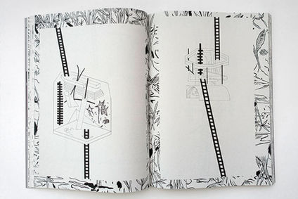
Rotodraw also turns Roaming Foliage into metafiction, with not just his ability create objects “out of nothing” (the power of any artist), but the foliage of the garden becomes animated when Rotodraw is having a dream—meaning the unstable fabric of the story world is linked to Rotodraw’s mind. That reality is also shaped by the characters who interact with the ever-changing face of the wishing well—and the reader too, since we’re instructed to write a description of the face on the lines provided inside the book (so it really is like a puzzle book). Other pages include things that aren’t there (such as items that the characters are not carrying) and events that don’t happen (it was only an “anxiety dream” when she threw her friend’s bodiless head into the well).
As the unnamed characters’ adventures continue, there’s a secret password, wild dogs, a gate twice left open, an elf giant, a magic monolith, invasive tobacco plants, a dog-shaped fungus, a ladder, a tunnel, an image-projecting telephone, a mysterious hallway, and, like any quest narrative, a return home. In other hands, this would all be merely an entertainingly odd fantasy tale. And while it is still that, Kyle’s meta-garden also draws attention to the underlying structures of the comics form, giving it new sustenance to grow previously undreamed possibilities. I hope Rotodraw never wakes up.

[A version of this post and my other recent reviews appear in the Comics section of PopMatters.]
Tags: Koyama Press, Patrick Kyle, Roaming Foliage
- Leave a comment
- Posted under Uncategorized
15/04/19 Portraits of the Comics Scholar as a Middle-aged Man


These images are photographs digitally adapted in Microsoft Paint. All of the content, meaning all of the pixels, originate from the photographs without additions. The second combines two photographs and so is a photo collage. The last and third-to-last were created by incrementally reducing the size of the original until distorted by pixilation and then enlarging again. The odd-numbered images are derived from one photograph, using Paint’s transparency function with various mouse-drawn line patterns to layer portions of the same photograph over itself. So it this last one:

- 1 comment
- Posted under Uncategorized
08/04/19 Paintings of a Painter’s Paintings


I’ve been working on a graphic novel–or graphic novella really. I’m on page 27 of a planned 40, so maybe that’s just a graphic short story? Either way, one of the characters (I learned while writing/making the story images), is a painter. I realize that’s a terrible idea (like a short story about someone who writes short stories), but I’m now committed to it. Worse, as I started the third chapter (they’re only ten pages each), I found that I needed/wanted to include some of the artist’s paintings. Or I think they’re her images. They might only be my cartoon representations of her paintings–the same way any cartoon image only marginally or indirectly represents its subject.
Cartoons are metaphysically weird that way. When Calvin’s cartoon head pops off in surprise, we don’t think his head actually popped off, right? That’s just how cartoonist Bill Watterson draws him for dramatic effect? But is he drawing Calvin’s experience of himself or Hobbes’ and the viewer’s experience of Calvin? Who is the filtering and so image-shaping consciousness that makes an image not literal?

In my story, the husband of the painter is looking at the paintings she left on the easels in her studio before moving out. It’s not a happy marriage. I know that the same way he should know that and how the reader-viewer knows it: by looking at her paintings. They’re not happy either. The figures inside the canvasses seem contorted and trapped.
But if my images are cartoon representations of her paintings, whose cartoon eye do they reflect? I’m not in the story, so am I drawing a version of what the painter sees when she paints or am I drawing what the husband sees when he looks at the paintings through his own biased unhappiness? Either way, I’m drawing an image of an image that also represents someone’s mental state.
I’m also (even more weirdly) “painting” in the now proudly defunct Microsoft Paint. Why? Because I’m too lazy and techphobic to upgrade to something made in the 21st century. But I also like how the extreme limitations of the program have forced me into really odd creative corners that I don’t think I would have ever found if I were using a more functional tool. Also, since cartoons simplify reality, a simple tool feels right.

- Leave a comment
- Posted under Uncategorized
01/04/19 Space Scribbles
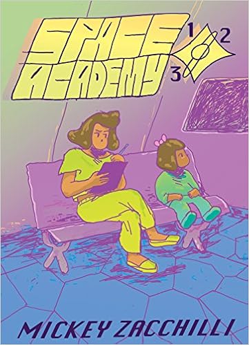
Taking exams, remembering your locker combination, auditioning for the school play, repairing the critical hull breach—it turns out attending school in outer space isn’t all that different from school today. Mickey Zacchilli draws an entertainingly familiar future in Space Academy 123, a book-length collection of her daily Instagram webcomic of the same name. Her cast includes Ashley the hyper-confident underachiever, Andrew the teary-eyed, spacesuit-wetting overachiever, Naomi the oddly self-reflective school bully, Shandy the preternaturally precocious preschooler, Donna the newly graduated principal who had really hoped to be a chiropractor, and Grandfather Computer the emotionless mastermind secretly manipulating the Academy. They evolve together in interweaving plots of romance and intrigue that build and diverge and meander and build again, creating a pleasantly un-novel-like graphic novel experience.
Zacchilli’s style is the comic’s most unexpected and engaging quality, one that defines not only each installment but the governing principle behind the whole series. The pages look like lose, first drafts, the kind of quick sketches an artist roughs out while deciding the number and positions of panels, keeping their content as basic as possible. Instead of traditional gutters, she draws single frame lines along the panels’ inside edges, leaving outer edges open to the margins. The same, thin lines define the characters and their words and word balloons, with lighter pencil marks adding only sporadic depth—or rather indicating where naturalistic shadows could be developed since the effect is less crosshatching than stray scribbles.

Similarly, many of Zacchilli’s figures appear only partially drawn. Lines dividing shoes and legs can vanish or reappear panel to panel. The deliberate imprecision allows basic shapes (the double ovals of most character’s hair, for instance) to shift without seeming to indicate any change or other significance to the actual character. The roughness of the style creates some ambiguity about the identities of characters when they are first introduced—a challenge that Zacchilli counters with definingly overt character markers such as Ashley’s eyepatch, Regina’s triangular glasses, and Shandy’s hairbow. Arguably all cartoon characters require such visual markers (Mickey Mouse’s ears, Dick Tracy’s chin), but Zacchilli pushes the norm to its barest extreme.

Each one-page comic also includes a title banner drawn in the top panel. Though the lettering varies, the thicker pen lines always distinguish “Space Academy 123” from the rest of the drawing. This is perhaps Zacchilli’s oddest and so most interesting choice. The purpose of a title design is repetition. Look at any other comic and the same, series-defining graphic is used in each installment. Zacchilli instead redraws her title in an evolving sequence of variations, each as rough as the last. Were these pages actual rough drafts, no artist would bother redrawing and therefore redesigning title letters week after week after week.

And yet in another sense Space Academy 123 is a rough draft. Zacchilli does not appear to be working from a script or even plot outline. Like the drawings themselves, the characters and storylines take loose shape directly on the daily pages. The school bully does not receive a name till reintroduced in a “Character Update” some fifty pages into the series. The same update identifies “human teacher (name not yet revealed),” but her name is never revealed, while other characters later refer to her as if “Human Teacher” were her name. The subplots have a similar ad hoc aesthetic. While many do develop, others peter. Naomi vows early on to figure out Ashley’s “true wants,” but then barely notices her again, focusing attention (and possible attraction) on Andrew instead. Late in the collection, Naomi declares a Homeric quest to find the Private Admin Jacuzzi—a goal that both Noami and Zacchilli appear to abandon without comment.
Other plot threads do continue, but not always in meaningful ways. Though Grandfather Computer’s decision to move the space station seemed important at the time, no consequences follow. And why exactly did he manipulate the principal into going to retrieve the repositioning ore herself? Which, to be clear, was just “resources” when first introduced. More significantly the computer recognizes Shandy’s potential, declaring, “That child is VERY smart. If you don’t captivate & challenge her mind, things will go VERY wrong.” But then Shandy does go unchallenged, trapped back in Sunshine Storytime after her brief stint at hull breech repair. And though the school play was cancelled, and Andrew still hasn’t read the play Ashley wrote to replace it, why does that matter? And why introduce a “new girl” character in the second half, and then do nothing with her?
Sometimes Zacchilli writes and then scribbles out words inside her character’s word balloons, apparent evidence of her literally rewriting as she goes. She seems to follow the same revise-on-the-fly technique at the macro-level, scribbling her way through her Academy one open-ended page at a time. Though the effect makes for intentionally sloppy story structure, it is also an effective choice for the science fiction content. Like most genre fiction, SF is riddled with clichés, ones highlighted by Zacchilli’s aggressively generic title. But rather than delivering her school-in-space tropes in standard futuristic detail, her scribbled artistic and literary style undermines expectations to entertaining if chaotic ends.

[A version of this post and my other recent reviews appear in the Comics section of PopMatters.]
- Leave a comment
- Posted under Uncategorized


