Monthly Archives: September 2017
25/09/17 Gender-Blender Superhero Decides Not to Save the Day

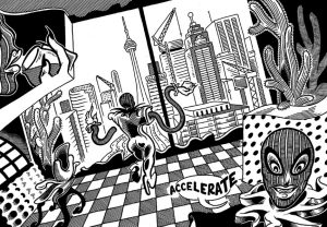
Eric Kostiuk Williams’ Condo Heartbreak Disco fluctuates between superhero parody and superhero tale set in an absurdist world that reflects but warps ours like a funhouse mirror. Reminiscent at times of Robert Crumb and Bob Burden, Williams’ style is transgressive in a familiar way, evoking a decades-long history of alternative comics. Though his immediate subject matter is the gentrification and over-development of his home city of Toronto, the plot of an ancient demonic entity constructing empty “Readymade Art Condos” in order to wipe away humanity is too playfully self-indulgent to serve as serious social critique. Instead, Williams’ primary subject is his style itself, which his characters and plot serve well.

The opening page establishes in four wordless panels the evolution of Toronto from a sparsely constructed 19th-century-era port to a crowded futurscape of impossibly shaped buildings. Those four panels then reappear on the following page but drawn as a single object ambiguously merging with explosive clouds as the buildings transform into the letters of the title. That paradoxical shift between words that describe a fictional world and word shapes that are objects in that world is common on comic book splash pages. But for Williams, it is a defining style of his narrative in which characters and objects are both their solidly naturalistic images grounded in a fully physical world but also somehow their radically unstable drawings free to morph across the surface of the page.

Williams’ layouts are accordingly chaotic, with broken frames, interpenetrating images, endlessly irregular panel shapes, and drawn objects that serve as frame edges for other bordering images. The self-reflexive style even infects Williams’ sound effects when a character grabs hold of the word “CRUNCH” in the process of producing it.
The morphing art features two equally anarchic characters: the ambiguously dynamic duo of Komio and the Willendorf’s Braid. Both, appropriately, are shapeshifters, capable of transforming their nominally female bodies at will. Komio’s usually high-heeled platform shoes are extensions of her actual feet which in bed appear barefoot yet toeless. Her white stocking of a body is also free of hair, ears and genitalia. Although she can bend and bulge into any set of shapes she likes, she also needlessly dons wigs and costumes, leaving her disturbingly button-round black eyes her most consistent features.
Komio’s cartoonishly feminine lips are near constants too, though they also serve the practical purpose of attracting the men she has been hired to capture and torture. For “lifetimes,” Komio performed “vengeance as public service” but now prefers payment. Though her first victim seems deserving of his fate as his apparent rape victims materialize to watch his punishment, Komio’s questionable motives foreshadow the nominal superhero plot’s turn into anti-melodrama.
When Komio discovers that another “more than human” shapeshifting being is her antagonistic, she relishes the “real challenge.” It’s a superhero cliché as old as the Golden Age Batman and the Silver Age Spider-Man, but here Williams warps hubris into complicity. Komio soon abandons her sidekick lover Braid and literally merges with her enemy. Left alone, Braid (again, literally, she’s an enormous braid of hair coiled into human shape) attempts to aid the residents of their former neighborhood as the skyrise condos reduce them all to homeless squatters. But the struggle seems futile. How could Robin save Gotham after Batman has joined forces with Joker? The “dystopic conclusion of development for its own sake” may even describe Williams’ own aesthetic, one motivated by the pleasures of its own excesses more than any purpose outside them. In that sense then Komio’s betrayal is inevitable.

Williams does leave readers on an ambiguously positive note though. Braid finds the exploitive Instigrammer who unwittingly led the demon to Toronto through his “geo-tagged photos” that revealed “a naively deterministic yearning for an authentic, lived urban experience.” Though he realizes now he’s “a complete piece of shit,” Braid tells him: “But maybe you don’t have to be.” Since the narrative ends on the same page, the gentle scolding seems to be directed at Williams’ own readers.
But Williams seems more engrossed in his now literally warping images. The page concludes with the opening panel of the futuristic Toronto cityscape now bending as if stretched across a curved surface. It’s an ambiguous but fitting ending to the anti-superhero tale.

[The original version of this and my other recent comics reviews appear in the comics section of PopMatters.]
- Leave a comment
- Posted under Uncategorized
18/09/17 Pop Art Amsterdam
As some past readers of this blog may have noticed, I have a thing for Andy Warhol (one that infected at least one of my students). So imagine my delight when on the first day of our family vacation last month, our Amsterdam canal guide steered us past this unlikely sight:
 I’m a little slow, but I eventually figured out it was an ad for a Pop Art exhibition in the city that same month. Warhol’s “Marilyn” was pleasantly everywhere:


Given that the original work is a commentary on the nature of reproductions, these ads seem like a natural extension of Warhol’s vision. And, by an even more pleasant coincidence, the actual exhibition was housed in the same building as the conference I was attending:


Though I’ve looked at dozens of book illustration reprints and online pixel-versions of Warhol’s art, it was startling to see the originals in person:


And if I’m obsessed with Warhol’s “Marilyn,” then Roy Lichtenstein’s “Crying Girl” is a close second:

None of the online versions I’ve looked at include his signature:

These two Pop Art paintings have been my top influences as I’ve dabbled in Word Paint for the past year:

 When the new online journal Sequentials announced its first CFC (“call for comics”), I leapt:
“The late-20th Century ushered in a multi-disciplinary reaction to modernism that influenced various disciplines, artists, and thinkers. Since this time, postmodernism has been taken up in literature, film, music, philosophy, architecture, theory, and more. Despite its widespread influence, however, postmodernism remains a debated movement with many scholars and creators arguing that it lacks clarity and meaning. Characterized by an emphasis on deconstruction and critical theory, postmodernism has evolved in past decades to include innovative, if contested, ideas and structures. For Sequentials’ first Call For Comics, we seek visual interpretations of the concept of postmodernism… Submissions must be illustrated in comics form and can visualize a particular aspect of the concept or the movement as understood through a particular discipline. Additionally, submissions may visualize an explanation and/or critical inquiry of the subject.
“This project asks contributors to (re)imagine the meanings of both the subject they are drawing about andthe form that their interpretation takes. By encouraging contributors to conceptualize their work in a distinctly visual way, this project highlights the unique creative capabilities of the comics medium and reflects TRACE’s overall focus on innovative research, writing, and knowledge production. The Sequentials project seeks to display and circulate original visual scholarship, providing alternative modes of meaning making and centralizing issues of form.”
My response, “This Is Not Marilyn: The Dailies,” began with a newspaper-like strip of the publicity photo that Warhol used in August 1962 to create his first requiem-like silkscreen after the news of her death:
 Then I started layering and playing with the comics conventions of talk balloons, thought bubbles, and caption boxes:
 The complete, eleven-strip sequence is available in Sequentials‘ first issue here (though personally, I prefer Oriana Gatta’s contribution.)
Meanwhile, back in Amsterdam, I kept finding more Marilyns, including Banksy’s Kate Moss variations:


And meanwhile in the online universe, Sequentials‘ next issue will focus on “queer”:
“For Sequentials’ second special Call For Comics, we seek visual interpretations of the complexity of queer existence, discourse, and theoretical concepts. We are particularly interested in submissions that comment on the relationship between various deployments of the term “queer” and concepts of visibility, visuality, and art-as-activism. Submissions must be illustrated in comics form and can visualize, for instance, a particular interpretation of a given theorist’s concept(s), a unique contribution to the field of queer theory, or the possible connection between comics and queer theory.”
[To be continued . . . ?]
Tags: Andy Warhol, pop art, Roy Lichtenstein, Sequentials
- 1 comment
- Posted under Uncategorized
11/09/17 The Boundless Talent of Jillian Tamaki

Jillian Tamaki’s collection Boundless features nine eclectic short stories, with plotlines ranging from a mysterious and trance-inducing music download to a mundane but adultery-revealing infestation of bedbugs. Characters include talking animals, a woman shrinking to a sub-atomic level, and the producer of a pornographic sitcom from the 90s. Seven of the stories appeared individually in magazines and online, so Boundless is an especially welcome collection of Tamaki’s short works, ones that stand distinctly apart from both her longer collaborations Skim and This One Summer with writer Mariko Tamaki as well as her collected webcomics series SuperMutant Magic Academy.
While all nine stories are unified by Tamaki’s signature artwork, her style and format vary. The longest tale spans over forty pages, the shortest only twelve. Two are black and white, one is brown and white, while others include one additional tone, a bluish gray or a muted orange, while still others employ multi-color palettes. Tamaki’s lines are sometimes sharp and her panels framed; other times her figures seem to quiver in the pages’ open spaces. Two stories even run perpendicularly, requiring readers to rotate the book and turn pages as if flipping a calendar. But despite all of its variations, reading Boundless is mostly a unified experience. The two perpendicular stories open and close the collection like bookends, while the middle stories explore a common thread of reality-warping media and consumerism.

“Body Pods” recounts the formative and continuing influence of a mediocre sci-fi adventure film on its now adult fans. Though the narrator has no interest in the movie, it haunts her through the obsessions of her successive lovers as they and the larger fan base mourn the deaths of aging cast members. By the end she not only hates the film, but prefers her isolation.

Although the narrator of “Darla!” recalls his work on an obscure TV sitcom fondly, he ends his story similarly alienated. Like the sci-fi film and its star, the TV show is the receding highpoint of his increasingly mediocre life. Although the former producer appreciates the attention of a new generation of internet fans, their snide attitudes seem to undermine the value of the show and his life in general.

“Sexcoven” explores another fan world, this time of a six-hour recording of an atonal drone that produces hallucinogenic euphoria in dedicated listeners. Like the sitcom, the mp3 is from the 90s as recalled now by its no-longer entranced followers. But here Tamaki takes a wider approach, tracing the progression of the phenomenon through a range of transitory characters, until settling into the plight of a small group of the most dedicated. But the story still ends with a young researcher interviewing one lone and lonely member long out of touch with her splintered group and life.

Tamaki’s meta-narrative of alienating media consumption takes a fantastical turn in “1.Jenny,” one of only two stories not previously published. The main character, Jenny, grows obsessed with an alternate version of herself who exists in a mirror Facebook, an internet phenomenon which, like the Sexcoven mp3, appears one day without explanation. Unlike the previous TV, music, and movie obsessions, Jenny’s is current and all-consuming. When her alternate self, 1.Jenny, finds happiness in a relationship, Jenny plunges into jealousy and depression. But unlike Tamaki’s other protagonists, Jenny unplugs, seeks therapy, takes up swimming, and finds new equilibrium. When she does eventually glance at the other worldly Facebook again, she can’t help but feel triumph about her mirror’s break-up. Tamaki lightly questions Jenny’s cruelty, but her state is far better than those of the collection’s other protagonists.
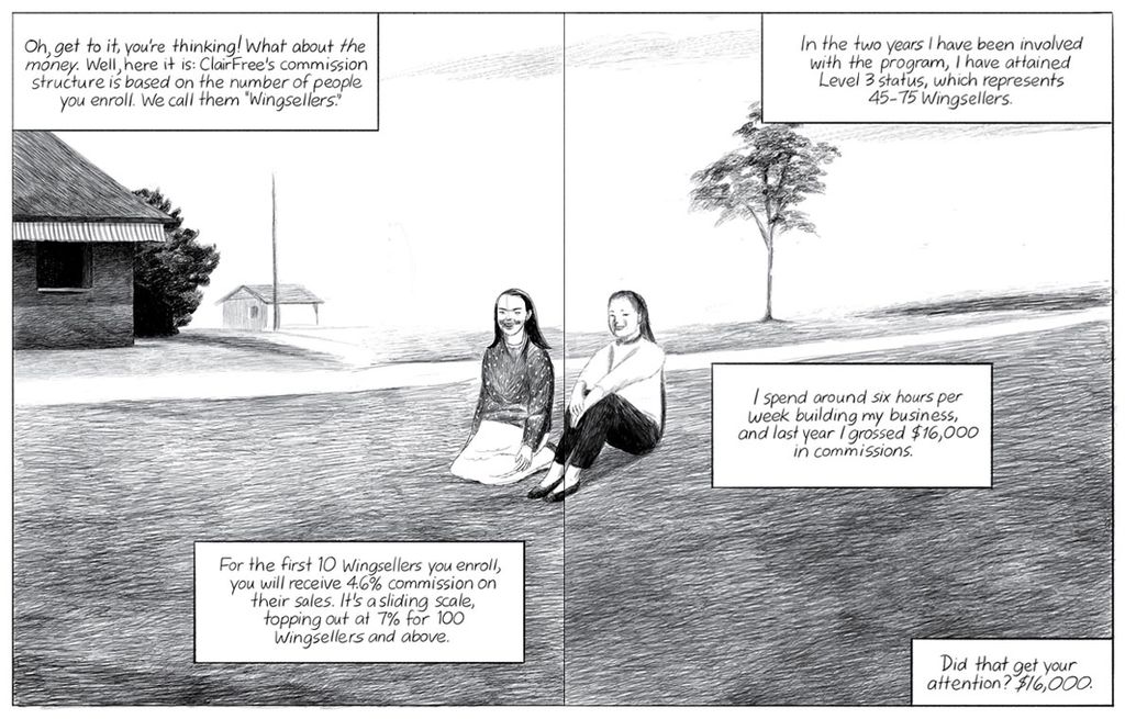
“The ClairFree System,” Tamaki’s most overt critique of consumerism, is more ambiguous in both conclusion and structure. She juxtaposes the text of a well-practiced sales pitch with a sequence of narratively unrelated images. For example, the narrator’s description of crying with joy at the sight of her acne-free face borders a two-page spread of a mother breast-feeding a toddler. While the juxtaposition might evoke a range of possible meanings, the core effect is disconnection—arguably the same disconnection underlying the speaker’s manipulation of a potential client with false emotion and promises. The story ends with the narrator grasping the other woman’s hands, presumably to apply a skin cream sample, but the white hands floating in the panel’s black background suggest a desire for deeper human contact, one made impossible by the narrator’s goal.

Tamaki’s most realistic tale, “Bedbug,” constructs no fictional products or internet phenomenon, but its narrator suffers more than all others. Her adultery manifests physically in bedbugs that nearly destroy her marriage as she and her husband pick through their belongings, disposing of everything but the most essential items. A honeymoon-purchased neck-pillow and the bed itself both go. Not unlike Tamaki’s other narrators, this one is an English professor and novelist, and she understands herself through media-transmitted clichés she both mocks and embraces while suffering the deeper alienation. She keeps her affair a secret as she accepts her husband’s embrace in the final frame. The story is poignant, and also a Tomine-esque outlier in the collection’s range of genre and subject matter.

“Half Life,” appropriately the collection’s shortest work, is also its most fantastical. The narrator begins shrinking for no reason. Initially the effect is pleasant; out-grown dresses suddenly fit again without the inconvenience of dieting. Soon she needs new shoes too, and then “objects start rejecting her” as she no longer can open jars of food. But she admonishes herself for speaking harshly of things like spoons, because she is “the uncalibrated one.” In the end, she merges with the emotional life a dog who swallows her as a microorganism, but she can’t be sure if the feelings she detects are the dog’s or just her mind playing tricks on her. The ambiguity is striking, but the overtly fantastical conceit and the peripheral attention to media or consumerism place the story outside the collection’s mostly unified whole.

The opening and closing works, “World-Class City” and the titular “Boundless,” stand apart from the middle stories. Neither are narratively driven and instead echo the verse style and animal imagery of children’s picture books. Rather than depicting urban landscapes, life in a so-called world-class city features monkeys and plants and ambiguously drawn natural shapes, beginning and concluding with watching human figures drawn as if peering over the page edges. While otherwise unlike the consumer media of the middle stories, the repeated, sing-song phrase of “World-Class City” does create an artificial prism that warps its unidentified speaker’s understanding of life there. “Boundless” follows a sequence of narrators in an exploration of the paradoxically bound nature of animal life. Squirrels test continually test each other’s territorial edges, while birds watch for even a single, nearly invisible but deadly spider thread, and a lone, Hobbes-quoting fly ends its brief, brutish life crushed in the pages of a closing book—a fitting ending to Tamaki’s collection.

[The original version of this and my other recent comics reviews appear in the comics section of PopMatters.]
Tags: Jillian Tamaki
- Leave a comment
- Posted under Uncategorized
05/09/17 Was She Pretty?

Leanne Shapton Was She Pretty? is not a comic in a traditional sense. No talk balloons and caption boxes, no panels and gutters, not even recurrent characters or a plotline. Shapton instead offers variations on a single theme, a litany of ex-lovers and their lingering presence in new relationships.

The table-of-contents features over fifty first names, the vast majority women, their status as ex- or current girlfriends unmarked, because each couple is also a triangle. Josephine and Robert plus Robert’s ex, Alicia. Jennifer and Richard plus Richard’s ex, Cassandra. Alicia and Cassandra remain not only as memories for Robert and Richard but as new, evolving conflicts for Josephine and Jennifer. Most of Shapton’s drawings are of women, with about a dozen of the one hundred or so images featuring men, making women both the primary haunters and the haunted.

Shapton’s form reflects her subject well. Each two-page spread is a kind of couplet: words on the left, drawing on the right. The words, usually one or two sentences, are typeset and centered on otherwise blank pages. The drawings are ink sketches, executed in a quick, gestural style, that occupy the majority of their pages. While the words and images are linked by their exclusive use of black on open white backgrounds, the effect is division, with the center margin separating the two halves of each image-text. The thin, regular shapes of the font also contrast the thicker, irregular lines of the sketches that evoke their moments of creation by Shapton’s living hand. The words evoke only the impersonal process of book manufacturing.

The contrast is especially pronounced since Shapton presents the words of the cover and preceding Prelude in her own handwriting, a style that emphasizes the same, intentionally uneven line qualities as her drawings. The cover art consists only of the looping letters of her title with no other illustration, further emphasizing the drawn quality of the words—reminiscent of Henry Matisse’s own over-sized handwritten words in his 1947 Jazz. Shapton’s Prelude pages also include words and images on both left and right pages, further preparing her contrasting couplets.
In nearly every case, a lefthand sentence names a character who the accompanying drawing appears to depict. Shapton writes, “Jason’s ex-girlfriend was Taylor,” and so the drawing of a woman on the facing page appears to be Taylor. This is deceptively simple. Gender assumptions prevent the image from representing Jason, but Shapton sometimes includes two female referents: “Martin had never mentioned his hauntingly beautiful ex-girlfriend Carwai to Heidi.” The sketch of a woman’s head fills the next page. She appears to be Carwai, not Hedi, in part because her minimally drawn face could be described as “beautiful”—though those features are “hauntingly beautiful” only as a result of the juxtaposed words. The image might as easily be Heidi. But when Shapton writes, “… Mimi found out that it was Evan’s ex-girlfriend Cindy who tried to strangle her in the schoolyard when she was eight,” the facing image of a child appears to be Mimi, not Cindy the ex. This is likely because the child’s eyes are downcast and her hands pocketed, the posture of a victim not a bully. But again the link is inherently ambiguous.
Roughly a fifth of the drawings depict objects belonging to an ex. Katya’s ex-boyfriend’s postcards appears on both pages, as does Lucy, the only figure to span a two-page spread. Fiona doesn’t appear at all, only her hand-drawn name, because its sound triggers an eleven-minute silence over dinner. While Shapton’s characters usually change with each page turn, seventeen of her micro-chapters extend for two or three couplets, two for four, and the penultimate for eight. Josephine’s three-couplet dream that her boyfriend’s ex keeps trying to give him “articles of used clothing” also disturbs the formal symmetry, with an article appearing on the second left page and the third remaining entirely blank. Graham’s second and third lefthand pages are blank too, apparently a result of his giving “a number of girlfriends” the same romantic CD compilation. Instead of focusing on exes, Elizabeth’s worry about the women who replace her divides her multi-page sentence into the book’s only fragments.
Margaret’s sixteen-page sequence serves as finale, a sub-list of Scott’s exes from a box of journals that Margaret finds and reads. As an unexpected result, Margaret experiences not just guilt but also love for Scott “because everything she adored about him was evident” in his past relationships. The final spread, however, literally reverses this positive realization by placing Margaret’s final words on the right: “This did not go far to alleviate her nausea, or slow the spool of images rushing through her head.” But in fact it has: the opposite left page is now blank. The relief is momentary though. The final couplet returns to form, detailing the rash and stomach pain Louise suffers at the sight of Greg’s ex.
Although each triplet of characters is independent, the accumulative effect is still narrative, with all of the girlfriends, boyfriends, and ex-girlfriends forming three conglomerate characters, whose details vary but not their core experiences. Shapton quotes Kierkegaard in her Prelude: “The chain is very flexible, soft as silk, yields to the most powerful strain, and cannot be torn apart.” Kierkegaard is alluding to Norse mythology, but Shapton implies the impossible-to-break links between exes, as well as the far wider links between all of the characters suffering these same anxieties.
Existentialism aside, Shapton’s characters also share basic features, literally through her unifying gestural style, but also ethnically, sexually, and socioeconomically. Makeda and Olivia are the only African American faces, and Ghislaine and Sophie the only non-heterosexual couple. But privilege is nearly ubiquitous. In addition to educations involving “Med school” and “PhDs,” characters travel between cities for business and continents for pleasure. Character-defining descriptions include: “daughter of two prominent pyschoanalysts,” “heiress,” “critically acclaimed” singer, “fashion designer,” “chief designer of a centuries-old fashion house,” “fine-art photographer,” “child prodigy,” “theater director,” and “Argentinian supermodel and the face of a multinational cosmetics conglomerate.” There is also a “nurse” and “salesperson,” but wealth is far more common and overt: Edie “enjoyed Brahams” but “preferred money,” and “Lena’s ex-boyfriend made less money than her other boyfriends. She loved him the best, but he always felt he had something to prove.”
While Was She Pretty? may suggest that anxieties over exes are universal, it also subtlety critiques its circle of privileged sufferers: well-off, good-looking people with an abundance of romantic relationships. These are problems worth having.

[The original version of this and my other recent comics reviews appear in the comics section of PopMatters.]
Tags: Leanne Shapton, Was She Pretty?
- Leave a comment
- Posted under Uncategorized


