Monthly Archives: July 2018
30/07/18 Hinged Panels
A few weeks ago I suggested using “hinge” to replace McCloud’s ubiquitous yet frustratingly ambiguous “closure.” While McCloud’s term has related meanings in Gestalt psychology and narrative analysis, hinge is a comparatively simple metaphor: it’s what joins two images together. I’ve identified eleven kinds:
Recurrent: two images represent the same subject.
Spatial: two images represent a shared space.
Temporal: two images represent a shared timeline.
Causal: a common quality of temporal closure in which an action is understood to have occurred between images.
Embedded: one image perceived as two images.
Non-sensory: non-spatiotemporal differences between two representational images.
Associative: two dissimilar images represent the same subject.
Gestalt: two images perceived as a single image interrupted by a visual ellipsis.
Pseudo-gestalt: two physically continuous but representationally non-continuous images.
Linguistic: two images relate primarily through accompanying text.
I offered some photographic examples earlier, but now I want to show off work by students from Leigh Ann Beavers’ and my spring term course. The following illustration will appear in our Creating Comics (Bloomsbury 2020):

1) Emily juxtaposes two identical images. The spatial hinge is obvious: we’re looking at the same cube on the same shelf from the same angle. The temporal hinge is harder. How much time passed between the images: an hour, day, minute, week, second, month? Or did no time pass, and the images are the same because they show the same moment? Or how do we know the second image doesn’t happen first in the story world and the images are arranged to reverse chronology? Technically we don’t, but comics norms imply a forward movement in time—unless something drawn prevents that assumption.
2) Emily’s second pairing repeats the same spatial hinge, and though it’s still ambiguous how much time passes between them, the appearance of a hand means that the two images are not showing the same moment. A causal hinge also explains why the block is gone in the second image: after grabbing it (as drawn in the first image), the hand then removed it (not drawn), leaving the shelf empty (drawn in the second).
3) Mims’ first two panels use spatial, temporal, and causal hinges too. We don’t know how far apart the sidewalk in the first panel and the sand in the second are, but we infer they’re in walking distance and that minutes pass between them. We also assume that the person wearing the shoes in the first panel removed and discarded them during that same period of time. We make similar inferences between the second and third panels—though note the addition of a gestalt hinge: the water line appears at the bottom of the second panel. So spatially the second and third panels are continuous—though time passes between them to allow the figure to have stepped into the water. An astute viewer might also notice that the figure’s shadow changes—in ways that could confuse things and so might then be ignored, either consciously or unconsciously.
4) Anna draws a figure on a bed surrounded by giant, writhing centipedes. Though it’s possible to see this as a single image, the bed is more likely a panel inset placed “over” the image of the centipedes—which, if understood as a close-up, means the centipedes aren’t giant. Though the centipedes could exist somewhere in the same room as the bed, the spatial hinge is ambiguous. That’s because the centipedes are most likely not real. This is the dreamed or otherwise imagined fear of the figure in the bed—and so an example of a non-sensory hinge.
5) Hung draws no panel frames, and so his image has no gutters either. Is this an image of three players practicing soccer? Probably not. First, all three are drawn so similarly, they create a recurrent hinge. Plus each figure implies a different angle of perspective on the undrawn field or fields, and so three different moments in time. Though the figures overlap and are in a sense one image, they create the impression of three images through embedded hinges. Notice that the third figure includes a half-outline, a kind of partially embedded image that suggests movement. But if it’s understood as a blur—like the movement lines of the ball—then it’s experienced as one moment in time and so is not embedded.
6) The corner of a house viewed from outside and an off-centered close-up on an interior doorknob–how do these relate? Presumably they’re parts of the same house—but why are they side-by-side? Any spatial hinge doesn’t tell us much. But if you read Coleman’s two captions, the images take on a clearer relationship, including the presence of multiple undrawn characters at the center of the story. But without the words there is no story. The images relate primarily through linguistic hinges.
7) Lindsay’s two images require a spatial hinge to understand that the second is a close-up of the driver operating the car in the first. Though a temporal hinge might suggest either two consecutive moments or a single moment, the effect is roughly the same. More interestingly, she lines up the edges of the road to the edges of the driver’s head, creating a pseudo-gestalt effect. The road and head have no close spatial relation within the story, but they’re drawn as though they’re connected—suggesting something about the driver’s character too. Since Lindsay uses no gutter, just a single line framing and dividing both images, the pseudo-gestalt hinge is even stronger. She also draws the driver’s sunglasses breaking the second frame, further connecting the two images.
8) Finally, Grace connects her two panels with a gestalt hinge. It’s as if the gutter interrupts a single image, imposing a break where we understand there is none in the story world. Though the story context would tell us more, the half-empty picnic blanket in the left panel and the lone figure on the right are suggestive—more so than if the gutter didn’t highlight her isolation and imply the absence of someone beside her.
- Leave a comment
- Posted under Uncategorized
23/07/18 What is Style?
Roughly speaking, style isn’t what you draw but how you draw it. It’s the idiosyncratic quality that distinguishes a drawing from a replica. Roland Barthes calls a photograph “a mechanical analogue of reality” because it translates reality with the least transformation; but every reproduction, including photography, contains “a supplementary message, in addition to the analogical content itself (scene, object, landscape), which is what is commonly called the style of the reproduction,” something that even photorealism contains since “there is no drawing, no matter how exact, whose very exactitude is not turned into a style” (1977: 17, 18).
Photorealism is relatively rare in comics (Bill Sienkiewicz and Dave McKean are occasional exceptions), but even photo comics (including Dave Crossley’s black and white “Christopher’s Punctured Romance” in HELP! in 1965 or the recent A Softer World webcomics of Emily Horne and Joey Comeau, as well as the entire genre of Italian fumetti) support W. J. T. Mitchell’s claim that not even “photographs have a special causal and structural relationship with the reality that they represent” (1994: 282).
Though photos are not “real,” they do feel more realistic than drawings. Transforming reality into a set of lines is itself a stylistic distortion, and those lines may be thick or thin, dark or light, short or long, angular or rounded, straight or squiggling, curved or jagged, continuous or broken, consistent or variable. The choice of line controls the overall image which defines the overall story world.
Leigh Ann has drawn twenty-four panels with different styles of lines:

Since everything in the world of a comic book is composed of lines and every line is an expressive line, every object has an expressive quality that an artist can manipulate. Douglas Wolk calls a comics artist’s line:
“an interpolation, something the cartoonist adds to his or her idea of the shape of bodies in space. In a cartoon, every object’s form is subject to interpretive distortion … A consistent, aestheticized distortion, combined with the line that establishes that distortion, adds up to an artist’s visual style . . .” (2007: 123)
While lines can be described independently of their subject matter, they also control how a viewer experiences that subject. A character composed of short, thick, jagged lines would be different from the same character if composed of long, thin, curving lines. Those details are another window into his character. They create impressions about his emotional state. Is he calm or agitated? An artist might ask that question in advance and then choose a style to capture it. Or she might simply start sketching and, noticing the agitated feel of her short, thick, jagged lines, decide how upset the character must be—and how much he is trying to repress it given the contrastingly calm shape of his posture. These choices may feel more like discoveries than inventions, but they can only happen if the story is developed visually.
The lines that compose a character also have overall shapes that are understood to be the actual shapes of the character’s body. If the style is naturalistic, those shapes will fall within the range of human beings. Many comic images are well outside them. If, for instance, the head is more than a seventh or eighth of his height or is more rounded than a human skull, then he will appear less naturalistic and more cartoonish. If his head is a third or more of his height and perfectly round, he will be extremely cartoonish, probably resembling Charlie Brown or a character from South Park more than an actual person. A naturalistic character will also include more lines to create the illusions of shadows and depths through cross-hatching. In 99 Ways to Tell a Story, Matt Madden illustrates differences in line quantity by drawing the same one-page scene in “Silhouette,” “Minimalist,” “Maximalist” and even “No Line” styles, all with the same objects using the same contours but varying the number of internal lines (2005: 176-183).
Cartoons tend to be composed of fewer lines, with less internal shading to indicate musculature or the complexities of fabric folds in clothing. They’re “flat.” A naturalistically drawn character might produce an expectation that his internal world is similarly complex, that he has the same psychological depth as a three-dimensional person. A cartoon character is more ambiguous. His emotions may seem simpler. When creating stories through images, external qualities and internal qualities are the same qualities.
“Cartoon” originally referred to a cardboard-like paper used for preliminary sketches. When England’s Punch magazine published a series of “cartoons” lampooning Parliament’s planned murals in 1843, the word became associated with both satire and a specific drawing style: simplified and exaggerated. A cartoon has fewer details than a naturalistic drawing, and those details—the contours of the lines—are distorted. Naturalism requires more lines—more depth-creating crosshatching, for example—and the contours of those lines align more closely to their subject matter. Images that combine those two categories are harder to classify. An exaggerated but detailed image isn’t naturalistic, but it might not connote “cartoon” to a viewer either, and image made of very few but observationally accurate lines might strike some viewers as a cartoon and others as naturalistic.
Leigh Ann has drawn our student Henry nine times:

The top row is realistic in the sense that the line shapes of the image match the photograph they’re based on. But as you move left to right, each image changes in terms of detail. The first is heavily cross-hatched; the second uses value blocks of uniformly rendered black; and the third includes only contour line. The second row follows the same progression, but the figure is distorted. Leigh Ann exaggerated Henry’s feet, hands, and head. She could exaggerate different features instead, and to any of a range of possible levels. She could also alter the shapes themselves, making the head rounder, the feet squarer, the hands longer, etc. Simplification—meaning the reduction—of details can vary more too, with different areas of an image, foreground and background for instance, contrasting. As far as style, the top left image is the most naturalistic, and the bottom right is the most cartoonish.
Few outside of comics would call the reduction and alteration of details “cartooning,” but Picasso’s eleven-lithograph Bull series demonstrates the same two qualities. Though his final minimally detailed and maximally distorted image is not a cartoon in the sense of a shared set of drawing norms, it is expressed in a set of instantly recognizable visual norms. It is a Picasso bull. It is drawn in a Picasso style. Neil Cohn analyzes style as sets of customs or “dialects.” The “‘mainstream’ style of American Visual Language [that] appears most prevalently in superhero comics” he terms “‘Kirbyan,’ in honor of the historical influence of Jack ‘King’ Kirby in defining the style.” (2013: 139). He names the “Barksian” dialect after Scrooge McDuck artist Carl Barks. Manga and underground comix have their own dialects too, making individual works dependent on a language-like system of generic symbols. A face drawn in a Manga style resembles other drawings of Manga-style faces more than it resembles any actual face. This affects a viewer’s understanding of the character and situation at yet another level. A manga character creates a very different impression and set of expectations than a character drawn in the style of Robert Crumb. Both styles tell viewers what kind of world they’re entering, and so what norms are in play.
- Leave a comment
- Posted under Uncategorized
16/07/18 The Smell of Starving Boys
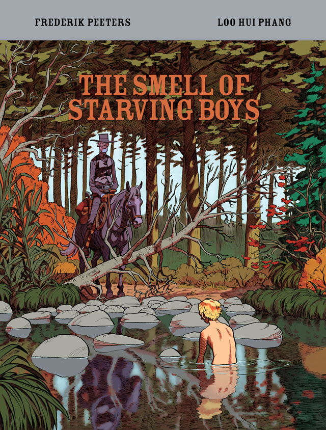
Though the Western is the only genre uniquely set in North America, it has diminished in U.S. fiction. Only a few American films and novels of recent decades depict the late 19th century period of colonial expansion across the so-called frontier. But the West—or at least a fantastical version of it—continues to expand in France, where Laos-born writer Loo Hui Phang and acclaimed bande dessinée artist Frederik Peeters published The Smell of Starving Boys in 2016. London’s Self Made Hero released the first English version earlier this year.
Phang imagines a privately funded propaganda campaign into the “Comancharia” for the purpose of photographing the landscape and attracting settlers who will then mine its mineral riches. But one member of the expedition adds, “I’d have loved to believe in something impossible,” a desire seemingly shared by the authors. Though the post-Civil War setting is nominally historical, Phang’s characters quickly shift from the unusual to the fantastical: a gay photographer whose fake spiritualist photos turn real; a cross-dressing teen who speaks the secret language of horses; a cadaverous-looking bounty hunter who sucks horses dry of blood. Even the pot-bellied, colonial capitalist stops wearing pants and envisions founding a utopian civilization free of women and sexuality. A tribe of Comanche populates the periphery of the plot, with an unnamed old man following the explorers and silently delivering tokens of apparent magic: a double-exposed horse head on a photographic portrait plate, a severed horse head that serves as a soul-summoning bull-horn to herds of stampeding horses.
Oscar, who has fled sexual scandal in Manhattan, wears an aristocratic boy’s portrait inside his locket. Peeters renders Milton, the party’s farmhand servant, with nearly identical features, substituting a white wig for cropped blonde curls. Milton, however, is no boy, but a virginal young woman named Weather fleeing a father trying to sell her into marriage. Oscar, apparently transformed by her boyish looks and the whimsical west, falls in love. The two have sex for the first time while her father’s zombie-like bounty hunter searches outside their secret cavern chalk-marked with magic runes by the old man.
Peeters renders Phang’s world in a consistent, loosely naturalistic style, with the occasional cartoonish feature reserved for the racist capitalist, the caricature of Phang’s social critique. Peeters’ layouts are similarly consistent and feature a four-row base with one to three panels per row. His vertical gutters occasionally align but typically avoid rigid grids in favor of shifting patterns, including a dozen sub-columns in which the novel’s reading path briefly moves top-to-bottom rather than left-to-right. When the effect is achieved through combined panels, the image content tends to be panoramic, with expansive vertical views of the western landscapes. When Peeters divides a panel into thinner, horizontal strips, the content is accordingly cropped, usually of facial close-ups reduced to eyes or mouth. Panels are almost invariably rectangular, with the exceptions appearing near the novel’s end and coinciding with moments of violence: an arrow through a neck, a bullet into a gut. Peeters abandons his base layout for the four-page climax, including the novel’s only two-page spread and full-page bleeds. The striking visual shift evokes the simultaneous splintering of the story’s reality as physical and seemingly spiritual worlds collide. When Peeters reprises the base layout for the epilogue, the world is stable again but permanently altered as Weather and Oscar ride off into their ambiguous afterlife together.
The contributions of Edward Gauvin, the French translator, are even more ambiguous. It’s unknowable whether Phang’s original French included the equivalent of the clichés “in the blink of an eye” or “There’s the welcoming committee.” Since such phrases cluster in the dialogue of the expedition leader, the most two-dimensional and satirically broad character, the effect mostly works. But when Oscar’s speech includes the novel’s title, the intent is less clear. While giving oral sex to Weather, Oscar reminisces about the sexual delights of boys: “if you only knew the smell of starving boys … I’ve never felt that way about girls … But you. Goddamn. You awaken it.” Oscar presumably means “starving” to be erotic, perhaps intending something closer to “skinny” or even “emaciated,” but “starving” has a more distressing connotation. If he actually finds starving boys arousing, then he’s turned on by a sex partner’s desperation for food, which then implies domination and coercion. Though I doubt that was Phang’s intended meaning, it’s equally difficult to believe she and Gauvin would not have worked through the semantic nuances of the novel’s title.

I also wonder about the amount of nudity of the novel’s only female character. Phang and Peeters find multiple opportunities to strip Weather of her clothes: a bath in a stream, a sex scene, an order at gun point, another sex scene. While Oscar is sometimes naked, and Peeters draws the capitalist’s mushroom of a penis more than once too, the eye of the novel roams longest on Weather’s adolescent body, including on the cover. The Western frontier, as romanticized by the French authors, is largely a sexual frontier, a border between genders and sexualities—what the story’s moralistic villain would eliminate. While it’s difficult not to root for the romance, it’s unclear why a female body, even a female body briefly understood to be a male body, should receive greater attention. It’s also unclear why the lone and unnamed native character should care about let alone magically aid Oscar and Weather’s romance, especially given the threat that their expedition poses. As her name implies, is Weather close to nature and so, as the cliché goes, like an Indian?
Despite these questions, the graphic novel’s mix of fantasy and Western tropes is involving, and Peeters renders Phang’s story with subtle craft. Phang also emphasizes the nature of image-making from the first panel: an upside landscape as viewed through the inverting lens of Oscar’s camera. The authors repeat the motif twice more, including on the novel’s final page, reminding readers that The Smell of Starving Boys is itself a set of inverted images too, ones that alter as much as reveal their subject matter.

[A version of this post and my other recent comics reviews appear in the comics section of PopMatters.]
Tags: Frederik Peeters, Loo Hui Phang
- Leave a comment
- Posted under Uncategorized
09/07/18 What If?

What if an evil genius is tricking you into believing that the world around you is real when it really isn’t?
What if on an alternate Earth everything is identical but for one almost undetectable detail?
What if trying to travel to the past transported you to a different universe instead?
What if a mad scientist removed your brain and is keeping it alive in a vat of nutrients?
What if lightning struck a dead tree in a swamp and transformed it into The Swampman?
Any of these fantastical plots could be the premise of a superhero comic book. Stan Lee sometimes gave artists at Marvel little more to work with—just a note on a piece of paper or a plot point mentioned on the way to his desk. Jack Kirby or Steve Ditko would work out the details.
Except none of those scenarios comes from comics. They’re all thought experiments written by highly regarded philosophers: René Descartes (1641), Hilary Putnam (1973), David Lewis (1976), Hilary Putnam (1981), and Donald Davidson (1986), respectively. Like comics, fantastical tales are a staple of philosophy. Philosopher Peg Tittle includes 126 in her 2005 What If … Collected Thought Experiments in Philosophy. But superhero comics were well ahead of her. Marvel published its first What If? in 1977, and DC published a range of “Imaginary Tales” in the 1950s and included two “Just Suppose” tales in one of its first 1936 titles.
Philosophers could fill volumes too. David Chalmers writes about zombies, Laurence BonJour about clairvoyants, and Frank Jackson about a scientifically all-knowing woman who’s never seen color. The list of “What If?”s seems endless:
What if your body slowly transformed into rock, but no one around you noticed?
What if a god were stripped of his memories and forced to live as a crippled human?
What if a time traveler returned to his childhood and told his past self about the future?
What if you could save the world but had to sacrifice millions of people first?
What if you and all the universe were just the thoughts of a small child?
Except those scenarios don’t come from academic philosophy. They’re all from superhero comics: The Fantastic Four (1961), The Mighty Thor (1968), The Defenders (1975), Watchmen (1987), and Heroes Reborn: The Return (1997). And they are no more fantastical than scenarios philosophers have been dreaming up for centuries. Not just What If and “Imaginary Tales,” but arguably all superhero comics contain thought experiments. While philosophy’s most amazing thought experiments could be adapted into a limited series of illustrated superhero comics titled Thought Experiments, the reverse is true too. Writers and artists of Marvel and DC can be understood as philosophers and their comics as works of philosophy.
And what if they actually are read that way?
That’s the fantastical “what if” premise of What If? Philosophical Thought Experiments of Superhero Comics, a manuscript I’m co-authoring with my W&L colleague Nathaniel Goldberg. I’m happy to report that a university press has given us a green light, and so Nathaniel and I are spending part of our summer revising for an August deadline. You’re currently reading a condensed draft of the introduction.
Each chapter presents puzzles, or philosophical thought experiments, derived from superhero comics. We then select tools from philosophers—Kant’s Categorical Imperative, Descartes’ evil genius, Dennett’s intentional stance, and others—to help solve that puzzle by helping to understand the thought experiments themselves. Our goal isn’t necessarily to explain philosophy. It’s to use superhero comics to illustrate philosophical thought experiments, and then in turn to use philosophy to explain superhero comics. So unless you’re already well-versed in philosophy, you’ll learn about philosophy too.
Philosophers who identify as analytic—which the majority of English-speaking philosophers do—spend a great deal of time analyzing concepts and defining terms. Though literary critics’ attempts at analysis and definition tend to be limited to literary concerns—including in recent years comics—that’s where philosophy and literary criticism happily collide. For the authors of this book, the collision took place in front of Washington and Lee University’s English department photocopier. Nathaniel Goldberg had descended from the philosophy floor because their machine was on the fritz. Chris Gavaler, himself in the English department, was doing some copying of his own. Nathaniel struck up a conversation about Chris’s superhero blog. Superheroes are not the most typical focus for literary criticism, but Nathaniel assured Chris that philosophers wrote about weird things too. In fact, Nathaniel was an expert on Donald Davidson’s The Swampman, a thought experiment Chris noticed resembled Alan Moore’s own Swamp Thing. A conference paper in Iceland soon followed and now this book. In the process, Nathaniel learned MLA citation norms and Chris learned what is now one of his favorite phrases, “necessary and sufficient,” as in “What are the necessary and sufficient conditions of being a comic?”
Chris answers this question in his recent essay “Refining the Comics Form” where he defines a comic as
a static, spatial field with recurrent elements perceived as conceptually discrete images in juxtaposition with other conceptually discrete images, in which the images are pictorial, abstract, typographic, and/or linguistic, but not linguistic and typographic only.
If you prefer a shorter answer, we recommend Scott McCloud’s pioneering 1993 definition: “juxtaposed pictorial and other images in deliberate sequence, intended to convey information and/or produce an aesthetic response in the viewer.” And if you prefer a really short answer, Will Eisner gets it done in two words: “sequential art.” Many comics scholars, including Chris and several philosophers, take issue with McCloud and Eisner for a range of reasons: what about one-panel “comics” like The Far Side and The Family Circle? What about the moving images juxtaposed in film and TV? What about physical panels displayed on a gallery wall? What about juxtaposed images in mediums that pre-date the 20th-century and so the term “comics”? While these questions are good ones, they and others like them are not the focus of this book. This volume includes “Superhero Comics” in its subtitle, and the superhero genre squats near the center of the definitional zone. Our reading list includes only multi-paneled works printed on paper, bound in units of typically twenty-two pages, and published after 1937.
“Superhero,” as naming both a genre and a character type, also presents a range of definitions, which variously include and exclude marginal cases such as Harry Potter, Buffy the Vampire Slayer, and Nick Fury of Avengers fame. Chris takes a different, “no-common-denominator approach” in On the Origin of Superheroes, arguing instead that the category “superhero” has no single necessary or sufficient condition but only a list of potential ones, with different characters demonstrating different combinations with potentially no overlap (3). Twentieth-century philosopher Ludwig Wittgenstein might argue that examples of different superheroes share a “family resemblance.” Just as there many be no single necessary or sufficient physical condition of all members of a family, individual members do share some with at least some others, and through a series of overlaps the family can be picked out as a whole. No matter, since instead of exploring border cases to further test and refine definitions, we again stake our analysis at the genre’s and medium’s centers.
Defining “philosophy” presents challenges too. But enough philosophers think that some sort of analyzing concepts and defining words is what philosophy amounts to that we accept that as our working definition. That helps explain why philosophers often trade in conceptual or definitional work. One common philosophical tool is to try to conceive of or define situations that are not real but that instead reveal lessons for us. In a word, philosophers “experiment” in thoughts, rather than, as scientists do, in labs. These conceived or defined situations are thought experiments, the “What if?”s mentioned above.
Generally, thought experiments involve conceiving of or defining a situation where a few key details are changed from how they ordinarily are to test particular philosophical views. What if an evil genius did trick you into believing that the world around you were real when it really wasn’t? Does imaging that reveal anything interesting about the nature of knowledge? What if your body were slowly transformed into rock and no one around you noticed? Does imagining this reveal anything interesting about the nature of personal identity?
As we know from above, the first thought experiment is from an academic philosopher. The second is from a comic book writer. Each could be developed by either sort of person. Plato wrote semi-fictionalized dialogues, which encouraged readers to imagine themselves in particular situations. Most academic philosophers, before and since, write essays, treatises, or technical books—which are arguably less engaging than Plato’s work. While typical thought experiments, unlike Plato’s, are not presented in fiction, they can be. As philosopher Ross P. Cameron explains, “a typical fiction tends to be much longer than your typical thought experiment and hence can present you with a more detailed scenario” (31). Philosophers Jonathan Jenkins Ichikawa and Benjamin Jarvis even call philosophical thought experiments “mini-fictions” as opposed to the standard-sized ones. Likewise, philosophers Johan de Smedt and Helen de Cruz argue that, though both typical philosophical thought experiments and fiction rely on similar cognitive mechanisms, fiction “allows for a richer exploration of philosophical positions than is possible through ordinary philosophical thought experiments” (59). The exploration is richer not only because it’s more developed but also because, as cognitive research shows, readers of fiction are immersed in a way that readers of philosophy usually aren’t. Smedt and Cruz continue: “Regardless of whether they are outlandish or realistic, philosophical thought experiments lack features that speculative fiction typically has, including vivid, seemingly irrelevant details that help to transport the reader and encourage low-level, concrete thinking” (64). Readers take the scenarios more seriously.
These scholars contrast typical philosophical thought experiments with the longer scenarios in traditional science fiction and fantasy novels, but their points may apply even better to comics. Novels employ words to express ideas, while comics employ both words and images, and so reading a comic operates on an additional cognitive level. It can therefore be both more immersive and more challenging due to its multi-media form.
Of course, neither science fiction and fantasy novels, nor superhero comics, treat their scenarios explicitly as thought experiments. They don’t usually examine the assumptions involved and don’t draw broader lessons from them. And they certainly don’t consider whether the experiments were done under the appropriate conditions, say, by changing only a few features here and leaving the rest as is. There are no appropriate conditions, other than those that make their stories enjoyable. Superhero comics in particular aim first and foremost to entertain. Actual analysis is done better by academic philosophy, just as we’d expect.
Combining superhero comics and philosophy could be a powerful way to explore thought experiments because it merges the strengths of each.

[The paintings at the top and bottom of this post are by SANDRA CHEVRIER, and they’re currently at the top of my “What if we can use for the cover of What If?” list.]
- 1 comment
- Posted under Uncategorized
02/07/18 Hinged Panels ( or, Closure Takes a Vacation)
Viewers tend to imagine the simplest solution to the puzzles created by placing two images next to each other. Since Scott McCloud published Understanding Comics in 1993, those puzzle-solving inferences have been called “closure.” To apply it to comics, McCloud focuses on the gutter, “that space between the panels,” as the site where “human imagination takes two separate images and transforms them into a single idea.”
McCloud borrowed the term from Gestalt psychology, which describes how, for example, a viewer mentally fills in the gaps between dots to perceive a dotted line as a “line” and not simply disconnected dots. In comics, viewers fill in gaps in a metaphorical sense—even though there’s usually a literal gap between the images too. But filling that conceptual space doesn’t involve imagining more images. We don’t mentally draw new panels. We just understand the implied content. The information is image-less.
In other visual arts, diptychs often create the Gestalt effect of closure by dividing a photograph in half or painting across two abutting canvases to create one visual field that is then physically framed in two sections and hung side by side. Medieval diptychs include literal panels joined by hinges—another metaphor for the gutter (which is itself a metaphor). Since “closure” has been the working term for three decades, I’m giving it a vacation this week and using “hinges” instead.
So in comics, hinged panels are any two-side-by-side images that connect in the viewer’s mind. Usually that connection is spatiotemporal. Unless forced to think otherwise, we tend to assume that the second image depicts the same setting after the shortest likely interval has passed. I was on vacation with my family in Europe last month, so I”ve created some hinged panels to illustrate. We were in the Czech Republic, Slovakia, and Austria–though in Italy these might be called “fumetti,” the Italian term for photo comics.
The first four provide a typical spatiotemporal hinge, sometimes with the viewer’s point of view remaining stationary and sometimes moving forward through the setting or shifting angles, as the subjects of the images move too:


The expected forward-moving hinge is so strong that it doesn’t matter what order the images occurred in reality. The next four hinged panels actually reverse the order that I snapped the photos, but the effect is the same. Time still seems to be moving forward–mainly because nothing within the images prevent that assumption:


The temporal hinge also helps to explain the spatial hinge, especially when the setting doesn’t repeat any overt elements. A viewer probably makes sense of the next pairing by inferring that the figures in the first image walked until they arrived at the cafe in the second–even though the backgrounds don’t have much in common.

But how much time passes in the hinge? Usually the shortest possible. So a viewer would assume that the above daytime images occur on the same day. But what about the next hinged panels? Unlike walkers wearing the same clothes as they walk and then later sit, the mannequins don’t give any action clues. Is this an hour later, a day, a month?

In addition to that forward-moving temporal hinge, the next hinge also connects the images by their internal shapes: the triangle of the first person’s body followed by the triangle of the next person’s arms. There’s a thematic hinge too. Both are photographs of people taking photographs of a Klimt painting. I wonder if that thematic effect overrides the temporal hinge so that a viewer doesn’t necessarily assume the two panels are in chronological order?

And what about this statue? The change in background quality and silhouette might imply a temporal hinge of several hours–or is that just because of the change of angle?

These next panels reverse angles too. And if you assume the point-of-view represents a character (the photographer), then you assume that they depict the central building at different moments in time. But without that assumption, would they instead appear to be simultaneous from two angles of an omniscient visual narrator?

And these panels are hinged by an effect very near to the original meaning of “Gestalt.” The two panels almost line-up, the second revealing that the cemetery in the first is raised. And to the degree that they do line-up, they probably also appear to be simultaneous. The gestalt hinge eliminates the forward-moving temporal hinge.

Things get even stranger here. Two versions of a Klimt: the original and a fake. Which is which? Which was photographed first? I suspect the hinge in this case doesn’t trigger any temporal inferences–or rather the two version are understood to exist simultaneously, and so their image here do too.

And what now? Two windows, but not quite the same window. Is this only a thematic hinge and so temporally the two can be read in either order? Or do you understand the figure in the second image as having stepped into the frame after the first image–and so a forward-moving temporal hinge despite the windows not matching?

The front of a painting and the back of a painting–or really a different work of art pretending to be the back of the first painting. Accepting the illusion though, the front and back of a painting obviously exist simultaneously, so do the images too? Or do you imagine someone flipping the painting over during a hinged moment?

And last and least: is there any spatiotemporal relationship between these two images? Or is the hinge entirely thematic: oddly placed mannequins? The actual temporal leap of the photos is about a year, and the spatial leap is continental, but the hinge doesn’t imply that.

You’re now free to return to your regularly scheduled terminology. But I do wish we could toss out the unnecessarily convoluted “closure” and replace it with a clearer term like “hinges.”

Tags: comics closure, Scott McCloud
- Leave a comment
- Posted under Uncategorized


