Monthly Archives: July 2020
30/07/20 What’s the difference between a cartoon and a cubist painting?
It’s a matter of perspective.
A painting is cubist because it presents more than one perspective. A drawing is a cartoon depending on the perspective of the person looking at it and whether they think there’s a divide between comics and fine arts. That’s one of the reasons I like John Pham’s graphic novel J&K. Its world is a colorful jumble of discordant perspectives, some literal, some metaphorical.

As Jay and Kay are walking home in the opening pages, a rush-hour crowd weaves around them. Some of the figures are standard cartoons with giant round facial features on giant round heads. But some faces are more inexplicable, doubling mirror-like along a horizontal axis instead of a vertical one. Jay and Kay would fit into most newspaper funny pages, but their best frenemy Eggy’s face is composed of a dozen bulbous half-circles. Though peculiar, the fact goes without notice within the story world because the style isn’t all that different from the other characters. One of the guys cat-calling Jay and Kay has two mouths, and the other’s face follows the cubist logic of a Picasso portrait: three angled squares with a wedge of a mouth on the back of the head and a misplaced nose near the chin.
Pham’s landscapes are peculiar too. Sloping roofless buildings line the minimalist streets. The mall looks like a modernist architect’s incomplete blueprint. Many panel backgrounds are just a spray of vibrant color with little illusion of depth. Pham changes styles for the video games, creating avatars of free-floating balls and pyramids that draw attention to the peculiarities of the story world through contrast. The environment reminds me of the subtle chaos of George Herriman’s early twentieth-century Krazy Kat cartoons—which, depending on your perspective, should be hanging in the same galleries as Picasso and other artists of the same period.

Pham also explores perspectives in the psychological sense. Like Picasso, he views things from more than one angle. That scary witch shuffling down the empty street toward you? Don’t worry. She just wants to give you a hug and a sweater. And those ghouls grabbing your ankles as they crawl from their graves? They just want to scold you for not being a better parent. Also, they’d be happy to babysit Wednesdays and Thursdays. Even the vampires at the mall you hurry past, they’re just depressed and lonely. Why don’t you hang out and talk awhile?
The novel is structured as a set of discrete but linked episodes punctuated by full-page ads: laundry detergent, horror movie, video game player, cassette store, taco mix, the mall. Since each reflects events from the story world, the effect is both consumer critique and metafiction. The ads also add to Pham’s pastiche aesthetic, with every story element seemingly borrowed from some other real or fictional source. Better still, the novel contains several mini-comics, including a copy of Cool magazine Jay likes so much, directions for playing Eggy’s video game Dance Warrior, and a vinyl single of Gaseous Nebula’s “Deep Space.” Like Kay, I don’t have the technology to play the song, but I agree with her when she explains to Kay: “I dunno. I just like having it.”

Pham’s pastiche also includes transitional words in the corner of panels (“And,” “So,” “Finally”) that could be lifted from any of Chris Ware’s graphic novels, and he swiped Eggy’s sweater from Schultz’s Charlie Brown. Eggy looks suddenly very Garfield-like when he transforms into a cat for the last fifth of the novel. That’s not a spoiler. There’s no narrative explanation for the change. Jay and Kay are also suddenly cats. Why? Pham’s apparent answer: well, why not?

It turns out the lives of cartoon animals and cartoon people are pretty similar. There was a pleasantly bewildering moment where I imagined the characters had been animals all along and I simply hadn’t noticed before, but a quick flip of pages shows how easily Pham turns a cartoonishly round head of hair into cartoonishly round dog ears. The characters’ inner lives change about as much. Jay and Kay remain oddly consumed with liquids. Previously Jay was upset about her back sweat, and Kay about the drizzle of snot down Jay’s face when she was crying about her parents. Now as cats they wander the neighborhood drinking from dog bowls and bathtubs. Instead of shoplifting from the mall or stealing tacos from Eggy’s party, Jay and Kay go to the park and accidentally pee on beds. They still don’t like Eggy though.
There are plenty more oddities (the baby-like creature that erupts from Jay’s back acne is a biggie), but the overall tone is a wandering sadness as disconnected characters fail to find meaning in a cartoon world devoid of either literal or metaphorical depth. Even the unexpected death of a main character only confirms the novel’s background hum of loss. Of course Eggy drives away the girl he asks out because he’s wearing a cross and doesn’t realize she’s a vampire. Of course the one-armed army ghoul rebuffs Jay’s attempts to bond with him because her father was a vet too. We never find out what exactly happened to their parents, presumably because it doesn’t matter. They’re still absent.
Seeing the world from multiple perspectives doesn’t make it a happier place. Cartoons, Pham reveals, are flat for a reason.

[A version of this post and MY OTHER RECENT REVIEWS appear in the BOOKS section of POPMATTERS.]
- Leave a comment
- Posted under Uncategorized
27/07/20 Retconning Sex
[Guest co-blogger Nathaniel Goldberg and I examine a recent Supreme Court decision in terms of sequels and retcons, two pop culture concepts we explore in our new book Revising Fiction, Fact, and Faith: A Philosophical Account.]
Responding to the Supreme Court’s 6-3 ruling in Bostock v. Clayton County, the National Review wrote in an editorial: “The Supreme Court Redefines Sex.” Others have also used “redefine” to explain the Court’s action. They’re understanding Justice Gorsuch’s majority opinion as an update from previous findings. “Sex” used to mean one thing. With Bostock, it came to mean something else. In fiction, at least if we’re talking about serial works, we’d call Bostock a sequel. It continued the discussion of sex by giving it a new meaning, as a sequel continues the discussion of a hero by giving them a new adventure.
Sequel, however, doesn’t really describe things here.
That’s because, according to Gorsuch’s majority opinion, the Court didn’t redefine anything. Instead, the Court’s ruling was based on “the straightforward application of legal terms with plain and settled meanings.” The ruling merely acknowledged that sexual orientation and gender identity are inseparable from sex. Gorsuch’s opinion was reinforced by Justice Kavanaugh’s dissent, criticizing the majority for taking a “literalist” approach to Title VII language of the Civil Rights Act of 1964.
(In fact, Gorsuch’s opinion matches the “Brief of Philosophy Professors as Amici Curiae in Support of the Employees,” signed by 80 philosophers and arguing that sexual orientation and gender identity are categories “partially defined by sex and cannot logically be applied to any individual without reference to that individual’s sex.”)
Yet, in a separate dissent, Justice Alito also correctly observed that gender identity was a concept “essentially unknown at the time” that the 1964 law was written. Is not knowing something the same as that something not existing?
A philosophical distinction helps. The Justices might not be disagreeing about metaphysics, or facts about the way things are. Maybe they all agree that sexual orientation and gender identity are inseparable from sex. After all, being a lesbian means being female by sex and attracted to others of the same sex. Being transgender means being someone whose gender differs from their sex. The Justices also probably aren’t disagreeing about epistemology, or facts about what the authors of the 1964 law knew. The other justices likely all agree with Alito.
Rather, the justices are almost certainly disagreeing about whether epistemological facts (who knew what when) are more important than metaphysical facts (sex is inseparable from sexual orientation and gender identity). It’s a question of priority. Which is more important: what was known or what is the case—epistemology or metaphysics?
While at least Alito opted for epistemology, the majority opted for metaphysics. As Gorsuch argued: “the limits of the drafters’ imagination supply no reason to ignore the law’s demands.” The authors of the law referred to sex, which as a matter of metaphysical fact is inseparable from sexual orientation and gender identity. So the law refers to those too, even though the authors may not have known—let alone imagined—that it did.
In his 1980 book Naming and Necessity, philosopher Saul Kripke introduced the term “rigid designator.” A rigid designator designates, or refers to, the same thing in all possible circumstances the thing exists in. And that’s independent of our knowledge of the thing. “Water” referred to H2O in 1720, before people knew modern molecular theory, just as it refers to H2O in 2020, when people do.
Kripke is a philosopher of language, and he aimed to show that certain kinds of words—names for people or kinds of things—are rigid designators. On his view, they refer to metaphysical facts, independent of epistemological ones. That, we suggest, is the majority’s reasoning concerning “sex.” The Supreme Court didn’t redefine “sex.” It merely determined that sexual orientation and gender identity are inseparable from what “sex” refers to. That follows from the “the straightforward application of legal terms with plain and settled meanings,” including the legal term “sex.”
If Kripke’s notion of rigid designation is right, and “sex,” like “water,” is a rigid designator, then the metaphysics of sex, like the metaphysics of water, stays fixed, independent of our knowledge of it. Add to this Kripke’s view that definitions are about metaphysics and not epistemology, and you have Gorsuch’s point. Bostock didn’t redefine “sex.” It merely determined that sexual orientation and gender identity are inseparable from what “sex” (already) means.
That’s Gorsuch’s conclusion, phrased in a philosophical key. The same conclusion can also be phrased in a literary-theoretical one. We’ve written elsewhere that rigid designators are essential to understanding the phenomenon of retconning.
“Retconning” is short for “making retroactively continuous.” Retconning happens all the time in serial fiction. Some metaphysical fact about some character is revealed later to be true, when in an earlier story no one would have accepted or likely even guessed at it. Retconning is also one way of understanding how legal decisions, including the Supreme Court’s, work. In 1896, the Court decided in Plessy v. Ferguson that racial segregation was constitutional. In 1954, the Court decided in Brown v. Board of Education of Topeka, Kansas that it wasn’t. Yet Brown wasn’t a decision only for 1954 onward. Brown retconned Plessy. According to Earl Warren’s majority opinion in Brown, racial segregation had never been constitutional. It’s just that, in 1896, the Court mistakenly thought that it was.
Retconning broadens our epistemology by revealing new things about already-existing metaphysics that, at the time, we would have been rejected. Modern science revealed that water had always been H2O, even though no one in 1720 would have agreed (let alone understood). Brown revealed that racial segregation had always been unconstitutional, even though Plessy insisted that it wasn’t. And—to the present case—Bostock revealed that sexual orientation and gender identity had always been inseparable from sex, even though before Bostock not everyone realized that it was. While it’s surprising that the Court determined this 56 years after the law under review was written, it’s no more surprising than that the Court determined that racial segregation was unconstitutional 58 years after it had wrongly claimed otherwise.
That’s also why it’s not quite right to call Bostock a sequel to previous law, just as it wouldn’t be right to call Brown a sequel to Plessy. Sequels sometimes retcon what came before. But often they merely make what came before continuous, rather than retroactively continuous, with later findings or events. Brown didn’t continue Plessy’s findings. It revealed new things about Plessy that even its authors didn’t realize. Brown made Plessy retroactively continuous with it by declaring that, while it was decided correctly, Plessy had been decided incorrectly.
Back to the National Review. The editors claim that “it would have been better to leave the meaning of the law as it was when written and leave to Congress the decision of when and how to change it.” This is a misunderstanding of the ruling. The majority in Bostock did leave the meaning of the law as it was when written. They just broadened our epistemology by revealing that its meaning covered cases of sexual orientation and gender identity. That’s why Congress didn’t need to change it by writing a “sequel” law with a new definition. Bostock determined that no sequel, or continuation, was necessary, because the decision retconned “sex.”

- 1 comment
- Posted under Uncategorized
20/07/20 A Haven for the Wonderfully Weird
There’s weird, and then there’s Weird. Eric Haven is both. He takes an idiosyncratically weird approach to the horror genre of the Weird to produce a hybrid graphic novella that belongs to no genre but his own.

Haven models his Cryptoid title design on the classic 50s horror comic Tales of the Crypt, but with intricate red lines that suggest a circulatory system, making the letters appear semi-living. The suffix “oid” means “resembling,” but rather than being crypt-like, a cryptoid is apparently a kind of hybrid creature: part animal and part whatever the hell Haven’s car-crash of an imagination can conjure next.

There’s a Mankylosaurus (half human, half ankylosaurus) grazing at a restaurant salad bar. There are nine types of bat hybrids (half ant, eyeball, octopus, penguin, bear, nose, hand, and batman). The Resister is a half-human, half-eagle superhero battling Donald Trump and his evil, oozing, gray-skinned, tentacled Dark Lord, Steve Bannon. I don’t know what exactly the superhero-oid Nightsword is, but Haven lifted the wheeled but human-headed android Box directly from the classic 70s scifi film Logan’s Run. The Gnome looks like the garden variety found in lawncare stores—except his origin story involves a husband drowning in a flash flood and then inexplicably shrinking.
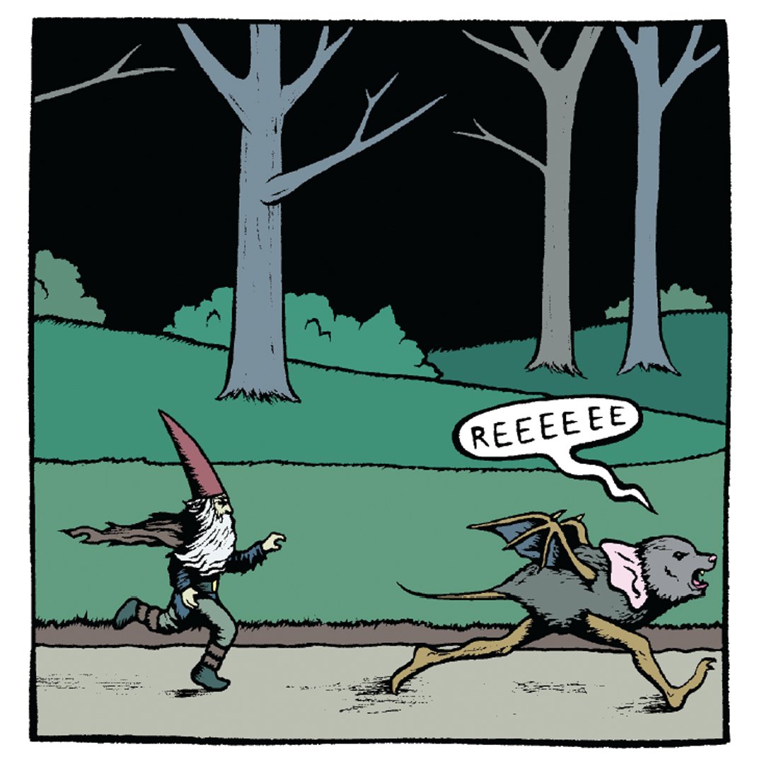
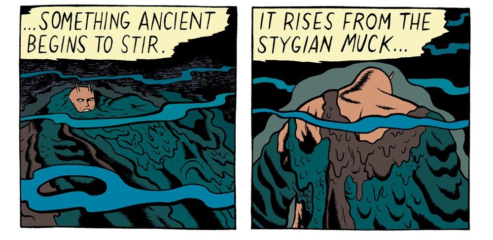
After living in the miniature wild for years, he returns long-bearded to his astonished wife, crashing through their bedroom window on the back of a “flightless running shrieking bat.” Despite his changed appearance (why is his cap pointed now, and how does a hoodie grow into a tattered cape?), she says his name instantly: “Roger?” He stares back, as Haven draws a succession of panels zooming into his eyes and the ocean rolling inside them—which transitions into the actual ocean and a monstrous being emerging from the Mariana Trench.
That’s the kind of peculiar transition Haven supplies between most of his interlocked vignettes. Technically, Cryptoid might be a collection of short comics (you can find part of “The Resister” at Haven’s website), but I would still call it a graphic novel because of its repeating characters, motifs, and structure. The internal logic of each scene may feel random, but the larger design is carefully constructed with nesting narratives.

After a title-page sequence, the novel opens with an alien face staring back at the viewer and then down at the Salad Bar where Mankylosaurus appears before going to bed. After the bats and gnome escapades and that unexplained creature rising from the deep, Haven draws two back-to-back superhero sequences, The Resister and then Nightsword, followed by Box’s adventure supermarket shopping. Then the creature from the deep continues his ascent in the second half of the now-titled “He Comes Slouching” (an unlikely allusion to Yeats’ apocalyptic poem “The Second Coming”), before Mankylosaurus wakes from a nightmare, and that alien watcher continues his silent observations.
If that doesn’t sound like the plot of a typical graphic novel, it’s not. Haven isn’t interested in narrative. Cryptoid follows the logic and aesthetic of pastiche. Many of the images echo classic comics. Though Haven references EC horror titles from before the company was hobbled by the censorship code in 1954, Marvel artist Jack Kirby may be the bigger influence. That silent alien giant staring down at the globe of the Earth is a riff on Kirby’s Watcher from his early 60s Fantastic Four. And Kirby drew dozens of monster titles in the late 50s for Marvel’s pre-Marvel incarnation Atlas Comics. Even if the visual allusions are not all apparent, one of the pleasures of Cryptoid is intuiting the overlay of references filtered through Haven’s own idiosyncratic style.
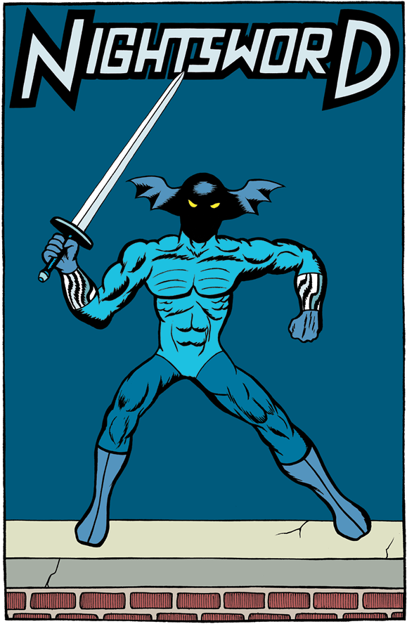
Despite the superhero references, Haven’s action poses are aggressively un-heroic, suggesting the anatomical awkwardness of posed toy action figures rather than the grace and power of superhuman forms. Nightsword opens with a sequence of full-page images zooming in slowly to the character standing on a roof edge as if positioned there by a child’s hand. When the pages split into double panels, his figure raises an arm while the rest of his body remains unchanged—again as if the same child is hovering just out of frame, adjusting his joints between images. The effect is absurd in both appearance and pacing.
Next Haven draws unexplained swirls in the twirling sword’s wake, each an apparent gap in the fabric of reality. But what they are doesn’t matter. Haven just wants his viewers to look at them as they widen and cascade and consume whole panels. Eventually Nightsword’s squiggly body reforms from the tentacle-like swirls. What does this mean narratively? I have no idea. But the lack of narrative significance is part of the point.
Despite the horror and superhero surface material, Cryptoid may be best understood as a kind of abstract comic. Often the incremental panel-by-panel transformation of shapes and colors is the primary content, not the nominal action of a soon-to-be-forgotten character. We are like the watcher staring silently down at the peculiarities of Haven’s world, content to observe without intervening or even judging, indifferent to the plight of individuals but entertained by the odd and endless cycle of change.

[A version of this post and my other recent reviews appear in the Books section of PopMatters.]
Tags: Cryptoid, Eric Haven
- Leave a comment
- Posted under Uncategorized
13/07/20 Why I asked my university to remove “Lee” from its name and my town to remove “Stonewall Jackson” from the name of its historic cemetery
First, I doubt there’s much I will add to this topic that’s not been said elsewhere, and so unless you know and are interested in me personally, there’s not much reason to read this. Also, if you are a member of the Facebook page Rockbridge Civil Discourse, which I co-founded and co-moderate, you may have already heard me express some version of this first part:
I do not advocate “erasing history.” Memorials (such as statues and named locations and institutions) are not a part of the history that they memorialize. They are a history of how history has been memorialized, and so they are like history textbooks, only harder to change. To the best of my knowledge, every statue of a Confederate leader (Lee, Jackson, Davis, etc.) is an explicit celebration, not a neutral presentation of historical facts. Even so, I don’t want them erased. I think statues should be preserved but not displayed except in a carefully curated space.
I also have no desire to “attack,” “denigrate,” or “vilify” Lee, Jackson, or anyone else who fought in the Confederacy. But not celebrating is not the same as attacking. Ceasing to celebrate is also not attacking. I understand that these individuals were complex human beings who possessed a mix of traits, including some positive ones. I do not want to reduce them to their negative traits. I do not want to judge them harshly or unfairly or anachronistically by my contemporary values. But I don’t want to glorify them either. I want to understand them as human beings, not as monsters or saints.
Lee and Jackson have been described to me as honorable, loyal, brave, humble, ingenious, heroic, peaceful, and dedicated to the well-being of enslaved people through education. The memorials express the opinion that such attributes matter more than their other attributes. But I believe that slavery is so exceptionally and self-evidently repulsive that leading an effort to keep four million people enslaved cannot be offset enough to merit memorialization.
After 79% of the W&L faculty voted to approve a motion asking our board of trustees to removed “Lee” from our school’s name, the Washington Post headline the next morning included the adverb “resoundingly.” A friend emailed me a congratulations, but I had to say that the moment did not feel celebratory because, while some faculty members of color supported the motion, some objected to its inadequately inclusive process and a wrong-minded focus. I can literally only imagine their experiences. A queer-identifying friend described her experience when the Supreme Court ruled in favor of gay marriage: That was not what she had been fighting for, and celebrations that drew energy away from her continuing fight were just the latest in an ongoing series of obstacles.
I admit that I did not support the motion “for” anyone other than myself. I cannot claim that my vote was my way of supporting my school’s faculty and students of color if: 1) I did not first ask them if they desired that specific act of support, and 2) there were other things they desired more. If someone claimed to be doing something “for” me without first asking my opinion about it, and while also not doing other things that I care about significantly more, I can imagine speaking against their action, even if the action in itself were something that I might otherwise, albeit mildly, approve of.
I understand that changing names can be merely “cosmetic,” “performative,” or “symbolic,” and that such changes alone achieves little and potentially distracts from more important efforts. I have heard that argument from both white conservatives and black progressives now, and I agree with it. But since symbols do have symbolic significance, changing them is not meaningless.
A memorial to a Confederate leader is statement that white supremacy isn’t important. Confederate memorials means a society is willing not only to overlook racist actions but to celebrate those and other actions for reasons that are unrelated to race. It is a statement of priorities. Other things—regional loyalty, family pride, military prowess, etc.—are more important than four million human beings remaining in slavery.
I can literally only imagine what a black person experiences, but as a white person I experience Confederate memorials as directives to remain silently complicit in the legacies of slavery and Jim Crow. They’re hardly the only directives, or the most important ones, but they are some of the most flagrant. I may also be silently complicit in more significant ways. If a majority of black people defended memorials, I would accept that judgement. Still, I prefer my grandchildren to be born in a country that does not place people who committed extraordinary acts of white supremacy on pedestals. That feels to me like a minimal expectation.
I was recently accused of “propping up white supremacy” and “prioritizing racists” because I co-signed a Rockbridge Civil Discourse statement asking Lexington City Council to follow a process that all parties, whether for or against renaming the cemetery, could feel was fair. The accusation came from a white male progressive of roughly my age. I pointed out that many people in our community do not recognize white supremacy as white supremacy and so unless he had a strategy for persuading white conservatives about the existence and significance of unconscious bias and systemic racism his desire to “tear it all down” would fail.
I have regular conversations with conservatives who disagree with me about a range of issues, including Confederate memorials. I had a protracted conversation with the leader of an alumni organization that opposes removing Lee’s name from our school because we should instead “proudly celebrate” his legacy. Though I do not find it entirely convincing, the most effective argument I’ve heard on behalf of Lee and Jackson is that it is unfair that so many people now associate their names with racism. Maybe it is unfair. But if so, that unfairness does not counteract the fact that “Lee” and “Jackson” now primarily do mean white supremacy.
If I had grown up revering them because I had been taught that they should be revered, I imagine I might find the current meaning of their names bewildering. I imagine I would find it difficult to change something so deeply ingrained in me since childhood. I imagine I might feel attacked personally and might respond defensively and angrily. I imagine I might name a range of rationales for why Confederate memorials should remain, while avoiding the most overwhelming fact of these men’s lives: they chose to lead armies in a war to keep four million Americans in forced labor, poverty, torture, rape, and breeding. That’s why I asked for their names to be removed. I don’t think children, black or white, should be shaped by that reverence.
I’m glad my city council voted to remove Jackson’s name from our cemetery, and I am hopeful that my board of trustees will vote to remove Lee’s name from our school’s. Meanwhile, I will continue to work with members of my school and town to address more pressing needs.
- Leave a comment
- Posted under Uncategorized
06/07/20 The First TV Broadcast Was in 1925

This is Stooky Bill, television’s first celebrity. He premiered in 1925 from a department store in London. It was a publicity stunt. John Baird, the inventor, transmitted him by radio wave across the building. Later broadcasts would be electronic, but Baird’s was mechanical. He used a selenium cell, an old tea chest, an empty biscuit box, a perforated cardboard disc, and a neon-gas lamp to shine light through the spinning holes—two sets of each, the first to scan, the second to reassemble the strips of light into a replica. He started with thirty vertical strips, and eventually reached 240, which electronic TVs more than doubled. When they divided the strips into colored rectangles in the 60s, they called them pixels, short for picture elements, the smallest units of an image.
John Baird’s previous entrepreneurial projects included: artificial diamonds (he lost his engineering job at the electric company after diverting too much power), Australian honey, Baird’s Speedy Cleaner (Belgian soap), boot polish, Borax-filled socks (Baird’s Undersock), fertilizer, a flying machine, glass razors (never rust or tarnish), guava jelly (procured personally in Jamaica and eventually taken off his hands by a local sausage maker), pneumatic boots (the lurching experiment ended when one of the interior balloons burst), and selenium cells (permanently scarred his left hand).
Stooky was made of plaster, the kind used for broken bones. He was a ventriloquists’s dummy, because it was too dangerous for a person. Baird posed him in the glare, not minding when its straw hair singed, when its cheeks splintered, if one of the light-choppers spun loose and unhinged the jaw. He spoke to his hand clenched inside of the dummy’s head, and the dummy clacked something back. There’s no recording, no transcript.
When I projected this image from my laptop to our TV screen, my wife asked if I’d drawn our daughter. Apparently that’s the radio wave the spinning discs of my brain keep receiving. I made it in MS Paint. I make everything in MS Paint. It’s the equivalent of Baird’s contraption to Photoshop, but I like the limitations. The singed bits.


- Leave a comment
- Posted under Uncategorized
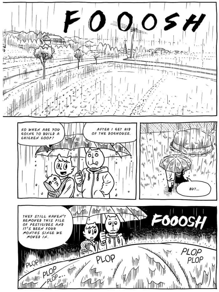
02/07/20 Umma’s Two-Sided Table

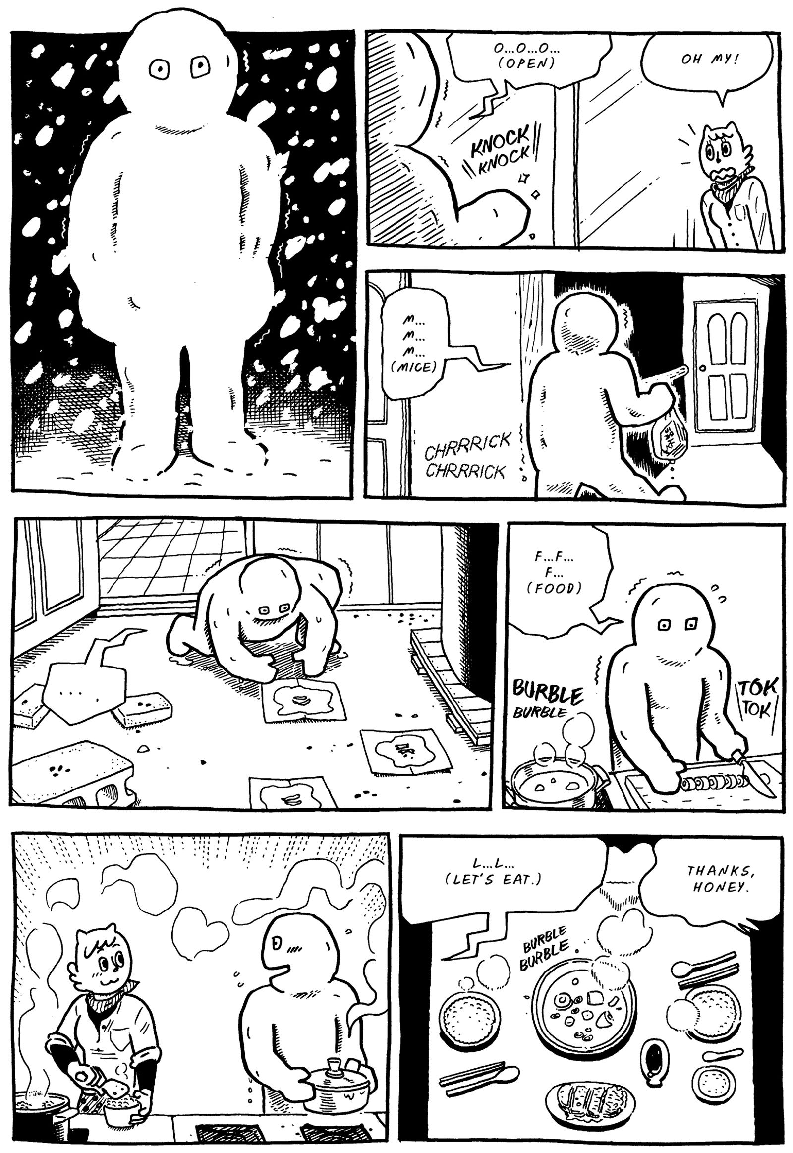
Umma’s Table features standard cartoon characters: anthropomorphic animals with rounded heads, enormous facial features, and roughly proportional bodies. Emotions are an ever-changing arrangement of minimal lines—worried diagonals, smiling curves, radiating streaks of surprise. But artist Yeon-Sik Hong’s hand can also be unexpectedly nuanced. The novel’s prologue includes a two-page spread of the family’s new home, with nearly every brick, roof shingle, and fence link meticulously inked. Even the distant hilltops are crosshatched with individual trees. Yet as the narrator looks on, the back of his head is only a round, cat-eared outline without a single line of interior detail, contrasting the finely rendered wrinkles of his winter coat.
Differences between simplified characters and their more realistically detailed environments have been common in comics for almost a century, but Hong employs them for deeper effects that place the nature of his story world into intriguing tension. I want to refer to Umma’s Table as a memoir because it reads like a memoir (and is almost a sequel to Hong’s actual memoir Uncomfortably Happily). The effect is produced by the language of the first-person narration weaving between the speech balloons. The main character Madang describes moving into a new house with his wife and newborn son, cooking in the unheated kitchen, shoveling snow, ferrying his elderly parents to doctors’ waiting rooms, attending community meetings—the bricks and fence links in a realistically mundane yet compelling life. Where fiction typically emphasizes plot, Hong emphasizes a rich layering of events that creates the artful impression of memoir-like fiction.
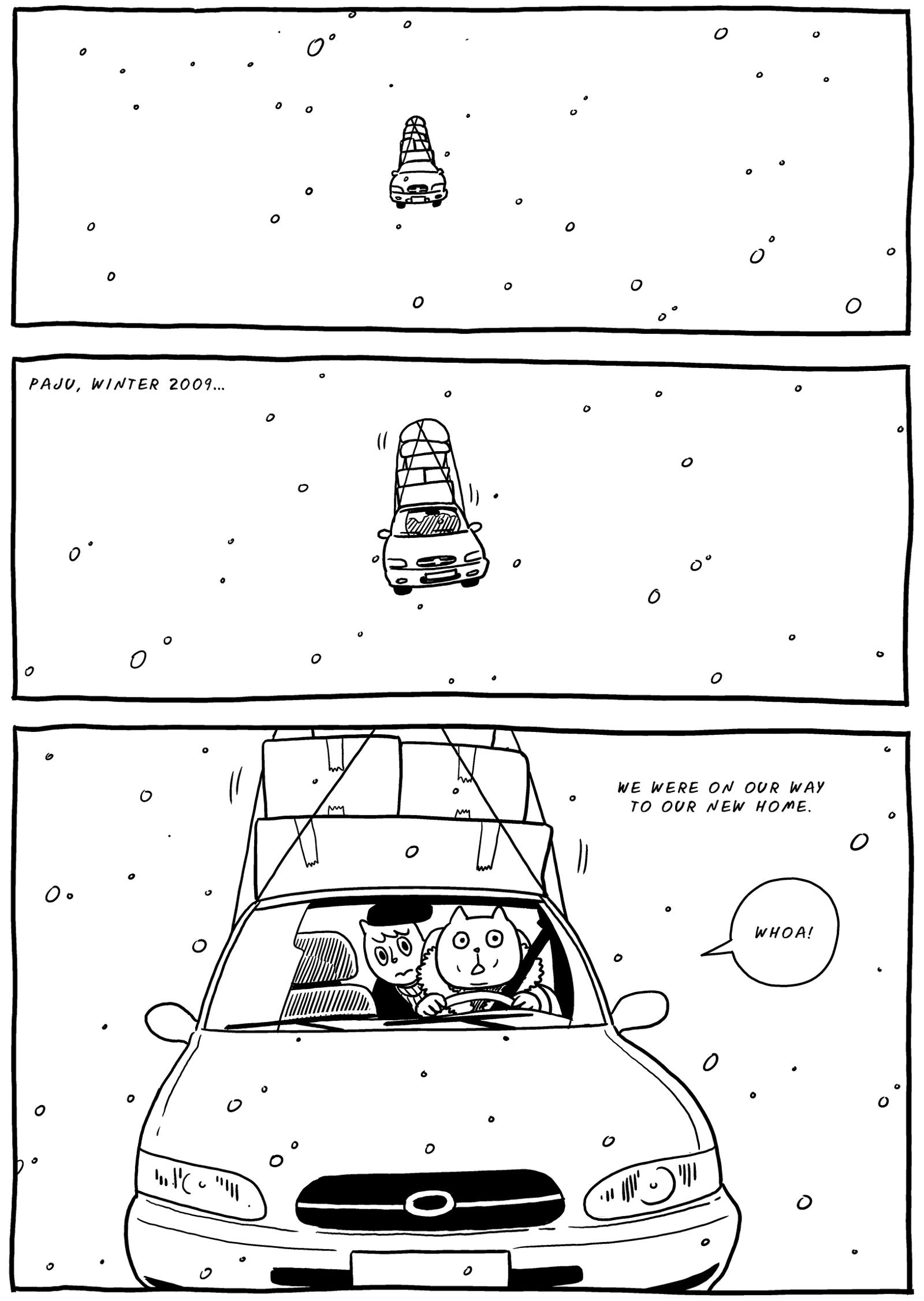
But reading Umma’s Table is very different from looking at it. If Janet Hong (no relation to the author) had not translated the English edition from Japanese (including footnotes in the gutters for signage within images), the novel would “read” very differently. The realism would give way to fantasy. The opening pages depict Madang’s car in apparent flight as it careens over a map of the landscape (and so understood as a visual metaphor) and also hovers a few feet above the road (less easily understood metaphorically). At first, the image might be dismissed as exaggeration: Madang took that bump in the road pretty fast and it feels like they’re flying. But then how did the cow from the pasture end up on top of the car too? As the family unpacks, the bags and boxes also hover and follow Madang as he carries furniture inside.

Rather than contained as prologue hyperbole for the thrill of moving in, the car continues to fly when Madang drives into an otherwise realistic city. Is this a world of magic anthropomorphic cats? Apparently not since no other cars appear to fly, and if Madang has magic powers, why doesn’t he use them to chop vegetables or shovel the relentless snow? Other quasi-cartoon qualities quietly infringe on the realism too. Do non-anthropomorphic animals speak in this reality? The mice “PEEP” and “SQUEAK” when they are near human-cat characters, but watching the family shiver in bed, they mutter to each other: “TSK TSK,” “THOSE POOR HUMANS.” If this is the world as warped by Madang’s psychological experiences, shouldn’t he have to hear them?
Other instances are extreme enough that only a metaphorical interpretation seems possible. When Madang drives away from his parents’ apartment, his car rises into the blackness of outer space, and his mother waves goodbye from the globe of her tiny planet, a ring of medical pills orbiting it like a dozen moons.
Later while his son is nursing, Madang wonders: “Did my mother look this happy when she nursed me?” In the next moment, Madang pulls his son away from his sleeping wife’s breast to suckle there himself: “Iwan, Mommy’s boobies actually belong to Daddy.” In the next panels, little Iwan is roaring in cartoon furry, the wife is sleep-murmuring scribbles, and then her hand shoves Madang’s blurred and X-eyed face away from her. His body is also impossibly child-sized.
Did that really happen? Was it a dream, a daydream? Did Madang feel the impulse to suckle and then imagine the consequences? It’s difficult to know. The narration never acknowledges the event. It’s as if Umma’s Table is working simultaneously on two tracks, one verbal and one visual. More radically, it’s as if the novel takes place in two worlds, one mundanely realistic, the other fantastically ambiguous. Arguably all comics with words work on those two different tracks, and readers are so conditioned to read rather than to view, the tensions go largely unnoticed.
Though the story is dominated by Madang’s melancholic narration of realistic events, Hong’s visual approaches maintain their own lower but playful register. When cooking, multiple images of Madang appear as if elbow-to-elbow along the sink and countertop that reappear across the vertical gutter to create the impression of a continuous space viewed through adjacent, window-like panels. Sometimes even one of the multiple Madangs is interrupted by the gutter, creating a visual complexity in counterpoint to the simple narration: “The kitchen was freezing, but I got through the winter without turning on the heat … which was only possible because I couldn’t feel the cold while cooking.” That unremarkable ellipse parallels the visually unusual gutter break, downplaying the oddity of the art.
Hong’s layouts are equally playful, a mixture of mostly three-row variants, some with curving edges that accent the emotion of a scene, others leading a viewer’s eye across the spine of a two-page spread to produce long double rows. Rather than establishing a repeating base pattern, each page wanders through a slightly different maze of panel shapes. The effect is subtle and, like Hong’s other visual features, easily overlooked while reading Madang’s story.
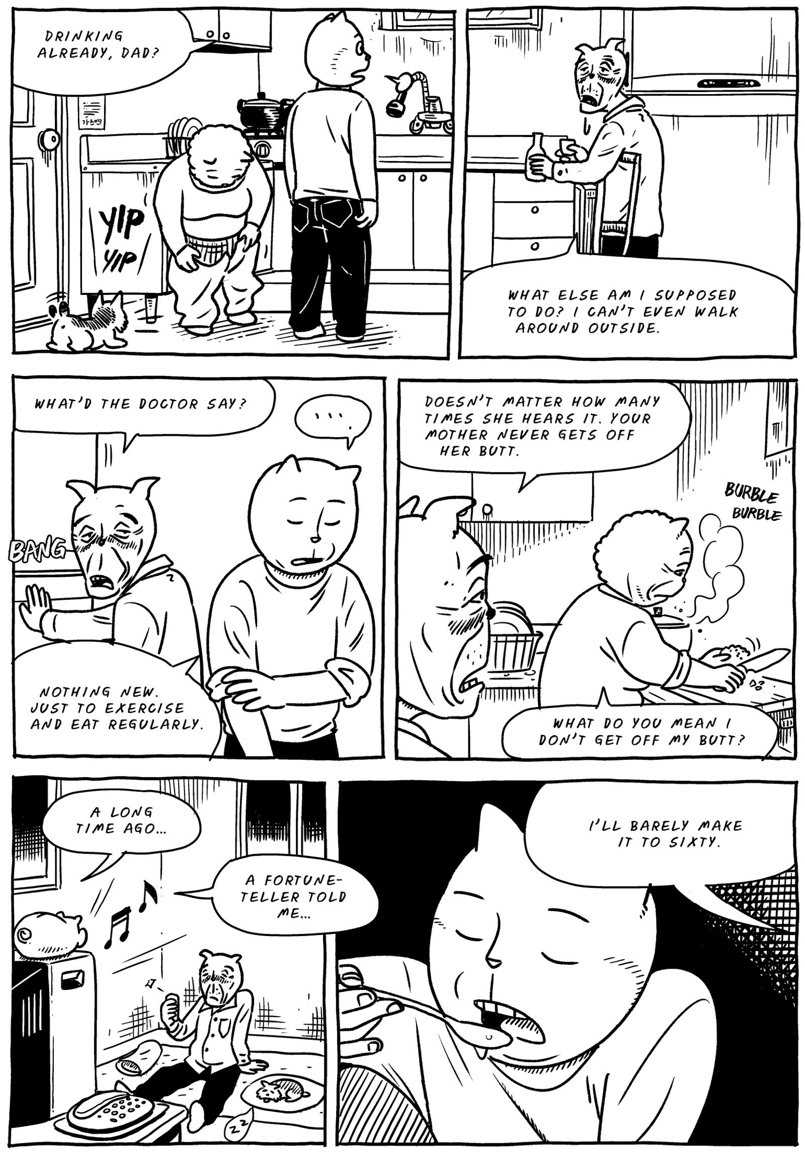
Fortunately, that story is an equally good one. Its links are intricate too: a pile of dangerous pesticidal waste near the house, worrisome medical tests and fortune-teller prophecies, work deadlines, strange basement bugs, marital arguments over domestic duties, hospital bills, his father’s increasing alcoholism, his mother’s decreasing condition. Madang weaves between idyllic memories of his childhood and the grounding tasks of his adult life, two worlds in increasingly opposing orbits.
One of the novel’s strongest sequences is a visual counterpoint between the child Madang at his mother’s breast, and the adult Madang as his mother’s hospital bed. The removal of her breathing tubes parallels the snipping of an umbilical cord. Ultimately, the two tracks of Hong’s novel coalesce to capture both visually and verbally the painful aftermath and recovery of a parent’s death.

[A version of this post and my other recent reviews appear in the Books section of PopMatters.]
Tags: Umma's Table, Yeon-Sik Hong
- Leave a comment
- Posted under Uncategorized


