Monthly Archives: December 2019
30/12/19 That Other Book of Comic Book Philosophy
When the University of Iowa published Nathaniel Goldberg’s and my Superhero Thought Experiments in fall, they added Comic Book Philosophy. I didn’t love the subtitle at first, but it grew on me, especially since our book wasn’t the only work of comic book philosophy published in 2019:

It’s no surprise that a recent edition of Zhuangzi’s The Way of Nature, an ancient Daoist text, was a best-seller in China—where roughly twelve million people identify as Daoists. It’s perhaps a little surprising that the edition was a comic book. Thanks to Princeton (a university press not typically regarded for its line of comics) cartoonist C. C. Tsai’s adaptation of The Way of Nature is available for the first time in English.

Tsai (his first name is Chih-chung, but he prefers C. C. when publishing in English) is already well-known to Asian readers, and hopefully that well-earned acclaim will translate to new audiences. If you know as little about Daoism as I do, you don’t recognize the name Zhuangzi either—though apparently he’s right up there with his better-known Confucian forebear Confucius. Tsai provides an ideal introduction.
Tsai’s layout is elegant. Built around consistent two-page spreads, each left-hand page opens with a full-height caption box containing Zhuangzi’s original Chinese text, and each right-hand page closes with the same. The caption boxes never vary in size, but the amount of writing does, with as much as six full columns of Chinese ideographs and as little as one. While I can’t read Chinese myself, I appreciate the choice on the general translation principle of providing originals and, even better, how well Tsai integrates them with the translated content sandwiched between.

Tsai also uses the columns as a visual element, with the lines that compose the ideographs echoed in the cartoon sections between them. Gutters separate the caption boxes, but adjacent comics frames are interconnected with single lines defining each set of panels. It’s a subtle effect, but the choice compresses the multiple panels into single ideograph-like units. The interiors of the panel are sparse, with the English text floating freely in negative space that merges with the mostly undrawn backgrounds of the cartoons. The think black lines of the drawings, the English words, the frames, and the ideographs all combine in balanced compositions well-suited to the themes of Zhuangzi’s writings. Such sage advice as “Don’t draw a boundary around the boundless” takes on additional meaning though the visual paradox. Tsai also creates a visual rhythm with Zhuangzi often speaking the final, moral-like statement in the white space of an unframed final panel.
The most pleasantly peculiar elements are the cartoons themselves. Though The Way of Nature may be most English-speaking readers’ first encounter with Tsai, his style should not be unfamiliar. While likely uninfluenced by him, Tsai’s carefully curving and angled shapes are reminiscent of Al Hirschfeld’s hyper-stylized caricature style popular in the U.S. in the 1970s (I first encountered Hirschfeld from his cover for Aerosmith’s 1977 album Draw the Line). Tsai sharp clean lines form similarly exaggerated and simplified figures. No crosshatching suggests depth or texture, so the interior spaces of most bodies are as empty as the interior panel space surrounding them. The most repeated figure, Zhuangzi himself, features a head roughly a third the size of his entire body. The top of his mostly bald head is impossibly large and round, his chin is a pointed triangle, his eyes are two tiny dots, and the “C” of his left ear is mirrored by the “C” of his right ear as well as the 45-degree-angled “C” of his nose.
While it’s odd to read the talk-balloon musings of a Yoda-proportioned philosopher, the juxtaposition provides an unexpectedly humorous undercurrent to the otherwise drily voiced philosophy. Would Zhuangzi approve of his language being mouthed by a cartoon parody of himself? I have no idea. But I approve. Still, Little Zhuangzi (he’s not named that, but there should some way to differentiate the actual philosopher from Tsai’s rendering) alters Zhuangzi’s words just by appearing to utter them.
The effect is beneficial, especially when the themes are so familiar. That the advice to “genuinely appreciate every moment of life” and “just let it happen naturally” are clichés is a testament to Zhuangzi’s influence. By expressing them through cartoons, Tsai reduces the cliched effect by giving the eye images to wander, and the familiarity is softened by the gentle irony of the absurdly drawn speaker. Instead of sounding pompous or predictable, Little Zhuangzi seems playful and joyous—an attitude attuned to the actual Zhuangzi’s apparent intent.
Tsai also adds other touches. When the philosopher muses on the relativity of old age, one of his students comments on the eight-hundred-year-old man drawn in front of him: “Wow, he is old!” A second chimes in: “You can say that again.” I’m guessing that dialogue doesn’t originate from the Chinese text next to it. Little Zhuangzi later admonishes another student for calling his teachings useless, telling him that “you’re really only using this little piece of ground you’re standing on, right? But, if we cut away all the rest of the ground around it … how useful is it?” In classic Wile E. Coyote fashion, the student hovers in mid-air for a frozen moment, before plummeting in the next panel and eventually landing in a pile of the repeated word “useless” holding up the much larger word “useful” which Little Zhuangzi stands on.
Would the over two-thousand-year-old Zhuangzi approve of these flourishes? I hope so. According to Edward Slingerland’s foreward, Zhuangzi (who may have been male, female, or several people combined) enjoyed innovation, adding new, often onomatopoetic words to classical Chinese. Translator Brian Bruya (who, according to Slingerland, is a master of biahua or colloquial Chinese) also provides a detailed introduction, substituting missing biographical information with the historical context (the Zhou dynasty was in disarray) and an overview of Daoism generally (Confucius was first) and Zhuangzi’s particular take (reject fate, ignore conventions, practice non-action).
It’s good advice, whether voiced by an ancient philosopher or his cartoon avatar.

[A version of this post and my other recent reviews appear in the Comics section of PopMatters.]
Tags: C. C. Tsai, The Way of Nature, Zhuangzi
- Leave a comment
- Posted under Uncategorized
23/12/19 AOC Has Great Values
That’s how an artist friend of mine explained why I select images of Rep. Alexandria Ocasio-Cortez to digitally experiment with. I’ve been exploring the paradoxically freeing limitations of MS Paint by taking images of people and faces and searching for the sweet spot between recognizable resemblance and absolute abstraction. When does an image of AOC stop being an image of AOC? When does it stop being an image of anyone? The values my artist friend meant are the columns of black hair framing her face, including that bright swath of red lipstick. It also helps to begin with a face that most folks across the political spectrum would have to admit is good-looking as I test various kinds of distortions that I hope are good to look at in a very different way. I started these digital experiments with photos of Trump, and they inevitably devolved into multiple kinds of ugliness. AOC is the mirror opposite of Trump, and so maybe a good test subject for discovering whether distortion is by definition ugly.
Here are seven AOC photo illustrations I made since she took office last January:


Tags: Alexandria Ocasio-Cortez
- Leave a comment
- Posted under Uncategorized
19/12/19 Cartoon Realism
There’s a reason comics gained their first foothold into literary respectability through graphic memoirs. While anything not about anthropomorphic animals or crime-fighters in spandex might seem respectable by contrast, memoir is an especially apt genre for an image-driven form because words can’t always convey the ambiguous complexities of personal experience. Sometimes they’re just too blunt a tool. Sometimes it’s more accurate to evoke undefinable nuances rather than declare steadfast facts.

Travis Dandro’s King of King Court is an excellent reminder of how evocatively effective comics are in the hands of a skilled memoirist. Because Dandro is focused on moments of his childhood and adolescence, his artistic style shapes that content through a cartoon lens. His figures are reminiscent of Jeff Kinney’s Diary of a Wimpy Kid and Bill Watterson’s Calvin and Hobbes—and there’s even a little Charles Schultz’s Peanuts in there too. The key is simplicity. Dandro’s cartoon self has empty circles for eyes, a half-circle for a nose, triangle spikes for hair, and often no mouth at all. The style works in part because it indirectly implies that childhood is simple too. This should be a world free of the difficult details of adulthood, like drug addiction, physical abuse, armed robbery, and suicide—things that partially define Travis’s paradoxically cartoon life.
I say partially because, despite the central presence of an abusive father figure, Dandro focuses at least as much on the seemingly inconsequential minutia of his child self’s wandering attention. Yes, “Dad Dave” is shooting up in the kitchen pantry, but look how super cool the ants are climbing on that bottle cap in in the front yard. The fact that the cap came from a Miller Lite bottle doesn’t matter to Travis, but Dandro the memoirist is keenly aware, selecting that detail from all possible details to suggest (without directly stating) that his younger self was unaware of the some of the most troubling details surrounding him. Or maybe young Travis was aware at some level and was diving into childish play to escape. If Dandro were a prose memoirist, he might have to take a stance on that question and eliminate the ambiguity. But as a graphic memoirist, Dandro can instead leave his viewers to interpret his images as they like.

The cover image of Travis walking past a towering tree echoes an interior page, only without the graffiti gouged into the bark—including the word “FUCK” which is both literally and metaphorically over his head. Dandro is artful with his visual metaphors throughout. When the teenaged Travis is sitting angrily brooding about Dave returning after eight years in prison, an apple falls and bounces not far from the backyard tree in front of him. This is after Dandro has already revealed that his younger self was a jerk in high school, drawing a giant penis on a chalk board to prank a teacher. When the temporarily reformed Dave starts using again, a minutely drawn hornet nest grows panel-by-panel on the eaves of the house. During an attempted family beach vacation, a storm tears Travis’ umbrella from his hands and tosses it into the trees, where it is shown mangled pages later.
While the apple, nest, and umbrella resonate metaphorically, each is also part of the Travis’ real world, giving them double meanings. Dandro is equally apt at exploring the imaginary wanderings of Travis’s mind too. He dreams of floating into the sky on the blow-up Bozo punching bag Dave gave him. Later the same toy deflates from a wasp sting, leaving Travis to drown in a flooded landscape. After Travis’s mother has moved the family to another town because Dave was arrested for trying to break into their house, Travis wakes to find Dave covering his mouth and pulling him from his bed. After a ride in a car trunk, Travis stands before a lake as Dave places a knife against his throat—and then severs his neck. Travis jolts awake in his bed—the first indication that it was a dream.

Dave’s fantasy life is worse. Early we witness his hallucination of an unidentified character committing suicide with a rifle and following Dave around zombie-like. Later Dave dreams of being buried alive, and once, when presumably high on heroine, he begs Travis to help him defend the house from an attacking horde of undead. Dandro reveals late in the memoir that the suicide was Dave’s brother and that guilt is driving his addiction. It’s a central and humanizing detail that turns Dave from a caricature—Dave’s moustache is a rectangle and his eyes permanently attached sunglasses—to a three-dimensional character deserving of sympathy. Though not too much sympathy, since he remains a verbally and physically abusive bully, repeatedly beating Travis, his brothers, and his mother.
Though committed to the cartoon style, Dandro occasionally breaks form to provide a suddenly naturalistically detailed and proportioned image. It happens most often around animals, with a close-up of a bird or fish or flea or wasp, each carefully contrasting the impossibly blocky anatomy of the human characters. The effect reinforces Travis’ escape from reality, as though the natural world were wholly unrelated to his family life. Dandro breaks this pattern only once: a full-page close-up of the precisely wrought lines of Dave’s muscular back as he’s lifting weights in the basement. Rather than escape, here the realistic penwork reveals the depth of the threat.

Though Dandro’s cartoons, like cartoons generally, are composed of simplified shapes with little three-dimensional crosshatching, his style is also atypically dense. Most pages are filled with meticulous scribbles of shadow. Dandro’s layouts further intensify that density by eliminating gutters and drawing panel images inside interlocking frames that unify each page as a single unit. These choices also resonate at a metafictional level once the teenaged Travis becomes a cartoonist within the memoir. Dandro plays a visual game by redrawing his younger self’s portrait of his mother in a style only mildly more cartoonish than the style that is the baseline reality of the story. Accepting a compliment about the realistic vein in the penis he drew on the chalkboard, Travis says, “Yes, it’s the little details that make a drawing come to life.”
It’s also the little details—whether drawn, stated, undrawn, or unstated—that make Dandro’s memoir come to life.
[A version of this post and my other recent reviews appear in the Comics section of PopMatters.]
Tags: Drawn & Quarterly, King of King Court: A Memoir, Travis Dandro
- Leave a comment
- Posted under Uncategorized
16/12/19 The Phenom


- Leave a comment
- Posted under Uncategorized
09/12/19 Marguerite Dabaie in the New Shenandoah

One of the best things about being comics editor of Shenandoah is finding amazing artists and asking them to submit to the magazine. It helps that I review a couple dozen graphic novels every year, mostly from small independent presses, so I’m always stumbling into wonderful new work. This winter the new issue of Shenandoah includes an excerpt of the historical novel-in-progress The Silk Road by Marguerite Dabaie:
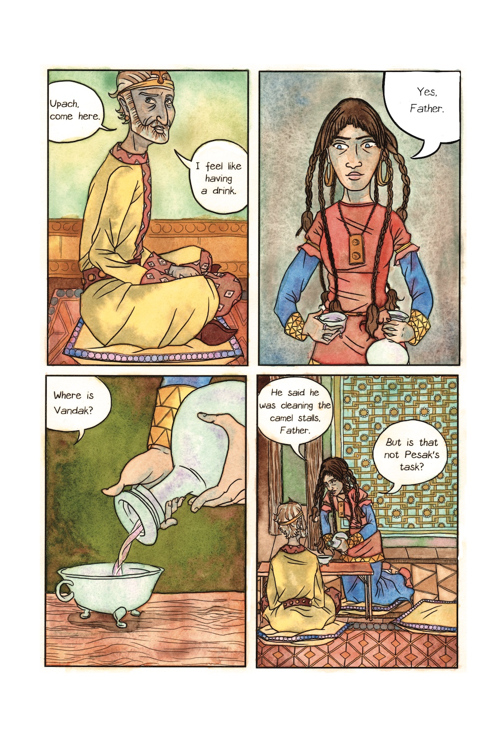
I contacted Dabaie after reviewing her first book The Hooka Girl and other True Stories in 2018. It was not about smoking hash in hookah bars and hooking up with “exotic” belly dancers. It’s an intentionally scattered memoir in comic strip form of a childhood and young adulthood navigating the cultural hazards of growing up Palestinian in the U.S.
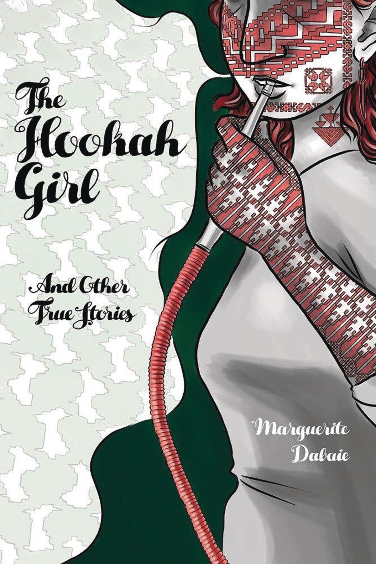
The Hookah Girl is a physically small book, a 6″ x 6″ square, and most of its 17 sections fluctuate between three and five pages, with a few one-, two-, and six-page outliers. The first, an introduction rendered appropriately in comics form, explains Dabaie’s ten-year struggle to publish her memoir due to its apparently “provocative” and “overly political” content. One publisher turned it down for fear of being “firebombed” because of the first strip, a sequence of paper doll cut-outs to dress the cartoon figure of “Margo” as a hijab-wearing Muslim, a gun-toting Revolutionary, a harem seductress, a bomb-vested Martyr, and, finally, a Hungry Artist—the closest representation of her actual self: “I’m sorry to break it to you, but some Palestinians enjoy drawing and eating as well.”

The title strip, “The Hookah Girl,” is only seven panels across a two-page spread, describing a childhood memory of an annual Palestinian Day celebration where a woman carted around a rented hookah and smoked it all day. Both the woman (possibly Dabaie’s distant and unnamed cousin) and the event (which included carnival games and bouncing in an inflatable castle) seem unremarkable—which is likely the point. The so-called Hookah Girl isn’t exotic because she’s Palestinian. She stands out despite it. And though the rent-by-the-hour hookah caught Dabaie’s childhood attention, it’s the woman’s “hand cart”—what Dabaie carefully draws as a metallic dolly—that commands her memory now.
Though I appreciate the indirection of titling the book after the so-called Hookah Girl, “The True Arab Experience” and its subtitle “This handy guide will help you with the Arab-American lifestyle!” are a clearer indication of the collection’s goal and tone. Dabaie lovingly documents aspects of her family that feel peculiar to her while growing up in a larger U.S. culture: speaking in an unnecessarily loud voice, mispronouncing letters, overstocking nuts and seeds, pointing with your head and eyebrows, eating grape leaves—a favorite food to be hidden from your non-Palestinian school friends.

The next strip begins as a how-to guide for rolling those grape leaves, before revealing wider details—the aluminum on the TV antennae, the inexplicable garbage bags filled with the leaves—and then the even wider details of how the family drives at night to distant Napa valley grape orchards to snip off the leaves before chased away by police. A traditional memoir would linger on the incident longer, answering many of the implied questions: How often did this happen? Was it unique to her family? Did it seem peculiar to her at the time or only afterwards? Dabaie instead jolts us to the next fragment.

Her accounts also aren’t always loving—as when she thanks her father for doubting her artistic skills (“This is all a waste. She’s only a girl.”) and so spurring her further away from the traditional feminine roles her family expected of her. She also longed to learn music, even trying to play her father’s oud and darbuka when he wasn’t home because he refused to teach her. He didn’t let her practice school instruments at home either because “girls just didn’t do those things.”
Dabiaie critiques mainstream U.S. culture too—noting without naming her that Gal Godot, an Israeli actress who served in the military and supported the 2014 war in the Gaza Strip that left 2,000 Palestinians dead, plays a feminist goddess fighting to end war. Yes, Dabaie is dissing Wonder Woman—as well as a half dozen other beloved U.S. films that portray Arabs as nonsensical cartoon villains. Yet she is also enamored by Leila Khaled, an airplane-hijacking terrorist and/or freedom fighter—though Dabaie’s interest swirls around the woman’s contradictions as both a gender-breaking and gender-conforming celebrity.

Whether you agree with Dabaie or not, her point of view is uncommon and so well-worth hearing. She names Palestinian cartoonist Naji Al-Ali as an influence, an exile who “antagonized everyone.” Though Dabaie’s comics are far gentler, she seems like an exile too, never quite at peace anywhere. Outside of her family home, she’s subjected to racist jokes, while inside it she is unable to master basic cultural skills—like extracting the meat from a sunflower seed with her tongue. She renders neither incident as especially harrowing—the joke-teller slumps off in embarrassment when told by someone else that Dabaie is “half-Palestinian”—but it introduces Dabaie as a “nus-nus,” or what she terms a “stealth Arab,” someone who passes as white but grew up Arabic. Much of her collection involves her trying to explain her culture to non-Palestinians readers, taking pride in textile art or mapping her Italian grandmother’s migration route into multicultural Palestine.
Much of her childhood involved similar attempts—though after her one-legged uncle began screaming inexplicably at her friends, she no longer hosted birthday parties at home. She ends the collection in her childhood too, with the statement: “I didn’t know what to believe,” a revealing refrain that encapsulates her split-culture and leaves her permanently mired in her past.
Dabaie is also a talented artist, who portrays herself and her family in an evolving array of styles that creates an underlying instability to her micro-narratives. While most of her renderings are simplified in a cartoon-sense, they vary between exaggerated caricatures and stripped-down naturalism, an appropriate stylistic span for a fragmented memoir about her own shifting identity. Even her page’s frames and gutters are unstable, sometimes decorative, sometimes solid black, sometimes open—further reflecting the memoir’s lack of a baseline reality.
Dabaie’s is a world in constant flux, unwilling to maintain a single style or even narrative thread for more than a half dozen pages. Her life must be gleaned in fragments and pieced together accumulatively. While gently provocative, The Hookah Girl is primarily entertaining, a brief but engaging glimpse inside one artist’s dizzying life experiences.

[A version of this post and my other recent reviews appear in the Comics section of PopMatters.]
Tags: Marguerite Dabaie, Shenandoah, The Hookah Girl and Other True Stories, The Silk Road
- Leave a comment
- Posted under Uncategorized
05/12/19 The Comic Book of Sarah
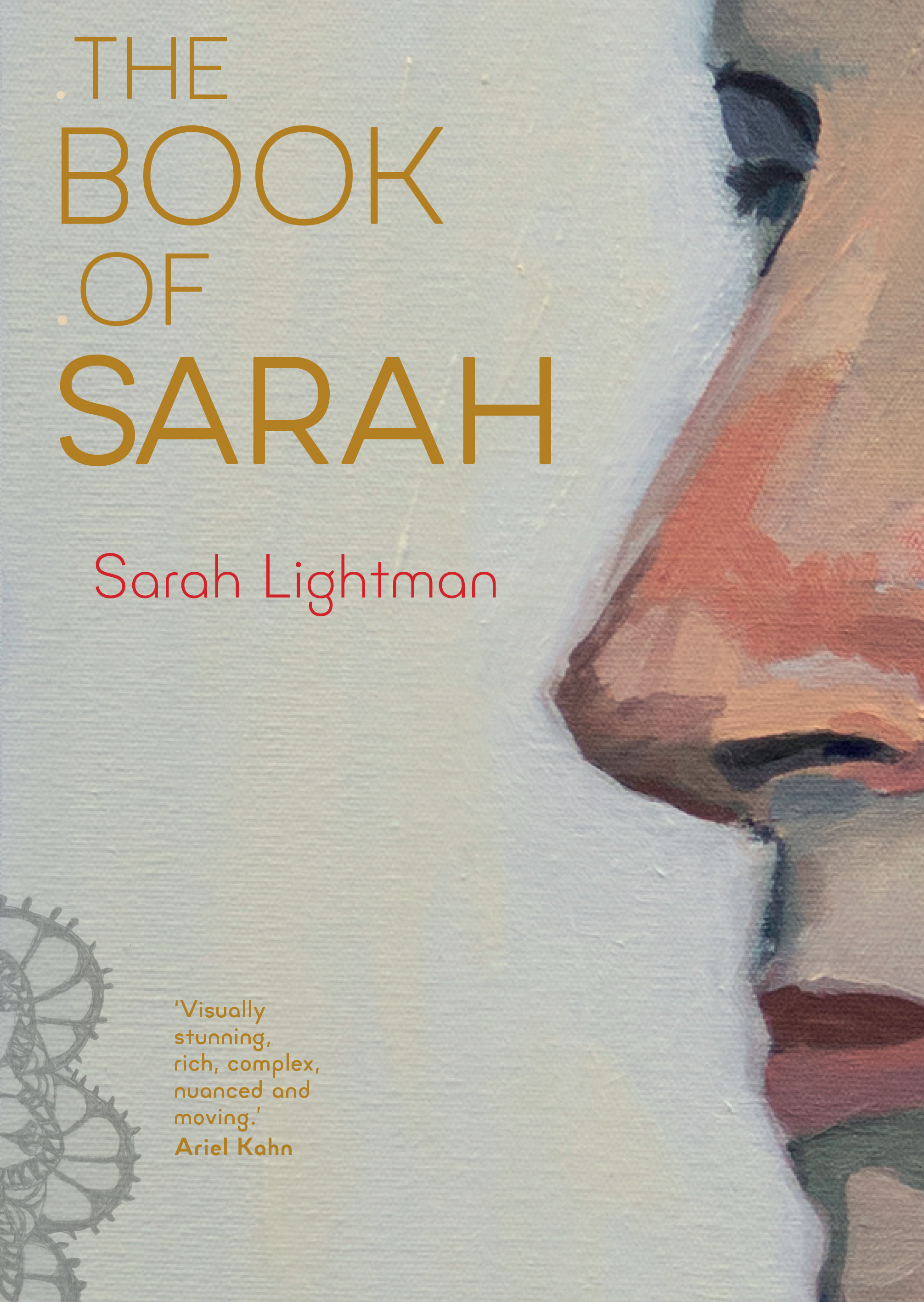
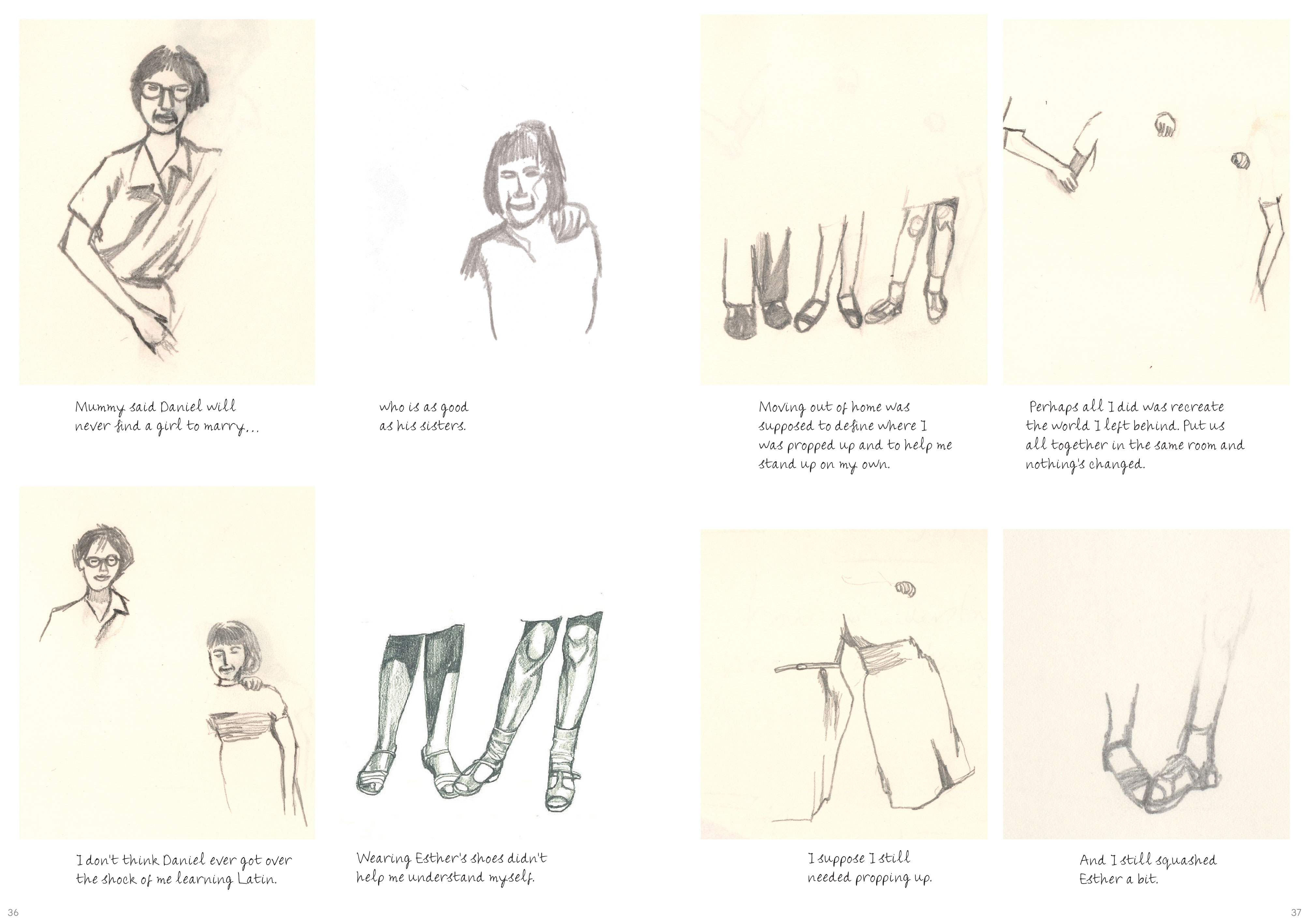
I was happily surprised to learn last spring that another university press has ventured into the expanding field of comics publishing. The Pennsylvania State University Press released Sarah Lightman’s graphic memoir The Book of Sarah under its Graphic Medicine imprint, one that’s been around since 2015. While I look forward to perusing the dozen or so other titles, Lightman is an ideal starting point for readers interested in sequential art that doesn’t fit the conventions of traditional comics. That’s why I’m including four of her pages in the anthology section of my and Leigh Ann Beaver’s Creating Comics textbook due out next year from Bloomsbury.
Each of Lightman’s eight chapters feature a Torah-related title, emphasizing the religious focus of her upbringing—one that resulted, directly or indirectly, in her suffering decades of anxiety and insecurity. Or maybe she would have suffered the same if she had grown-up in another religion or in none at all. Still, the absence of a biblical Book of Sarah speaks metaphorical volumes.

Unlike most comics creators, Lightman is not interested in layout norms that treat a page as a multi-image unit. Most of her pages feature a single work of art, and when they include two, it seems to be due to the width of the images requiring (or at least inviting) a pair to be positioned in a column. She rarely includes more than two—though the exceptions are striking: a family portrait redrawn in incomplete fragments:
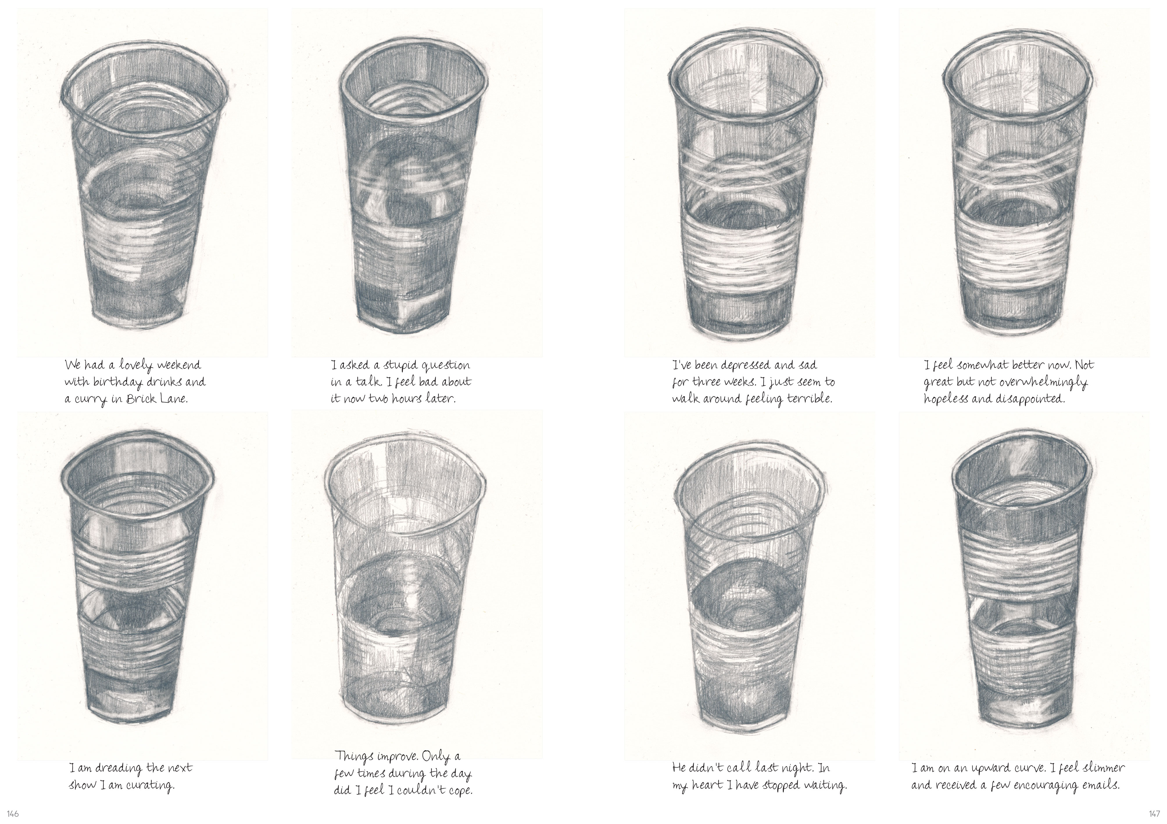
A repeating half-full, half-empty water glass providing a visual metaphor for her shifting optimism:
She extends beyond a 2×2 structure only once: two page-spread of Warhol-like grid of self-portraits in varying styles, but all with vague backgrounds that she uses to emphasize her inability to engage fully in her life:

Lightman also eliminates the related comics norms of drawn frames, instead letting the white of an image background bleed into the white of the page or, if the image is drawn to its edges or on cream-colored paper, letting the image float freely in the whiteness. The visual approach emphasizes the images as artwork rather than just pieces in a narrative—though they function at that level too. Lightman’s narration appears beneath most images, ranging between four words (“Smile, said the midwife.”) and 140 (in an atypically long account of her grandparents’ immigration to England from Lithuania). Lightman uses a handwriting-imitating font, which is a nice gesture, but the perfectly identical letters and spacing is an imperfect match to the intensively hand-created images above each, some of which include their own hand-drawn words.

But the font choice also establishes a sense of two-worlds, the visual and the verbal, playing against each other. Here’s where Lightman’s proves herself not simply an accomplished artist, but specifically an accomplished comics author. While the art world is full of excellent artists who could fill a similarly sized book with equally well-crafted drawings, few have the comics savvy to construct the sort of complex narratives and image-text relationships that Lightman achieves in her memoir.
She narrates, “Things and spaces speak for me,” a reflection on the form of the graphic memoir, especially in her ability to shape her experiences into visual meanings. After describing reading The Hungry Caterpillar to her son, she begins a litany of the foods she ate as expressions of her former insecurities, moving into other kinds of objects, the gift of a plant, a boyfriend’s toothbrush, her cell phone as she waits for him to call, the bench she sits on, and finally a two-page spread of its pencil-gray view.

The images match her words—and yet Lightman is absent. Her cellphone floats in the white of the page instead of the palm of her hand. She draws the bench twice too, but never herself on it—an absence that poignantly contradicts her own narration. When she does finally draw herself, in a three-image zoom-in of a framed photograph that begins with blanks spaces where her and her former lover’s faces belong, it is a sudden, full-color close-up that visually states far more than the word “happy” repeated in the narration below it can.

Elsewhere Lightman’s word-image combinations are even more inventive. She writes that her “scaffolding of self was barely holding up” below a self-portrait that includes scaffolding in the background. Assuming the image is drawn from a photograph (as it and many others presumably were), did the incidental inclusion of the background detail prompt Lightman to develop scaffolding into a verbal metaphor or did she write the sentence first and seek an image to match it, possibly adding the scaffolding? While such process-focused questions are usually non-essential to a final product, they are more revealing for Lightman since her memoir is about process in multiple senses.
At times she seems to be selecting images from her pre-existing work to include as needed, while at other times she seems to be drawing in order to fill a narrative need. And there are even moments when an image seems to be included for its own sake, making the narrative flow bend around it. All three approaches are intriguing, but their combination is even more so. Since Lightman is depicting her years-long struggles with depression and her varying attempts to overcome it, the vacillating approaches take on further significance.
Lightman herself seems to be more than one person—or rather herself at different moments in her evolving life. Her self-portraits and varying styles capture this effect, but her verbal narration emphasizes it too. At times she speaks retrospectively, looking back on past events from a present tense grounded somewhere around 2015: “From where I draw now, I can see a church and a synagogue.” At other times her present-tense narration is a diary-like account of past events as they seem to be happening: “I asked a stupid question in a talk. I feel bad about it now two hours later.” She offers no visual cues (a change of fonts, a sudden shift in the visual style of an accompanying image), but the effect is subtle and so no obstacle to reading, while also offering rewards to greater attentiveness. It also makes the words image-like, snippets seemingly pulled from the same sketchbooks as many of the images.
Ultimately, Lightman finds herself, metaphorically but also visually, as her later self-portraits suggest. She even addresses “young Sarah” as a separate entity she wishes to console. This is not a narrative surprise, since the shifting time perspective reveals her marriage and child’s birth midway through the memoir, even as it then wanders back to lonelier times—when “the hole inside” parallels more empty-faced, incomplete portraits of herself attempting to be a good daughter and granddaughter and niece and girlfriend to variously less-interested boyfriends. It’s also no surprise that she’s no longer an Orthodox Jew by the end—though her spiritual life seems more complexly deep after she becomes a mother.
There is so much more here worth analysis and praise—the use of a carton of eggs in a reverie about contemplating pregnancy; the distantly rhymed images of her therapist’s shoes, the first male, the second tellingly female—but I will leave it to readers to explore themselves.

[A version of this post and my other recent reviews appear in the Comics section of PopMatters.]
Tags: Pennsylvania State University Press, Sarah Lightman, The Book of Sarah
- Leave a comment
- Posted under Uncategorized
02/12/19 Accenting Panels
I’m on sabbatical this year, completing the textbook Creating Comics with Leigh Ann Beavers based on the spring term course we developed and taught together. Here’s the draft of a section on how to make images stand-out on a page.

Ivan Brunetti calls a grid “democratic” because panels “are all exactly the same size … from which we can infer their equal weight and value in the ‘grand scheme’ of the page” (2011: 45). But Joseph Witek warns that “highly regular grids tend inevitably toward both visual monotony and flatness in narrative action” (2009: 153). Abel and Madden recommend a middle position, working with “a basic grid of equal-sized panels” but also varying from it “by introducing a tilted panel, to name one variation, the effect is much more powerful because the tilted panel jumps out at the reader to emphasize a mood, plot point, or dynamic motion” (2008: 71).
Comics creators have a range of techniques for accenting images. Here are nine. The key is scarcity. A page can include one and sometimes two accented images before the layout becomes so irregular that nothing stands out because there is no underlying norm. While accents prevent visual monotony, they also give greater attention to the story content of the accented image:
- Size is the most obvious means for establishing a panel’s importance over other panels on the same page. The larger the panel, the greater the implied significance of its content.
- If frames are rectangular and aligned with page edges, frame tilt is a visual accent mark, drawing attention to an otherwise identical panel. In film, tilting a frame means tilting only the content of the frame while the frame itself must remain unchanged. In comics, an artist instead has three tilt options: tilt the frame and the content; tilt the frame but not the content; or tilt the content but not the frame. All three work as accents.
- Because perpendicular rectangles are the overwhelming norm, individual images may be accented by any variation in shape.
- As discussed above, if gutters are otherwise parallel, individual panels may be highlighted by differences in spacing.
- A reverse technique to spacing, images can draw attention by appearing to be placed overtop other images, creating the effect of playing cards arranged with their corners or edges overlapping.
- Insets, which appear as if placed entirely within the borders of a larger image, are a variation of overlapping.
- Even if images are similarly sized, shaped and arranged, the drawn quality of frames can highlight content.
- Frames can also accent image content if elements of the content are drawn as if breaking the frames and entering the negative space of the gutter and possibly the space of other images—and so another form of overlapping. Broken frames are often used to depict movement and violence, as if the frame is unable to contain the image subject due to the subject’s speed and power.
- If images contrast other images through differences in style, they may stand out in the page composition too.
Here are four pages by our students, each with a different layout, different accent techniques, and accents on different action sequence parts:
1. Hung begins with three rows of slightly irregular heights. Although the first two are divided into two panels each, the bottom full-width panel is less accented by size because the middle panels are taller. The primary accent is instead the overlapping panel positioned in the center of the top four panels. It is also tilted, and its black background with white letters stylistically contrasts the rest of the page.
The page details Hung’s main character’s acceptance into a soccer team, with images of him performing multiple actions: getting the news on the phone, jumping for joy afterward, flying in an airplane, and arriving at the team’s city. There’s also a panel of a sign with the team logo and the accented caption panel with the words he presumably says to his parents after the first phone call. In terms of sequences, the accented panel is its own one-panel action, since nothing else on the page depicts that phone conversation. The news he delivers to his parents shakes up the status quo and so is both disruption and climax.

2. Grace begins with an irregular four-row layout, progressing from two to four to three panels in each row, before the final accented panel. While the circular shape clearly breaks the rectangular norm, Grace further accents it with wide areas of white space on both sides. And though the gutters are consistent width above it, the gutter shapes create an additional overlap effect, suggesting that the last panel occupies the space that would otherwise belong to the third row.
Grace’s page also tells a complete story that combines at least three actions. The first row disrupts the character’s walk home; the second depicts the emergence of the cat from the garbage; the third depicts their first interaction; and the final, accented image skips a range of implied actions—walking the rest of the way home, putting away groceries, etc.—to end on a new balance that resolves the combined plot of the whole page. The wide white margins of the final spacing also seem to relate to the narrative leap to that much later moment in a different location, as if additional gutter space is needed conceptually too.

3. Henry draws a regular 3×2 grid—with every panel identical in size, shape, frame, tilt and spacing, with no overlapping or frame-breaking elements and no insets. Henry instead accents the bottom left panel through a stylistic difference. The background of the fifth panel is heavily shaded in black, a sharp contrast to the white and uncrosshatched backgrounds of the five other panels.
The page continues an action sequence from a previous page, with the narrator being electrocuted in an attempt to trigger his mutant powers. The first three panels complete that action, followed by a one-panel action of the guards untying him and giving him water, before the torture continues in the last row. The accented panel includes captioned narration explaining that every time he nearly falls asleep he is jolted awake as shown in the last panel. The last row then is a two-panel action sequence, beginning in balance and ending in disruption, with the climax and new imbalance left implied as well as cyclical. By accenting the first balance panel, Henry highlights the character’s moments of near peace.

4. For his second layout, Hung uses a mixed path approach, beginning with a two-panel column paired with an unframed second column, and ending with a bottom row of three panels. The lack of a frame around the second column accents it through contrast with the other framed panel, while also effectively expanding the image content by merging its background with the white of the page and so accenting it by size too. To a less degree, Hung also accents the first panel in the bottom row with a contrastingly thicker frame.
Like Hung’s previous page, this one includes the narrator performing at least three actions, each condensed to one or two images: receiving a pass and then scoring; speaking to his father on the phone; and reading in his new home. Again, Hung accents the phone conversation to a parent, establishing a link between pages that creates a suggestive pattern about the main character. If the panel of him scoring was accented instead, it would appear that winning was more important than connection to family. The secondary accent is also on the high five between players, further emphasizing relationships over the sport itself.

- 1 comment
- Posted under Uncategorized


