Monthly Archives: October 2022
31/10/22 Comics Analysis of My Very Local Election Memes
Are social-media memes comics?
You might be surprised how often that debate erupts on the comics scholars listserve. There are two short answers:
- If by “comic” you mean a work in the comics medium (which is defined by publication context), then: No.
- If by “comic” you mean a work in the comics form (sequenced images), then: Sometimes.
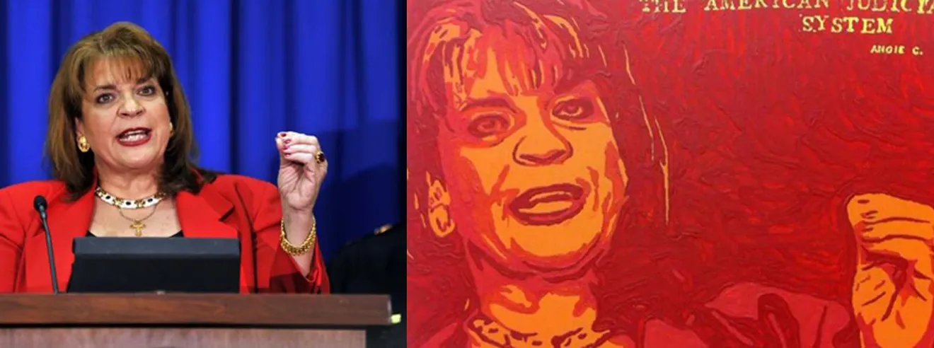
Though most memes include words, most are not in the comics form because each tends to be perceived as a single unified image (and so therefore not as sequenced images). Here’s an example featuring a local candidate in my town:

The meme consist of one image (a screenshot from a candidate forum video) and three sets of words: the “Chamber of Commerce” (captured in the screenshot), the quoted words (in response to a question about how city council candidates would address local childcare needs), and a name.
The word-image relationships are so common, they likely go unnoticed. The juxtaposition of the quoted words imply that they are being spoken by the figure (who appears to be speaking), and the juxtaposition of the name to both the quoted words and the speaking figure implies that it identifies both.
I don’t think anyone would describe the meme as a sequence of images. Though some works in the comics medium are similar (one-image cartoons in newspaper comics sections are formally the same), the meme is not a “comic” in that sense either.
Analysis gets more complicated when memes have multiple image parts in addition to words, and those parts tend to be viewed in a certain order and so in a certain sequence. The above meme is the most recent and (I hope) last political meme I make this election season. The one below was the first. I designed it after learning that the above MAGA candidate was running for office:

The meme is a single page (I want to say “digital canvas,” but that sounds pompous even though it’s more accurate), but it breaks into three conceptual units divided by white space identical to the white background. If I had framed each unit, the meme would more clearly be in the comics form:

Since any sequence of (at least two) images is in the comics form, the meme is in the comics form, and so is (formally) a comic. It is not, however, in the comics medium (I posted it on Facebook), and so I suspect most viewers would not call it a comic. I wouldn’t either. I would call it a work in the comics form, which is less catchy than “comic” but hopefully clearer.
As with the first meme, the word-image relationships are so straightforward they likely go unnoticed. The words and the images in the first panel duplicate. The “3 open seats” and the image of three identical chairs refer to the same subject. Both are also metaphorical, since “seats” and the photograph of chairs are not what’s “open,” which is abstract (an elected government position defined by duties and a duration of time).
The second conceptual panel is straightforward too: the words and images duplicate again. Each photograph represents a candidate, and the words under the photographs are their names. Though most viewers (even ones from my very small town) don’t know what each candidate looks like, most probably assume that the order of left-to-right photographs and the order of top-to-bottom names correspond. That assumption is reinforced by the frame around the fourth photograph and the letters of the fourth name both being red — as well as the shared blue frame around the first three photographs and the blue letters of the first three letters. The election context also likely translates the two colors, blue and red, into a political dichotomy: Democrat/Republican.
The third conceptual panel frames only words, so there is no image-text relationship. Still, the words establish the point of the meme, that like-minded voters should vote for the first three candidates and not the fourth. While that’s probably obvious, notice how that message is not conveyed by the words alone:
- “There are 3 open seats on Lexington City Council. There are four candidates: Nicholas Betts, Chuck Smith, David Sigler, Collette Barry-Rec. Beginning September 23rd, you can vote for three of them.”
Read (rather than viewed) the meme is politically neutral.
It also helps that the first three photographs have similar content (headshots), while the fourth is a medium shot of a person holding up a handmade protest sign with the message in red letters, “TRUMP LOVES ALL PEOPLE,” and a smiley face. I suspect that even a viewer who did not read the protest sign would glean that the meme was supporting the other three candidates — even though none of the words (including the ones in the photograph) state that.
Like a joke, I think all of this is both obvious and understood instantaneously. Also like a joke, explaining it feels redundant and the opposite of funny. But I’m an academic, so that’s pretty much my job description.
Next meme.

The first two examples both clearly include at least one image, making them at least potentially comics. But does this one include an image?
The middle section includes the only four elements that are not words: a frame, three white ovals, an outline oval, and a thin rectangle that seems to block most of a name. If you perceive those elements, plus the three names and fourth obscured name, as representing a ballot, then they are an image. Because the rest of the meme includes only words, the overall meme is not in the comics form.
In this case, the words alone convey the message. I’m not sure if a crossed-out word is primarily a word or primarily an image, but adding it doesn’t significantly alter anything:
- “50 Ways Rockbridge supports David Sigler, Chuck Smith, Nicholas Betts,
Colette Barry-Recfor Lexington City Council. Early voting starts September 23rd.”
Since the names are ordered as they appear on my town’s actual ballots, the meme is also instructive, showing voters how to fill-in the ovals for the first, second, and fourth candidates. (Though it’s not necessary to cross out the name of the third candidate, it won’t hurt.)
The next meme is not in the comics form:

And yet it reveals something key about words: they’re images too. The visual styles of the six word renderings are the most significant elements of the meme. First, words in English (like layouts in the English comics medium) are read left-to-right and then top-to-bottom (AKA, the z-path). Yet if that common-sense fact is applied here, you get this:
- “BETTS LEXINGTON SIGLER CITY COUNCIL SMITH”
I don’t think anyone reads them in that order. I’m pretty sure most readers instead experience this:
- “Betts, Sigler, Smith [for] Lexington City Council.”
Why? Because three of the words are large and blue, and three of the words are small and black. The visual style reorders them and determines their combined meaning. Style then isn’t just some additive quality working separately from word meaning. It can rewire the most fundamental language norms.
A last variation:

If we apply the blue then black rule again, you get this:
- “Betts Sigler Smith Vote Lexington City Council Now.”
Reverse the color rule and it’s this:
- “Vote Lexington City Council Now Betts Sigler Smith.”
I don’t think readers experience either. I suspect it’s probably this:
- “Vote [for] Betts, Sigler, Smith [for] Lexington City Council Now.”
Or, since the first and last words are largest and may be apprehended together, this:
- “Vote Now [for] Betts, Sigler, Smith [for] Lexington City Council.”
Where the first version created a definitive word order that determined sentence meaning, the expanded variant may allow for some indeterminacy. Either way, how each word is rendered is the determining factor. And the ordering effect isn’t a visual puzzle. Our brains perform it at a mostly pre-conscious level of perception.
I suspect it occurs almost as quickly as decoding the unremarkable order of these words:

- Leave a comment
- Posted under Uncategorized
24/10/22 Supreme Court Conceptual Art (or, “Let’s Say I’m a Prince Fan”)
[Update: SCOTUS ruled on May 18, 2023, which I discuss here.]
“Conceptual art,” according to the art-term entry on the Tate website, “is art for which the idea (or concept) behind the work is more important than the finished art object. … a conceptual artist uses whatever materials and whatever form is most appropriate to putting their idea across – this could be anything from a performance to a written description.”
I accept that broad scope to include Supreme Court Justices, who routinely include descriptions of imagined works in their opinions. My favorite was written by Justice Breyer for the majority Google v. Oracle. While making a point about copyright infringement, Breyer refers to “one of the world’s shortest short stories,” and then apparently includes it: “When he awoke, the dinosaur was still there.”
During the oral arguments for Warhol v. Goldsmith on October 12th, three more Justices described conceptual artworks. I have taken the role of artist assistant and rendered each based on the written descriptions from the court transcript.
.
Go Orange Prince by Clarence Thomas

Justice Thomas:
“Let’s say I’m a Prince fan … [and] also a Syracuse fan and I decided to make one of those big blow-up posters of Orange Prince and change the colors a little bit around the edges and put ‘Go Orange’ underneath. Would you sue me?”
.
Chromatic Yellow by John Roberts

Chief Justice Roberts:
“There are artists whose work consists of single color within a frame, right? Mondrian, Albers. Let’s say somebody uses a different color. The original is blue and the allegedly copyright-violation work is yellow. If you’ve got art critics to come in and say that blue sends a particular message, yellow sends a different one, would that satisfy any claim of copyright violation?”
.
Happy Prince by John Roberts

Chief Justice Roberts:
“Let’s suppose that—I think you can do this with technology—instead of the mood that Prince is conveying in the Goldsmith photograph, you put a little smile on his face and say this is a new message. The message is, Prince can be happy. Prince should be happy. Is that enough of a transformation? The message is different.”
.
Red Dress Mona Lisa by Samuel Alito

Justice Alito:
“Well, suppose that the Mona Lisa was copyrighted and somebody, a real — really skillful copyist, made almost an exact copy. Most people could never detect the difference, except the — the copyist changed the color of her dress. If you showed those two to most people today, they would say, well, all right, brown dress, blue dress, red dress, doesn’t make any difference, right?”
.
The Justices conceived their four conceptual works for the purpose of determining whether Warhol’s Orange Prince infringes on Lynne Goldsmith’s photograph of Prince:

To that degree, they are depressingly bad works of conceptual art.
Here’s why:

Fair use doctrine includes four factors. Thomas’s poster explores the first, “The Purpose and Character of the Use,” and the third, “The Amount or Substantiality of the Portion Used,” questioning whether the change of use (Warhol’s Orange Prince is a work of fine art meant for art galleries, Thomas’s “Go Orange Prince” would be mass-produced football-game paraphernalia meant for stadiums) is sufficiently transformative despite the verbatim reproduction of the image.
I think the answer is a fairly obvious no.
I discussed in a recent post that the Court is likely to sidestep the most pressing question: “artists need to know what is and what is not adequately transformative when developing artwork from a source image. … I predict they dodge the needed work of determining a standard for meaningful transformation.”
Thomas’s conceptual art, because its degree of factor-three transformation is essentially zero, suggests no new insights on that core challenge.
Roberts doesn’t do any better.

It doesn’t help that Roberts references the wrong artist (the above 1961 Blue Monochrome is by Yves Klein, definitely not Piet Mondrian or Josef Albers). Worse, his line of questionings yields nothing new about transformativeness. I’m pretty sure Thomas was thinking about the minimum level of transformation, which is at least a starting point. Maybe Roberts was approaching from the opposite end of the spectrum, since his conceptual piece is 100% transformative, deriving literally nothing from Klein since every drop of paint would be a necessarily different drop paint. Nothing of Klein’s painting would be reproduced in Roberts’ Yellow Monochrome except the concept of a monochrome painting, which can’t be copyrighted and therefore can’t be infringed upon. But I don’t think that was his point. He seemed to be snagged on whether sufficient transformation can be defined by the presence of any “new message” in the new work, which is a side effect of transformation not the transformation itself.

His second conceptual piece is a little better, but also mostly a variation on Thomas’s, since, again, it’s about least amount of transformation possible. Roberts was still more interested in “message” though, a murky idea that avoids the question of degrees.
It would be more useful to ask whether the altered smile alters “the heart” of Goldsmith’s photograph. SCOTUS ruled in 1997 that infringement occurs if the copied portion is “the heart of the work,” and they ruled again last year that: “even a small amount of copying may fall outside of the scope of fair use where the excerpt copied consists of the ‘heart’ of the original work’s creative expression.” (That’s from Breyer’s Google v. Oracle again, same section as his dinosaur short story.)
Sadly, the key question of what constitutes “the heart” of a visual image, particularly an image of a individual such as Prince, somehow never came up during the oral arguments. I’d say Roberts’s Happy Prince raises a good question, albeit one that the Chief Justice wasn’t aware he was raising. Most of the image reproduces the original verbatim–and yet if the altered mouth alters “the heart” of Goldsmith’s photograph, then the transformativeness must be substantive and, if so, it shouldn’t infringe. I would love if the Supreme Court would answer that core question. But at the moment, they don’t seem to know the question exists.
Alito certainly doesn’t.

Maybe Justice Alito was napping during Thomas’s and Roberts’s questions, because his conceptual art is a step backwards into irrelevance. Thomas at least introduced a change of use. Alito is just imagining some second work of fine art with some non-essential element altered. Again, if he had reread infringement cases that focused on the question of what constitutes a work’s “heart,” he would know that his questioning was self-evident: yes, a copy of the Mona Lisa that alters only the color of the dress would infringe on the original.
The Court isn’t supposed to declare their decision until summer, and I really don’t know which side they’ll land on. Sadly, I suspect it won’t matter, because they will do nothing to clarify the central question for anyone other than the plaintiff and defendant in this very particular case. When we read the ruling, the problem will still be there.

Tags: Andy Warhol, fair use, Goldsmith, infringement, prince, SCOTUS, Supreme Court
- 4 comments
- Posted under Uncategorized
17/10/22 Why the Supreme Court is Broken and the Surprisingly Easy Way to Fix it

According to the most recent polling, trust in the Supreme Court has dropped 22% in the last three years.
For the previous half century, trust varied between 60% and 80%, dipping only once to nearly 50%. Now for the first time, a majority of Americans distrust the Court.

Of course “the Court” refers to the institution, not the changing roster of individuals who embody it.
The members of our current Court were appointed by five different presidents over the last thirty years.

Because appointments are for life, and Justices are free to retire at any time (typically timed so their replacement is appointed by a president of their political preference), there’s no predicting how long any particular Justice will serve. Also, two of the last four vacancies were due to deaths. As a result, it’s impossible to predict how many Justices any given president will replace.
Looking at the last three decades, the average is two per president.

At first glance, the distribution appears roughly even. Sure, Trump has the most, but only by one compared to his three predecessors.
But then consider the number of terms each president served.

Add a couple more decades, and the results are similar.

Yes, Reagan appointed one more Justice than Trump, but he was in office twice as long.
The disproportionate distribution is more obvious when you calculate Justices per presidential term.

Reagan and then Bush appointed two Justices during each of their terms, at least twice as many as their two predecessors, as well as their next three successors.
But that imbalance is minor compared to Trump’s three appointments.
Though appointments are unpredictable and often a result of luck and happenstance, Trump’s weren’t. The intentional disproportion was orchestrated by Mitch McConnell, who refused to allow a vote on Obama’s appointment after Scalia’s death almost nine months before a general election, and then rushed through Trump’s appointment after Ginsberg’s death less than nine weeks before the next general election.
Without McConnell, Obama and Biden would each have one additional appointment.

If McConnell had instead undermined the Court only once under Obama, the distribution would still be fairer.

Instead, the McConnell packing has produced a Court deeply out-of-sync with the American public because three of its members were selected by not simply a one-term president but by the only president in US history to lose the popular vote by 2%.
That president also made his goal explicit. Trump said during a 2016 debate: “If we put another two or perhaps three justices on, [overturning Roe] will happen. And that will happen automatically, in my opinion, because I am putting pro-life justices on the court.”
As a result, 66% of the McConnell-Trump Court voted to overthrow Roe, even though only 35% of the US population agreed. Gallup shows consistent Roe support.

Roe reflected the will of voters as expressed through presidential elections of at least the last three decades.
The randomness of Court openings thwarts that will. It is explicitly anti-democratic. No other government official decides the duration of their own term with no means for voters to replace them.
The shortest serving current Justice is of course the newest:

Looking at all 116 Justices in Court history, the average serves for 16 years.
Two current Justices are just over that average:

Only one current Justice is exceptionally out-of-sync:

Thomas is starting his 32nd year.
Kennedy, who is just below Thomas on the all-time longest-serving list, retired during his 31st year.
Neither should have served that long. The Supreme Court should not be controlled by the whims of its incumbents, some serving twice as long as the average of all its other members.
The solution is remarkably simple.
It’s also already been introduced in Congress.

Note that last clause. It prevents another McConnell fiasco. Obama appointed Merrick Garland (currently Biden’s Attorney General) to replace Scalia in March 2016. McConnell prevented a vote, but under the new bill, Garland would have become a Justice four months later anyway.
The bill also satisfies the constitutional requirement that Justices are permitted to serve for life. The bill removes no Justices; it only determines when they will become Senior Justices.
The Constitution states that Justices “shall hold their Offices during good Behaviour,” meaning they can only be removed by impeachment.
Personally, I think the fact that one of our current Justices is married to a person who publicly denies the legitimately of the 2020 presidential election and, significantly worse, was communicating with the losing president’s chief-of-staff to strategize how to keep the losing president in office, that’s sufficient grounds for impeachment.
That Justice Thomas has also already served twice the average term exacerbates the problem. With 18-year term limits, the last hold-out from the early 1990s would no longer be determining law. Roberts and Alito would soon follow. Then moving forward, every president would appoint two Justices each term. If a president is reelected, they appoint two more–just as Reagan did. The make-up of the Court would then reflect voter will and not the unpredictable whims and political preferences of its individual incumbents.
The bill even has high bipartisan support. According to a June poll, 67% of Americans favor term limits for Supreme Court justices, including 57% of Republicans. The number was 70% in September. That super-majority support has been consistent for years: 77% in 2020 and 2019, and 78% in 2018.
We just need a Congress willing to listen to the overwhelming majority of the American public.

- 1 comment
- Posted under Uncategorized
10/10/22 SCOTUS: Meaningfully Transformative v. Recognizably Derivative?
[Update: SCOTUS ruled on May 18, 2023, which I discuss here.]
Beginning October 12th, the Supreme Court will hear arguments for Andy Warhol Foundation for the Visual Arts, Inc. v. Goldsmith.
The case is convoluted but in short: Lynne Goldsmith photographed Prince, and Warhol used her photograph to make his own artwork. (I blogged a lot about this in spring 2021.)
Did Warhol infringe on Goldsmith’s copyright?
When a first court said no, Goldsmith appealed.
When the next court said yes, Warhol appealed.
Now the Supreme Court will give a definitive ruling.
According to SCOTUSblog.com, the issue is:
“Whether a work of art is “transformative” when it conveys a different meaning or message from its source material (as the Supreme Court, U.S. Court of Appeals for the 9th Circuit, and other courts of appeals have held), or whether a court is forbidden from considering the meaning of the accused work where it “recognizably deriv[es] from” its source material (as the U.S. Court of Appeals for the 2nd Circuit has held).”
More generally, SCOTUS will clarify the parameters of fair use in art.
Or at least that’s the hope. Agreeing with the historically low opinion the U.S. population has of the McConnell-packed Supreme Court’s recent behavior, my hopes are low. (The Court’s majority somehow did not notice that the Constitution does not acknowledge let alone confer rights to so-called unborn people [the 14th Amendment applies to “persons born”], and yet it ruled that such constitutionally non-existent people’s rights trump the rights of actual people who are pregnant.)
The above issue summary implies that if the Court decides that transformative meaning can’t be considered for recognizably derivative images, Goldsmith wins; and conversely, if the Court decides that transformative meaning can (and presumably therefore must) be considered, Warhol wins.
That, unfortunately, ignores a third possibility: transformative meaning must be considered, and Goldsmith wins because Warhol’s work fails the transformative test.
It ignores (or at least obscures) a forth possibility too: Warhol wins by passing the transformative test.
It’s the test that’s desperately needed. Without it, the parameters for copyright infringement will remain ambiguous, and threats of lawsuits will continue to control artistic behavior. In short, artists need to know what is and what is not adequately transformative when developing artwork from a source image.
The history of similar legal cases (and non-cases) adds to the confusion.
Warhol’s Warhol-defining Marilyn artworks are recognizably derived from a photograph taken by Eugene Korman to publicize the 1953 film Niagara. Korman was employed by 20th Century Fox, but neither ever sued Warhol for copyright infringement, suggesting that Warhol’s art was meaningfully transformative.

Similarly, in the 2014 KIENITZ V. SCONNIE NATION AND UNDERGROUND PRINTING, circuit judges ruled that a recognizably derivative image fell under fair use because:
“Defendants removed so much of the original that … only the smile remains. Defendants started with a low resolution version posted on the City’s website, so much of the original’s detail never had a chance to reach the copy; the original’s background is gone; its colors and shading are gone; the expression in Soglin’s eyes can no longer be read; after the posterization (and reproduction by silk-screening), the effect of the lighting in the original is almost extinguished. What is left, besides a hint of Soglin’s smile, is the outline of his face, which can’t be copyrighted.”

That argument strikes me as unfortunate nonsense, since I suspect most viewers would categorize the second image as recognizably derived from the first, and its consists of more than just an outline of a head and a hint of a mouth. It captures the subject’s likeness. SCOTUS ruled in 1997 that infringement occurs if the copied portion is “the heart of the work,” and they ruled again last year that: “even a small amount of copying may fall outside of the scope of fair use where the excerpt copied consists of the ‘heart’ of the original work’s creative expression.” Since the face in the poster is recognizably derived from the face in the photograph, does that mean the poster copied the “heart” of the original? I suspect yes. And yet I would also think the poster fell under fair use (though mainly for other aspects of the 4-part doctrine, since the poster was used to parody a government official).
The degree of transformation is the unaddressed problem.
For his Obama political poster HOPE, Shepard Fairey used a photograph taken by Mannie Garcia while covering a press conference for the Associated Press. The Associated Press sued, and Fairey eventually settled out court, agreeing to pay the AP $1.6 million.

Fairey’s image retains more detail from its source than does the non-infringing Kientz example, but not much more. Where is the line for infringement? Not knowing means copyright-holders can easily intimidate artists with just the threat of lawsuits.
For the tribute album Kind of Bloop, Andy Baio used a pixilated version of the photograph of Miles Davis taken by Jay Maisel that appeared on the cover of the 1959 Miles Davis album Kind of Blue.

Baio thought he was safe because the pixilated version reproduced the source image “at a dramatically reduced resolution that incorporates few of the photograph’s protectable elements.” That seems to align with the Kientz ruling. But litigation is expensive even when a defendant wins, and the risks of losing can be financially catastrophic. So Baio settled out of court.
I’m not aware of similar court cases involving comic books, and yet the history of “swipes” runs from the medium’s beginning:

And continues into its present:

Which only intensifies the need for SCOTUS to create a test for legally minimal transformativeness.
The image on the right is derived from the Picasso painting on the left. Because it is not “recognizably” so, I assume I have not infringed on any copyright:

But in the second pair, the image on the right is an early stage in my transformation process.

Does it infringe? I have no idea. But if SCOTUS does its job right, I will after their Warhol v. Goldsmith ruling.
My Picasso example is moot, but others aren’t.
In 2014, the Associated Press threatened to sue George Zimmerman over a painting recognizably derived from a photograph of prosecutor Angela Corey taken by Rick Wilson:
To be clear, this is the same George Zimmerman who (in my opinion) got away with (third-degree) murder when he was acquitted after fatally shooting Trayvon Martin in 2013. I don’t really care if AP sues him or not. But I do care about the broader legal implications.
“If you put George Zimmerman’s picture inside Rick Wilson’s, there’s no question it’s the exact same photo,” the AP attorney claimed. “It’s just that he’s put some red screen on it, and you can’t do that. The U.S. Supreme Court has come and said that you can’t do it, and he’s going to have a hard time fighting it.”
Although it seems true that “Zimmerman clearly directly copied an AP photo to create his painting,” as the AP alleges, he did not just “put some red screen on” the photo, and it is not “the exact same photo” because it is not a photo at all.
Also, no, the U.S. Supreme Court has not come and said that you can’t do it — or that you can either.
That’s what we’re waiting for.
My best guess: SCOTUS sides with Warhol, but fails to explain in a manner that will clarify infringement for potential future cases. Alternatively, the Court sides with Goldsmith and still fails to explain in a manner that will clarify infringement for potential future cases. Either way, I predict they dodge the needed work of determining a standard for meaningful transformation.
But on a more hopeful note, at least Justice Jackson will be part of the process.
[And if you’re curious how that process went during the oral arguments, continue here.]

- Leave a comment
- Posted under Uncategorized
03/10/22 Visual Design 101: Layout Flow (also, please go vote)
I’m a comics scholar, not a graphic designer, but I’m not the first to notice the overlap. Canadian cartoonist Seth made it explicit: “comics = poetry + graphic design.”
The following info meme is definitely not poetry. It’s also not a work in the comics medium. But it does reveal a lot about visual design and how comics analysis and composition might be useful tools.
So first consider in what order you view the following words and images. Notice how your eyes move around the surface as you glean the information.

If you’re like me, you wandered a bit. I’m not sure what a graphic designer would call that, but in The Comics Form, I term that a variable viewing path. I use Thierry Smolderen’s analysis of a William Hogarth engraving as a primary example: it invites “the reader to a ‘winding walk’ from one detail, one clue, to another,” creating “a slow read, one that invites the eye to lose itself in the details and to return to them.”
The early vote meme is not in the comics medium, but it is in the comics form (because it includes more than one image, including a mailbox, a voter depositing a ballot, pages from a calendar, and a card ID). For works in the comics form or the comics medium, a viewing path is either variable, allowing a range of “winding walks,” or directed, prescribing a single path. Whether called a comic or not, the meme is presenting content that a viewer has to absorb in some order. Scott McCloud calls that “flow,” how “the arrangement of panels on a page or screen, and the arrangement of elements within a panel” guide “readers between and within panels” by “directing the eye through reader expectations and content.”
I think the voter guide has a flow problem.
According to McCloud, such navigating should be “a simple, intuitive process,” one that will “be transparent to the reader” so that “the reading flow can continue uninterrupted.” He therefore warns prospective artists to avoid “inherently confusing arrangements,” because they produce “just enough split-second confusion to yank readers out of the world of the story.” Joseph Witek expresses the same aesthetic preference, because “readers who are trying to figure out the proper way to read the page are readers who are not immersed in the story.”
As far as a general aesthetic principles, I disagree with McCloud’s and Witek’s assumption. I think sometimes an artist has good reason not to privilege effortless flow. But in this case, “the story” is voter information, and the artist (presumably someone working for Virginia’s Democratic Party) distracted me with a variable viewing path that served no purpose.
Tools of comics analysis can help with that, first by mapping the meme’s layout, and then by suggesting a less interruptive arrangement.
If you’re like me, you first tried to find a directed path, and so started in the top left corner where paths typically begin. My eyes started wandering only after the visual structure didn’t move them in any clear direction. Those top left words (“There are two ways to vote early in Virginia”) are clear enough, but the words underneath them (“by mail or in person”) and the image to the right are oddly distant (even though their meanings overlap). Whichever you view first requires an unintuitive leap to view the second.
So for starters, I would move the image to the left:

That image-and-text proximity is better, but it doesn’t get at the overall flow challenges. So consider the units of information in the entire meme. I count seven:

I’m not sure about that second row (is “Same day registration begins Oct. 1” part of the “Important Dates” list?), and though the six questions/answers could be subdivided, together they are the “FAQ” content. Many comics pages have seven or more units too, but in this case my eye is unsure how to move through them:

When you look at the top right image, its proximity to the next cluster of words (“Same day registration begins Oct. 1”) could lead your eye downward. Or you may attempt to maintain a Z-path (left-to-right, top-to-bottom) and move instead to “Important Dates.” Continuing on that path leads you to the registration information — though why is that date not rendered in the image of a calendar like the first four? And since the image conveys the idea of dates visually, why include the redundant subtitle at all?
Moving to what might seem like the next row is more confusing, since the arrow-like tails of the two speech bubbles that contain “FAQ” point downward to the ID image, implying a column path, and yet the actual FAQs are clustered to the right. One references IDs and so its content would send you back to the left, and another references registration and so conceptually would link you back up to the important date a row higher.
Analyzing the meme as a comics page may help. Except for the bottom banner, there are no drawn frames, but the others are implied:

That cluster of six mini-panels could be drawn as a regular grid, but I think the lack of frames creates a less rigid effect. More “split-second confusion” occurs in at least two places: moving from panel 4 to two possible panels 5, and then once in the cluster of six smaller panels, moving from panel 5 to two possible panels 6:

If I ever teach a class on visual design (which I strongly suspect I never will), I might assign students to redesign the voter guide to flow as a “simple, intuitive process.”
Feel free to grade my own attempt:

It contains all of the same information (minus the superfluous “Important Dates” and “FAQ” image) in roughly the same space (though my version turned out a little more square than rectangular). Since the original top words aren’t the title, which instead appears at the very bottom (“2022 Early Vote Guide”), I moved that too.
Here’s how I think the flow works:

Instead of a Z-path, it begins as an N-path, but then after the first column on the left, the second column merges Z- and N- viewing — though hopefully the back-and-forth produces no split-second confusions but an intuitive sense of intended variability.
Or at least that’s what my comics-immersed brain perceives. If I ever get tired of writing comics theory, maybe I can volunteer to design voter memes for the VaDems.
Meanwhile, have you voted yet?

- 3 comments
- Posted under Uncategorized


