Monthly Archives: September 2022
26/09/22 Which Party Will Win the Senate?
Early voting started in Virginia last Friday, but neither of our Senators, Warner or Kaine, are facing the end of a term.
Of the 100 seats in the Senate, 35 of them are up for election this cycle.
Of those 35, 21 are currently held by Republicans and 14 by Democrats.
Despite that seemingly Democratic advantage, Republicans and Democrats have about the same number of competitive seats. According to the latest Cook Political Report ratings, Republicans are defending three seats in the “lean R” category, one in the “toss-ups,” and one in the “lean D”, while Democrats are defending three “lean D” and two “toss-ups.”
So if you look only at toss-ups, Republicans would seem to have a two-to-one advantage. But since Democrats have to win only one of those three, the advantage is reversed (because Vice-President Harris is the tie-breaker if the Senate splits equally, as it is right now).
The three toss-ups are: Nevada, Georgia, and Wisconsin. Until last week, Cook considered Arizona one too, but they changed its status to “Lean D” last week. According to 270toWin, there’s also a fifth: Pennsylvania.
And some consider Ohio, North Carolina, and New Hampshire to be in play too. (Occasionally, even Florida and Colorado are mentioned, but that seems a bit far-fetched to me.)
Of those 8 races, to win control of the Senate, Republicans need to win 5.
To keep control of the Senate, Democrats need to win 4.
Looking at the polls, odds look good for Democrats. According to the conglomerate averages at FiveThirtyEight on September 21:
- in Pennsylvania, Fetterman is up by 9.5 points.
- in Arizona, Kelly is up by 8.7 points.
- in New Hampshire, Hassan is up by 6.6 points.
- in Nevada, Cortez Masto is up by 2.9 points.
- in Georgia, Warnock is up 2.1 points.
- in Wisconsin, Barnes is even.
- in Ohio, Ryan is down by .2 points.
- in North Carolina, Beasley is down by .3 points.
Using to the Cook spreadsheet, the polls predict these winners:
So if the election had been held on September 21, the Senate would have gone either 51/49 or 52/48, with Democrats gaining one or two seats (definitely Pennsylvania and possibly Wisconsin). Though given the closeness of North Carolina and Ohio (both are essentially even with differences of only .2 and .3), either of those could have tipped Democratic too, for as much as an unlikely but possible 54/46 majority:
But are the polls right?
I keep reading anxiety-driven articles (“Are the Polls Wrong Again?” “Will the Polls Overestimate Democrats Again?” “Pollsters fear they’re blowing it again in 2022“) insisting that there is no Democratic polling bias—just the relentless fear of one.
Is there a way to counter that fear?
According to Politico’s Stephen Clermont: “When voters dislike both parties, they will vote Republican unless Democrats compel them otherwise.” So he recommends looking not at the polling difference between candidates, but at just the Democrat. Based on the 18 Senate and presidential races from 2014-2020, if the Democrat polled:
- 49% or higher, the Democrat won.
- 48%, the Democrat won almost two out of three (63%).
- 45-47%, the Democrat won about one out of five (19%).
- 44% or lower, the Democrat never won.
I see at least two problems with this approach. First, merging three percentages (45, 46, 47) allows for a lot of wiggle room for one of the most critical questions (when are the odds 50/50?), and, second, are 18 races really enough of a data set to draw meaningful conclusions? Also, I’m not sure Clermont’s claim (“When voters dislike both parties, they will vote Republican unless Democrats compel them otherwise”) is true generally, and “dislike” may not capture attitudes toward some of this year’s MAGA extremists. As McConnell said, the GOP is suffering from “candidate quality.”
Still, this seems like a useful exercise. According to the conglomerate polling averages at FiveThirtyEight on September 21:
- in Pennsylvania, Fetterman: 50.9%
- in New Hampshire, Hassan: 49%
- in Arizona, Kelly: 48.8%
- in Georgia, Warnock: 47.9%
- in Wisconsin, Barnes 47.6%
- in North Carolina, Beasley: 45%
- in Ohio, Ryan: 44.5%
- in Nevada, Cortez Masto: 44.2%
The top two are clear Democratic winners, and since 48.8% is pretty close to 49%, I’d call that three. Democrats need just one more. Since both 47.9% and 47.6% round up to 48%, both should have close to two-to-one odds, with either one likely to produce the Democrats’ necessary fourth win. If they do win both, that tilts the Senate 51/49, with the remaining three seats likely going Republican.
Back on the Cook spreadsheet:
And that’s the most pessimistic prediction. Even though Cortez Masto’s 44.2% is at the bottom of the list, she’s leading in polls by about 3 points, and FiveThirtyEight gives her 54% odds of winning, the same as Warnock who, according to Clermont, should win.
According to FiveThirtyEight predictions, Democrats should gain one seat for a 51/49 majority:
Though 54% odds on either of the two tightest races are only slightly better than a coin toss, for Republicans to take control of the Senate, they need to with BOTH coin tosses. That’s possible, but not likely.
And, again, that’s not according to the polls. If you look at just those numbers (now updated as of Sunday September 25th), the Democrats would win four additional seats for a 54/46 majority:
That’s the kind of too-good-to-be-true prediction that has Democrats so paradoxically terrified that all positive predictions must be false. Since two of those predictions are close to even odds (51 and 53), and two are only slightly better (55 and 56), I wouldn’t assume anything about those outcomes. But even if Democrats lost all four, they would still keep control of the evenly divided Senate (because of Warnock, who is predicted to win with two-to-one odds).
Last January, I wrote this blog entry: “Which Party Will Win the Senate in November 2022?“
Because Arizona, Nevada, and Georgia all lean Republican, the key question then was:
“Can Democratic Senators Kelly, Warnock, and Cortez Mastro hold their seats in unfavorable territory? If any two lose, the Republicans control the Senate. If only one of those Democratic senators loses, control of the senate then hinges on Pennsylvania. Because Pennsylvania’s Republican senator is retiring, the seat is wide open, with over a dozen candidates competing in both party primaries. Personally, I’m betting the current lieutenant governor, John Fetterman, wins both the Democratic primary and the general election.”
Nine months later, Kelly and Fetterman both look like safe bets. And while Warnock and Cortez Mastro remain unknowns, they are joined by Wisconsin’s Republican incumbent Johnson.
Republicans have to win all three tossups, plus two additional battleground states, Ohio and North Carolina, in order to win the Senate.
Democrats have to win only one of those five.
As I said last January: “The answer is of course unknowable. It will probably remain unknowable right up to the election. All we can know right now are the factors that will shape the outcome.”
While that remains true, the factors look very good for Democrats.
- Leave a comment
- Posted under Uncategorized
19/09/22 This is a Job for Comics Theory!
I recently came across an online publication that embodies a range of comics qualities while also challenging formal assumptions about comics. That is exactly the sort of thought puzzle that comics theory is built for.
So, first question, is this set of images in the comics form?
In terms of layout, it’s a regular 3×3 grid with uniform pairs of horizontal and vertical gutters.
In terms of image content, it’s nine photographs featuring one or two individuals, none repeating.
The lack of recurring elements likely means the nine images don’t produce a viewing order. Your eye moves through the set in any direction. Technically that means they’re not sequenced and so not in the comics form if the comics form is defined as sequenced images–though I’ve found that in comics scholarship “sequenced” is sometimes used to mean simply juxtaposed, so there may be wiggle room (I split those hairs in Chapter 6 of The Comics Form).
So tentatively I would say, yes, the grid of nine photos is in the comics form. It is not, however, in the comics medium, which is defined by publishing context. The grid is the background for an article in the New York Times.
If the article (Maya Salam’s “The Faces That Look Back at Us When We Come Out, Again and Again“) were in the comics medium, I’d call that a splash page. It’s not, so I won’t. But I think comics theory still offers the best set of tools for analyzing the online article’s structure.
First, note that the arrangement (including the bottom portions of the lower images and the span of the middle words) varies based on the individual screen it appears on. Also, the whole grid is never fully shown (I had to cut and paste the version at the top of the page). That’s because the visual conceit is that a series of opaque white rectangular panels inscribed with words (AKA, “caption boxes”) obscure parts of the middle column as if the caption boxes were on a separate plane three-dimensionally “in front of” the photos. The caption boxes appear to move up as a viewer clicks the down arrow key:
Of course the caption boxes don’t actually “move,” and the photographs are never actually “under” them. The illusion of depth is common in works in the comics medium that are printed on paper. It’s as if panels sit on the surface of the page, sometimes partially overlapping. Of course there is nothing “under” anything else. It’s all just ink on paper. For the Times article, it’s all just pixels. But both create the illusion of a formal structure, which is why I call it “pseudo-form” when analyzing the effect in The Comics Form.
The illusion of movement adds a wrinkle. It’s not exactly animation. Or at least not what we might call passive animation. The viewer controls the movement: you have to click the arrow key or nothing happens. That seems akin to turning the physical page of a paper comic. Roy Cook considers that element of control to be an essential for something to be a comic: “The audience is able to control the pace at which they look at each of the parts.”
My definition of the comics form is simply “sequenced images,” though, based on the history of how comics scholars have used the word “image,” I derived the further stipulation that a comics image is “any flat, static, visual image juxtaposed with another.” The adjective “static” may exclude the Times article from the comics form. Unless a viewer’s control of pace means each image is static — until a viewer does something (turns a page, clicks a key). To that degree, the illusion of words moving up the middle column may be little different from the pages of an actual paper comic turning in a viewer’s hands.
But that’s not the weird thing about the article’s structure.
The last click of the arrow key triggers an animated sequence in which the still images seem to rearrange themselves into a new set.
The new arrangement changes the grid to six rectangles, one four times larger because it combines the previous space of four. That’s common in the comics medium. Watchmen does something like that on nearly every page:
But now the larger image isn’t static (in any sense). It’s a streaming film clip:
That means the new layout juxtaposes four still images, one caption box, and one moving image. Is the combination in the comics form? If all of the images were moving, I would say definitely not. Split screens are fairly common in film and TV. The first one I ever saw was in the 1979 film More American Graffiti, but the techniques is probably better known from the TV show 24. Neither is in the comics form.
But here more than half of the combined image is not moving and so would be in the comics form. Does juxtaposing them with a moving image take them out of the form?
I’m not sure.
But while I’m contemplating that complexity, the movement of the viewer-controlled caption boxes is still keyed to arrow clicks:
And the independently animated clip keeps playing in the background and even repeats if you don’t advance the words. After two single, full-layout images, the grid scrambles again, creating a new arrangement, which the words continue to advance over, one click at a time, until triggering another new arrangement:
I won’t toggle through the whole article (which you should read anyway, for its content, not my analysis of its form), but those are the essential features. It’s clearly a hybrid structure, one that can exist only online. If you want to dismiss it as “not a comic,” first consider this next sequence:
Unlike the thematically linked set of nine non-sequenced images that opens the article, these three stills are sequenced narratively and even follow the N-path of a conventional comics layout:
Even if the larger article is something else, those three images are in the comics form. The next image relationship (which occurs after the arrow key triggers another new arrangement) is instead simultaneous.
Even a viewer not familiar with characters from The Office could understand the two faces in the bottom left image to be reacting to the content of the larger image to its right. Because it is larger, a viewer likely apprehends the near kiss first, before noticing the smaller reaction image to its left — breaking a standard z-path order arrangement. And the unrelated cartoon image at the top left (yes, that’s from BoJack Horseman) might be scanned last, even though top left is the standard starting point for a work in the comics medium.
I don’t know what to call the article’s form, but I’m already contemplating adding a chapter to future editions of The Comics Form.
- Leave a comment
- Posted under Uncategorized
12/09/22 Remapping the Comics Modes
One of my favorite things about Scott McCloud’s 1993 Understanding Comics is how often it’s wrong. That sounds like a left-handed compliment, or probably just an insult, but I mean it sincerely. McCloud’s pioneering mistakes made so much possible. They remind me of early maps, how wonderfully wrong they appear in retrospect, in part because they provided a baseline for the next cartographer to correct. Correcting is easy. Terror is the blank page, the “here be dragons” at the shifting margins. McCloud slew a lot of those dragons.
As I started writing The Comics Form I was in debt to other early cartographers too. I remember when Joseph Witek published his first book, Comic Books as History: The Narrative of Art of Jack Jackson, Art Spiegelman, and Harvey Pekar, in 1989. I was a year out of college and had never imagined a work of academic scholarship could focus on comics.
Pulling my thirty-something-old copy from my shelf now, I’m not finding an author’s bio, but I suspect that Witek (who, I’ve since learned, goes by Rusty) can’t be all that much older than me. I wrote him a letter back then. A small group of my recently graduated friends and I wanted to start a hybrid literary journal, and I asked if he would be willing to submit something. He didn’t respond, which was both appropriate and just as well. (I really I hope that letter no longer exists.)
I didn’t come across the name Witek again for two decades. I had just entered the field of comics studies and was using Smith and Duncan’s then-new Critical Approaches to Comics. (I’ve since gotten to know Matt Smith, who lives about an hour and a half down Rt. 81.) My favorite chapter remains Witek’s “Comics Modes: Caricature and Illustration in the Crumb Family’s Dirty Laundry.” (I just placed it on my first-year writing seminar syllabus again this semester.) It provides what I’ve found to be one of the most useful tools for the analysis of visual style:
- Cartoon Mode: “In general, stories in the cartoon mode often assume a fundamentally unstable and infinitely mutable physical reality, where characters and even objects can move and be transformed according to an associative or emotive logic rather than the laws of physics. Bodies can change suddenly and temporarily in shape and proportion to depict emotional states or narrative circumstances, as when the body of an outraged character swells to many times its normal size, or appears to levitate several feet off the ground in a cloud of dust.”
- Naturalistic Mode: “In its fully developed form, the naturalistic mode is often called “realism.” In this mode, the rendering of figures and objects adheres to (or at least points toward) the artistic conventions for creating the illusion of physical forms existing in three- dimensional space. A significant effort is made to create that plausible physical world using shading, consistent lighting sources, texture, and linear perspective. Backgrounds are rendered in detail, especially in establishing shots, and that background tends to be depicted relatively fully from panel to panel.”
Witek includes two drawings of Bob Hope to illustrate the difference.
And here’s where my own cartographic corrections begin.
Why are there only two modes? The two Bob Hopes drawings differ because the first consists of more exaggerated lines, but aren’t the number of lines in each roughly the same? Witek identifies simplification and exaggeration as the cartoon mode’s primary qualities, which means that not only should the naturalistic mode be unsimplified and unexaggerated, but there should be two partial categories too.
So I found more drawings of Bob Hope:
The top right image by Al Hirschfeld is clearly in Witek’s cartoon mode, and the bottom left is clearly in his naturalistic mode (despite being drawn by Norman Rockwell). The bottom right image is made of roughly the same number of lines as Hirschfeld’s, but is less exaggerated, while the top left is very exaggerated but also detailed in a way that contradicts Witek’s cartoon mode.
I address that in The Comics Mode:
“Instead of Witek’s two modes, the combinations of simplification and exaggeration produce four. Cartoons remain clearly opposed to the detailed, optically accurate style of naturalism, but two additional modes emerge from the crisscrossing spectrums. Some caricatures are exaggerated but not simplified. This combination has no term, but it may be referred to descriptively as ‘detailed exaggeration.’ Images that are simplified but not exaggerated are similarly unnamed. Where detailed caricatures often align with cartoons, viewers may regard unexaggerated simplifications as a form of naturalism. Graphic novelist gg works in this mode, and reviewers for The Globe and Mail and Sequential State describe her 2017 I’m Not Here as “photorealist” and “photorealistic” (Rogers, Hoffman). The claim is peculiar considering that gg’s images are composed of opaque shapes lacking any interior detail. They are highly simplified, but their contours appear realistic, suggesting photographic source material. This mode also has no name, but may be referred to descriptively as ‘unexaggerated simplification.’”
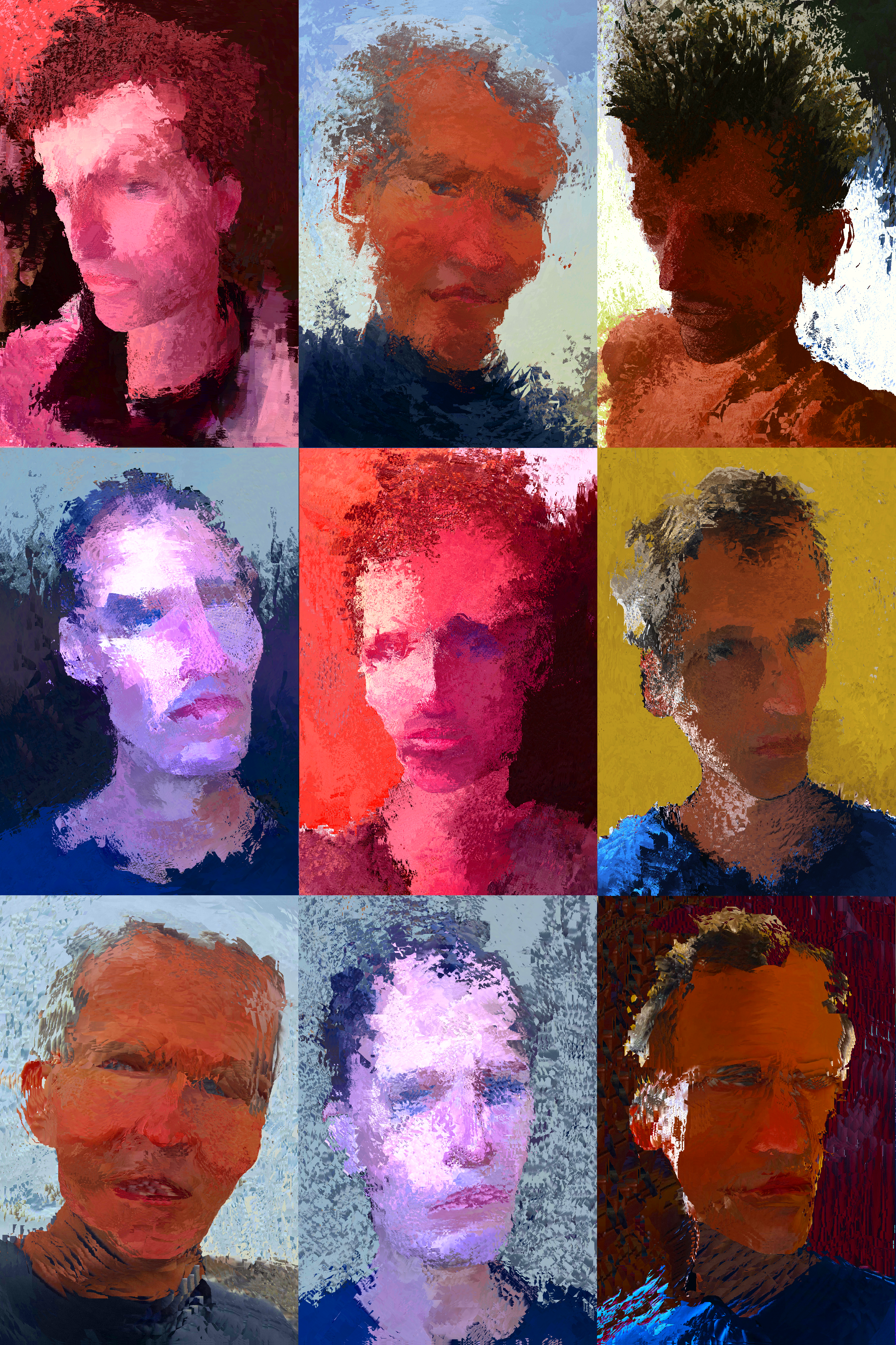
Instead of dissecting Bob Hope, I dissect my own head for an illustration:
In addition to offering an expansion of Witek’s analysis, The Comics Form also corrects my own 2017 Superhero Comics. In the chapter “The Visual Superhero,” I created two spectrums, simplified-detailed and exaggerated-unexaggerated, and subdivided each into a five-point scale, and then combined them to create a chart consisting of twenty-five distinct styles.
It’s not that the resulting “Abstract Grid” is necessarily wrong (though I suspect some of its claims are overstated), it’s more that it just isn’t necessary. The implications of identifying just four modes opens up a range of further questions, some of which I address in The Comics Mode, and some I leave open. But they’re all possible because of my debt to Joseph (Rusty?) Witek.
- 2 comments
- Posted under Uncategorized
05/09/22 Political Cartoons & The Comics Form
Last month I posted an analysis of political cartoons and their relationship to the comics form. I figured that would be a one-off, but the exercise apparently sharpened my eye because now I can’t glance at the Politico cartoon page without brainstorming impromptu lectures.
Cartoons may be especially apt material because they are designed to communicate messages instantly and so with zero analysis (because if you have to analyze whether a joke is funny, it’s not). That also means analyzing them can be pleasantly perverse, revealing the unexpected formal complexities under a deceptively simple surface.
So first, a quick recap: political cartoons are in the comics medium (because that’s defined just by publishing context), but they’re only in the comics form (AKA, sequenced images) if each includes more than one image (which I’m finding happens more often than I’d expected).
In the comics medium, the presence of two (or more) panels creates the learned expectation that the panels are sequenced in time, and that the content in a panel on the right will happen chronologically after the content in a panel on the left.
Multi-image political cartoons obey that rule:
Except when they don’t:
In the above example, the two images instead are understood to happen simultaneously. That’s possible in part because technically there are three images. The centered talk balloon is drawn as though it’s three-dimensionally “on top of” of the two panels as well as the gutter between them. Comics theory tends to consider talk balloons (and thought bubbles and caption boxes) as parts of panel content, but I think this shows pretty clearly that they exist as though on a separate plane. So it’s not that the talk balloon breaks the panel frames. Talk balloons are never bound by other frames because they are their own kind of frame, one that frames a specific kind of image: words.
Dividing talk balloons from other image content reveals that their are two kinds of representations or story-worlds (AKA, diegeses) occurring simultaneously. There’s the subject matter of the image content, and then there’s the arrangement of that content (through things like panel framing, spacing, sizing, etc.). The secondary diegesis is usually called layout, but I think it’s useful to recognize it as its own kind of representational object too (and so not “form,” which is why I call it “pseudo-form” when I discuss it in The Comics Form).
This parody of Biden (drawn before his recent legislative successes and 5-point rise in the polls) is of course a riff on Warhol-style “pop art.” I often show my student one of Andy Warhol’s Marilyn silkscreens and ask if it’s a comic (which is a trick question because it’s in the comics form but not the comics medium). The question tends to reveal the above expectation (that image content moves chronologically forward in time in a left-to-right, top-to-bottom “reading” pattern) which Warhol violates, but also the expectation that the image progression will tell some kind of “story” (which opens a whole other Campbell’s soup can of worms).
Again, I think it helps to divide the primary diegesis from the secondary diegesis. Though the rendered images of Biden and Monroe change, those changes don’t reflect changes happening in the story world (where Biden and Monroe are not changing colors and other qualities). They are happening in the world of the rendered image, which for Marilyn is the surface of the actual silkscreen. More weirdly for Biden, it is some imaginary world where Warhol created a multi-image painting of Biden, and the cartoon is a reproduction of that non-existent object, presumably hanging on a wall somewhere.
That two-level diegetic analysis also helps to explain the visual play in my favorite political cartoon this month:
Here the primary and secondary diegeses merge. The image is simultaneously a reproduction of a partially redacted FBI affidavit regarding the search of Trump’s residence, and a cartoon representation of Trump himself. The affidavit is highly realistic (it’s taken from and so looks exactly like a page of the FBI document), but the Trump figure is intentionally unrealistic, creating two literally overlapping kinds of images.
Yet the images more than just overlap because the black horizontal lines are simultaneously parts of both, with vacillating meanings depending on how they are perceived in relation to the other image parts. They are redaction lines when viewed as part of the FBI document, and they are stripes in Trump’s prison uniform (and/or a kind of prison bars) when viewed as part of the Trump figure. They are simultaneously both, toggling back and forth according to viewer perception.
My runner-up favorite also creates the illusion of a paper document:
Here the image consists (almost) entirely of words, but their meaning is altered by how they are rendered. I discuss this sort of image-text relationship in The Comics Form and briefly in a recent post. By taking Sen. Lindsay Graham’s exact words (spoken aloud on Fox News about the possibility of Trump facing prosecution) and rendering them in the style of a ransom note (individual letters cut-out from magazines and glued to Senate stationery), the cartoonist gives them a new meaning that critiques Graham by implicitly comparing him to a kidnapper making violent threats.
But sometimes simple really is pretty simple.
My last political cartoons are less about Democrats vs. GOP than about Marvel vs. DC. Two allusions to Marvel’s Incredible Hulk cropped up, the first praising Biden, the second lampooning Florida’s Gov. DeSantis:
But DC ties with two allusions to Superman.
Placed in sequence, those last two create a kind of authorially unintended story (Super-Biden explodes from his grave and fights threats). The two cartoonists were working independently of each other, but because they both happened to draw Biden as Superman, and because I placed the grave scene first and viewers have a learned expectation that the content of later images occur chronologically after the content of earlier images, the perception of a story happens whether intended or not. (That’s another difference between the comics form and the comics medium.)
We’ll see what the cartooning universe offers next month.
- Leave a comment
- Posted under Uncategorized


