Monthly Archives: March 2018
26/03/18 Space and Time in the Comics Form

Manuele Fior’s 5,000 Km Per Second was originally published in 2009 and, after winning the Angouléme and Lucca comics festivals awards in 2010 and 2011, was translated and published in English for the first time in 2016. As suggested by its title, the graphic novel explores the effects of distance across continents and decades. Its love triangle begins when the teenaged Piero and his best friend Nicola ogle Lucia as she moves into an apartment across the street and concludes twenty estranged years later on that same street. The intervening years include multiple heart breaks and the one-second delay Lucia in Norway and Piero in Egypt experience as they speak while five thousand kilometers apart.
Fior’s art is cartoonish in its simplistic shapes—noses are triangles, ears half-circles—and his colors can be expressionistically lavish, and yet the overall effect seems oddly naturalistic. Fiore’s storytelling is especially effective in its nuanced use of the comics form. His white gutters are atypically wide, creating a discursive distance that draws attention to the thematic distances at the heart of the novel.
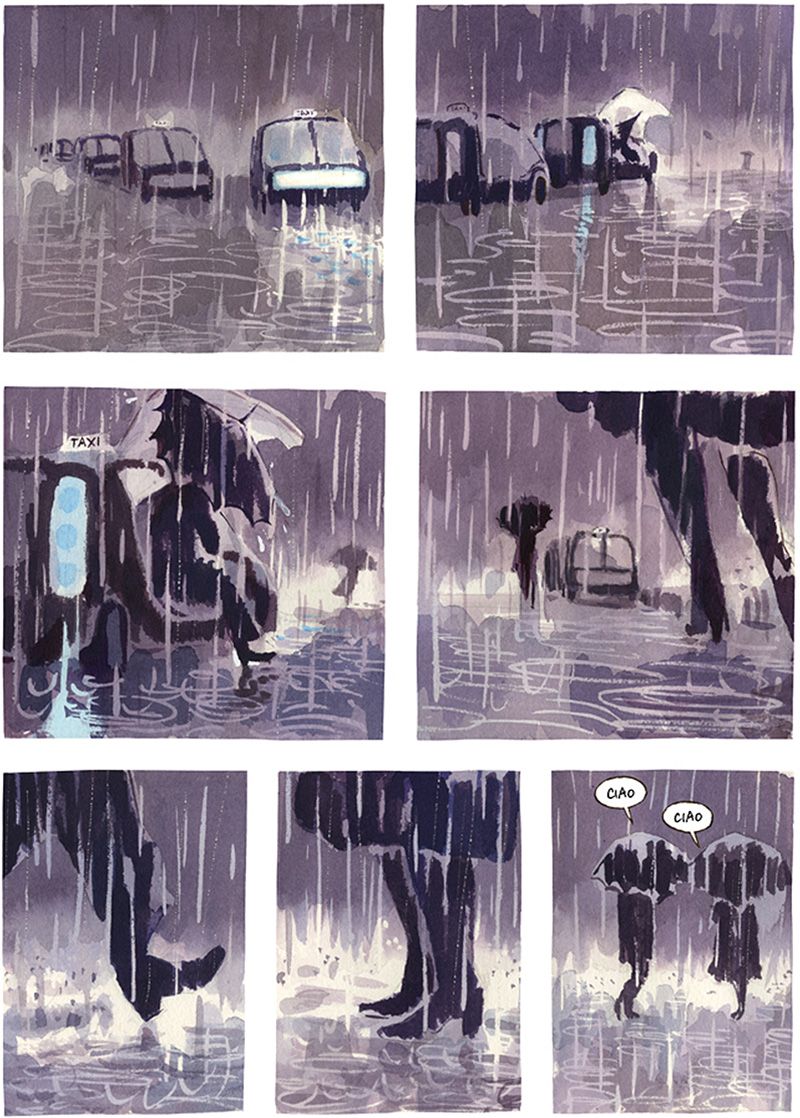
Jessica Abel and Matt Madden warn graphic novelists in their textbook Drawing Words & Writing Pictures: “Don’t go too wide with gutters, because the panels will tend to visually fall apart from one another and not look like a unified page” (80). Fior’s pages are not as extreme as Abel and Madden’s “too wide” example, but his gutters do subtly suggest the lack of unity between his characters and the falling apart of their relationships.

That distancing effect is heightened where his unframed panels merge with the white of the page background, especially along speech bubbles, which Fior divides with sharp black lines within panels but leaves open to the gutters along outer edges. As a result the interior of talk balloons share the white of the background page. Though unframed, the panel edges are also sharp, cutting off image content with a precision that contrasts Fior’s watercolors and often thick gestural lines. Drawn content never breaks frame. The effect is paradoxical: a spaciousness that rigidly encloses. Again, the formal style mirrors the novel’s emotional content.
The rigidity is apparent in the layout scheme too. Almost all pages are regular 3-rows, most fluctuating between two and three equally sized panels, punctuated by the occasional full-width panel or, more rarely, an off-centered row as if two panels of an implied three have been combined. The five full-page panels are notable exceptions, as are four other variations, but the overall effect is a rectangular consistency as unbroken as the paradoxically frameless panels.
If space is time—and space is literally time in the comics form—the world of the novel is a temporal cage. And Fior pushes at the formal qualities of that cage to tell his story. The novel opens with a full-page panel of Lucia’s balconied apartment building, followed by a page of three full-width panels as the perspective tightens around interior figures visible through windows as they speak. The third page then offers a close-up an unidentified face—Piero’s—as he bends the slats of his window blinds and stares grinning at the reader. The contrast between the bright yellows and the sudden gray blue communicate the 180-degree change in location, and the white slats partially merge with the gutters—as if Piero is bending them too. Although the tight frame suggests he is alone, the final panel of page four reveals Nicola for the first time as the two vie for the same view.
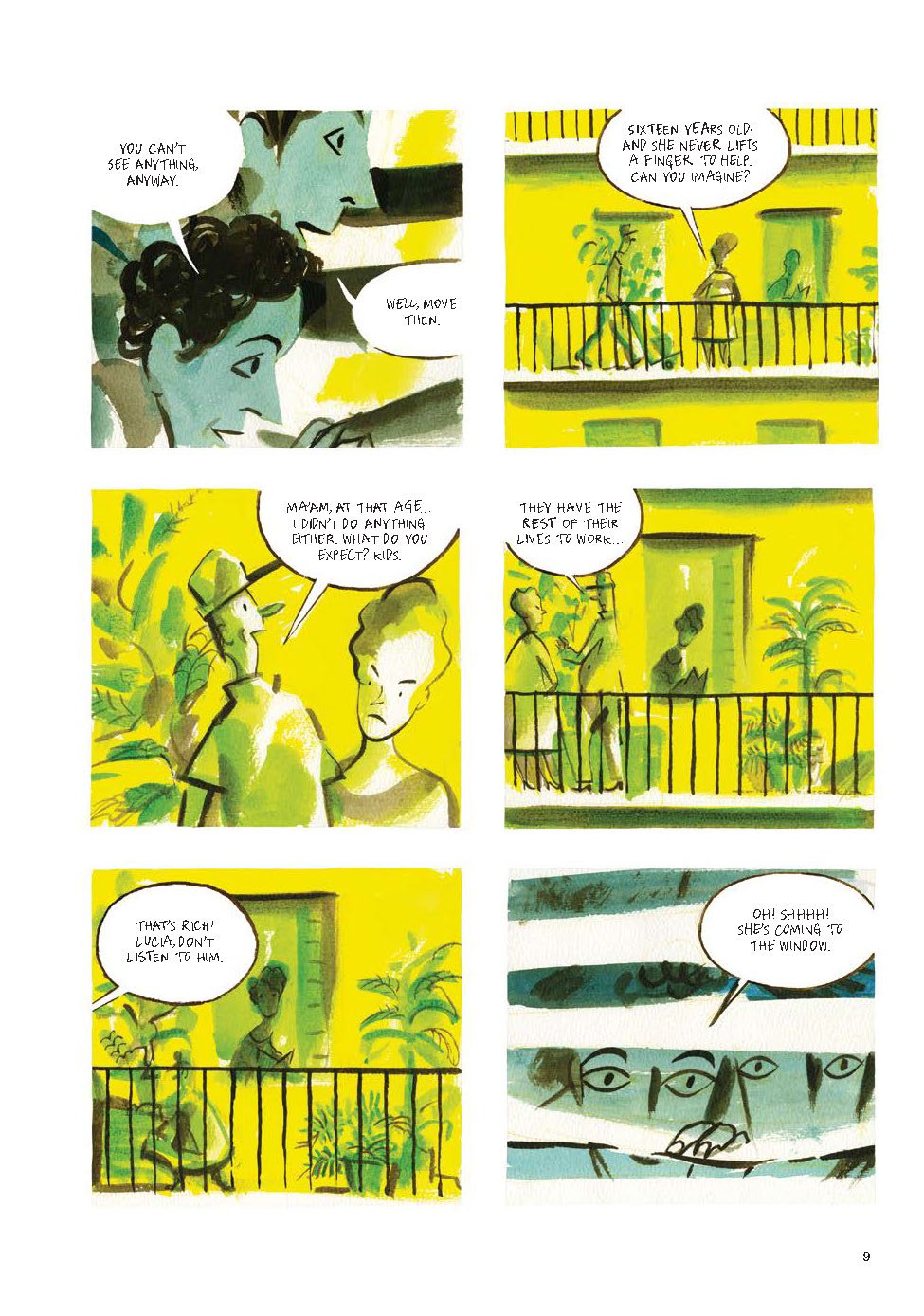
The conflict is defining of their friendship, as is Fior’s pleasantly misleading use of framing. Nicola did not newly arrive on the scene, but was always present yet narratively unacknowledged.
The second chapter leaps unexpectedly in both time and location, as Lucia, now a graduate student, arrives in Norway. Fior waits seventeen pages to reveal that she and Piero—who last seen had only barely managed to gasp a love-struck hello to her when they passed each other for the first time—have been dating and now, as Lucia writes a letter to him, are breaking up: “I don’t love you anymore. There, I’ve said it. I realize it’s easier from far away.” Their relationship, the novel’s romantic core, occurs entirely in the gutter between pages.
Chapter three opens with three pages of Egyptian scene-setting before finally revealing Piero, who soon is arguing with an estranged and unnamed girlfriend by phone before plunging into sickness-induced erotic dreams of Lucia.

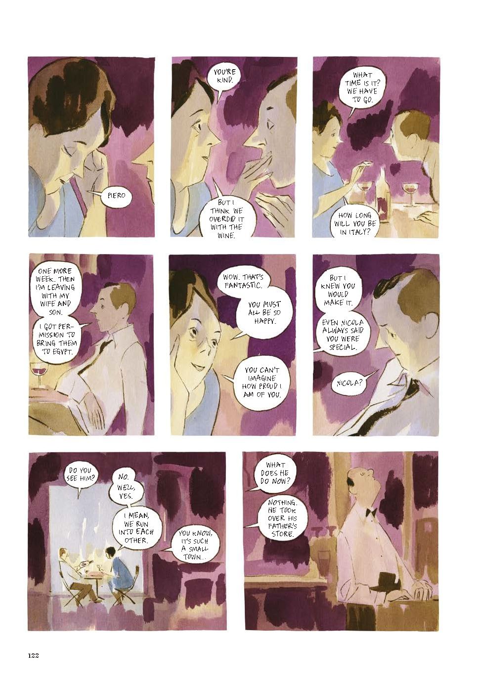
A chapter later we leap to Norway again with the now pregnant and unhappily married Lucia as she reads about Peiro’s archeology work in the newspaper and recalls making love with him for the first time to a song on the radio. She soon decides to leave her husband and a chapter later makes the titular phone call to Piero, who has just learned that his own wife is pregnant too. Though their conversation seems warm, Fiore creates an estranging effect for readers by including only Piero’s half of the dialogue, leaving Lucia’s words ambiguously implied.
Concluding the novel’s building rain motif with four pages of gray downpour, Fior offers a final eight-year leap forward as the ex-lovers finally meet in person again.
Though Piero is returning to Egypt with his family in a week and Lucia we learn later is living with Nicola, the two attempt to have drunken sex in a restaurant bathroom before parting again—now it seems definitively. But Fior, having established the unbreakable and unforgiving nature of time, then draws the novel’s first and only flashback: a five-page scene of the jealous Nicola searching unsuccessfully for his best friend as Piero hides in Lucia’s apartment and Lucia lies to Nicola, culminating in the sex scene Lucia described almost sixty pages earlier. Only Fior does not draw the scene. He concludes the novel just moments earlier as Lucia lies invitingly on her bed and Piero grins—a fitting ending to a novel that so often evokes by avoiding its most central content.

[The original version of this and my other recent comics reviews appear in the comics section of PopMatters.]
Tags: 5000 Km Per Second, Manuele Fior
- Leave a comment
- Posted under Uncategorized
19/03/18 Comic Book About My Dead Mother
I heard a third-hand theory that it takes six weeks for a body to flush out the initial grief hormones after a loss, but neither Google nor my counselor would confirm that. It’ s been ten weeks since my mother died. For the first month my mental focus was zero, and all I could find myself doing was working obsessively on comics images. February was sporadically better, and some version of my former brain seems to be sprouting with spring now. Not sure that has anything to do with cortisol or takotsubo cardiomyopathy, but it fits my I’m-feeling-better-now narrative, so I’m going with it.
Last month I posted a set of thirty-some images of women-in-action, each literally culled from a photograph (hyper-stripped to mostly outlines, which also makes alterations easier). I was also planning on combining them on this 6×4 gridded pages:
 But rather than using the squares as image-enclosing frames (AKA, “panels”), I filled each to create a semi-continuous background that the figures also interact with. Here’s the new, 7-page sequence:


So what does this have to do with my dead mother? Well, the plan was always to replace the black background squares with superimposed photographs of her. I’m thinking there will be 4 sequences of 6 pages (matching the panel grid, with the pages of the repeating floating figure removed to create an epilogue of sorts), with each sequence featuring a different photo or photo collage. Eventually I want to incorporate words, but for now here are two “silent” versions. They seem to be about working through a process, maybe a physical metaphor for the possibly apocryphal grief hormones that may or may not have been working through my body this winter. Like most things, this is a work-in-progress.


 The second sequence uses a painting (by a relative, but I’m not sure who, some increasingly distant cousin I think) of my mother’s college graduation photo:


Is the static background a representation of death and the impossibility of change? The foregrounded figures are semi-transparent and so made of the same image content, just filtered for a color contrast. They’re of course static too, but they appear to be moving, climbing, jumping, swimming, floating, walking their way in and out of some invisible ocean and up and down some invisible mountain. Is that a metaphor too?
- 3 comments
- Posted under Uncategorized
12/03/18 The Art of a Comics Letterer
While numerous scripters, pencilers, inkers, and the occasional colorist vie for authorial recognition in the comics industry, the lowly letterer remains the least lauded of contributors. Marvel’s star scripter Brian Michael Bendis tells aspiring writers: “Lettering should be invisible. You shouldn’t notice it.” It’s no surprise then that a letterer’s name never appears on a comics cover.
In addition to comics artist, illustrator, and graphic designer, Hannah K. Lee is a professional letterer and the lone author of Language Barrier, a pleasantly perplexing amalgam of one-page comic strips, single-issue zines, and stray experiments in the comics form. 
Or almost never. By pushing at the ambiguous border between words and images, Lee gives new meaning to comics pioneer Will Eisner’s observation: “WORDS ARE IMAGES!”
Even Bendis acknowledges that lettering needn’t be invisible if “it is a determined piece of storytelling in graphic design”—a description of nearly every page of Lee’s collection. In the most extreme cases, like the two-page spread “Millennial” that concludes the book, letters are the only graphic element.

But more often Lee combines words and pictures. The yellow letters of “You don’t owe anyone anything” contain warped smiley faces, much of “Nowhere to hide” is obscured by blades of grass, and clusters of eyes dot and cling to “Beautiful! We see you.” Sometimes Lee’s letters seem to fight to emerge from webs of similar shapes, adding irony to “Everyone knows your name” and “You are popular.”

Even when Lee renders words in familiar fonts, she finds other visually playful ways to disrupt their meanings. For the sequence “Close Encounters,” she isolates each word, floating their letters in white space for the reader to piece together while also puzzling their relationships to juxtaposed images. The fractured letters of “Change” hover beside a ribbon knotted around an impossibly thin neck. The letters of “Nervousness” dot the spaces beside and between a wavy tuning fork. Even when letters cohere easily, their accompanying image challenge simple interpretations—as with a sheet dangling from a clothesline beside the phrase “A soul leaving a body.” The graphic quality of the words are stable, but their semantic qualities continue to shift unpredictably.

Lee also explores images in isolation. The typically white background of the opening, title, credit, and closing pages feature wallpaper-like renderings of commercial product characters: the Chicken of the Sea mermaid, Chiquita banana’s Carmen Miranda, the smiling figure of Sun-Maid raisins. Though unaccompanied by product logos, the iconic images evoke the words Lee eliminates. Roughly of a third of the collection consists of other wordless images, some free-standing, others in sequence.

The 17-page “Shoes Over Bills” lovingly details a collection of women’s shoes, with juxtaposed phrases “Credit card debt” and “Emergency dental work.” “Hey Beautiful” is an appropriately fragmented sequence of a female body shattered and collected in still-life fruit bowl. It also includes free-floating words, presumably spoken by a male voice offering compliments, insults, and offers to mansplain Radiohead and Battlestar Galactica (the original).

Such gender analysis is central to Lee’s larger project. “Interpreting Emoji Sexts” offers contrasting translations of Lee’s hand-drawn rendering of ambiguously suggestive emoji combinations. Another two-page spread offers valentine candies with the unlikely phrases “Equal chore distribution” and “I like your body hair.” “Penises” consists of one-page comics arranged in traditional grids and features a cartoonishly rendered woman assessing the undrawn, but graphically implied shapes of her changing lovers.

Lee opens the collection with a similarly traditional comic, the four-page “1 is the Loneliest Number,” that explores the unlikely benefits of living alone. It is a welcoming entrance into what soon evolves into a comparatively anarchic exploration of the outer edges of the comic form.

If you’re looking for conventional storytelling with a main character narrating the travails of contemporary dating, this is not your book. Which is a shame, because Lee explores that same subject matter to better effect by abandoning panel grids and just-like-life characters and diving directly into the deep end of the image-text pool. Experimentation is rarely this much fun.
And if you don’t run off and buy Language Barrier (one of many gems from Koyama Press), you can stop by Lee’s website to see more of her work.

[The original version of this and my other recent comics reviews appear in the comics section of PopMatters.]
- 2 comments
- Posted under Uncategorized
05/03/18 The Comics Journalism of Miriam Libicki
I’ll be co-teaching “Creating Comics” for the second time this spring term and just put in my book orders–changing literally every single title on the syllabus. Happily, that includes adding comics journalist Miriam Libicki’s Toward a Hot Jew, who will also be visiting my campus this spring, thanks to W&L’s Hillel House.
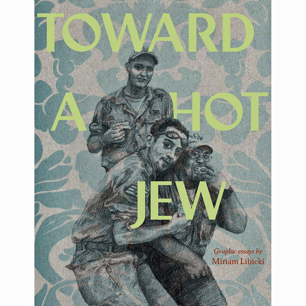
Toward a Hot Jew collects seven of Miriam Libicki’s graphic essays or, as she refers to them in subtitles, “drawn essays.” Though her subjects are overtly political, her shifting styles happily produce little resemble to the genre-defining comics journalism of Joe Sacco. Libicki instead achieves her own hybrid, non-fiction subgenre, one that interrogates both her stated topics and the comics form in general.
Only two of the essays—analyses of Jewish influences on autobiographical comics and the relationship between Jewish and black identity—resemble traditional comics.

Not only does Libicki subdivide their pages into (usually) traditional panel layouts, she renders their images in the simplified and slightly exaggerated style of cartooning, including a speech-balloon-trailing version of herself who address readers through the fourth-wall of the page.

Libicki, however, distances herself from her own representation, noting in an arrow-shaped, Magritte-alluding caption box pointed at her cartoon self: “(This is not Miriam Libicki. You are unlikely to recognize Miriam Libicki on the street, with these drawings to go on.)”
![]()
Even if she did not literally draw attention to her artifice within the essay, its placement within the collection achieves the same result. In the two essays prior to her cartoon self’s first appearance, Libicki already rendered herself in an impressively naturalistic style.

She also appears briefly but in equally vivid detail in two later essays. While I don’t know if I would recognize her on the street based on these images (I suspect I would), the contrast is pronounced.

These self-portraits appear in essays that also avoid the panel layouts of traditional comics. Four of the seven essays instead devote each of its pages to single images, with text variously positioned around it. The title essay consists of pencil portraits of figures floating in context-less, white backgrounds.

The photo-based images far exceed the realistic detail of most comics, nonfiction or otherwise. Three other essays retain the one-to-one image-to-page ratio, but expand the visual range with watercolors and colored lettering—a further departure from traditional comics.

Libicki’s essays then champion multiple approaches by avoiding a single, dominant style. They range between nine and forty-five pages, but their effect is also accumulative, one emphasized by the absence of a table of contents. Splash pages mark each essay’s opening, but the divisions are otherwise fluid, promoting continuous reading. The chronological ordering also creates a longer narrative effect with evolving portraits of both Israel and Libicki herself. The first essay, one of the collection’s shortest, features her in art school in 2003, experimenting with single images broken into panels that both conform to and undermine the comics convention. “Ceasefire” recounts in a diary-like fashion her week-long visit to Israel at the end of the Lebanon war in 2006. She returns two years and twenty-four pages later in “fierce ease,” reprising her watercolor portraits of interview subjects, mostly friends and relatives, who speak in speech bubbles interspersed with Libicki’s narration overlaid on backgrounds. “Strangers” continues a similar approach, but with a greater emphasis on collaged texts.
Libicki quotes extensively in other essays too, even the two traditionally comics essays, providing one of the collections’ few consistencies. She also often embeds her process into her final products. Midway through “Strangers” she writes in a dated, diary-like entry: “But I’ve been doing all of this research about tensions around Jewishness and Blackness! And Lisa prophesized this four years ago! This has to be what my next drawn essay is about.” And of course it is. “Jewish Memoir Goes POW! ZAP! OY!” even includes a redrawn and resized version of a page from the preceding essay, now to express an autobiographical fact: “I write all about Israel, but they can’t show my drawn essay at the local JCC because ‘my love for Israel is not evident,’ and I’d break the Holocaust-survivors’ hearts.”
While her subject matter is almost always Israeli society, most especially critiquing racist attitudes toward black Jews, Libicki also indirectly portrays the stages of her own evolving self: suburban child, grad student, fiancé, mother, art instructor. But as babies appear on her lap and hip—each rendered in the naturalistic or cartoonish style of that page’s Libicki—the author is always foremost a journalist interrogating Jewish identity. When her content is most didactic, she chooses traditional comics forms, literally lecturing about semiotics and Orientialism, complete with quotations from Edward Said, Gayatri Chakravorty Spivak, and Cornel West.

The title essay is equally argumentative in its analysis of the changing sexual perception of male and female Israeli soldiers, but the effect is lessened by its disembodied text: no cartoon Libicki peers out from the page to lecture in talk balloons. While Libicki finds cartoons and panel layouts conducive to clear conclusions—she advocates for “radical empathy” and “alter-alterity” in the final essay and argues for the superiority of “hyper-self-consciousness” in “gonzo aesthetics” in the fourth—her one-page watercolors favor a much less didactic approach. Her visits to Israel instead evoke uncertainty: “The only conclusion I have is that no matter how I try to relate to Israel—tourist, former resident, or journalist—I’m mostly an outsider who can’t really understand.” After recounting the endemic mistreatment of Sudanese refugees, she concludes only with questions and self-criticism: “But what can I do? I sign a digital petition, hold my Canadian baby, and read my twitter.”
The undertone of self-doubt, as well as Libicki’s interview method, begins with the opening essay as her fellow students’ attempt to explain “why they wanted to be artists.” The fragments include missed introductions, drunken exhibitions, distracted kissing, impractical visions, illegible instructions—ending with Libicki’s own regrets over unusable interviews and her inability to imitate Joe Sacco. The failure of course is paradoxical. Had Libicki succeeded in reducing herself to a knock-off Sacco, Toward a Hot Jew would not exist and comics journalism, as well as comics generally, would be less for it.

[The original version of this and my other recent comics reviews appear in the comics section of PopMatters.]
Tags: Miriam Libicki, Toward a Hot Jew
- Leave a comment
- Posted under Uncategorized


