Monthly Archives: April 2020
30/04/20 The Hard Tomorrow is an Easy Read for Today
Eleanor Davis has tackled the graphic novel.
Not that she needed to. Her last three graphic works were already significant accomplishments. Her 2014 How To Be Happy is one of the best collections of graphic short stories (most run about twelve pages) by a single author I’ve read. Her 2017 You & A Bike & A Road takes nonfiction comics to a new, diary-driven level. And her 2018 Why Art? is 157 pages of metafiction, technically five pages longer than the newly released The Hard Tomorrow, but Why Art? has only one panel per page and fits in the palm of my hand.
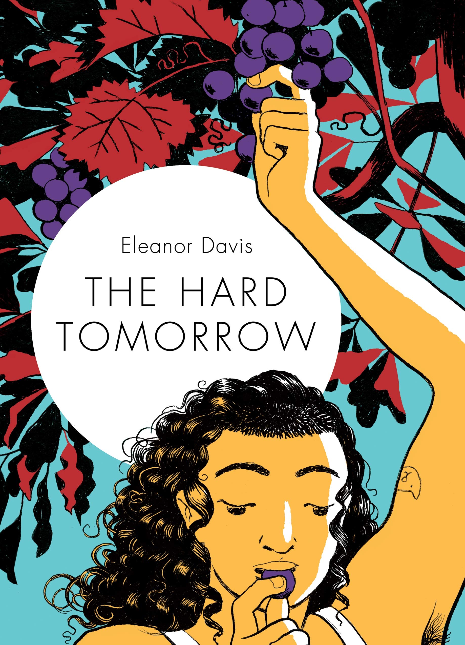
The Hard Tomorrow is a full-sized and full-fledged graphic novel, complete with a main character, supporting cast, and plot points galore. (If you think it’s odd to list those qualities, then you need to read Why Art?). Davis made a pdf of the opening chapter available for purchase on her website in 2018, so I’d been in happy suspense for a while. Will Hannah get pregnant? Will her pothead husband ever build their house? And just how serious is Hannah’s infatuation with the mysterious Gabby?
There’s a political protest group too, and a sweet old lady whose days are surely numbered, and what’s with that weirdo with all guns in the woods, and the female cop with a sense of humor and riot gear? Like I said, plot points galore, but approaching The Hard Tomorrow from the same plot angle you would a movie or TV show is to miss the best parts. It’s a comic, and like other great comics, it tells you how to read it while you’re reading it.
Davis likes three-row layouts. That’s not unusual. It’s the most common layout in contemporary graphic novels. Davis also likes to accent key moments through panel size. Big moments are literally bigger. How big varies: a full-width row, a full-width double row, a full page, a two-page spread. Size matters. When Johnny exhales from his weed pipe, the cloud fills a full-width panel, dwarfing the surrounding panels only half its size. We know Johnny’s smoking is a problem not because Davis tells us (the page is almost wordless), and not even because she draws it, but because she uses layout as a way of making meaning.

Some of the effects are common, even filmatic, like the panorama of Hannah and Johnny’s personal trailer park in the woods in a double full-width panel. Davis is establishing the setting as a director might. But when Hannah glimpses a baby from her car window, Davis draws a face-to-face double portrait of mother and child in the same sized panel. The viewpoint must be Hannah’s, but the proximity and detail is impossible from that moving distance, and so the oversized image is also a window into Hannah’s psyche. Of course she runs a stop sign.

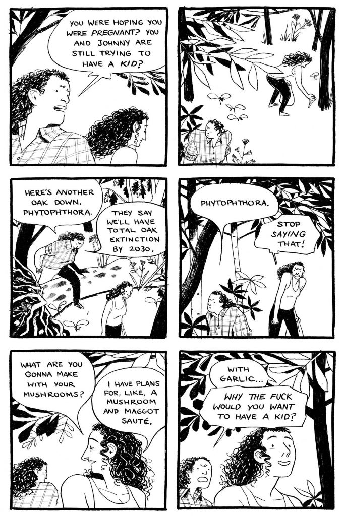
When Hannah and Gabby are picking wild mushrooms together, Davis provides another panorama-like panel of the tenderly detailed woods, but then the next double full-width is an overlapping double portrait of Hannah and her best friend, a lesbian who seems to have the same unstated feelings as Hannah. Oh, and that verpa mushroom stem that Gabby is showing Hannah looks exactly like a vagina. Davis completes the scene arc with a third same-size panel when Hannah loses her temper because Gabby criticized her for wanting to get pregnant. Hint: Gabby’s concern might not really be about the declining state of the planet.
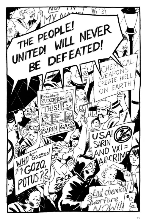
Davis goes even larger for the protest scene. The day march received a full-page panel crowded with hand-scrawled signs and thick-lettered shouts, but the night protest (a co-organizer was arrested and charged with terrorism) earns the novel’s first two-page spread. After breaking the three-row norms for a few pages, Davis returns to her base layout and double full-width accents of a cop cuffing a protestor facedown on the pavement and then Gabby bulling over the cop in a tableau reminiscent of Frank Miller’s Batman. Though Davis is no superhero artist, her stylized proportions aren’t so different, and here she’s working in the same stark black and whites as Miller does in Sin City. The damsel Gabby is saving of course is Hannah.

At this point we’ll be wandering into spoilers, so I recommend stopping here and reading The Hard Tomorrow for yourself. Though never romantically together, Gabby and Hannah’s break-up scene is one of my favorite pages in the novel. Instead of accenting with size, Davis goes the opposite direction and culls away content from the interiors of the three cascading panels until the two characters are just a set of thin lines in white space. Of course the characters are always sets of lines in white space, that’s what it is to be a character in this and most comic, but usually an artist lulls her viewers into forgetting that we’re looking at drawn images and not some impossible film footage from a cartoon dimension. Leaving an image incomplete inside a frame breaks the convention that panels are windows into other worlds. The incomplete image is another psychic window into Hannah.
There’s a whole other side plot with Johnny and his weirdo best friend. As lame as Johnny is, Davis rescues him with his refusal to fire his buddy’s gun at a female mannequin. This is after a full-page panel of Johnny holding the disturbingly detailed weapon in his hands, an image that communicates almost erotic desire. When he fires it into the air instead of at the target, the full-page panel is mostly white space. It’s a good moment, followed by a more disturbing one since what goes up must come down. The novel’s second two-page spread is mostly white space too, with Johnny isolated on one side of the page gutter, and his dead friend crumpled on the other.
Manslaughter, riot police, alleged terrorists, lesbian adultery—if this is sounding melodramatic, it’s not. In fact, Davis’s most interesting narrative move is her eventual rejection of drama and narrative. When Hannah and Johnny reunite after their travails, there’s the requisite fighting and, yes, she finally articulates her earned frustrations with him, but then Davis largely abandons the plot. Not just that plot, but all of the plots.
Time and pacing jerks forward to winter and pregnancy and then there we are in hospital for the birth. Davis devotes ten pages not to standard birth-scene pushing and wailing, Hannah’s or the baby’s, but to the moments afterwards. For five consecutive two-page spreads, the newborn sits on Hannah’s lap, effectively the reader’s lap from the angle Davis draws. The baby opens its eyes. The baby turns its head. The baby turns its head again. For ten pages. Time is revolutionized. The preceding nine months only received eight pages, because these few seconds are literally bigger.
Unbuilt houses, political unrest, romantic intrigues, everything else is so tiny in comparison. Everything else is just plot. Davis shows us what matters.

[A version of this post and my other recent reviews appear in the Books section of PopMatters.]
Tags: Eleanor Davis, The Hard Tomorrow
- Leave a comment
- Posted under Uncategorized
27/04/20 World Pandemic Leads to Minor Breakthrough in Comics Theory
The one benefit of Virginia’s and Pennsylvania’s CV-19 lockdowns: daily study halls with my son at our dining room table. He’s a first-year at Haverford and would normally be enjoying his classes up in Philadelphia, and I’m on sabbatical and would normally be wallowing in the too-quiet empty nest of our house. I feel a kind of Monkey’s Paw guilt about the pandemic, since I had been not-so-secretly wishing my son were still living at home when the world as we knew it came to an unexpected end. Now Cameron and I can procrastinate on our laptops at opposite corners of the same table.
That includes my sliding this image across to him and asking:
“What order would you view these panels?”

It’s a page from Matt Baker’s “Sky Girl” in Jumbo Comics No. 83 (December 1945). I’m writing on Baker for Qiana Whitted’s collection Desegregating Comics: Debating Blackness in Early American Comics, 1900-1960. My chapter isn’t due till August, but like I said, sabbatical. Also, Matt Baker’s layouts are pleasantly insane. The content is too (note the so-called “Good Girl” art, including the impossibly small feet, impossibly thin waist, and impossibly long legs of the panel five figure), but my analysis is (mostly) of his disruptive viewing paths.
Which is why I wanted to see how Cameron navigated the page. According to Neil Cohn, who has done some of the most thorough analysis of viewing paths, viewers follow eight protocols:
-
- “Go to the left corner.”
- “If no top left panel, go to either the highest and/or leftmost panel.”
- “Follow the outer border.”
- “Follow the inner border.”
- “Move to the right.”
- “Move straight down.”
- “If nothing is to the right, go to the far left and down.”
- “Go to the panel that has not been read yet.”
But those don’t really explain Baker’s page. Numbering the panels according to the order determined by their content gets you this:

Comics theory doesn’t have much in the way of terminology for describing viewing paths. This page, like essentially all of Baker’s pages, follows an underlying Z-path and so the assumption that the images are arranged in rows rather than an N-path’s columns.
But that doesn’t explain the leap from panel 3 to panel 4–especially the unusual way it requires viewers to skip the not-yet-viewed panel 5. I’m calling that a “parallel saccade.” A saccade is the quick eye movement that usually happens at the end of a row and the start of a next row. A Z-path saccade usually moves diagonally left and down, but Baker’s instead moves in a parallel line.
Getting from panel 5 to 6 is easy enough, but it requires moving from right to left–the exact opposite of Z-path norms. I’m calling that a “reversed path,” because, well, that’s the most obvious name I could come up with. (If you have to coin a new term, you should make it as usefully self-evident as possible.)
Then moving from panel 6 to 7 requires another leap, this time over part of an image that has already been viewed. I’m calling that a “segment leap,” because the leap occurs not as part of a saccade (where it’s normal) but within the progression of a row, which is a kind of segment (allowing at least the theoretical possibility that it could happen within a column segment too).
Baker uses these three (and a couple more) disruptive techniques routinely. That’s why writing his chapter has been so much fun.
So when I slid my computer screen over to Cameron’s corner of the table, I thought he was going to get gummed up and have to pay careful attention to the image content, stopping and backing up a couple times to navigate the right order. But he didn’t. He got it on his first try, and it only took a few seconds, pausing only slightly at those three trouble spots. Which prompted my next question:
“How the hell did you do that?”
I was lucky that I got to watch him, because it was clear that he was doing something holistic and intuitive. Baker’s atypical techniques were virtually no challenge. Which suggests that Cohn’s protocols are missing something. Rather than assessing order according to the arrangement of entire panels by following frame and gutter edges, viewers seem to be doing something both simpler and more effective.
Cameron just attended to some small portion of each panel and ignored the rest. When placing numbers in my diagrams, I tried to approximate the geographic center of each, assuming centers are important. But apparently they’re not.
Look what happens when I instead delete everything but the top left corner of each panel:

All those weird Baker techniques vanish.
But look at what happens when I delete everything but the bottom right corners:

The confusion intensifies. 1, 2, 4, 3, 6, 5, 7 makes no sense. Which suggests that viewers don’t care about the supposed exit area of panels, only their top left entrance points. This rejects comics theorist Theirry Groensteen’s claim that a viewer’s eye “always arrives … from another point situated within the” viewing path and an “exit is always indicated, pointing to another” panel. It does’t matter where the image ends. A next panel is determined by the entrance area of the current panel.
I tested the approach on a few more Baker examples. These three pages combine some of his techniques for some particularly odd moves:

But entrance-order clarifies them:

All but the last two panels in the second diagrams, because it’s not clear if highest or leftmost gets ordering priority.
So this approach will still need some testing and de-bugging, but I think it does a better job of explaining what comics viewers actually do when navigating a page. When I showed this all to Cameron while we were still sitting at the table (a new chapter of his favorite blog novel had dropped that morning, so progress on his math homework was appropriately slow), he asked:
“So are you going to give me credit for this?”
Yes. I hereby name the system for navigating panel order according to image entrance areas:
Cameron Corners.
- Leave a comment
- Posted under Uncategorized
23/04/20 Making Comics Isn’t Really About Making Comics
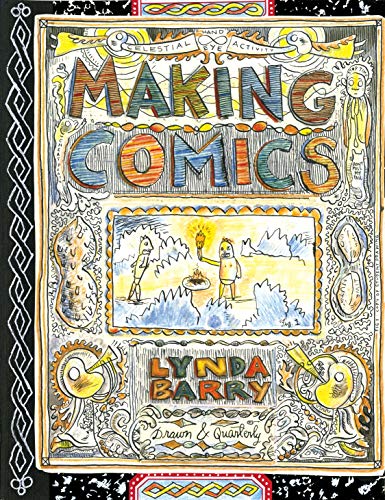
There’s a reason Lynda Barry is the first comics artist to win a MacArthur “Genius” Award. Though I’ve been her fan for years and have taught her graphic memoir One! Hundred! Demons! in my classes, her excellence in the comics form does not place her above the many other equally excellent comics creators out there. Barry is also an extremely well-regarded educator who has developed an idiosyncratic pedagogy for comics, but even that doesn’t distinguish her from other great comics artists with equally impressive teaching creds.
What does make Barry such a deserving comics “genius” doesn’t have much to do with comics. I don’t know if the MacArthur Foundation received advanced copies of Making Comics (it was released last November, after the MacArthur announcements) and though I’m sure Barry would have won the award without it, Making Comics is all you need to understand why the foundation selected her.

If you’re at all familiar with her past work, you’ll recognize the book as a Barry book at a first glance. Like its predecessor, Syllabus (2014), Making Comics is printed to look like a classroom composition notebook, complete with a center-stitched binding and lined pages. It also looks like a one-of-kind, as if you’ve stumbled upon the only existing, hand-drawn copy that Barry physically made herself. The effect is emphasized by her doodle-like aesthetic that incorporates not only her loose, first-and-only-draft style of cartooning, but also the abstract shapes etched along the page edges as if she had pored over the notebook with the daydreamy meticulousness of an actual doodler. Every page is wonderfully crammed. There’s even a revise-as-you-go quality since some of the hand-written text includes cross-outs and insertions, details we would normally register as mistakes but here are integral elements not only of the artwork but of Barry’s larger vision.
Once you start reading (and it’s a surprisingly word-heavy book), you’ll realize you’ve entered a document made from an actual classroom. Some of the opening pages could be the handouts students receive on the first day of the semester, and later pages could be the assignments passed out at each meeting afterward. They include: drawing quickly, drawing with your eyes closed, drawing with your non-dominant hand, drawing with both hands simultaneously, drawing in tandem with a partner, drawing fragments with multiple partners, drawing images out of coffee stains and scribbles. It’s more than exercises though. Barry provides her personal, free-form lectures too, taping in drawings by former students (some of them rescued from discards on the floor), to create as an immersive a document as physically possible.
If you can’t take a class with Barry, Making Comics is the next best thing.
/cdn.vox-cdn.com/uploads/chorus_asset/file/19582582/MAKINGCOMICS.interior44.jpg)
But what kind of class is it?
The odd thing about Making Comics is that it’s not really about making comics. That’s not a criticism. If you’re looking for a how-to textbook on the comics form, there are plenty already out there (Scott McCloud’s even has the same title.) And (full disclosure) I’m in the process of co-authoring one of my own based on my own comics class to be published next year. Not surprisingly, I think mine significantly improves on all the others (otherwise why write it?), except for Barry’s because Barry’s isn’t ultimately a how-to textbook. Yes, it takes the form of one, and, yes, an instructor could teach a class following its daily assignments, but the results and, more importantly, Barry’s deeper concerns are not about comics. Comics are just a handy medium, one that has been so widely denigrated as bad art, lowbrow art, and non-art that those connotations align with her project of freeing her students from false assumptions about the nature of “art” and the importance of making it for themselves.
As a professor, I was delighted by the specificity of her approach, down to the minutia of her attendance policy (you’re damn right three tardies equal an absence), but those details serve a bigger purpose. Readers aren’t getting graded. What they are getting is an immersion into Barry’s philosophy of art and (this is going to sound a bit grandiose but I’ll say it anyway) life. Barry teaches us how to be better people by teaching us how to see and think and draw like children again.
She loves children. Making Comics is a love letter to every child who ever picked up a crayon and started making marks with unselfconscious intensity. Those children include her college students. Like her readers, some arrive at class with artistic training and some arrive with none at all. Essentially all arrive having long forgotten the uninhibited style of image-making they understood instinctively as children. Finding each of those children is Barry’s mission, and she is very very good at it.
I’ve read a lot of writing and drawing textbooks, and Barry’s is the only that has made me choke up with emotion. About a quarter into the book, she writes:
“Not a single drawing or line of my handwriting survived my childhood. I sometimes wonder if that’s why I hang onto the drawings my students leave behind. They are so alive to me. They give me something in the way a song I love gives me something. I can’t explain. Sometimes I copy them. Sometimes I draw on them, color them, cut them out. Almost all the pictures in this book are rescued images by students.”
I am moved by the intimacy and matter-of-fact vulnerability of those words and the volumes of meaning and unspoken experience they gently paper over, especially how the opening verb “survived” is echoed in the closing verb “rescued.” Later she writes about a class exercise:
“Sometimes we may encounter strong feelings and unexpected memories. We are free to follow them or to turn away from them or to change them with fiction. Sometimes we become unexpectedly emotional when reading aloud. We are always free to stop or to have someone else read it for us. And unless someone asks, we let any classmate recover on their own, allowing them the choice of privacy in the presence of classmates who lend silent support.”
In class, Barry requires everyone to assume a pseudonym that replaces their actual name for the entire semester. Hers have included: Professor Hotdog, Professor Peanut, Professor Skeletor, and Hot Stuff the Little Devil. I’ll admit when one of her former students described this approach to me a few years ago, I found it both silly and a little off-putting, as though Barry were depersonalizing her classrooms. She’s not. Instead, she’s found a way of becoming more personal, of accessing the unnamed and unnamable parts of ourselves, rediscovering the tiny fingers that understood everything there is to know about a piece of paper and a pencil.
Barry wants to rescue us all.
Will Making Comics help produce the next MacArthur-winning comics artist? I seriously doubt it. I don’t even know if it will help produce any published comics. That’s not Barry’s goal. If that’s your goal, Making Comics probably isn’t the textbook you’re looking for. But you should read it anyway. Everyone else should too.

[A version of this post and my other recent reviews appear in the Books section of PopMatters.]
Tags: lynda barry, making comics
- Leave a comment
- Posted under Uncategorized
20/04/20 Quarantine Comics Presents
I’ve been spending way too much quality time with my laptop since the world as we knew it ended. It’s not the healthiest relationship I’ve ever been in, but it beats the dystopia of swerving around fellow masked shoppers in the aisles of my local Kroger. Lately I’ve been tinkering a lot with Zoom portraits, though they aren’t really portraits since the images barely resemble the screenshots when I’m done MS Painting them. I’ve also had an improbable number of comics and other visual art published online since the pandemic started.
From Big Other, “My Mother’s Ashes” is a sequential requiem for Judy Gavaler, who died two winters ago and so missed the horrors of CV-19 wiping out nursing homes like the one she was living in. She’d smoked since she was a teenager and then stopped a year before she died, literally the only benefit of having Alzheimer’s. This first image is a continent of her cigarettes:

From Dream Noir, “Galleries” started as snapshots taken in European art galleries while on vacation with my family. My son and daughter are in there, along with complete strangers. The framed artwork includes a lot of Schiele and Klimt, who I somehow both love and despise:

From Lumina, “Strips” continues the despise half of that art theme, distorting famous nude paintings and merging them with strip club signage:

From Abstract Magazine, “Lady Frankenstein (1971), No. 1-9” adapts a B-movie Italian film. I combined the images into a single page to include in one of my forthcoming books, The Comics Form, to illustrate how images are not necessarily viewed sequentially even when arranged in panels:

From Scoundrel Time, “American Descent” is a little older, published last October and created during the first three years of Trump’s presidency. The descent is the U.S.’s and also literally Trump’s as he descends here from that accursed Hollywood Access bus:

And my very latest publication from FishFood, these are a mishmash of one- and multi-panel images:

So clearly my laptop and I having been spending a lot of time together during my sabbatical, which then became a world sabbatical as we all hunker in lockdown.
- Leave a comment
- Posted under Uncategorized
13/04/20 Art, Babies, and All of Existence

The title of Sylvia Nickerson’s graphic memoir has at least three meanings: art, babies, and all of existence. Nickerson has lots of first-hand creative experience with the first two categories. She is a widely published comics artist and, according to Creation, the single mother of a child named Toby. Though the third category should be God’s handiwork, it’s not clear from the graphic memoir whether such an entity exist, and either way, most of the problems Nickerson sees plaguing creation appear to be human-made.

Though Creation opens with daily domestic scenes of mother and newborn, it’s not that kind of memoir. Nickerson’s view is more panoramic, taking in all of her home city of Hamilton, Ontario. That wider thematic focus is apparent even when her immediate attention is on herself. She draws herself and Toby and most other characters in an aggressively indistinct style. Technically the figures are cartoons, at least in the highly simplified sense, but though they are exaggerated too, it’s through atypical compression.
Rather than the giant heads of, say, Shultz’s Peanuts characters, Nickerson’s people are boiled down to a few curving shapes and a wash of interior gray barely discernable from the grays outside their nominal bodies. They have no fingers. They have no necks. They have no faces. But they’re not rough sketches either. Their bodies are lit three-dimensionally, with differing areas of shadow. It’s as if Nickerson is drawing naturalistic renderings of actual blob-like people.
But not always. She breaks form several times in order to provide a detailed portrait of an individual character. When she and her son look inside a dumpster, Nickerson draws the sleeping homeless person not only in a larger panel, but in reversed white on gray lines that detail his clothing. When a homeless woman asks her for money, Nickerson fills a panel with her carefully lined face. The woman’s name is Nancy, and she becomes the center of the memoir.

The differences between the two sets of characters, the realistic homeless and the blob-like privileged, establishes the book’s central dichotomy and critique. It’s not just that Nickerson portrays the two groups as different species. The homeless are human, and the privileged are subhuman.
Nickerson makes no exception for herself. Much of her memoir is a self-indictment. When it opens, she is a successful artist in a gallery on James Street, the front line of Hamilton’s gentrification battle. She hardly thinks about the people in the neighboring buildings whose rents are rising beyond their income as the real estate under their feet grows in value. Nickerson draws herself and Toby’s ever-present stroller parked outside a quaint, corner café, while a panhandler stands further down the block, across the street from an abandoned, window-shattered factory.
Though distant, the panhandler’s face is still a face, while Nickerson’s is featureless. Her visual approach reverses and so reveals her own psychological state at the time. Though content with her own dream-come-true art studio, she writes: “How could I ignore that this same place was where so many dreams had come to die?” The question is answered by her visual style. She refused to see homeless people as people, and now when drawn retrospectively, she is the one who appears subhuman because her willful ignorance lessened her.
Though she remains blob-like, Nickerson still explores aspects of her very real personal life. Single parenthood is a struggle. The mystery of her child’s father is evoked but never resolved. She would rather list historical and statistical facts about the city of Hamilton than about her missing fiancé and the circumstances of his leaving her and her newborn. His absence haunts the memoir, but Nickerson instead draws the now wavy-lined ghost of Nancy wandering the city after her unsolved murder roils the community into action, albeit short-termed and shallow. The memoir does not end with its central conflicts of homelessness and gentrification solved either.
It does end with other kinds of even slower, personal transformations though. Nickerson is expert at cyclical plotting, allowing certain events and images to repeat in a fractured order that offsets the memoir’s “broken” motif of shattered windows and emotional lives. She repeatedly returns to a moment preserved in a photo album when she and her fiancé were still together, posing with her parents before a scenic background. Though Nickerson reduces the scenery to nearly nothing, she draws her own suddenly detailed fingers holding th

e image, as if removing the panel from the layout to examine it more closely.
What does it mean that the implied author looking down from the reader’s God-like vantage isn’t the same blob as the “photograph” of her? I’m not sure, but it’s that kind of emotional thought experiment that underpins all of Nickerson’s vague yet-not-vague creation.
Ultimately the version of herself Nickerson portrays near the end of the memoir is a healthier version than the one at the beginning. They are also literally the same. Nickerson repeats the images of the opening pages—a blob mother changing her blob son’s diapers, giving him a bath, reading him to sleep—changing only the narrated words superimposed at their margins. She begins with the realistic but socially taboo complaints of an overtaxed mother missing her former professional life. By the end, that same mother is cherishing those identical moments, aware of how quickly they are passing. The effect is not that this new wisdom overwrites the earlier struggles, but that it exists with them simultaneously.
Perhaps parenthood is a little like James Street, an imperfect place filled with struggles and rewards and no clear end in sight.

[A version of this post and my other recent reviews appear in the Books section of PopMatters.]
Tags: Creation, Sylvia Nickerson
- Leave a comment
- Posted under Uncategorized
09/04/20 The Ungentle Art of Gina Siciliano
There’s something intellectually delicious about a graphic narrative about an artist. While there are plenty of other kinds of self-referential visual art that literally draw attention to their own compositions, graphic narratives also provide a useful counterpoint to what can otherwise devolve into art-for-art’s-sake navel-gazing. There’s a story. There’s a constant forward-pushing narrative-drive urging readers to keep reading, to not pause over each picture but to glean the necessary information and turn the page to see what happens next. But the viewer in me still wants to pause, wants to study the paradoxical crosshatches that combine to form the figure of an artist seemingly drawing herself.
If you’re like me and so are no scholar of Renaissance painting, you may not have heard of Artemisia Gentileschi. At first glance I thought the name was the author’s invention (“Gentle Art”?), a fictional artist inserted into a metafictional history. Happily, the artist is quite real, and I am now one degree less ignorant thanks to the also quite-real artist Gina Siciliano.
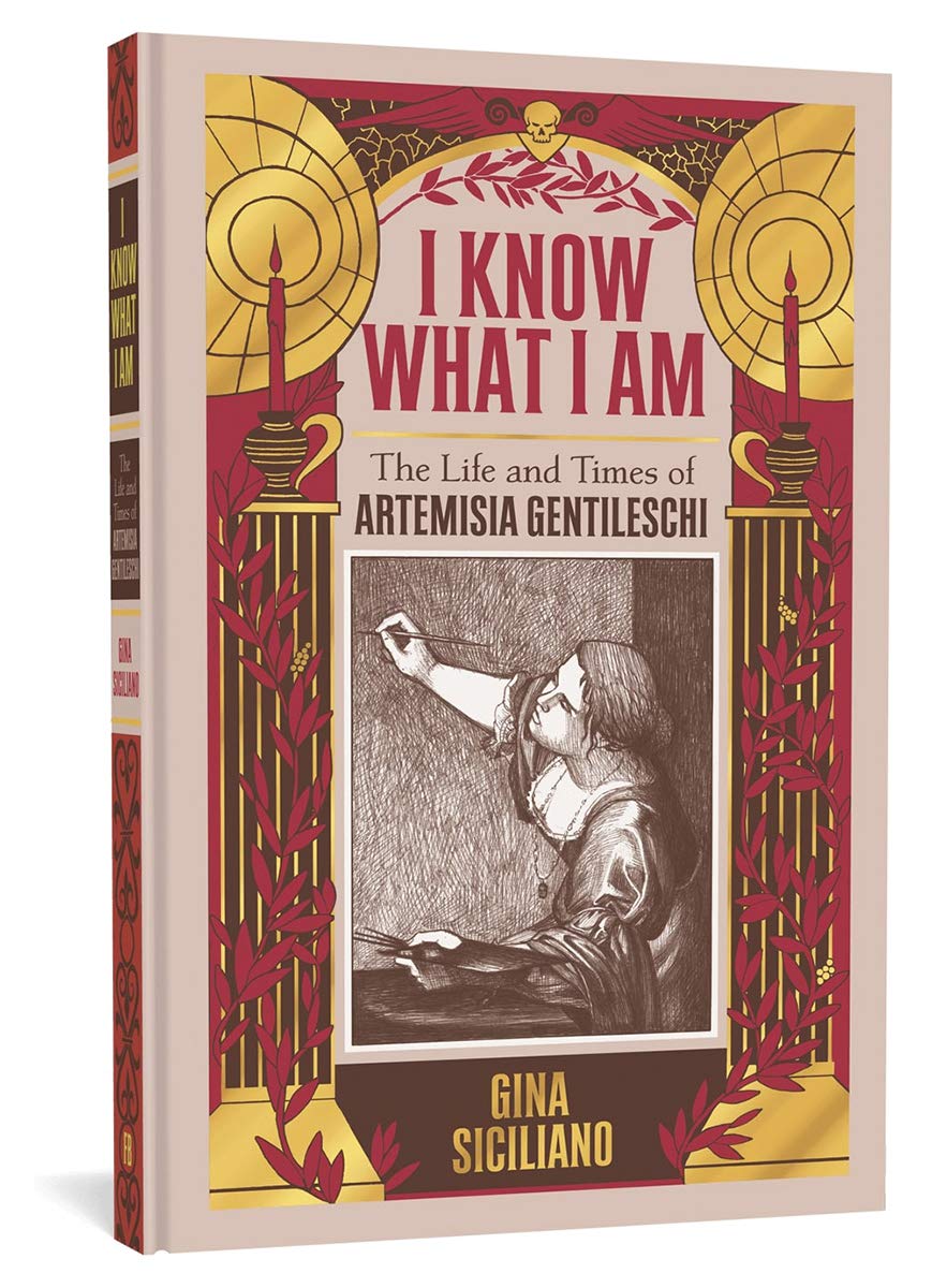
I Know What I Am is a formidable work of comics scholarship, including fifty pages devoted to detailed notes and bibliographic sources. The notoriously research-obsessed comics writer Alan Moore may have a rival. And since Nick Sousanis’ Unflattening earned him a PhD from Columbia University, Siciliano should be eligible for a similar degree.

Siciliano opens with a title-page recreation of Gentileschi’s painting Judith Slaying Holoferness. It’s an extraordinary image: two women overpowering a man and slicing through his neck with the determined diligence of a slaughterhouse crew. If you look at the original, you’ll see Siciliano’s recreation is remarkably similar.
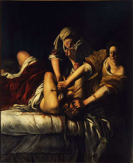
Of course instead of blended oil paints, Siciliano combines the tiniest of pencil marks into areas of near blackness, suggesting an exceptionally meticulous process. But there’s something else, some difficult-to-name difference in the slightly less detailed faces, how the unmarked areas of the page bring out an emotional nuance, the teetering difference between indifferent triumph and triumphant indifference.
It’s difficult not to read Siciliano’s own experience into that edge of difference too, since her preface opens with her first viewing the painting and how it initiated the entire book project. It also centers on Siciliano as a survivor of sexual abuse viewing Gentileschi as a rape survivor. Perhaps fearing a #MeToo backlash, Sicilian foregrounds what others might regard as her bias and aims for transparency, explaining: “That is why there’s a lengthy notes section at the end, so that readers can trace all my decisions if they want to.” I trust Siciliano’s viewpoint but appreciate the notes all the same.

Even if you’re not inclined to interrupt the narrative flow by flipping to the back of the book every time you glimpse one of Siciliano’s recreations or wonder about the historical basis of an event, her scholarship is embedded in her art. Below her penciled copy of Judith Slaying Holoferness she draws the words: “ALL LOWER-CASE LETTERS REPRESENT QUOTES FROM SOURCES LISTED IN THE NOTES SECTION AND BIBLIOGRAPHY IN THE BACK.” The juxtaposition is brilliantly peculiar, a righteous beheading coupled with a scholarly disclaimer. It is a fitting introduction to the hybrid narrative that follows.
Hopefully my extended attention to a single image is fitting too, since it echoes Siciliano’s approach. The graphic narrative opens with Artemisia’s father viewing Caravaggio’s newly painted The Calling of Saint Matthew in 1600, using it as the organizing principle for the first fifteen pages. Artemesia doesn’t make her first appearance until page eighteen, and her second until twenty-four. Instead Siciliano traces the crosshatching histories of Rome’s Counter-Reformation through the figures of philosopher Giordano Bruno burned alive for heresy, Beatrice Cenci publicly executed with her family for orchestrating the murder of her brutally abusive father, and Caravaggio whose improbably complex and violent life is an extended side note to the influence that the renown painter had on Artemisia’s father, a struggling painter who eventually trains his daughter in his craft.
When it comes to motivations, Siciliano is carefully circumspect with probabilities while also constructing plausible paths. She answers the most central question, “Why would Orazio teach his only daughter the secrets of his trade?,” with a rhetorical question: “Was it because his sons simply did not show the technical ability, creative drive, and commitment she did?” The implied answer is of course yes. Flip to the notes for this pivotal page, and you’ll learn instead about the church transept Siciliano recreates in the image background. That juxtaposition describes the biography’s overall approach, meticulously rendered visual scholarship coupled with highly educated invention.
Siciliano is also spinning a story. While painting her first masterpiece, Susanna and the Elders, the teen Artemisia must also escape the abusive attention of multiple male characters plotting against her. The first of the book’s three parts closes with a closing door, as if Siciliano refuses to invent the visual details of her heroine’s rape. But she then illustrates the court transcripts, disturbingly explicit in lower-case font, at the start of the next section.
The trial is lengthy, involving pages of witnesses and cross examinations, as well as the gynecological testimonies of two midwives and the repetition of Artemisia’s testimony while being tortured. Part three opens with her rapist’s banishment and her hastily arranged marriage to her patron’s younger brother, a painter she had never met. Children, commissioned paintings, romantic intrigues, sword fights, and more court scenes follow as Siciliano’s scope widens to include Galileo, the eruption of Mt. Vesuvius, and the 1647 political riots in Naples.
The six decades of Gentileschi’s life are too rich to summarize here, but one detail especially resonates. Before the trail and at its conclusion, Siciliano recounts how Artemisia emphasized the connection between two women of different social classes bonding together to kill a tyrant enemy in the frontispiece painting, Judith Slaying Holoferness. That division-crossing bond suggests Siciliano’s own connection to her subject matter, as the two artists seemingly work together across centuries to construct, image by recreated image, fact by researched fact, a moving biography and cultural history of early 1600s Rome.

[A version of this post and my other recent reviews appear in the Books section of PopMatters.]
Tags: Gina Siciliano, I Know What I Am: The Life and Times of Artemisia Gentileschi
- Leave a comment
- Posted under Uncategorized


