Monthly Archives: August 2022
29/08/22 Integrating Color into Color-blind Comics Theory
In his 2011 “Black & White to Color and Back: What Does It Mean (not) to Use Color?” Jan Baetens observes: “a global theory of color in the comics field is still missing” (111), resulting in “color-blind” scholarship where “color is either neglected or seen as a less essential feature” (112).
Patrick Johnston in his 2016 dissertation, Working with Comics: Labour, Neoliberalism and Alternative Cartooning, observers similarly that comics studies “currently offers little in the way of analysis of comics’ use of colour” (113), but that “a full integration of colour is necessary” to understand “the specific nature of individual comics” (153).
When Leigh Ann Beavers and I published Creating Comics in 2021, we left out all discussion of color and included only black and white images in the anthology section. That was mainly for practical reasons: color is more expensive (a point Johnston explores in depth about the comics medium). I just published The Comics Form, and though my analysis of transparent and non-transparent images applies to color, I don’t discuss color directly.
I’m in the early stages of a new book now, The Color of Paper: Representing Race in the Comics Medium, and so I’m starting to address Baeten’s “color-blindness.”
Working toward the integration of color into comics theory, Johnston asserts that black and white images are inherently more “abstract,” meaning they convey less verisimilitude than do color images. For corroboration, Johnston cites Lindsay Smith who describes black and white photography as an “incomplete, or intermediate stage of representation which can but suggest mimesis even with its glaring lack of coloration” (149). Also citing Scott McCloud’s claim that “colour will always look more ‘real’” (141), Johnson concludes that “Black and white comics are, of course, an abstraction” too (142).
Smith, however, is analyzing photography, where the level of verisimilitude-producing detail is the highest possible, including for color. A black and white photograph is more “abstract” in contrast to a color photograph because its lack of color is the most non-realistic quality of either image.

The same is not necessarily true of drawings. A color drawing and a black and white drawing may share a range of non-realistic qualities, many much more “abstract” than lack of color. If the black and white image is rendered in a photorealistic style and the color image is a cartoon, viewers will likely perceive the black and white image as significantly more “real.” Color is not determining.
Bill Sienkiewicz’s and Steve Ditko’s renderings of Kingpin are a clear example:

The challenge stems partly from the ambiguity of the term “color,” which encompasses a range of techniques and, more importantly, effects, some significantly more verisimilitude-producing than others. If a black and white photograph were colorized with discrete shapes of solid colors within the limited palette range of the four-color separation process that dominated twentieth-century comics, the effect may instead be an increase in abstraction due to the non-realistic colors contrasting with the other realistic details. Andy Warhol spent much of his career exploring that contrast. His Marilyn, Prince, and other photo-based series feature blocks of vibrantly incongruent colors added to black and white images for non-realistic effects.
At minimum, McCloud’s claim that “color comics will always seem more real” needs to be divided into kinds of “color comics” (192). While it’s obviously true that we “live in a world of color, not just black and white,” it is also true that we do not live in a world of “flat-color,” where “bright, primary colors” are “held by bold, simple outlines” (189, 187). Baetens describes the “‘clear line’ aesthetics” of many bandes dessinées similarly, noting that “color never blurs the black contour line, which remains always perfectly visible” and “is always monochromatic inside the surface delineated by a contour line” (2011: 117). Baetens, however, does not assess the relative verisimilitude of color hues in relation to their resemblance to the hues of the subjects they represent. What Baetens describes as “monochromatic” and McCloud as “flat” applies not to hues but to how hues are applied, or what we might term the color units.

Though acetate color printing is a mechanical form of pointillism, because variously colored dots are identically spaced in combination with the surface color of the paper to a create a single uniform color within each discrete area, those areas rather than the internal dots within them are experienced as the units of color composition. When a comic originally printed with acetate color is reprinted with digital color, those some areas are uniformly colored without the pointillistic combination of the original dot process.

When Milestone Comics produced its first comics in 1993, color artist Noelle Giddings used colored pencils and watercolors, and so the color units were pencil marks and brush strokes. Though the units combined for unified effects, the colored areas within black contour lines contained gradations independent of the area-delineating black lines.

Milestone’s printing process produced more realistic effects compared to traditional acetate printing because, to paraphrase McCloud, we live in a world of gradations, not just monochromes.
If a color image has small units of gradations, its overall effect may be realistic—provided its hues are also realistic. If a color image features small units of gradations, its overall effect may be realistic—provided its hues are also realistic. Terminology is problematic. The adjective “realistic” (like its synonyms “verisimiltudonous,” “mimetic,” “literal,” “transparent,” or its antonyms “abstract,” stylized,” “impressionistic”) describes a representational image’s resemblance to what it represents without indicating the basis of the assessment. Rather than providing evidence for a claim of realism, stating that an image is realistic because it has realistic qualities (such as realistic color) is a circular restatement. Though the terms are not more precise, for consistency I suggest “naturalistic” and “non-naturalistic” for assessing the qualities of representational color.
Color needs to be assessed along at least two spectrums. One spectrum refers to hues; the other to the amount of differentiated detail. Combining spectrums creates four combinations, ranging from most realistic (naturalistic hues in small gradating units) to least (non-naturalistic hues in large monochromatic units), with two opposite mid-points (non-naturalistic hues in small gradating units, and naturalistic hues in large monochromatic units).
The four can be represented by a 2×2 grid:

And that grid can be filled-in with examples from outside the comics medium:

The bottom left combination describes color photography, such as Lynn Goldsmith’s 1981 photograph of Prince).
The top right describes many works by Andy Warhol, such as his 1984 Orange Prince, in which the background and the singer’s face are uniformly colored an inhuman shade of orange. (I wrote about this series last year here, and the Supreme Court will be hearing an appeal this fall to determine whether Warhol infringed on Goldsmith’s copyright.)
The top left describes works in the comics medium that feature acetate color separation. Warhol’s 1962 Orange Marilyn is another example. Unlike Orange Prince, the Marilyn silkscreen has only an orange background, but the interior of the face is uniformly colored a light pink that roughly suggests the color of the actress’s actual face, and the area of the hair is uniformly covered gold that roughly suggests blonde hair. The hues fall on the naturalistic side of the spectrum, but their monochromatic application falls on the non-naturalistic side.
The bottom right combination of non-naturalistic hues applied in naturalistic gradations is less common in art, but is commonly achieved by photoshopping photographs. Since grays are colors, black and white photographs belong in this category too, including the one taken by Eugene Korman for the 1953 film Niagara that Warhol used for his Marilyn series.
Since these are spectrums and not binaries, many images fall between poles.

Shepard Fairey’s 2008 HOPE digitally adapts a photograph of Barack Obama (taken by Mannie Garcia for the Associated Press who later sued for copyright infringement before settling out of court). Fairey explains his use of non-naturalistic hues: “I wanted it to be a portrait that was political in nature and that would de-racialize Mr. Obama by using a red, white, and blue colour palette that was patriotic.” Fairey also reduced the photography’s facial gradations to four monochrome areas (red, blue, beige, and beige/blue) plus black contour lines and shapes outlining and punctuating the interior area. Traditional comics acetate coloring, like Warhol’s Orange Marilyn and Orange Prince, often feature only one interior skin color.
HOPE, while clearly using non-naturalistic hues, may fall between naturalistic and non-naturalistic units:

If naturalistic hues are all that matter when assessing color, then viewers would describe Orange Marilyn as more realistic than HOPE. If they instead describe the image of Obama as more realistic than the image of Monroe, then perceptions of realism must rely more heavily on naturalistic units than on naturalistic hues.
You tell me:

Or perhaps the contrasting hues and units cancel each other out to produce similar levels of overall realism?

- Leave a comment
- Posted under Uncategorized
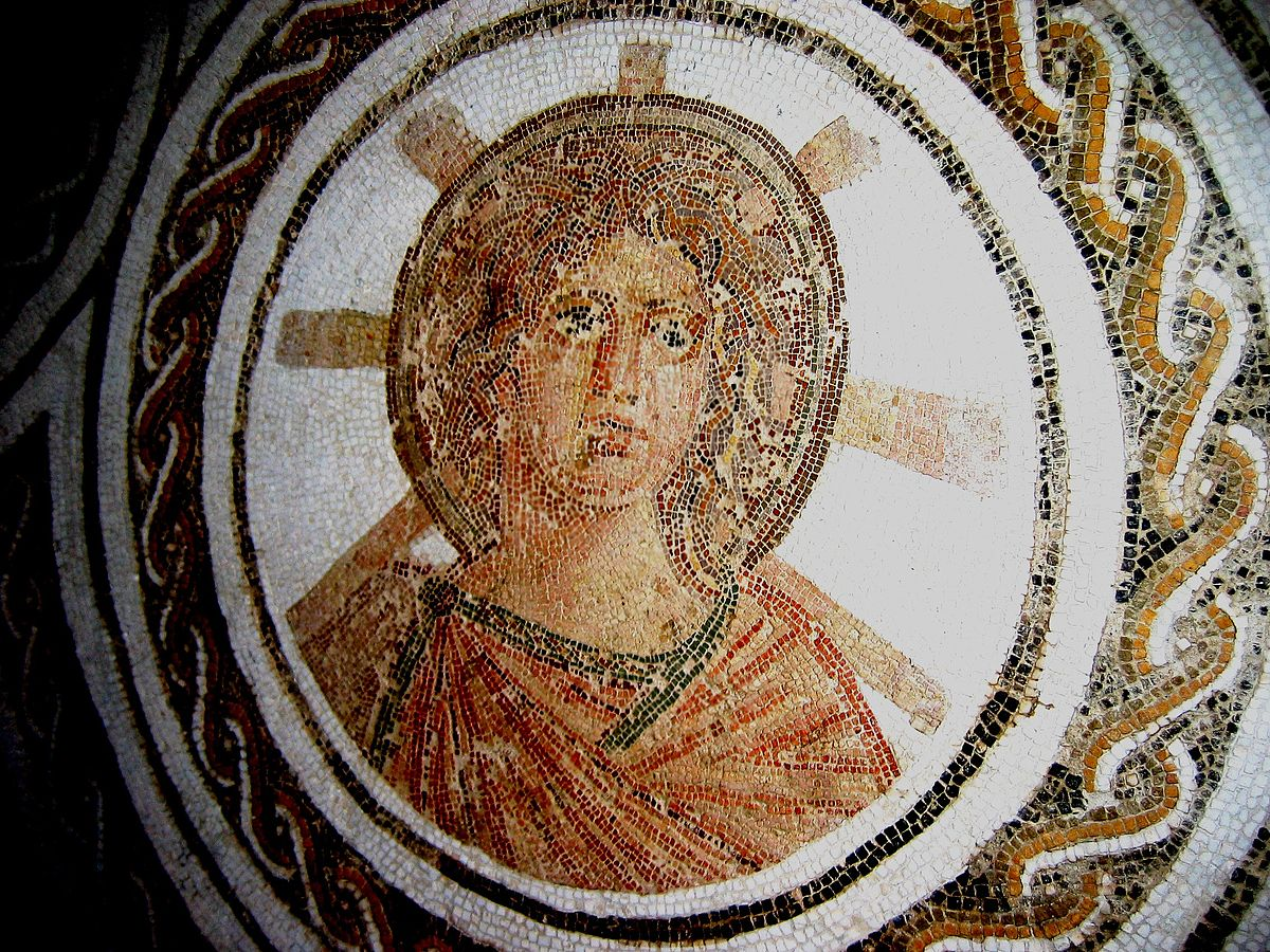
22/08/22 The Paradoxical Physics of Halo Emanata
Beetle Bailey artist Mort Walker coined “emanata,” presumably from the verb “emanate,” in his 1980 The Lexicon of Comicana. They are usually lines radiating from and so directing attention to an implied focal point. Cartoonists often draw emanata around a character’s face to “show emotion” and “reveal internal conditions” such as embarrassment or drunkenness, while emanata around nonhuman objects can suggest physical states including heat, odor, brightness, and “that something is spanking new” (Walker 1980: 28–9).
Since halos in religious iconography are a form of emanata, the practice dates to at least the Roman Empire with a circle and radiating spokes depicted behind Apollo’s head found in a second century floor tile:
Similar sunburst halos appear in Christian art, though later painters replaced flat opaque circles with three-dimensional rings floating above heads, as in Caravaggio’s 1605 Saint Jerome in Meditation:

Or with circular bursts of light emanating from behind heads, as in Francesco Podesti’s 1864 Apparition of Jesus to St. Margaret Mary Alacoque:

For his 1851 painting Washington Crossing the Delaware, Emanuel Leutze isolates Washington’s head against the brightening horizon for a radiant emanata effect that would not occur from other
angles.

Photographer Al Drago’s portrait of Donald Trump for the New York Times December 14, 2019 editorial “Impeach” arranges the president’s profile at the center of the presidential seal on the wall behind him, creating a circular halo intensified by the extreme blurriness of Trump’s head:

I briefly mention the above examples in The Comics Form, but because Bloomsbury could only allow me so many illustrations (I negotiated for higher than standard number, and then arranged multiple images within each numbered illustration to maximize visual examples), I’m providing them here for the first time. I’d also like to explore their representational norms further too.
Emanata aren’t part of the comics form (AKA, sequenced images) but they are a widely common convention of the comics medium. Halos are an even more widely common convention in single-image religious art. Emanata generally and halos specifically pose a question about representational transparency: is the visual element visible to characters in the depicted world?
Emanata in the comics medium tend to be invisible to characters, an odd paradox since each are composed of similar two-dimensional marks. Though Steve Ditko draws Spider-Man’s “spider senses” tingling, no one in the story world, including Spider-Man, can see the halo of emanata lines:

It’s less clear to me whether Apollo’s halo of emanata lines is diegetically transparent too, because it’s unclear whether the image overall is transparent. Do viewers understand not just the halo but all of the visual elements non-transparently, meaning non-literally, since any depiction of the god may be interpretive?

Drawing something that is non-physical as though it has physical qualities is of course paradoxical. But the rules for those paradoxes are themselves paradoxical. Herrad of Landsberg’s 1180 Hortus deliciarum includes an illustration of two haloed angels:

William-Adolphe Bouguereau’s 1899 Madonna with Child includes two halos too:

Though both pairs of halos denote the same thing, holiness, they operate as if by a different set of physics in each depicted world. Herrad treats them as three-dimensional objects, placing the angels’ spears either behind or in front of them, depending on the physical action. Bouguereau’s halos suggest different physical properties, appearing only in the background and so not obscuring foregrounded subjects (such as the Madonna). And yet the halos still have a physical relationship relative to each other, with the Child’s halo obscuring the Madonna’s halo, duplicating the figures’ physical positions but in some other quasi-physical plane.

Herrad and Bouguereau are divided by about seven centuries, so an evolution in representational norms is hardly surprising. It’s stranger to see competing norms within the same image.

The figure on the left has a three-dimensional halo, one that changes shape according to the perspective of the implied viewer. It follows the same rules of physics as a dinner plate attached to the back of the head. The figure on the right instead has a two-dimensional halo, one that appears to be embedded into the surface of the background rather then existing as an object in the represented world. If the figure turned his head, there’s no sense that the halo would rotate with it. That’s because the halo doesn’t promote the illusion of existing in the spatiotemporal moment as the other visual elements. If the figure continued moving to his left, the artist would have to create a new image with a new halo. That of course is true of the first figure too, but by depicting the first halo as if it were three-dimensional, the artist encourages viewers to imagine it behaving like other objects in the depicted scene.

Since both halos are non-transparent (no one in the scene can see either of them), the dinner-plate halo is more paradoxical because it is rendered in the style of diegetically visible objects. It’s striking that both exist on the same canvas–the ceiling of St. Mark’s Basilica in Venice:

My family and I visited earlier this summer (before I took an evening ferry to an adjacent island for the Invisible Lines comics convention). Construction of the church began around 1063, and the oldest mosaics are almost as old. Many were repaired after a fire in 1439, and many restored multiple times before and afterwards, so apparently only about a third of the mosaics resemble the original art.
Are the juxtaposed halo emanata a result of juxtaposed time periods? Or did the original mosaicist use both styles? I have no idea. But either answer is intriguing.
- Leave a comment
- Posted under Uncategorized
15/08/22 Cartoons & The Comics Form

The introduction of The Comics Form separates two often and easily conflated kinds of comics: things that are called “comics” because they are in the comics form and things that are called “comics” because they are in the comics medium. I try to give each a pretty straightforward definition:
- Works in the comics form are sequenced images.
- Works in the comics medium are works published and identified as a comic by an entity that identifies as a comics publisher.
I realize “entity” is an odd term, but it covers the range of possibilities: mainstream comic book publishers, literary journals that publish comics (like Shenandoah where I’m comics editor), mini-comics made on photocopiers, etc. (I ignore a fairly obvious technicality though: not everything published by a comics publisher is a comic. But since my focus is on the comics form, not the comics medium, I decided not to go down that and related rabbit holes.)
Dividing form and medium produces three subcategories:
- Works in the comics form but not the comics medium, which include all sequenced images not traditionally identified as comics.
- Works in the comics medium but not the comics form, which include single-image cartoons.
- Works in both, which include the vast majority of works in the comics medium.
Single-image cartoons have been the most overt stumbling block for producing a general definition of comics because they aren’t in the form but they are still routinely called “comics.” They’re also called “cartoons,” but that’s (primarily) a description of their style: simplified and exaggerated.
It doesn’t help that some “cartoons” are also sequenced images:

That’s by Politico‘s Mark Wuerker, who also edits the online magazine’s weekly selection of political cartoons. Since it’s divided into four sequenced images, it’s in the comics form. I would also say it’s in the comics medium, though the claim reveals a shortcoming of my above definition. Politico‘s “Cartoon Carousel” begins:
“Every week political cartoonists throughout the country and across the political spectrum apply their ink-stained skills to capture the foibles, memes, hypocrisies and other head-slapping events in the world of politics. The fruits of these labors are hundreds of cartoons that entertain and enrage readers of all political stripes. Here’s an offering of the best of this week’s crop, picked fresh off the Toonosphere.”
Wuerker’s description doesn’t mention the word “comics,” making Politico a cartoon publisher but not necessarily a comics publisher. Since Politico only publishes political content (the vast majority not cartoons), its cartoons are more specifically political cartoons, a kind of art that traditionally appears in newspaper editorial sections but not newspaper comics sections (AKA, “the funnies”).
But whether technically in the comics medium, Wuerker’s four-panel political cartoon is in the comics form. So is the Atlanta Journal Constitution‘s Mike Luckovich’s:

Or at least it’s in the comics form if you view it as consisting of more than one image. If you understand it instead as a single image of an elephant standing in front of two diegetically juxtaposed images–like a lecturing curator standing in front of two paintings in an art gallery–then it’s not in the comics form because it’s a single image.
I perceived it as three images because the two background panels are framed in a way that suggest a traditional comics layout, making the middle strip a gutter rather than, say, the white wall the images are hanging on. The rectangular panels are juxtaposed two-dimensionally, while the elephant (which of course is also juxtaposed two-dimensional since the entire cartoon is two-dimensional) appears to be juxtaposed three-dimensionally. Since there’s no diegetic space implied (Luckovich could have drawn the panel content instead as images on two TV screens, for example), I would call this an example of layout as a “secondary diegesis.” While all layouts are secondary diegeses, Luckovich makes that explicit by drawing the elephant as if “in front of” the two panels.
Brian Stelfreeze creates a similar effect in Black Panther #1 (June 2016):

I analyze that page at length in The Comics Form, but I think you can see the essential similarities, especially how the three background images are diegetically separate from the foreground, representing four scenes simultaneously.
Here’s another complication: single-image cartoons and sequenced images that are also in the comics medium often use many of the same conventions. Speech balloons, for example. Here’s Bill Bramhall from the New York Daily News:

There’s no sense Bramhall’s political cartoon is in the comics form because there’s no sense that it can be understood as more than one image. Either way, talk balloons are not part of the comics form. A work in the comics form can certainly include talk balloons, but having or not having talk balloons doesn’t determine anything. That’s true of works in the comics medium too. A wordless comic is still a comic (however you define “comic”). But speech balloons are a wildly common convention of the comics medium, including works that are in both the medium and the form (which is the majority of things we tend to call “comics”).
More interestingly, eating a talk balloons violates the impression that talk balloons are not part of the image’s diegetic world. Characters shouldn’t be able to see them, let alone touch and chew them. By pleasant coincidence, I’ve been corresponding with Rodolfo Dal Canto following the Invisible Lines conference in Venice earlier this summer, and he recently sent me a segment from an Italian comic that plays the same meta game as Bramhall. Bilotta, Righi and Ponchione’s “Gli uomini della settimana” is about “a superhero who can interact with the words in the comic book (balloons but also onomatopoeia) and use or modify them”:

I’ve also been corresponding with Lukas Wilde since we participated on a comics theory panel at NeMLA in Baltimore last spring, and he sent me a related cartoon too:

Talk balloons are like thought bubbles, caption boxes, special effects words, emanata, and frame edges–things that don’t (normally) exist in the diegetic world for characters to perceive. But viewers can perceive them as though they are kinds of physical objects (overlapping panels, for example), which is why I call layout a secondary diegesis. Characters manipulating speech bubbles is related because of the metafictional effect, but I’m still considering whether speech bubbles are (necessarily) elements of a secondary diegesis in the same way that an arrangement of panels is perceived as though it were a set of flat images placed on top of a page surface or on top of another image, as, for example, Sami Kivela does in Undone by Blood:

Luckovich employs a similar technique, but minus a rectangular frame edge for the elephant figure “on top of” the other panels, and with the addition of the elephant’s apparent metafictional awareness of the image arrangement as well as the implied viewer being addressed. Also, the speech bubble functions the same way as layered panels do, and so arguably simply is a kind of panel:

I think works in the comics form are more prone to metafiction because they must arrange their images in some manner, which then draws attention away from the image content (the primary diegesis) and toward the (often illusionary) effects of a resulting secondary diegesis.
And that applies to any work in the comics form, whether it’s also in the comics medium or, more specifically, in the genre of political cartoons.
- Leave a comment
- Posted under Uncategorized


01/08/22 The Comics Form: Image-Texts Relationships
A nice thing about publishing a new book is the chance to improve ideas from old books. While I do that more than once in The Comics Form: The Art of Sequenced Images, it’s also nice to revisit an old idea and find that I still agree with my old self.
In the last chapter, “Sequenced Image-Texts,” I try to identity all of the possible relationships between words and images. Step one is figuring out the range of how two things can relate, and after going back to what I told prospective comics artists in Leigh Ann Beavers’ and my Creating Comics: A Writer’s and Artist’s Guide and Anthology in 2021, I stuck with the same four interactions:
- Duplicate: the two sets primarily overlap each other, neither contributing uniquely to the whole.
- Complement: the two sets primarily correspond, one or both providing additional but congruent qualities to the whole.
- Contrast: the two sets primarily contradict, each providing incongruent qualities to the whole.
- Diverge: the two sets appear primarily unrelated, neither contributing to a whole.
This time though I added what I hope is a clarifying illustration. Duplicating features (mostly) overlap. Complementing and contrasting features partially overlap. Diverging features don’t overlap at all (and so suggest no basis for comparison or contrast).

Scott McCloud identified seven word/picture combinations in Understanding Comics, but I think these four are sufficient and, hopefully, clearer. Umberto Eco introduced three in 1965, missing the fourth because the comic he was analyzing, Milton Caniff’s 1947 Steven Canyon, unsurprisingly didn’t include an example. John Bateman, the go-to expert on all things image-texts, noticed of McCloud: “As usual there are some patterns which continue to recur” (2014: 99). He said similarly of an earlier analysis of children’s picture books: “It is in fact striking just how often similar lists are suggested in different areas without, apparently, very much interaction between the distinct inquiries” (2014: 73). Which means I’m happily joining a list of fellow wheel-reinventers.
Bateman also distinguishes between what he calls “internal” relationships, “where the text ‘is’ the image,” and “external” relationships, “where the text … relates to other images” (2014: 27). Building on that idea, I see two kinds of internal relationships:
- First, if you’re looking at a word in isolation, the relationship is between what a word means and how it is drawn.
I was only allowed to included so many illustrations in The Comics Form, and this one I only mentioned, so I’ll include the actual images here. Bob Wiacek and Todd McFarlane’s The Incredible Hulk #340 (February 1988) title design complements. The meaning of the word “HULK” and the stylistic rendering of the letters as blocks of stone communicate similar but not identical ideas:
If instead of “THE INCREDIBLE HULK” the words were “STONE BLOCKS,” the meaning and style would duplicate. René Magritte’s 1950 painting The Art of Conversation employs a similar stylistic approach but for opposite effect. Painting the French word for dream, “RÈVE,” as blocks of stone contrasts the meaning of the word:

- Second, if you’re looking at a wordless image, the relationship is between what the image represents and how it is drawn.
That’s probably clearest when you’re looking at two drawings of the same subject. Though Norman Rockwell and Al Hirschfeld are both drawing Bob Hope, their stylistic approaches are remarkably different:
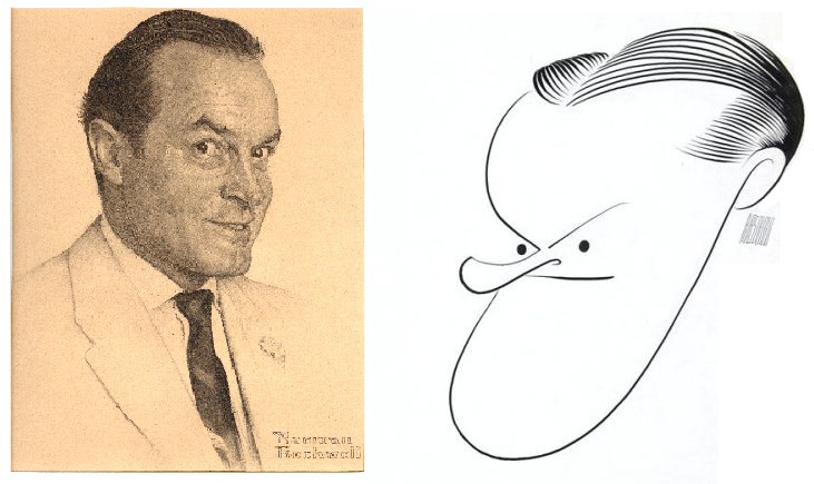
Things get more complicated when you combine a word and an image, but most image-text analysis looks primarily at one relationship: between what the word means and what the image represents.
I particularly enjoy when that relationship contrasts. Last Christmas I got Lesley a tarot deck drawn by Michelle Tea, which includes this bonus card:

The words contrast the swords piercing the figure’s body–though I suppose they also complement the figure’s implied attitude as as she indifferently reads her phone.
Here’s another. The ice cream shop in my town has displayed this sign for years:

The meaning of “CASH” in the phrase “CASH ONLY” is paper money (which is reinforced by the small print: “CHECKS ACCEPTED / ATM AVAILABLE”). But combined with a contrasting image of the singer Johnny Cash, “CASH” gains a double referent. If the ice cream shop owner were slightly braver, he might instead display this sign:

The image then would trigger the words “Johnny Cash,” which would then trigger the homonym “cash,” producing the operative meaning. Since the shop owner likely does not want any confusion (plenty of folks probably wouldn’t recognize the singer), the image is a kind of repetition with a playfully superfluous additional meaning.
Complementing relationships are fun too. I snapped this photo while on a walk with Lesley last summer. The branches nearly obscure the words, yet they convey a similar idea:

There are three more relationships:
- between what the word means and how the image is drawn
- between how the word is drawn and what the image represents
- between how the word is drawn and how the image is drawn
That’s a total of six relationships present in every image-text consisting of at least one word and one image. If an image’s subject is its meaning, maybe the easiest way to categorize them is:
- word meaning and word style
- image meaning and image style
- word meaning and image meaning
- word meaning and image style
- word style and image meaning
- word style and image style
Often there are more than one word and more than one image part, creating even more relationships. Keeping all of those webs of potential meanings straight is complicated, and usually not necessary. What matters is tracking the possibilities, and pausing when one yields an interesting result.
Consider the poster for the 2008 film I Can’t See Straight:

Looking first at just the word “Straight,” how it is drawn (curving font) contrasts its meaning (or one of them).
Its style also contrasts the style of the first three words, accenting “straight” by using a different font, a different color, and a lower placement.
The word’s more relevant meaning emerges in relationship to the image. The words in isolation would probably produce something like: “I can’t think clearly.” That meaning remains, but the image relationship extends it to include an explanatory pun through another contrasting relationship. What the words mean changes as a result of what the image represents.
The black font also duplicates the black of the foregrounded figure’s dress. The white of the first three words, “I Can’t Think,” duplicates the foregrounded figure’s earrings and second figure’s necklace, further linking the words to the characters.
The style of the image is sexualized, suggesting not just the general meaning of (the implied word) gay, but probably the imminent possibility of sex.
The book cover design for the novel uses the same words, as well as images of the same two actresses portraying the same two characters, but it produces different effects through different word-image relationships:

This time all four words use the same font. Though that font is relatively straight, without a contrasting curved font, that meaning of “straight” is largely absent. Instead of emphasizing “straight,” the use of a contrasting color for “think” emphasizes it instead. “Think”, however, doesn’t gain an additional meaning as a result. “Straight” still requires the image to refer to sexuality, but because the style of the image is less overtly sexualized (when compared to the movie poster), the effect is perhaps more romantic than sexual. The inclusion of the words “romantic” and “heart-warming” in the blurb reinforces that.
Personally, I would have combined the word styles from the movie poster with the image from the book design, but once again, no one asked me. With one exception, the above examples are outside the comics medium. The illustrations in Chapter 7’s “Embedded Relationships” section are all from image-text comics, so it’s fun to branch out.
- 2 comments
- Posted under Uncategorized


