Monthly Archives: November 2019
25/11/19 How to Use Words in a Comic

The above set of comics images shows a range of Leigh Ann and my students’ approaches to combining word rendering, word containers, and word placement:
1) While drawing all words in the same style, Grace gives her two characters different kinds of speech containers. Their shapes are the same, but their line qualities differ. This would allow a reader to recognize who was speaking even if the speech tail pointed out of frame or the panel was black to indicate darkness. Grace also leaves the lower containers empty to suggest that the two characters continue talking—but it’s not really the content of their conversation that matters. The gestalt hinge connecting the panels also adds to the plot tension of their growing closeness, especially since the reading path crosses back and forth over the gutter to follow dialogue.

2) Mims’ two characters are speaking in sign language as they sit next to each other in math class. While their hand arrangements communicate words, Mims also draws accompanying English words in the spaces both outside and inside their hands and arms. The hands and arms then are word containers, and they provide the contour lines that the words follow. The word content also combines three different types: they are like speech, but since they indicate no sound, they could be understood as the characters’ thoughts or as third-person narration translating their conversation for the reader.

3) Anna’s panel is the second in a three-panel sequence and includes the middle word in the phrase “ON YOUR MARK” shouted at a track meet. Though it’s speech, there is no talk balloon and no pointer indicating from whom or what direction the word is heard. While the capitalization and size of the letters suggest volume, the vacillating use of black and white lines against the contrasting background integrates the letters into the image to a degree usually associated with comics titles or other graphic design.

4) Henry’s character is chained while forced to listen to blaring music—the words of which are scribbled over his body. Letter style, size, and placement all suggest the overpowering sound of the lyrics. The words are difficult to understand, which matches the situation. Henry also placed the “O” in the word “HOVER” so that is circles the character’s head like an internal frame near the center of the frame, drawing the viewer’s eye first.

5) Coleman’s memoir narration appears in a caption box at the top of the panel. The box is made of the same lines that create the panel and so suggests a deeper level of connection than a word container drawn as if placed over the image content. After completing the artwork, Coleman scanned it and digitally inserted his narration in a pre-made font with a hand-drawn quality that matches the style of the drawing.

6) Grace draws the title of her comic “LONE” in white letters against a black panel, while also merging the letter “O” into the story world by isolating a single figure inside it. The angle of the letters also add to the literally off-balance feel of the one-panel scene.

7) For her essay about gender in Dracula film adaptions, Anna draws a three-row layout with irregular panels that contain either images or words. If Groensteen is correct that the first, center, and final panels of a page are visually privileged, the layout accents the word containers. The containers and panels also share the same curving and fringed frame style, suggesting that words and images are essentially alike. Grace also includes white words and arrows in the black margins that link to and comment on the image content. Because the gutter words are not in containers or rows that create a rigid reading path, viewers may read them in different orders. The gutter words may also lead a viewer to the last image in the second row before the middle image, further disrupting the layout’s expected z path.

8) Grace draws the onomatopoeia sound effect “BAM” next to the jagged emanata lines around the mouth of an overturned trash can. The letters also follow and are shaped by the triangular path the main character is walking in the background, creating a kind of word container that is also part of the story world and that the bottom of the letters break as they reverse color. Because the word is read left to right, it also works as a kind of arrow leading the viewer’s eye to the main character who is turning her head. Though drawn as a single moment of time, the image actually includes at least two moments: the can falls and makes a noise, and the character turns to look in reaction to the noise.

9) Daisy draws words and numbers inside the rectangular container created by the combination of the panel frame and the lines dividing the bedroom wall within the image. Though the writing could be part of the story world if the character had decorated his apartment with them, they instead represent his thoughts as he lies in bed. Despite not existing visually in the story world, the words and numbers appear to be blocked by the bed and table as they would be if actually written on the wall. Also notice how the white space around the lamp creates the effect of a glow because the writing is a kind of crosshatch shading.

- Leave a comment
- Posted under Uncategorized
21/11/19 High-Tech Futures on the Fritz
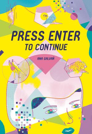
Fantagraphics Books has a thing for technological dystopias (Estrada’s Alienation, Schrauwen’s Parallel Lives, Daniels and Passmore’s BTTM FDRS). Or maybe that’s just what happens when you’re a publisher in the second decade of the 21st century. Their latest virtual nightmare was spawned in Spain, through the accomplished hands of comics artist Ana Galvañ. Her work is a welcome expansion of the familiar but still-rich genre of high-tech futures on the fritz.
Though marketed to Dark Mirror fans, Galvañ’s Press Enter to Continue flows from the older tradition of Twilight Zone and Outer Limits. But even that resemblance is misleading. Galvañ’s tales would not make good TV. I mean that as a compliment—and with no implied insult to TV (I’m Dark Mirror fan too). Galvañ’s images are not simply storyboards presenting a visual narrative one snapshot at a time. They’re much weirder.

Most comics images seem straightforward: each depicts a moment in a sequenced event unfolding panel by panel in a world essentially like ours (or ours if ours had things like dragons or superpowered crime-fighters). That’s so obvious it seems silly to mention. Yet Galvañ’s images, while still performing that storyboard function, also challenge it at times and nearly overturn it at others.
Take the first page of her fist story: a woman walks across a room in four panels. Or I assume she’s a woman, because the ponytail and short dress are standard cartoon gender markers (though here happily non-sexualized). But where’s her mouth and chin? While not outside cartoon norms (missing noses and even necks are also a standard for female cartoon figures), the effect is ambiguous: is this person actually devoid of these body parts, or is that just how she’s drawn and we’re to understand that she actually does have a mouth and chin? And when her figure doubles in the second panel and then nearly divides in two in the next, are those movement-suggesting blurgits (like motion lines trailing behind Superman in flight) or is the character in the storyworld actually becoming two bodies—and then three?

Usually a comics viewer doesn’t have to contemplate the relationship between the apparent image content and the metaphysical facts of its world. Usually images are secondary to words, with narration and/or dialogue doing the majority of the world-building work. But Galvañ ‘s eight-page story is wordless—and even title-less. The collection’s table of contents consists of five panels (four diamonds and one circle) with images excerpted from her five tales and a superimposed page number in each. Not a word anywhere. The other four stories do include words (three with dialogue, one with first-person narration), but that first story establishes a visual approach that pervades them all: what you see is not necessarily what you get.
That theme is central to the collection’s technological focus, where reality is never simply reality, but a constructed experience dependent on computers and other scifi gadgetry that scrambles identity into ambiguous parts. What does it mean when the female figure turns off the TV at the end? Were all of the images as imaginary as the ones on her screen or did one of her subdivided selves actually get eaten by a subdividing tiger? That we don’t know is part of the dystopian horror.
The other stories are equally strong, though I admire the wordless most. While Galvañ’s translator, Jamie Richards, provides effortless English, I again prefer the wordless sections of the second tale about a new member of a circus falling for the mysteriously masked Human Doll. Though I doubted whether her cartoon face actually was a mask (again, are the images like photographs of a weird world or weird interpretations of an unknowable world?), her secret is even stranger. I’m generally not a fan of sex scenes, but Galvañ’s sequence of geometric abstractions stray so far from erotica, human bodies are barely involved—and I’m not even sure the Human Doll is human. Again, the disturbing fun is not quite knowing.

The third tale features a Kafka-esque job interview. While I accept that in the world of the story it’s perfectly normal for people to enter and exit buildings by crawling through oversized pet doors, the weird thing is a carryover from the first two stories: what do those geometric shapes of color mean? Rather than dividing colors according to the ink shapes of her characters and their environments, Galvañ incorporates free-floating circles and triangles that seem to be independent of the story worlds. While some suggest lines of vision or directions of movement or areas of visual interest, others seem merely decorative—yet in a way that intentionally undermines a sense of story coherence. Are the walls changing colors or, again, do they just look like they are? As odd as that may sound, it’s an old norm of superhero comics, where panels backgrounds shift at the whim of bored colorists. Galvañ just makes that oddness feel oddly tangible.

The fourth tale (seriously, they’re not titled) is the most traditionally futuristic with playfully named “gliders” and “liquid crystal doors” and “marvapends” and “sinusoidal analysis machines.” What these objects are supposed to be is as ambiguous as ever, but by giving them names (I can only imagine the translation challenges Richards faced) they become improbably familiar, almost clichés, the usual scifi stuff. While I enjoyed the effect less than the wordless ones, I appreciate the juxtaposition, an illustration of how powerfully words influence our understanding of stories, even comics stories that are supposedly more visual than linguistic.

Galvañ ends the collection as strongly as ever, with another bewildered protagonist haunted by the ambiguities of what to her should be familiar technology. Is the ghost-child forming pixel-by-pixel on her screens a repressed memory, a government-induced hallucination, or something weirder still? Galvañ, as usual, leaves it to us to decide—or to not decide.

[A version of this post and my other recent reviews appear in the Comics section of PopMatters.]
- Leave a comment
- Posted under Uncategorized
18/11/19 Impeachment Portraits


I’ve been exploring the wonderful limitations of the now literally defunct Microsoft Paint and discovering some weird ways to make images from photographs. All of these portraits are from newspaper articles about impeachment testimonies and isolate individual aides, police officers, and witnesses as they walk the gauntlet of journalists between the elevator and the door to the restricted area for the hearings. I’m especially curious about the sweet spot where abstraction begins to collapse resemblance and yet the faces and bodies still somehow register as faces and bodies.
- Leave a comment
- Posted under Uncategorized
14/11/19 The Entrails of White Privilege and Other Horrors
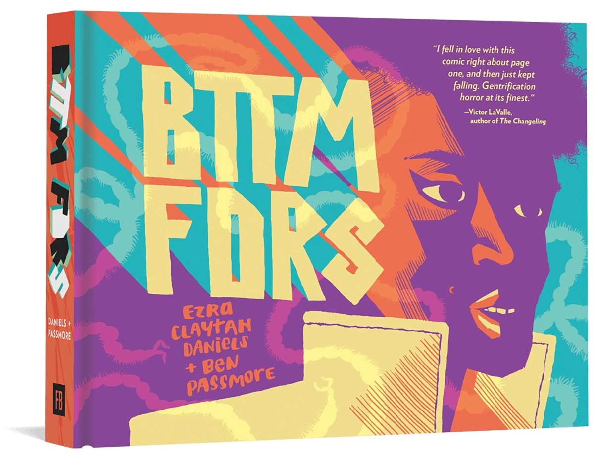
Though I didn’t figure it out until finishing the last page of Ezra Claytan Daniels and Ben Passmore’s graphic novel BTTM FDRS and flipping to the cover, I don’t think it’s giving anything away to reveal that the title is a variation on “bottom feeders,” the racist nickname for folks from the semi-fictional Bottomyards district of inner Chicago. As the main character Darla says, “Bottomfeeders come in all types”—including the giant slithering kind.
Though her father grew up in the area and is financing her as she tries to make it as a fashion designer, Darla and her white roommate Cynthia are fresh from art school and moving into a soon-to-be-gentrified apartment complex. Except why aren’t there any windows? And what are those noises inside the walls? And why is that freaky white guy always lurking at the entrance? And are those entrails in the toilet?
Based on BTTM FDRS’s race-fueled, scifi-horror premise, Ezra Claytan Daniels would find a happy home on the writing team for Jordan Peele’s rebooted Twilight Zone. He’s well partnered with Ben Passmore whose art is also all about color—in both senses. It’s a diverse cast, but Passmore tellingly avoids the most common marker of ethnicity: skin color. Old school comics color separation produces blocks of solid hues divided by object shapes: shirt, face, hair, background wall. Photoshop makes the technique that much easier, but Passmore twists it for more subtle effects, filling whole panels and pages into single colors, with internal shapes varying only by degrees.

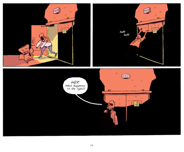
The approach seems natural enough at first, usually suggestive of changing light sources as characters move from windowless room to windowless stairwell to windowless basement. Yet why exactly is the hallway all greens? And when the panels later vacillate between all purples and all yellows, is that because the light fixtures are pulsing like police strobes? If so, why doesn’t Passmore draw the fixtures—and why doesn’t Daniels write dialogue so we know that the characters notice it too? The effect is quietly surreal, an unacknowledged ambiguity darkening the fabric of the story’s already horror-tinged reality.

Passmore’s characters are cartoonish, but not outlandishly exaggerated and so not able to break the bounds of their otherwise naturalistic world. Though cartoons often morph to reflect their internal thoughts and emotions, Passmore’s characters are consistently solid. Instead of drawing a violence-obscuring dust bubble around the exploitative white landlord as he’s dragged through a too-small opening, Passmore lets us witness arms popping from shoulder sockets in atypical cartoon gore. His cartoons also never break from their story’s prison-like panel gutters, which vary but mostly maintain a loose 2×2 base pattern. Interestingly though, Passmore’s orientates the entire book ninety degrees so the spine is bound along what would normally be the top edge, producing wide instead of tall pages. The story literally goes sideways.
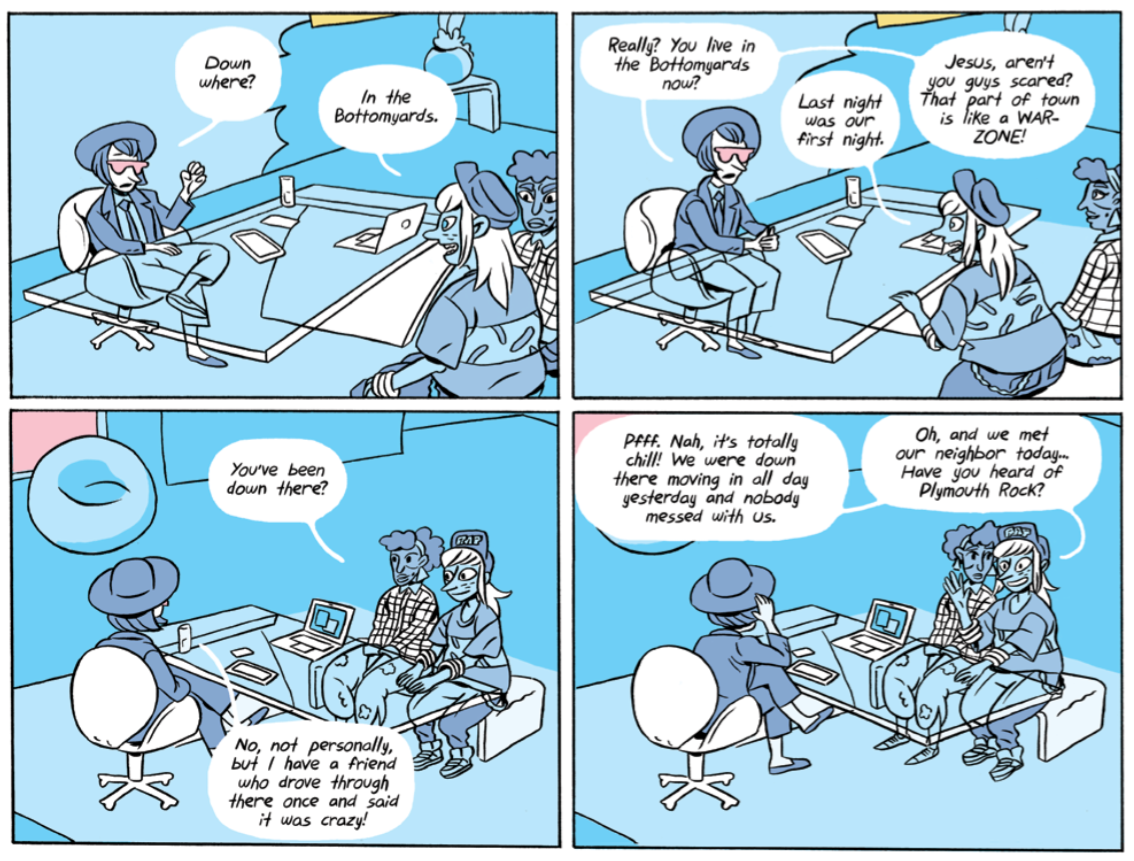
For all the novel’s early creepiness and eventual full-blown monstrous spectacle, the real horror bubbling under its white gutters is a different kind of whiteness. As her new neighbor, the problematically ironic rapper Plymouth Rock, tells Darla: “Can we just agree for now that the real threat is white people?”
He doesn’t mean in the Charlottesville Klan rally sense. Probably the 911 dispatcher wasn’t trying to be racist when she tells Darla: “You’re calling from the Bottomyards. We can’t send a car all the way down there unless there’s an actual emergency.” And Hadley, the white woman who might hire Darla and Cynthia for her fashion firm, she just doesn’t know any better when she remarks: “You live in the Bottomyards now? Jesus, aren’t you scared? That part of town is like a WAR-ZONE! … I have a friend who drove through there once and it was like crazy!” And doesn’t Hadley practically make up for it when she decides to rent an apartment in the complex for her visiting designers: “For, like, a totally AUTHENTIC Chicago experience, you know?”
Sadly though, the worst is Cynthia, the prototypically good-intentioned but clueless white liberal who thinks having a black friend is basically the same as being black: “I know I wasn’t the one they called the n-word in elementary school, but I was usually right next to you when it happened, and it was embarrassing for me, too.” After Cynthia refuses to move in as planned, fawns over Julio (Plymouth Rock’s actual name), and uses Darla to score cool points with Hadley, Darla dumps her. Cynthia returns the next day with her version of an apology, which ends with a familiar refrain: “But that doesn’t make me a racist, and I’m like super hurt that you think that. I’d feel a lot better if you apologized, too, actually. For calling me a racist.”

What’s this have to do with the entrails monster haunting the building’s vents? Literally everything—though readers wary of spoilers should stop now and go buy a copy of the novel. It turns out there’s a reason for the complex’s hidden surveillance cameras, lack of windows, and general prison-like architecture.

It’s a prison. Or was. I won’t recount the entire backstory (it’s even weirder than you’re thinking), because it’s all a pleasantly elaborate conceit to reflect back on Cynthia and the world of white privilege she represents.
A wall of walking entrails, the ultimate bottom feeder, is awakened by the influx of new excrement to eat and, when Cynthia wanders through the wrong broken hatch, merges with her. As the gently deranged son of a former tenant explains: “It’s a BUNCH of things all living in symbiosis. … I’m thinking that’s what happened to your friend. She got sucked into the symbiosis.“
In addition to straight-up horror trope, symbiosis is a good metaphor for U.S. race relations. Call it the deepest, darkest entrails of white privilege that need to unconsciously believe in black inferiority to survive. Or as Cynthia remarks as she’s hanging from the ceiling: “It’s uncomfortable but like not in a bad way. I don’t know what it’s putting in me, but it makes it feel okay.”
Of course she feels okay. She’s had her BBF black friend to lovingly undermine her entire white life. The monster just makes that literal, killing Julio in a jealous rage, blocking the exist when Darla tries to flee, resulting in yet another ineffective apology: “Ugh, I’m sorry. I didn’t mean to do that, either. I saw you running toward the door and couldn’t help it.” Since Cynthia is incapable of changing her own monstrousness, it’s up to Darla to save them both, resulting in Daniels’ two best lines of dialogue in the novel:
“Cynthia, I have an idea,” says Darla. “I’m not gonna tell you what it is though because you’ll probably subconsciously sabotage me.
“I don’t know why I keep doing that.”
Of course she doesn’t. That’s the whole point of white privilege. And that’s the whole point of horror–to drag up our culture’s biggest, ugliest globs of unconscious sewage and spread it across a white page for us to acknowledge. Ultimately, Daniels and Passmore are optimists though, opting only for a temporary kind of horror, the sort that resolves in hospital bedrooms instead of sealed basements. Even Passmore’s color scheme reboots to the comics standard, a range of blues and greens and yellows and reds, all in the same happily integrated panels.
Until the very last page offers a final, purple warning to Cynthia …

[A version of this post and my other recent reviews appear in the Comics section of PopMatters.]
- Leave a comment
- Posted under Uncategorized
11/11/19 Our Not-Entirely-Bad Dystopian Future
When I received a review copy of Estrada’s Alienation last June, I liked it so much that I contacted the publisher for permission to include four pages in the anthology section of Leigh Ann Beaver’s and my forthcoming textbook Creating Comics (Bloomsbury 2020). Here’s why:

Maybe 2054 won’t be so bad. Press a button and a fully prepared meal appears. Nap while your bed-shaped car drives you to work. Answer calls without picking up a phone. Let your Googleland brain implant monitor and adjust your chemical health, while McBody takes care of the rest. Watch a livefeed of the solar eclipse in the privacy of your own VR. Attend a Jimi Hendrix concert. Travel to fantastical landscapes and transform into impossible creatures. Have polar bear sex. Have snail sex. Set your implant to methelendioxymethamphetamine mode.
There are some downsides too. The north pole is floating in the center of the Arctic Ocean. All the pizzas and tacos and sushi you’re eating are made from fungus because most animals are extinct and nuclear waste poisoned the oceans that flooded the coasts. The world supply of oil will run out in a few years, and you were just laid off from the last refinery that wasn’t run by robots. Unpredictable extreme storms have eliminated all air travel. You stopped playing Call of Duty because the advanced levels may be secretly hooked to military drones for actual combat missions run by the government. Commercials happen directly to you, with annoying company mascots literally in your face. The content is suggested by your recent thoughts. Oh, and that livefeed of the solar eclipse was from a Starbucks satellite orbiting above permanent clouds of pollution.
This dystopic future is the product of Inés Estrada’s disturbingly plausible imagination, beamed indirectly into readers’ heads via the antiquated analog technology of ink and paper. When her characters Eliza and Charly logout from the solar eclipse, Estrada draws the Starbucks logo flashing inside their eyes. Readers just have to turn the page. The physicality of the book is always an appeal of graphic novels, but it is rarely so thematically critical to the story it contains. Eliza and Charly are trapped in an alienatingly virtual reality while we view them inside Estrada’s 3×2 comics grids.
That two-worldness plays out the level of style too. Estrada typically draws Eliza and Carlos as rudimentary cartoons, the lines of their bodies, like the lines of their apartment walls, containing little crosshatched detail. They’re literally and metaphorically empty. But when they go online, Estrada upgrades the CGI to detailed naturalism. Eliza floats in layers of meticulously inked cloud banks, the progression of their evolving shapes receiving their own page grid of near abstraction. When she gazes at her reflection in a forest pond, the surrounding vegetation approaches photorealism.

Estrada captures the quality of light reflected off of gently bobbing water as Charly floats, every kink of his hair precisely etched. When they are talking in their apartment, Estrada renders their bodies with sack-like simplicity, their anatomy more implied than shown. But when virtually floating underwater, the careful contours of their forms reveal the depth of Estrada’s drawing skill.

Though their real world is less real than their virtual worlds, Estrada breaks that norm at key moments. The two-page spread of Charly’s bayside oil refinery and the remaining fragments of polar ice surrounding it are as detailed as anything in their VR escapades. And Charly’s full-page commute through the raised highways looping through edge-to-edge skyscrapers of once-rural Prudhoe Bay, Alaska is too.

In contrast, Eliza never physically leaves their apartment, while working as a unicorn-horned, thong-bikinied, virtual porn star. If Estrada were a male artist, I might have found the porn choice exploitive, but she seems fully aware of and in charge of her novel’s politics. As one of Eliza’s NPC (non-player character) friends says, “Most AI are misogynists, just like the humans who programmed them.” That also helps to explain why all of the NPG characters in the virtual dance club are white people. As Eliza’s porn avatar dances, talk balloons from unseen viewers ask, “What’s your ethnicity?” (she’s Inuit), and offer to “pay u to fix your teeth.” Her grandfather calls her (by his hand-held cell phone) about the bad omen of a beached whale, extending their tribe’s colonization by Europeans and their descendants to the level of technological exploitation as their bodies are invaded by artificial organs.
Like Estrada, Charly is from Mexico. When he virtually visits home, half of the dialogue is in Spanish with footnote translations breaking the narrative flow for monolingual readers such as myself. It’s a smart choice because it pushes against the kind of effortless absorption that the virtual technology represents. Sometimes it’s good to have to work harder.
The footnotes also include the proto-links of choose-your-own-adventure technology, with six of the virtual scenes ending with a direction to “Return to pages 86-87” where the two-page spread offers a mid-story table-of-contents of the time-killing activities Eliza and Charly employ while waiting out the most recent storm. Only this time the storm waits out them when they lose internet connection for days. This result is boredom, actual rather than virtual sex, and, most importantly, dreams—the original, biological version of VR.
The problem is Eliza and Charly have already been having trouble distinguishing what is real and not real, and whether the distinction still means anything. Charly’s violent past has been haunting him in hallucinogenic flashes of Eliza’s corpse (a fear that briefly comes true). Estrada explores the theme at the meta level too, with Eliza asking, “Why do I feel like I’m still being watched?” (because she is, by us). Later she notices the fourth wall of her own comics panel and climbs out of the grid and into the open page—only to startle herself awake. More subtlety but weirdly, she refers to one of her earlier virtual adventures (an unfortunately R. Crumb-esque pornographic one) as something she read in a comic—which it was for readers, but not for her.
There’s a central plotline involving Eliza’s brain transplant getting hacked and the world’s A.I.s searching for a human host to create a hybrid biological/artificially-conscious baby. Though Estrada’s glossary-like endnotes assure readers “Don’t take anything too seriously, after all …. this is just a comic!,” she also refers to the “current exponential development of AI,” and, oddly sandwiched between the copyright and ISBN notices, “Climate change is real. The earth is alive and we’re killing her. Technology is not the enemy: oppression, greed, & exploitation are.”
It’s a fitting final word to her not-so futuristic dystopia.

[A version of this post and my other recent reviews appear in the Comics section of PopMatters.]
- Leave a comment
- Posted under Uncategorized
04/11/19 Impeachment Motion Studies


(It’s a long walk between the elevator and the doorway to the hearings room, and everyone testifying has been led down it by congressional aides and DC cops as a gauntlet of photographers snapped pictures. I assembled many of them into a sequence 4×2 layouts, showing the same hallway six times. I also digitally adapted the images, and though I added quotes from some of the witnesses’ opening statements, I eventually preferred to let the images stand by themselves.)
- 1 comment
- Posted under Uncategorized


