Monthly Archives: August 2023
28/08/23 Phantom Plots & the Lichtenstein Effect
While I was drafting a chapter on Matt Baker’s Phantom Lady for Qiana Whitted‘s collection Desegregating Comics: Debating Blackness in the Golden Age of American Comics, I found myself snipping individual panels and tossing them into a digital file. My chapter is about viewing paths and how Baker excelled at disrupting them (which I also talk about here and here), so isolating individual panels from their page context was exactly the opposite of what I was analyzing.
And yet I couldn’t stop. Why?
Something about the isolated images amused me — and not just the slapstick “Ooops!” of that last one. I think it had more to do with how each lone panel evoked a whole sequence while simultaneously denying the possibility of knowing that fuller narrative context. Each evokes by erasing.
Which got me thinking about Roy Lichtenstein:
Lichtenstein of course legally plagiarized multiple comics artists, extracting single panels from longer works. In some ways removing context removes narrative — or at least it removes the one specific narrative that was part of the creative process. I think viewers still experience narrative, but instead of “the” narrative of the plundered comic, the narrative effect of the single extracted image is open-ended.
Same thing happens with each Phantom Lady clip:
I came across an NPR article on Lichtenstein, and this caption captures the effect:
Lichenstein left it up to his viewers by removing the phone call from whatever comic book he found it in (he plagiarized dozens if not hundreds). Originally something specific had just transpired, but once the panel is isolated, all that’s left is the indeterminate feeling of being at some mid-point in a now unknowable sequence.
My Phanton Lady clippings work similarly:
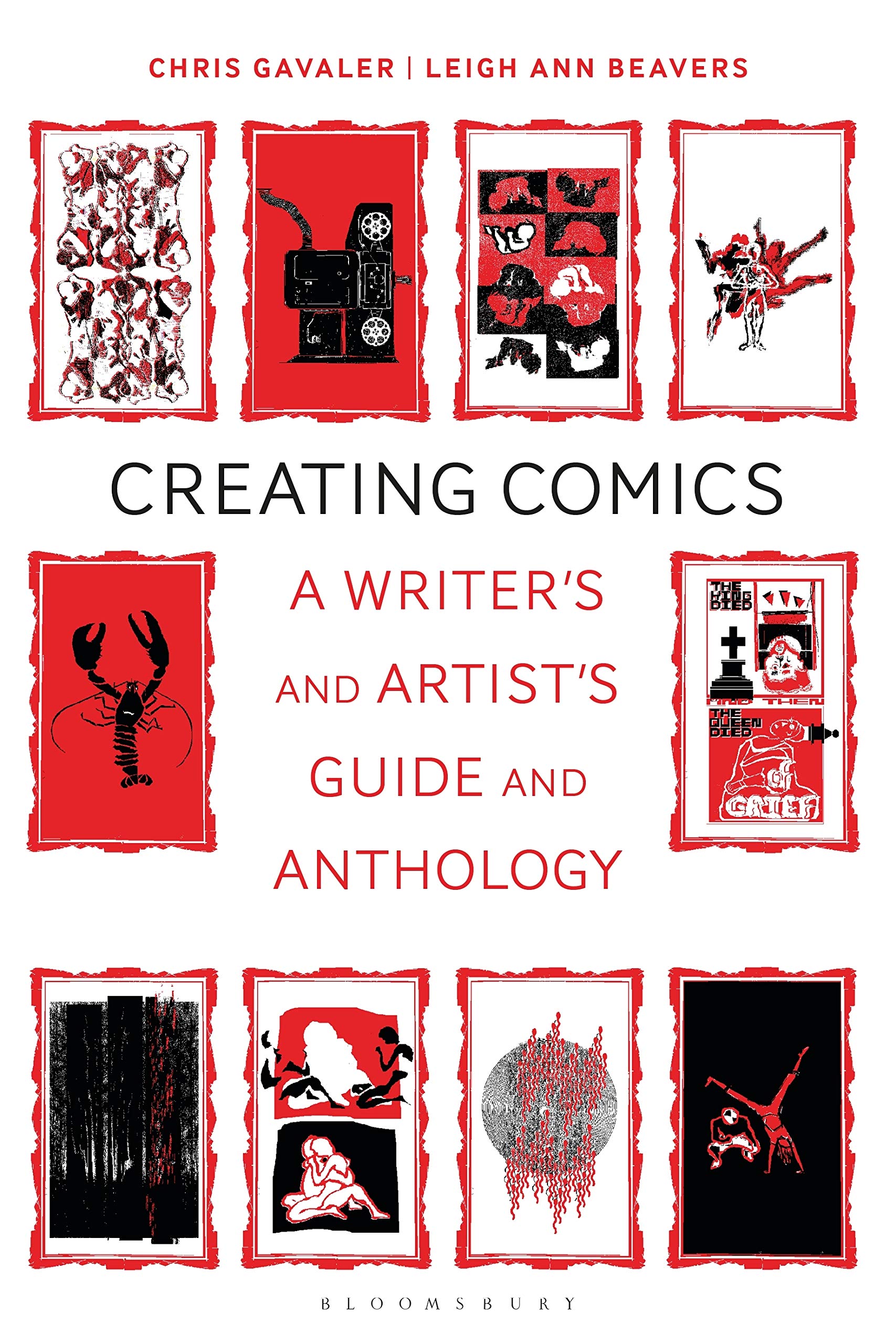
When I was co-writing my textbook Creating Comics, I harmonized a range of plot and event approaches into a 5-part structure:
If there’s such a thing as “the Lichtenstein effect” (I’m hesitant to attach his name to any term), I think it’s the viewer experience of hitting one of those points in an event arc, usually one of the three tension-filled middle points.
You then have the fun of feeling a range of possible plot moments, ranging both immediately before and immediately after the isolated panel.
I hereby term the single-image-triggered experience of two-direction open-ended narratives: “phantom plots.”
Tags: Matt Baker, phantom lady, Qiana Whitted, Roy Lichtenstein
- Leave a comment
- Posted under Uncategorized
21/08/23 Michel Foucault Is Not a Comics Scholar
This is not a calligram. But it’s close.
A calligram, according to James Harkness, is a “poem whose words are arranged in such fashion as to form a picture of its ‘topic'” (60), such as Guillaume Apollinaire’s 1918 “Salut monde”:
Arranged to evoke the Eiffel Tower, the words translate: “Hello world, of which I am the eloquent tongue which your mouth, O Paris, will forever stick out at the Germans.”
Apollinaire, according to Harkness, “was, in fact, one of Magritte’s favorite writers” (60), and so the painter would presumably have read the poet’s collection Calligrammes: Poems of Peace and War 1913-1916 before painting his 1929 The Treachery of Images:
The painting is also known as Ceci n’est pas une pipe or This Is Not a Pipe, the title of a 1968 essay by Michel Foucault, which James Harkness translated in 1983:
I have no particular interest in Foucault and only came across the essay during some tangential Google search (probably relating to my recent obsession with appropriation art, which I’ll try very hard not to talk about here).
Foucault is not a comics scholar. He did, however, provide one of the earliest analyses of the comics gutter:
“On the page of an illustrated book, we seldom pay attention to the small space running above the words and below the drawings, forever serving them as a common frontier. It is there, on these few millimeters of white, the calm sand of the page, that are established all the relations of designation, nomination, description, classification. […] The slender, colorless, neutral strip, which in Magritte’s drawing separates the text and the figure, must be seen as a crevasse — an uncertain, foggy region now dividing the pipe floating in its imagistic heaven from the mundane tramp of words marching in their successive line. Still it is too much to claim that there is a blank or lacuna: instead, it is an absence of space, an effacement of the “common place” between the signs of writing and the lines of the image.” (28-9)
To Foucault, the background color of the image is somehow both “colorless” and “sandy,” while, if “foggy” is visually connotative, also gray. The color (which Magritte painted on a canvas but may evoke the beige of a book page) is also conceptually “neutral” — what Foucault further calls “a neutral, limitless, unspecified space” (15), a space “possessing the neutrality, openness, and inert blankness of paper” (20) — recalling the racial paradox of racial Whiteness, which while literally “sandy” is also sometimes treated as conceptually “colorless” and so outside of race as Color. The “frontier” could be literal but is also as metaphorically suggestive as the “crevasse,” while “an absence of space” is pure abstraction and further paradox.
Foucault is not describing a comics gutter directly but a more general phenomenon that includes comics gutters as a subset. Magritte’s painting, he writes, “is as simple as a page borrowed from a botanical manual: a figure and the text that names it” (19). Foucault is describing any page that combines image and text. This more general approach is useful to comics theory, in part because comics theory has a tendency to describe and analyze gutters as if they were unique to comics, while also sometimes mistaking their merely conventional features for their definingly formal ones.
Foucault also recognizes the shared quality of the rendering hand, which further unifies the juxtaposed elements: “the words … underneath the drawing are themselves drawn-images of words the painter has set apart from the pipe, but within the general (yet still undefinable) perimeter of the picture,” and “conversely, the represented pipe is drawn by the same hand and with the same pen as the letters of the text: it extends the writing more than it illustrates it ….” (23). The same is true of many many single-author works in the comics medium.
In comics terms, Magritte’s painting consists of an unframed panel and an unframed caption box. Adding conventional frames defines those perimeters but without altering the juxtapositional relationships:
Foucault does indirectly reference comics conventions when coining the term “word-bearers” to analyze another Magritte 1928-9 painting, Personnage marchant vers l ‘horizon:
Though the shapes of the “bearers” might suggest speech balloons or thought bubbles, their label-like content (rifle, armchair, horse, cloud, and horizon) might better suit caption boxes or, given the paradoxical shadows they cast, the metafictional play of sound effects or splash-page titles. The fact that Foucault does not acknowledge any of these well-established conventions for “bearing” words within images reflects the unbridgeable distance between comics studies and visual arts analysis in 1968.
Yet Foucault does theorize image-text relationships, a consistently core quality of works in the comics medium. He notes “the inevitability of connecting the text to the drawing” (20) in order to address how Magritte undermines “the traditional function of the legend” (23). For comics, Scott McCloud coined “duo-specific” to name what Magritte describes as “the simple correspondence of the image with its legend” (23). For correspondence that favors either image or text, McCloud coined “word-specific” and “picture-specific.” Foucault describes the same relationships over the past five hundred years of painting:
“Two principles, I believe, ruled Western painting from the fifteenth to the twentieth century. The first asserts the separation between plastic representation (which implies resemblance) and linguistic reference (which excludes it). […] The two systems can neither merge nor intersect. In one way or another, subordination is required. Either the text is ruled by the image (as in those paintings where a book, an inscription, a letter, or the name of a person are represented); or else the image is ruled by the text (as in books where a drawing completes, as if it were merely taking a short cut, the message that words are charged to represent). […] What happens to the text of the book is that it becomes merely a commentary on the image, and the linear channel, through words, of its simultaneous forms; and what happens to the picture is that it is dominated by a text, all of whose significations it figuratively illustrates.” (33)
Foucault rejects the possibility of duo-specificity: “verbal signs and visual representations are never given at once. An order always hierarchizes them, running from the figure to discourse or from discourse to the figure” (33). Magritte breaks that hierarchical dichotomy because his paintings are an “art more committed than any other to the careful and cruel separation of graphic and plastic elements. If they happen to be superimposed within the painting like a legend and its image, it is on condition that the statement contest the obvious identity of the figure, and the name we are prepared to give it” (35).
Foucault describes “the nonrelation” of such image-texts, what McCloud terms a “non-sequitor” word-picture relationship, conceding that some relation may be inevitable, albeit a “very complex and problematic” one (37). Rather than corresponding, image and text may diverge: “Word and object do not tend to constitute a single figure; on the contrary they are deployed in two different dimensions” (42). Where “Kandinsky dismissed the old equivalence between resemblance and affirmation, freeing painting from both, Magritte proceeds by dissociating the two: disrupting their bonds, establishing their inequality, bringing one into play without the other…” (43).
Foucault calls the relationship “nonaffirming,” where “nonaffirmative painting” employs “nonaffirmative verbal statements” with images that break the other ruling principle of resemblance-based representation (53). Though in 1968, the approach may have been “an unmapped space” (54), it has been mapped multiple times since.
In Creating Comics (2021), I summarize four kinds of interactions:
- Duplicate: the two sets primarily overlap each other, neither contributing uniquely to the whole.
- Complement: the two sets primarily correspond, one or both providing additional but congruent qualities to the whole.
- Contrast: the two sets primarily contradict, each providing incongruent qualities to the whole.
- Diverge: the two sets appear primarily unrelated, neither contributing to a whole.
In The Comics Form (2022), I show how the four harmonize a range of approaches, including McCloud’s, Barthes’s, Kloepfer’s, Schwarcz’s, Nikolajeva and Scott’s, and Bateman’s. The earliest is Eco’s, whose 1965 comics analysis accounted for the first three interactions but not the fourth — which three years later is the core of Foucault’s analysis of Magritte. “This Is Not a Pipe” should follow Eco’s “A Reading of Steve Canyon” in a historical survey of comics theory.
If I had read it before publishing The Comics Form, I would have used Foucualt’s categorical insight to subdivide interactions into two clarifying subsets:
The essay also suggests a theory of comics representation and layout. Foucault describes Magritte’s 1962 painting Representation as a “representation of a portion of a ball game, seen from a kind of terrace fenced by a low wall. On the left, the wall is topped by a balustrade, and in the juncture thus formed can be seen exactly the same scene, but on a smaller scale” (44).
The repetition is central to Foucault’s understanding of similitude, the quality that Magritte uses to replace traditional resemblance. Foucault contrasts the two:
“Resemblance has a ‘model,’ an original element that orders and hierarchizes the increasingly less faithful copies that can be struck from it. Resemblance presupposes a primary reference that prescribes and classes. The similar develops in series that have neither beginning nor end, that can be followed in one direction as easily as in another, that obey no hierarchy, but propagate themselves from small differences among small differences. Resemblance serves representation, which rules over it; similitude serves repetition, which ranges across it. Resemblance predicates itself upon a model it must return to and reveal; similitude circulates the simulacrum as an indefinite and reversible relation of the similar to the similar.” (44)
Magritte’s Representation illustrates similitude through juxtaposed repetition. “In the same painting,” writes Foucault, “two images bound thus laterally by a relation of similitude are enough for exterior reference to a model — through resemblance — to be disturbed, rendered floating and uncertain” (44). Roy Cook, after initially proposing a “panel transparency principle” for comics (“Characters, events, and locations within a fictional world described by a comic appear, within the fictional world, as they are depicted in typical panels within that comic” [2012: 134]), instead adopted a position that aligns with Foucault’s analysis of Magritte: “our access to the physical appearance of drawn characters in general is indirect, partial, inferential, and imperfect” (2015: 25). A comics image disturbs the impression of a stable and accessible model. The possibility of transparency collapses under the strain of small (and sometimes large) differences between multiple representations of the same subjects common in works in the comics medium — a rarity in fine art painting but overt in Magritte’s Representation where “Similitude multiplies different affirmations, which dance together, tilting and tumbling over one another” (46).
Foucault’s similitude (Harkness acknowledges that the word is imperfect and “might best be translated as ‘likeness,’ ‘similarity,’ or perhaps ‘a likeness'” [59]) includes the juxtaposition of image-texts too, since Foucault also calls The Treachery of Images “an open network of similitude” (47). I’m tempted to apply “the network of the similar” to comics layout generally, especially since the smaller image in Representation is framed by dietetic elements — a technique common in comics, where series of images and texts representing the same subjects are routinely arranged within a single, subdivided page/canvas.
Foucault centers his discussion of linguistic nonaffirmation and pictorial similitude on his most idiosyncratic assertion, that the core of Magritte’s work is “The Unraveled Calligram”: “Whence comes this strange game, if not from the calligram?” (24); “The operation is a calligram that Magritte has secretly constructed, then carefully unraveled” (20); “Magritte redistributed the text and the image in space. Each regains its place, but not without keeping some of the evasiveness proper to the calligram” (25); “Magritte reopened the trap the calligram had sprung on the thing it described” (28). The last assertion immediately proceeds Foucault’s description of a gutter I quoted first — and so comics generally might fit his calligram-based theory of nonaffirming image-texts.
My own illustrations (one begins and the other concludes this post) are more similar to calligrams than Magritte’s paintings or most image-texts found in or out of the comics medium. Each is composed of two styles of lettering: white letters defined by black negative space and black letters defined by white negative space. A third element emerges in the representational outline produced where the two kinds of negative space meet.
I have no idea what Foucault would think.
[And if you’re really interested in Foucault and comics theory, I explored related points in a 2018 post “Foucault Comics.”]
Tags: Calligram, Guillaume Apollinaire, James Harkness, Magritte, Michel Foucault, The Treachery of images, This is not a pipe
- Leave a comment
- Posted under Uncategorized
14/08/23 Some Extremely Nice Things That People I Don’t Know Said About What Will Now Be My Next Book
While not the best three-word phrase in the English language, “Offer of contract” is definitely in my personal top ten of email subject lines, especially when followed with:
“I am delighted to let you know that the board were really excited by the proposal, finding it a compelling and innovative concept that could establish a new vernacular and way of thinking about modern times and history. I’m therefore pleased to be able to offer you a contract to publish your work …”
That email from my editor was preceded three weeks earlier by an almost-as-excellent email regarding the four reader reports:
“As you will see, the readers were really excited by this manuscript, finding it incredibly original, timely, creative and trailblazing. They felt the work had fascinating implications for a range of disciplines and it was an accomplished work that was broad, fun and very engaging. You can read the rest of the very warm reviews in the attached reports but with this feedback in mind, I would very much like to progress your proposal to the next stage in our commissioning process and present it to our publishing board. This is a meeting made up of editorial, sales and marketing colleagues who will assess the proposal and the reviews to decide if your book would have a home on our literary studies list here.”
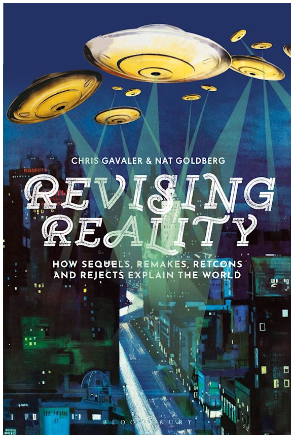
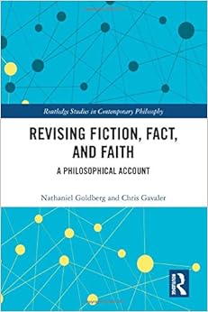
Four external readers is a lot, but the manuscript, Revising Reality (which I co-wrote with Nathaniel Goldberg as a general-interest sequel to our 2020 Revising Fiction, Fact, and Faith: A Philosophical Account) covers such a range of disciplines, so our editor was being thorough. While I know she and the editorial board enjoyed the reports, I suspect Nathaniel and I enjoyed them significantly more.
Here are some especially lovely excerpts:
Do you recommend we pursue publication?
“I do. This book accomplishes something rare: applying potentially esoteric ideas to everyday life in a manner that could affect change. That’s cool.”
“Yes. It’s a genuinely good and deeply interesting book, which makes accessible and coherent some exceptionally thorny but urgent questions.”
“Yes. This is a truly unique book that feels like the starting point of a further expansion of literary/media studies into history and historiography, a potentially fruitful pursuit that could add a great deal to both fields.”
Is the book representative of the research landscape in the field?
“No, it is not representative of the research landscape in the field, but that is because it is a trailblazer and is attempting to establish that landscape by applying these tropes of fiction to the real world and showing why they are important.”
“Not really. This really is quite an original book, which means that it competes in its own kind of field.”
Does the material seem sufficiently up to date?
“The timely nature of the book is one of its strengths.”
“In terms of engagement with a near comprehensive coverage of contemporary popular culture, the manuscript is indeed fantastically up-to-date.”
Please comment on the writing style. Is it written in the best way to support the book’s argument and central thesis?
“The writing is crisp, clear, and consistently engaging.”
“For a book this ambitious, moreover, the overall style is very accessible, which I also think is an accomplishment.”
“The writing is regularly snappy and direct. Working across so many topics is no small feat, but the prose is carefully measured and even-handed throughout even when engaging areas that are subjects of substantial controversy. There are lot of places where the book could go awry in tone, but there’s some judicious care and framing taken where it matters. It’s genuinely fun to read.”
How would you frankly describe the book to a friend or colleague?
“An accessible and engaging exploration of how storytelling frames our engagement with history and current events, through a lens that seamlessly combines literary theory, media studies, metaphysics, and historiography.”
“Neat book. Super readable. Fun for students. Makes a convincing case that we can use our talk of reboots and retcons to better understand history, science, law, and society.”
“This book takes tropes that we’re familiar with from popular culture – such as sequels and retcons – and applies them to the real world, showing how these tropes are an important way of understanding history and historiography.”
What positive contribution does it make?
“The book applies intersecting academic concepts (media analysis, metaphysics, and others) to ‘real world’ issues in a manner that is accessible and would likely retain the interest of both experts and laypersons. And it does so in a novel way.”
“I think highly of this book. It’s careful, timely, and lively. It engages an impressive breadth of topics in service of an interesting theoretical aim—one that scholars from diverse fields will recognize as potentially useful. No one will be an expert in each of the topics addressed, so any reader is sure to come away with an improved knowledge of one of science, law, fiction, pop culture, and so on.”
“This manuscript takes a set of artistic and pop culture tropes/concepts – sequels, remakes, retcons, and rejects – and applies them to the ways in which we understand and reinterpret/revise real-world history. This is a fascinating task, and one that expands upon previous work about these tropes to show how they are useful frameworks of interpretation for fields beyond just literary/media studies (namely, history, science, and jurisprudence).”
“Over a whole, this manuscript is an original and exciting approach to a rather wide range of topics. The focus through the concepts of revision, remaking, retconning and sequels works well and this frame allows the authors to connect a range of topics that would not otherwise quickly be thought or theorized together. I enjoyed how the authors of this book think American history and contemporary politics through the lens of popular culture. This, then, is an ambitious and creative academic endeavor, which I want to applaud.”
Would you be happy to provide a 20-50 word quote for our promotional materials and/or back cover of the book, with an acknowledgment if we decide to pursue publication?
“I would.”
“Yes.”
“Yes.”
“Yes. An exciting new application of popular culture tropes to our understanding of U.S. history and politics, and the ways both of these change over time.”
I can now also happily report that since receiving those external reviews and the thumbs-up from the Bloomsbury publishing board earlier this summer, Nathaniel and I have made a few additions and corrections, each of us rereading and then rereading again, before finalizing the manuscript — which we officially submitted last week.
Next up: copy edits!
Speaking of which, another question from the external reviewer form reveals what is probably my all-time worst (best?) typo:
Have you noticed any errors, inaccuracies or inconsistencies?
“Page 142 – I think the phrase ‘discrimination-based sex’ at the end of the first paragraph should be ‘sex-based discrimination’?”
Indeed, it should.
I’m sure I’ll have lots more to say here about Revising Reality soonish.
Tags: Bloomsbury, Nathaniel Goldberg, Revising Fiction Fact and Faith
- 1 comment
- Posted under Uncategorized
07/08/23 What Color is Jaime Hernandez’s Skin?
Panel presentations at the Comics Studies Society conference in Denton, Texas were a disciplined twelve minutes. I presented “Black and White and Color: Reprinting Race in Jaime Hernandez’s Mechanics” at 9:00 the first morning. I had initially planned for twenty, paired down to a happy fifteen the night before, and then snipped another three minutes on the fly. That means some slides never made it to the screen. Those include an epilogue presenting some preliminary results of the quantitative study I started earlier this summer (and posted about here and here).
The study includes three black-and-white images from Jaine Hernandez’s “Mechanics” as they originally appeared in Love & Rockets #2 (1983) and then as they appeared in the mini-series Mechanics as colored by Paul Rivoche in 1985. So far I’ve asked about a hundred people to identify the race/ethnicity of the drawn characters. I got very different results for two versions of Maggie:
When skin color was unknown (ie, the color of the paper), the most popular answer was white (43%). Rivoche’s addition of brown skin eliminated that impression almost entirely (1%).
The second biggest change was the more than doubling of Latina impressions from 28% to 67%. As I discussed last week, the actual Latina range is from Type I to Type IV on the Fitzpatrick chart:
Rivoche’s Maggie looks closest to Type IV to me, though perhaps edging toward Type V:
The change from unknown skin color to brown also increased the impression of Maggie being Black from 1% to 12%. This surprised me since Hernandez draws a nose (implied only by two small ink shapes suggesting nostrils and no other marks) that would be atypical for a Black woman. I’m guessing that 12% of respondents read brown skin as the equivalent of a linguistic sign for designating Blackness (which was still the norm in comics in 1985). The drop from 43% to 1% for impressions of whiteness follows the same logic. Even though some actual white people have Type IV skin (ie, brown), in comics brown means Black.
Brown skin also eliminated impressions of Maggie being Asian. That initial response (12%) surprised me because I didn’t see any of Hernandez’s drawn elements as implying Asian facial features. That I’m surprised is not especially relevant though, since one of my goals for this study was to avoid my own (white) subjectivity. But keep in mind that two-thirds of the respondents were white. I need to run the study again to see whether the numbers change if respondents are, for instance, all Black or all Latino.
The study includes two other Hernandez characters. Doctor Numura Mumura appears in only one image:
When Maggie falls ill with a dangerous fever, a doctor is called. Hernandez’s dialogue evokes witch doctor tropes (“You don’t suppose he might put a curse on us …?”), but Hernandez instead draws him in a business suit that the dialogue identifies as mafia-esque (“What’s he gonna do, tommy gun it out of her?”). Hernandez’s text is further ambiguous since the name “Doctor Numura Mumura” evokes both the Japanese surname “Nomura” and “murmura,” an Asian puffed rice dish.
Despite the ambiguous range of possibilities, Rivoche had to select a single race/ethnic-suggesting color. Adding brown skin significantly increased impressions of Blackness, from slightly over half (52%) to near unanimity (96%). Again, brown means Black.
The third character is Tse Tse:
She is the only person able to translate the Zimbodian’s “complex” language, and Hernandez draws her with a bicycle, a conservative dress, and black hair and facial features that could also suggest Blackness. Yet in her final panel in the final chapter of “Mechanics,” Tse Tse reveals that her “real name” is Rosa Colores Arriaga Banuelos.
The vast majority of respondents saw both the black-and-white and the colored versions of Tse Tse as Black. At first I interpreted the 9% white as evidence that when given an opportunity some white people will see white people (the black-and-white doctor’s 32% white and black-and-white Maggie’s 43% white support that too). Though I suspect that’s still the case, I also wonder if Hernandez was intentionally manipulating racial and ethnic expectations. His coloring of Maggie on the cover of Love & Rockets #2 suggests whiteness, making Maggie white Hispanic. Did he intend Tse Tse to be Black Hispanic?
That possibility reveals a flaw in my categorizations. Following the U.S. census, I originally had two questions, one on race and then one on ethnicity. I feared the division would block Latino impressions, so I combined race/ethnicity. For quantitative analysis reasons, I couldn’t offer a “choose any” option, which placed “Latino” into its own category distinct from both “White” and “Black.”
I think the far deeper problem is that racial and ethnic categories are scientific nonsense, exasperated by the notion that they can be identified by appearance. And yet, viewers of comics (like viewers of actual people) experience impressions of race and ethnicity all the time. The key phrase may be “impressions of.” Even though race and ethnicity are not legitimate biological categories, we are still enculturated to experience them, especially by appearance. That’s what I’m trying to study.
Lots more to follow.
Tags: Fantagraphics, Jaime Hernandez, Love & Rockets, Mechanics, Paul Rivoche
- Leave a comment
- Posted under Uncategorized


