Monthly Archives: March 2020
30/03/20 A Graphic Memoir that Makes Me Long for Congested Traffic
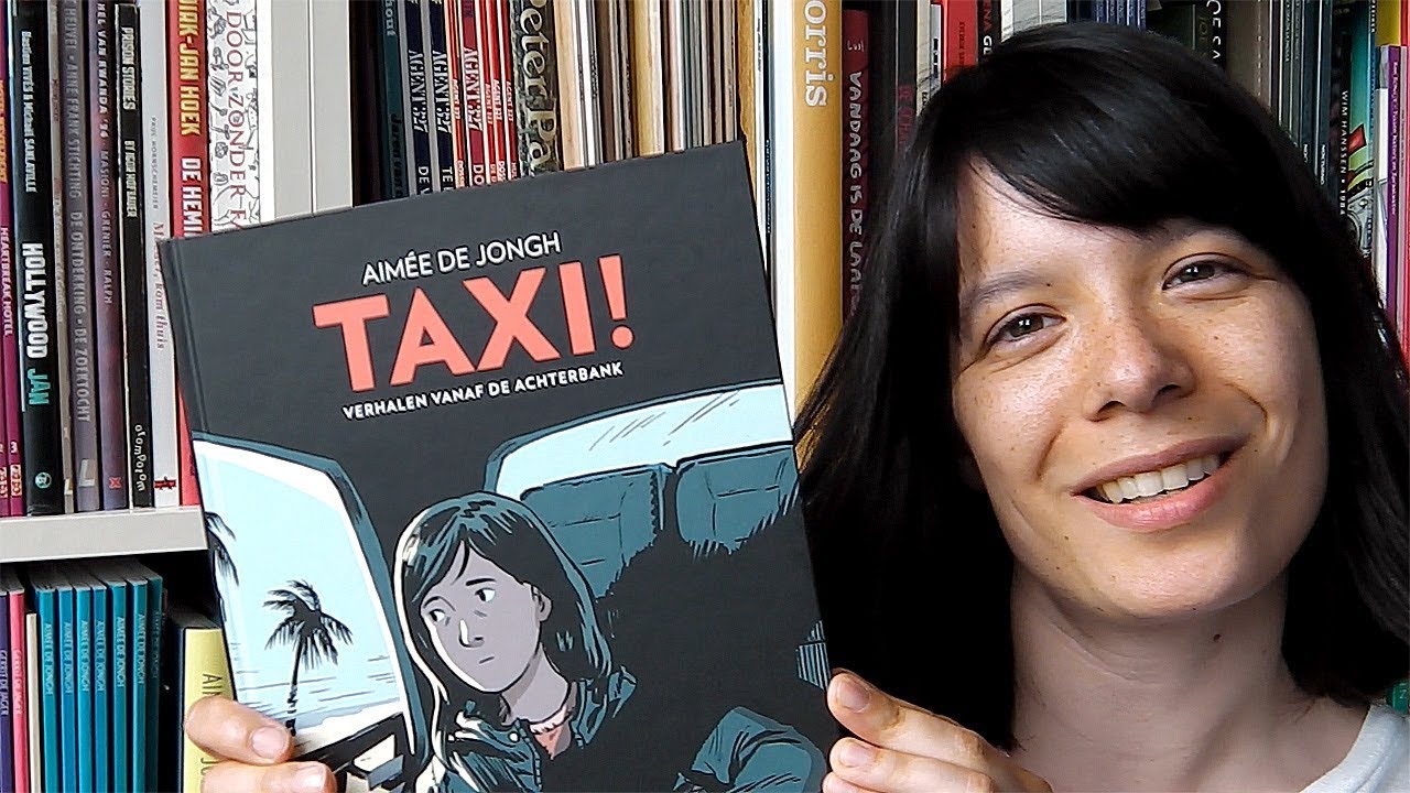
Cartoonist Aimée de Jongh released her first English-language graphic narrative last fall, but reading about taxis trips in crowded cities right now feels like a surreal dip into the ancient past. I just looked at photos of empty Los Angeles highways — the same ones de Jongh draws. She settled in L.A. after leaving her homeland of Holland and arrived in North America via the wonderfully congested routes mapped in Taxi!. I used to hate commuting the Garden State Parkway every day, but never thought I would long for traffic.

I have an urge to describe the memoir in film terms (a back-cover blurb refers to her “cinematic sense of storytelling”). The content is even reminiscent of Jay Jarmusch’s 1991 film Night on Earth about five taxi drivers and their passengers in five cities, two of them the same as de Jongh’s. Instead of just interweaving simultaneous events though, de Jongh reaches across time too, connecting actual conversations from her backseat vantage. After opening in Los Angeles in 2014, the comic leaps to Paris 2018, then backwards to Jakarta 2017, and then to DC during the same year, with Holland never shown but always present in the backstory and dialogue.

The leaps are artfully linked. The L.A. driver honks his horn in 2014, and suddenly the Paris driver is honking too, erasing the four years and thousands of miles between the paired actions. Another driver declares, “Welcome to Jakarta,” and next de Jongh is standing under a partially cropped airport sign welcoming her to the United States. A voice on the radio introduces an L. A. weather report, and we’re back in the puddles of rainy Paris. A complaint about crowded streets segues to an even more crowded full-page image of a Jakarta traffic jam.

Each leap occurs with a page turn, emphasizing the page as the primary unit of structure, an effect that has no parallel in film. De Jongh is also an expert of visual rhymes, placing the grinning face of the Paris driver in the bottom right panel of page 18 and the stony face of the L.A. driver in the same layout location on page 21. Though the two images are ten panels apart, the placement encourages a flipbook-like connection that ignores sequence in favor of a physical cross-reading impossible in film.

These kinds of rhyming leaps define the narrative logic at a deep level too. De Jongh constructs a jigsaw puzzle of personalities, life experiences, and national identities, where even contrasts ultimately reveal connections. The DC driver rants about the dangers of texting drivers, while the Jakarta driver spreads a newspaper across his steering wheel. The grumpy veneer of the L.A. driver hides a secret warmth, while the cheerful surface of the DC driver keeps splitting with angry asides. The Jakarta driver’s father died three days ago, while the DC driver has been on the job for three days, returning after the trauma of witnessing a fatal car crash two years earlier. Both rides occur in 2017, but de Jongh gives no hint at order, instead building an expanding sense of an all-encompassing present.
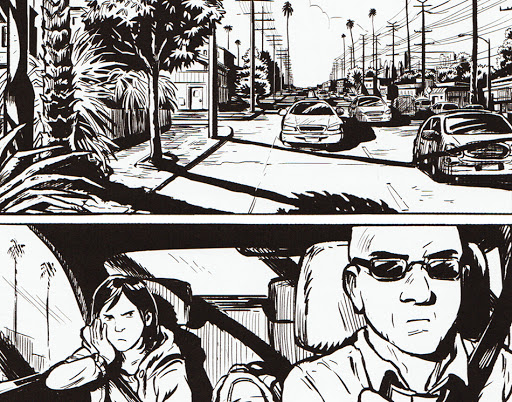
While the memoir collapses time and space, it also breaks down ethnic divisions. De Jongh opens with her account of a dark-skinned friend who always misses connecting flights while delayed by security. The Paris driver laments about the challenges of being Muslim in a city of chocolates during Ramadan, unaware that he’s passing a street memorial to cartoonists murdered by terrorists. He was born in France, but his parents are from Algeria. He mistakes de Jongh for Greek, but her family is from Indonesia. She’s lived in Holland her whole life, and the Jakarta driver flinches at the word, accusing her of three hundred years of brutal colonial rule. But then he reveals that his father is from Holland, before sharing pictures on his phone of the recent funeral.

De Jongh’s cartoon style forms yet another link, as if all of these characters are distant relatives sharing similar faces and body types, all of them wholesomely hobbit-like in their squat proportions and slightly-too-round heads. The effect is heightened by de Jongh’s otherwise naturalistic attention to detail, the textured bark of palm trees and the refracted light in street puddles. She allows herself the occasional cartoon convention of emanata lines surrounding a surprised expression or motion lines trailing a moving car, but she explores her own subtly idiosyncratic flourishes too. I especially admire how she draws talk balloons contained and sometimes even blocked by the window frames of the taxis, as though the dialogue can only be partly overheard by the viewer standing outside of the car. The inclusion of a photocopied receipt from the DC driver on an otherwise blank page is also a pleasantly jarring visual break from the book’s drawing norms and a reminder that the events are remembered rather than invented.
The artwork is all black and white and sharp-lined, contrasting the softer-edged earth tones of her collaboration Blossoms in Autumn published earlier last year. There de Jongh was working with another writer’s script, but Taxi proves that her narrative skills are as sharp as her drawing pens. The nominal plot of each interwoven vignette is the same: the driver’s attempt to get de Jongh to where she wants to go. But she’s already exactly where she needs to be.
[A version of this post and my other recent reviews appear in the Comics section of PopMatters.]
Tags: Aimée de Jongh, TAXI!
- Leave a comment
- Posted under Uncategorized
23/03/20 The Form She’s In
Lesley Wheeler’s new poetry collection The State She’s In (released last week from Tinderbox Editions) is not a comic. But it may include one:

I discuss the visual poem in the book of comics theory I’m drafting right now, The Comics Form: The Art of Juxtaposed Images. But is “En Dehors Garde Bingo” a comic? It violates at least two expectations of the form: images and image order.
First, the word “word” has at least two meanings: a combination of letterforms, and a set of meanings including connotations linked to that combination of letterforms and experienced in a reader’s mind. Neither refers to a specific instance of a word’s appearance as an image on a piece of paper or computer screen, which I distinguish as a word-image.
Like representational images generally, word-images are physical marks on physical surfaces, but unless the words are pictographic and so have some minimal resemblance to their subjects, their shapes are non-representational. But since word-images trigger linguistic content, which is a kind of representational content, word-images are also a kind of representational image.
Word-images may barely register as marks if a reader’s attention shifts primarily to their linguistic content seemingly bypassing their physical presence. “What we are looking at when we read,” explains Mendelsund, “are words, made up letterforms, but we are trained to see past them—to look at what the words and letterforms point toward. Words are like arrows—they are something, and they point toward something” (322). “To read,” continues Mendelsund, “is: to look through […] There is very little looking at” (334-5).
Words in prose-only texts are most often typeset in a single font and color and usually with little or no variation. That uniformity communicates the graphic equality of words’ discursive features. If all words are rendered identically, word rendering communicates no meaning. Comics scripter Brian Michael Bendis describes the same convention for words in traditional comics: “Lettering should be invisible. You shouldn’t notice it, unless it is a determined piece of storytelling in graphic design” (2014: 43).
Word-images that are also graphic elements of a graphically designed page disrupt written language’s looking-through tendency. A reader reads them in the linguistic sense while also being influenced by their renderings, so the meaning of a word is both linguistic and visual. Even “Spacing and typography,” observes Miodrag, “mold the reception of text” (2013: 78). Words in traditional comics typically appear to be hand-lettered, consist entirely of capitals, employ bolding for word emphasis, and may change size, line-thickness, stylistic shape, and color to denote a range of meanings.
Hatfield refers to such word-images as “visually inflected,” explaining that “visible language has the potential to be quite elaborate in appearance, forcing recognition of pictorial and material qualities that can be freight with meaning” (2005: 36-7). What Eisner calls the “visual treatment of words as graphic art” also complicates Walton’s assumption that the “seeing” of a word and the “imagining” of the word’s subject matter are separate, since the imagining is not simply the result of triggering a viewer’s set of meanings associated with the word but is also influenced by the discursive qualities of the specific word-image that does the triggering.
So are the word-images in Wheeler’s poem “images”?
Holbo observes: “Typography is graphic design. Novels, being typed are graphic novels,” and since “Letterforms are images,” prose-only novels and poems are comics if comics are juxtaposed images (2014: 15). In one sense, this is true, and yet intuitively word-images are distinct from images that are not words. Following Eisner’s phrase, I call a significantly visually inflicted linguistic image a graphic word-image, leaving the precise point on the implied spectrum to individual perception.
Are Wheeler’s colored word-images sufficiently graphic to be considered graphic word-images? Even if your answer is no, the poem might still be considered a comic because the words appear in panels.
In traditional comics, hand-lettered or typeset words but not graphically rendered words appear in frames. Unlike speech and thought frames, frames containing words that are not directed at pictured subjects are spatiotemporally ambiguous. Words within frames also divide into lines according to discursive shape requirements and so with little or no linguistic consideration, but containers can also produce units and rhythmic effects similar to lines or stanzas of poetry. The backgrounds of the framed areas are also usually different from the surrounding image, often with the same white negative space as margins and gutters. Since these frames, like comics frames generally, are not actual frames but drawn representations of frames, words in word containers are image-texts. The non-linguistic elements also communicate meaning.
If graphic elements such as word frames in conjunction with word-images are sufficient to make an image-text, then they are also sufficient to make multiple such image-texts a comic when juxtaposed.
But even if we treat each panel as a juxtaposed image-text, Wheeler’s “En Dehors Garde Bingo” may not be a comic because the panels have no reading order. If a comic is defined as a sequence, it must have a single correct order in which the images are to be viewed. That implies that there are also wrong orders—or at least orders that do not produce the aesthetic result that the preferred order produces. Defining a comic as a series means order doesn’t matter. There are no necessary linear successions.
In Creating Comics I divide comics into “sequences” and “sets,” the first being ordered, and the second unordered. Some sets of juxtaposed images are explicitly unordered. For its tenth anniversary the literary journal The Diagram released the anthology 10 of Diagrams in the form of a deck of playing cards, with an image-text by a different author on each card. The ten woodcut prints of Felix Vallotton’s 1898 Intimités are a set that when published in book form must appear in some discursive order, but not an order that is an aspect of the collective artwork. A viewer need not begin with the woodcut printed on the first page and is free to flip backwards or forwards at any time without disturbing any aesthetic effect.
Wheeler’s “En Dehors Garde Bingo” arranges its twenty-five, color-coded sentences into a 5×5 grid. They may be read in any order, which is a significant aspect of the poem’s aesthetic qualities. Unordered image juxtapositions (including image-text juxtapositions like Wheeler’s) are not sequences and so are not comics according to most definitions of the form.
But if you define a comics as simply juxtaposed images, order doesn’t matter. And then “En Dehors Garde Bingo” may be a comic after all.

Tags: En Dehors Garde Bingo, Lesley Wheeler, The State She's In, Tinderbox Editions
- Leave a comment
- Posted under Uncategorized
16/03/20 Rat Time
Koyama Press is scheduled to close shop by 2021, adding a bittersweetness to each new but last release. It’s like watching the final season of your favorite TV show–or your favorite network, since Koyama’s final batch of books looks like a prime-time schedule heavy on returning hit series. Keiler Roberts, Michael DeForge, and Patrick Kyle have each been with the press for several years. But only Roberts’ Rat Time is literally a continuing saga, picking up where her graphic memoir Chlorine Gardens left off in 2018.
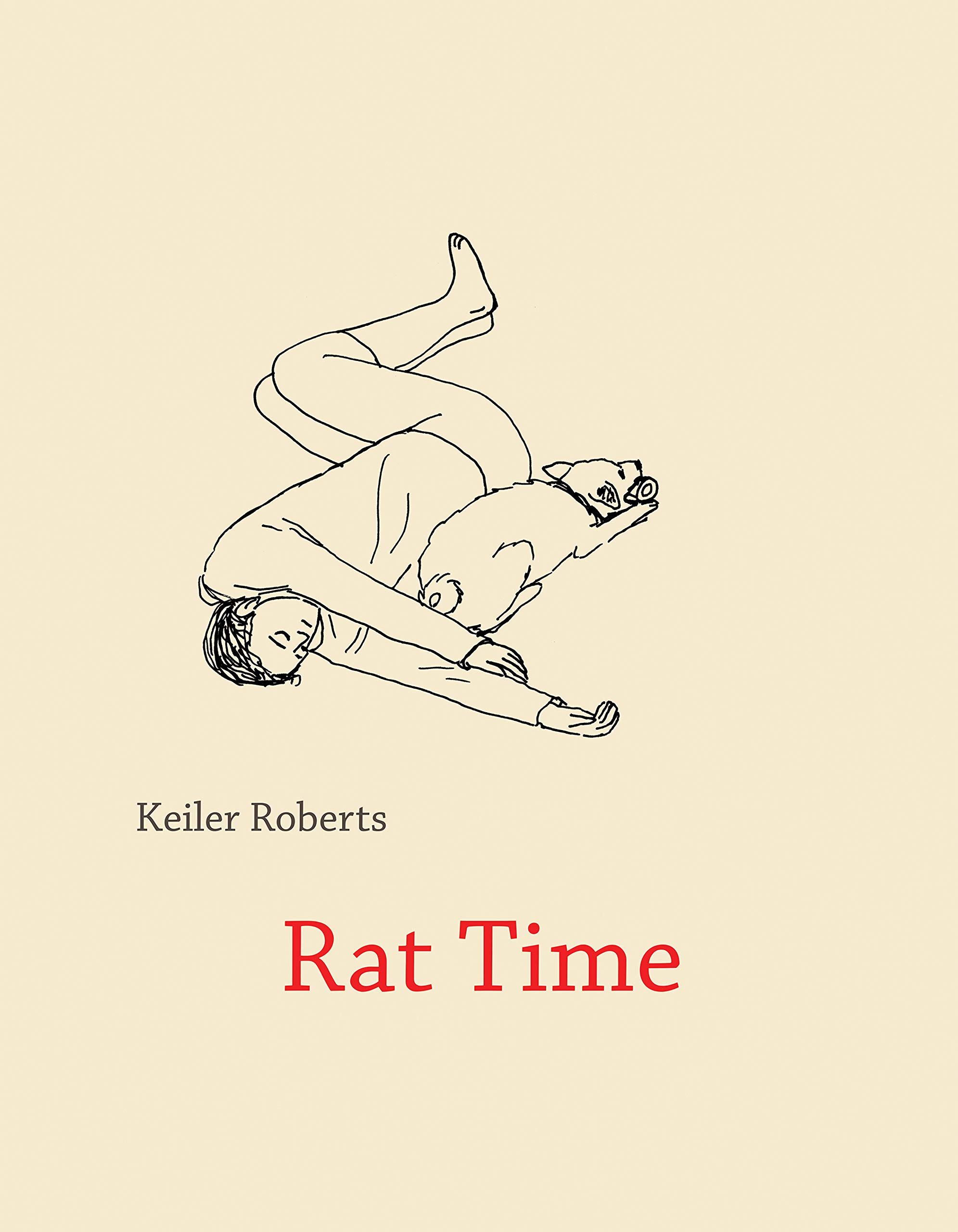
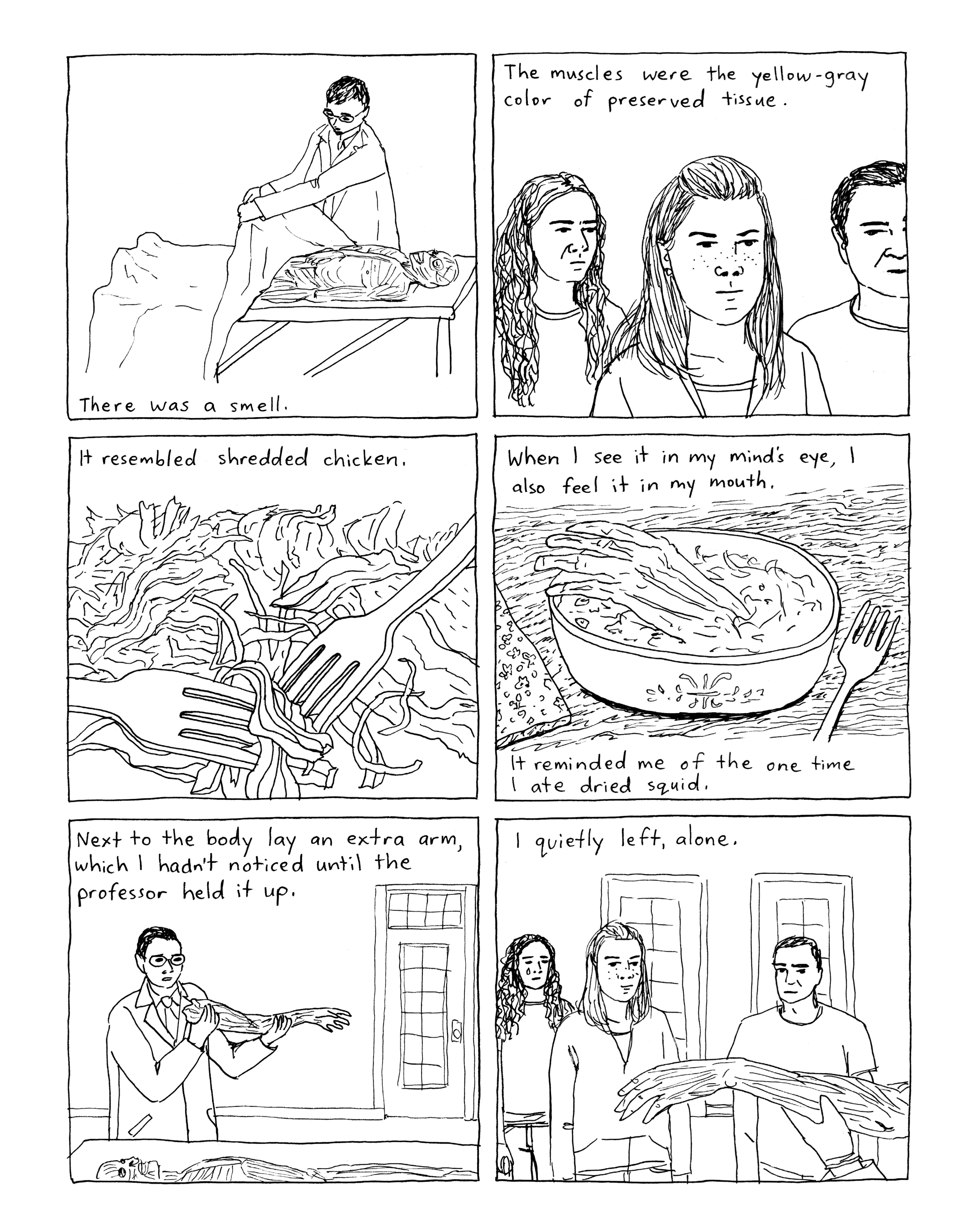
Roberts draws her school-age daughter Xia a little taller, but the rest of her cast of family and friends are the familiar minimalist line drawings of before, their world still composed of the same thin black lines as the gutters framing it. Though the effect is a species of realism, Roberts has no patience for crosshatching, leaving the interiors of her shapes intentionally flat and shadowless. Though animals and Barbie doll faces tend to be more precise than humans, when Roberts fully breaks style with a suddenly detailed and naturalistically rendered image (always, it seems, of a dead family pet), it’s a reminder that the rest of the book’s rough shapes and choppy lines are not determined by the limits of her skill but by the choices of her stripped-bare aesthetic.

Lisa Hanawalt on the back-cover blurb calls Roberts’ books “diary comics,” but I disagree. For an actual example of a diary comic, checkout Eleanor Davis’s You & a Bike & a Road, which was composed as an actual diary one entry at a time. The flow and arc of Rat Time are too artful to be the product of daily happenstance. These aren’t snapshots in a family photo album either, because Roberts wanders unannounced into memories ranging from playing with her childhood dolls to teaching her first catastrophically bad community college course. The transitions are brief and intuitive, providing just enough structure for the juxtapositions (Xia plays with dolls too; skeletons are more useful than cadavers when teaching drawing) to do the storytelling.
Maybe “story” is the wrong word. Although the one- and two-page family vignettes are punctuated with scenes in her therapist’s office as Roberts continues to struggle with bipolar disorder and early stages of MS (plot points carried over from last season), the book doesn’t feel plotted and certainly not dramatic. Roberts is aiming for the opposite effects, rendering a kind of gently comic, low-suspense universe made more realistic by its absence of artifice.
When Roberts attempts to write fiction, it has an uncanny resemblance to the nonfiction of her life. Even when she plays dolls with Xia (it must be an inheritable trait), Roberts can’t escape mundane realism. That’s a good thing. Though she foreshadows the book’s likely closure point when her narrator declares, “I’m either going to figure out how to write fiction or get a better idea of why I don’t,” neither of the promised outcomes transpires. That’s because foreshadowing is for fiction. She already knows why she doesn’t write fiction. It’s too contrived. So is traditional memoir, which is why she’s a master of understatement and inference.

Roberts doesn’t have to tell her readers that all of these recollections of dead pets are about her aging parents and the not-yet-detectable decay of her own body. Stating it would make it too dramatic, too obvious, too much like fiction. The pets are also about the pets. Roberts’ mother worries she touched the dog more than she touched Roberts as a child, but that’s okay. The transitory companionship of animals is superior to human companionship in many ways. Some of the most touching moments in Rat Time are full-page, uncaptioned images of pets and humans in quiet contact. Since backyard burials and memorial photos are an ever-expanding multi-generational tradition, it’s good that pet shops provide an endless supply of dogs and rats (the Roberts family has a thing for rats).
The phrase “Rat time” originated as the after-dinner time when Xia played with her pets. After she cycles through a few almost identically named rodents, “rat time” comes to resonate with absence too. While Chlorine Gardens readers will recall the recent death of Roberts’ grandfather, Rat Time only nods at that fact through his unacknowledged absence and her grandmother’s unremarkable singleness. This is just how things are. No need for drama or commentary. When Roberts showed Michelangelo’s Pieta to her first Art History class, she was embarrassed because she had nothing to say about it. Though “Let’s all just look at it for a few minutes” isn’t the best lesson plan, it’s not a bad life strategy.
Roberts takes us through a curated set of vignettes, creating a fragmented but still cohesive flow of events that resists the norms of plot while still providing its pleasures. There as so many small and touching and gently comical moments: a fond memory of a self-effacing professor, her imaginary Dear Gratitude Journal filled with ironic absurdities, cracking her therapist up by saying their work here is done, cooking and tampon catastrophes, a list of things that make her cry, a list that makes her happy.
The book itself has the logic of a list, as though Roberts is still assembling it, still thinking through each entry even as she jumps to the next. The past has that open-ended feel too. That self-effacing professor accidentally lost a ring while lecturing, and the sound of it bouncing away stays with Roberts. She still wonders if the women ever found it. One of my favorite images is Roberts sitting on her bed surrounded by open books with the narrated caption: “It doesn’t bother me to read parts of books and never finish them.”
Again, not a great lesson plan, but it’s the only life strategy there is.

[A version of this post and my other recent reviews appear in the Comics section of PopMatters.]
Tags: Keiler Roberts, Koyama Press, Rat Time
- Leave a comment
- Posted under Uncategorized
09/03/20 The Art of Unphotographing

The correct term is “photo illustration,” a kind of digital art that manipulates photographs. Arguably all digitized photos are digital art, and the boundary between a manipulated photo and a photo illustration can be blurry. Unless you’re doing what I’m doing, which is a miles-long stroll across the uncanny valley away from any borderline cases and deep into the thickets of abstractions. Where Photoshop can create photorealistic images from digital nothingness, I’m unphotographing photographs into pixelated pulp. I’m also using the un-Photoshop program, MS Paint, which Microsoft “deprecated” in 2017. I prefer it for two reasons: 1) I’m too lazy to learn Photoshop, and 2) I’m ridiculously happy with my results. I have added one cheat though: I open photos in Illustrator when I want to add something in grayscale (as you can see below). The steps just prior to the chessboard transparency are the most involved, free-form selecting slices of the image and transparency-pasting them back over again. It’s a way of mixing of colors directly on screen in what can look oddly painterly if you keep doing it long enough, which I do. I initially stopped there, but then had the brainstorm of testing the chessboard overlay. I like the results (see above), but maybe the pre-chessboard version is better (see the final image below).
This took much of my Sunday, waiting to drive to Charlottesville to pick-up my son at the train station as he was traveling home from Philadelphia for his spring break. Though maybe that’s the wrong word–when does home stop being “home”? That’s him in the photo. It’s another philosophical puzzle whether that’s him in the unphoto too. When does a photograph of Cameron stop being a photograph of Cameron? When does a photograph of Cameron stop being a photograph?


- Leave a comment
- Posted under Uncategorized
02/03/20 Creating Comics Canvas-First
In our textbook Creating Comics (due out from Bloomsbury at the end of the year), Leigh Ann and I describe three processes for creating comics before recommending a fourth: perhaps the most effective approach is a combination of the first three, developing story, image, and layout simultaneously. Though the page is always a kind of canvas, canvas-first emphasizes the page as a whole, treating other parts of the creative process as elements that evolve to suit it. So while creators may begin with plot, image, or arrangement ideas, they will change according to what works best on the page. Nothing is set in stone.
In an earlier blog, I showed how our student Henry developed his main character from a doodle, inventing his background and plot situation after revising him visually first: 
The next four illustrations show Henry’s canvas-first process for creating his one one-page comic “Homesick.” Some of the images in “Homesick” originated while Henry was drawing his character Gabe in multiple poses for homework. That discovered knowledge of his own character was key when he started composing Gabe’s story.

Henry begins by brainstorming textual descriptions:
“we have a center-framed GABE experiencing the drudgery of being reduced to a simple worldly person.
“the daily toil and drudgery of a demon?
“Stepping on the bodies of the damned, stabbing through the heads of non-believers”
Note the tiny sketch beneath the words: “Maybe begin with a lot of them,” and then the creative epiphany: “Daily toil and drudgery of human life.” His first row of four panels begin with Gabe hanging upside down, presumably sleeping as inspired by his bat wings, before enacting the “stabbing” from the descriptions. The next row shows Gabe sighing on a desk, an example of “human drudgery.” The rest of the row is undrawn, with the word “flying” substituting for images, as he establishes a layout idea of separately spaced and enlarging panels, followed by lines indicating the start of a full-width panel and the words “big panorama panel.” The next row begins the page over, revising the first draft row, adding “7:00” on a clock behind Gabe, suggesting that he has just woken up—though he is no longer hanging upside down. Notice how the sketchbook page begins the process by working in images, story ideas expressed in words, and layout designs all together.

Henry next sketches a full draft of the comic page. Row one is now a two-panel action of Gabe waking up as shown by a close-up of the clock followed by a close-up of his face. Row two consists of three one-panel actions of Gabe centered while performing individual acts of human drudgery: brushing his teeth, driving to work, sitting at a desk. The second half of the page enters his thoughts, with the largest panel labeled “Bosch World,” indicating Henry’s plan to develop Gabe’s memories with images based on Hieronymus Bosch’s c. 1500 painting Hell. The layout idea of spaced and enlarging square panels has evolved into circular panels that emerge from Gabe’s head like the circles of a thought balloon tail, with a sketch of Gabe flying inside each.

Henry refines the first three rows, giving Gabe’s bathroom a toilet, towel, towel rack, cabinets, counter, and sink. The car in the second panel is now much more than simply the driver’s wheel of the previous sketch. And in the third, Gabe’s work place includes constricting cubicles—though Henry has cut Gabe’s statement, “I can’t type.” Henry has also begun arranging the Bosch-inspired details in the central panel.

The final draft includes further refined details: a tighter close-up of Gabe’s eyes, so that the full strangeness of his anatomy isn’t revealed till the second row. One of his bathroom cabinets is now ajar and his towel features a realistic crease. There’s also a “Motivation” poster hanging behind his desk now. The chaos of the large, Bosch panel is fully developed and suggestively unframed. Because this is a one-page comic, ending on Bosch produced a cliff-hanger effect, so Henry moved the daydreaming Gabe to the final position, with his thought circles now flying back inside his head, completing the page’s action with his “sigh.”
- Leave a comment
- Posted under Uncategorized


