Monthly Archives: March 2024
25/03/24 Fear of a Black Phenotype
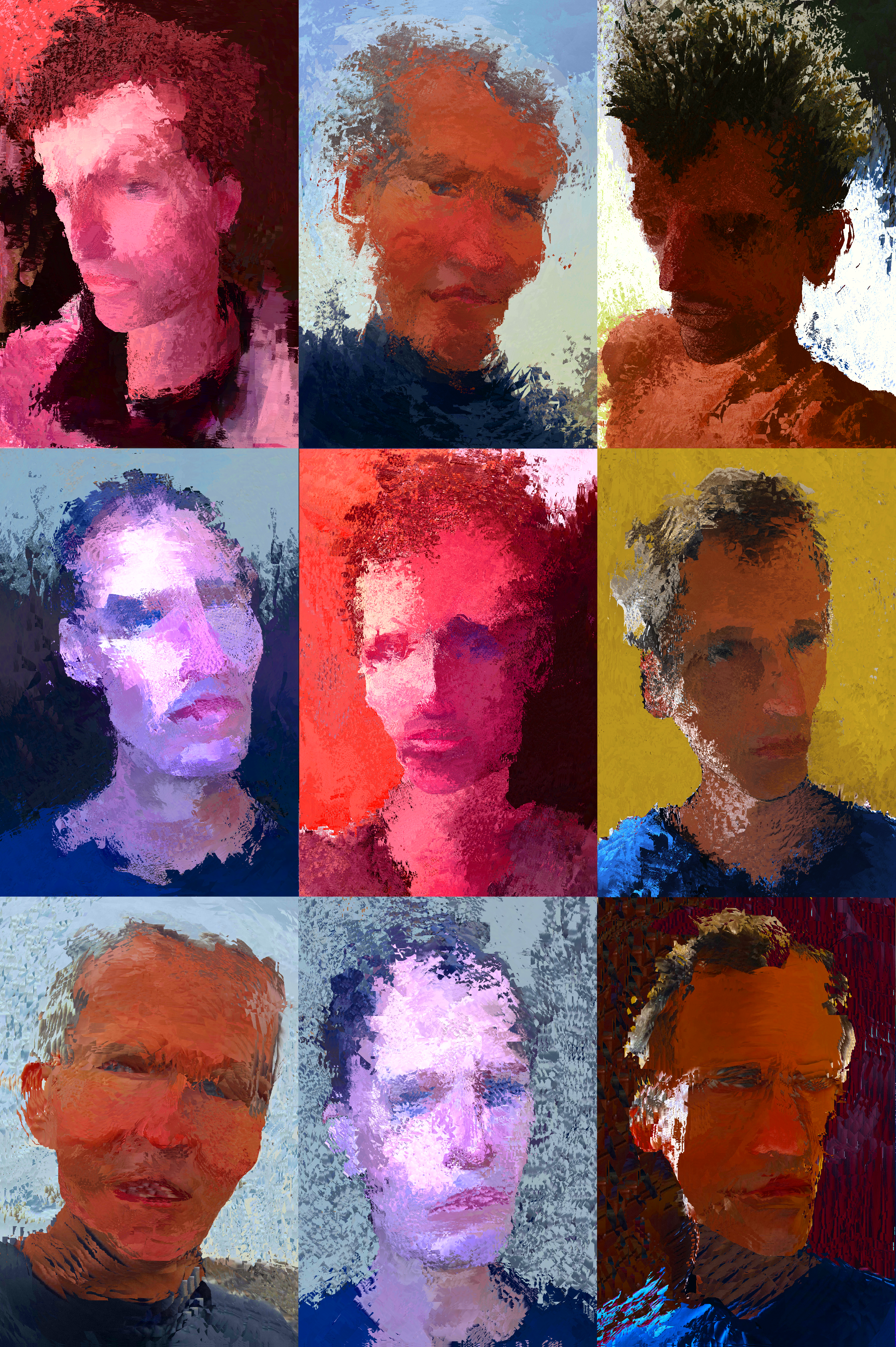
This image makes me a little nervous. I created it through an idiosyncratic digital process, where the final image is largely unrelated to the initiating set of marks, and no clear authorial intention controls the outcome. In other words:
I didn’t set out to draw a Black woman.
That I think (and think others will think) it’s a drawing of a Black woman makes me a little nervous — because so much of the history of white artists depicting Black people is horrific, and the image places me in that history.
But if my authorial intention doesn’t make it a drawing of a Black woman, what, if anything, does?
I think (and I think others will think) it resembles a Black woman. Resemblances is distinct from racist caricature, but it’s still problematic since the image isn’t of and so doesn’t resemble any one specific person who happens to be Black. It’s an invented image, and so for it to resemble “a” Black woman, Black women would have to have some common appearance that the image somehow imitates.
Setting aside the considerable issues of gender and focusing just on race, the image would have to resemble a Black phenotype.
In 2022, I received a reader’s report for an essay submission, “Reading Race in the Comics Medium,” that I’ve since revised and was just published in Closure #10. The reader reported:
“You must take into account how logics of race inform linguistic constructions, while also bearing in mind that racial phenotype is a very, very real thing. You seem to express tacit reservations about its existence … It is a very well-established and researched fact that Black phenotype is real, and consequential – even deadly – in white supremacist systems.”
I think the reader misread me. (The essay draft discussed, among other things, how men with Black phenotype receive harsher sentences and the specific attributes of noses drawn to represent Black faces.) But it also seems likely to me that I indirectly and unknowingly communicated, not a tacit reservation about the existence of Black phenotype, but a discomfort with talking about it. In other words:
Black phenotype makes me a little nervous.
And that nervousness apparently occurs whether I’m addressing the subject in words or image.
Being a little nervous isn’t a problem, especially if the nervousness results in my being more careful. As I’ve mentioned in previous posts, I’m working on a book manuscript tentatively titled “The Color of Paper: Representing Race in the Comics Medium.” Tacit reservations or not, I’m drafting a section about Black phenotype. It helps that I’ve been exchanging work with Jo Davis-McElligatt.
Here’s a passage I’ve been working on:
In her essay “Black Looking and Looking Black: African American Cartoon Aesthetics,” Joanna Davis-McElligatt uses the term “Black phenotype” three times. Though the phrase may communicate an immediate surface meaning (brown skin, black tightly curled hair, lips larger and nostrils wider than typical of non-Black people), no phenotype can simply be “Black” because phenotypes do not match racial categories. “Phenotypic traits have been used for centuries for the purpose of racial classification,” explains John H. Relethford, but “the boundaries in global variation are not abrupt and do not fit a strict view of the race concept; the number of races and the cutoffs used to define them are arbitrary. The race concept is at best a crude first-order approximation to the geographically structured phenotypic variation in the human species” (). As a result of that crudeness, the term’s adjective-noun combination is oxymoronic. “Phenotype” references physical qualities and “Black” references a socially constructed category, resulting in the impossibility of socially constructed physical qualities. To avoid that extrinsic-intrinsic contradiction, “Black phenotype” could mean physical qualities belonging to members of a socially constructed racial group. While technically accurate (group members necessarily have physical qualities), the phrase implies a unique subset of physical qualities that is consistent across members and therefore ultimately defining of the group – which then redefines “Black” as that set of physical traits and redefines “race” as not a social construction. To avoid that essentialist definition, I understand “phenotype” to mean: physical qualities perceived as belonging to members of a socially constructed racial group. The perception may be by members, non-members, both, or some combination, and the perception is always socially constructed. Since an individual whose appearance does not match a Black phenotype may still be Black, racial constructions also extend beyond phenotypes to include socially constructed perceptions of other qualities (such as speech, clothing, names, and social environment). Davis-McElligatt therefore references an artist’s rendering of a character’s “Black phenotype—his Black curly hair, dark eyes, rich brown skin, and wide nose and lips” and lists such “portrayals of Black phenotype” as distinct from both “Black expressive culture” and “the conventions of Black being,” as well as distinguishing “Black phenotype, or looking Black” from “Black behavior, or acting Black.”
This next bit may end up on the cutting floor, but it still seemed worth drafting:
My white phenotype includes beige skin, blue eyes, brown hair, a thinner than average nostril width, and smaller than average lip size. Distinguishing qualities of my white expressive culture, conventions of white being, and white behavior are too numerous and complex to easily list – though all align with my phenotype, and so a visual depiction of my phenotype may be sufficient to evoke them.
Weaving back to my digital art, I created this last image shortly after creating the image at the top of this post, using the same emergent process I described there.
I think it’s a drawing of a white person.
Is it?
Tags: Joanna Davis-McElligatt, reading race in the comics medium, the color of paper
- Leave a comment
- Posted under Uncategorized
18/03/24 The Strange Invisibility of a Black Kat in Front of a Black Sheet
I taught George Herriman’s Krazy Kat for the first time last semester to my advanced comics class. It was also the first time I came across the Sunday comic published in the San Francisco Examiner on July 11, 1919. I now plan to include it in the first chapter of my work-in-progress The Color of Paper. Here’s a first draft of my analysis:
Likely the first critic to analyze the series, Summer Baldwin wrote in 1917 that “Mr. Herriman’s medium is the pen and ink sketch,” noting a central contrast: “Krazy Kat is black,” but “Ignatz Mouse is done in line,” and the “other characters are also done in line” (801).
More precisely, Herriman renders Krazy Kat as a tightly cross-hatched and so nearly opaque ink shape, with minimal unmarked page area visible between the figure’s interior black marks, sometimes more lightly in the area of the stomach suggesting lighter fur. In contrast, Herriman composes Ignatz’s head and torso as exterior black contour lines with minimal internal marks delineating three-dimensional features. Ignatz’s limbs, fingers, and tail are single lines.
Other characters, including Officer Pupp, may also include minimal cross-hatching to suggest shadow, including along Pupp’s lower torso creating the impression of a protruding stomach. Herriman likely drew Krazy Kat similarly, what Baldwin terms “in line,” before adding “black” cross-hatching.
Baldwin also notes that Krazy Kat’s “face is white, with two black dots for eyes, and a thick black line for a nose” (801). That “line” is a double line or a circle depending on whether the nose is rendered in profile or as if viewed head-on, and the dots appear at the center of unmarked areas enclosed by two circles. Herriman also draws a backward protruding bow around the character’s neck, which, in Baldwin’s analysis would also be “white” since the two sides of the bow are drawn only “in line.”
The details are significant because the 1919 comic disrupts them.
Officer Pupp announces in the first image: “‘Kats,’ ladies, & gents, is invisible in front of black sheet, especially if they’re black kats.” His hand extends in front of the “black sheet,” revealing that his body is diegetically opaque, though discursively the interior area of his body is the page surface. The page areas visible outside of his body are discursively identical but diegetically distinct, representing either sky or ground depending on whether above or below horizon lines.
In the second image, Pupp instructs Krazy Kat: “Open them eyes!!” and Herriman draws two white circles punctuated with tall black pupil-representing shapes. Herriman does not include Krazy Kat’s “white” face or bow, nor the line-like areas of his stomach normally visible between crosshatches. This is presumably because he has only drawn the character’s eyes. Krazy Kat is not “invisible” because a black body is drawn “in front of” or even discursively surrounded by a black object but because the body is not drawn at all.
When Ignatz hands Krazy Kat what is apparently a glass milk bottle, the object appears to be opaque white in front of the black sheet – though once emptied, the bottle remains opaque white.
Krazy Kat’s crosshatched paw partially blocks the bottle when their body is black, and again as their body grows incrementally white as though filling like a container with liquid.
The filling effect is paradoxical though, since Herriman does not render the liquid pouring through their body, presumably because the body is still diegetically opaque black while discursively it is undrawn and then partially drawn. When fully drawn, Krazy Kat resembles Officer Pupp, both now “done in line.” Krazy Kat, however, stands in full contrast to the “black sheet,” reducing the contour drawing effect. Herriman also crosshatches no shadows within the body, further flattening the image.
When the character drinks from an “INK” bottle, the ink is presumably black, though the bottle is the same opaque white as the milk bottle. The figures also seem to hover several vacillating inches off the ground, and while the other characters and objects (including both emptied bottles) cast crosshatched shadows beneath or beside them, Herriman draws no marks in the areas representing the three-dimensional space before the sheet. The comic offers no diegetic explanation for the impossibilities, adding to the implicit effect of Krazy Kat appearing not diegetically “in front of black sheet” but discursively within a black panel.
The black panel also reveals other of Herriman’s drawing norms.
Though still “done in line,” when drawn diegetically in front of the black sheet, Ignatz’s limbs and tail are not black lines but white ones. Where other “white” objects are rendered by drawing black marks around them, these white areas do not appear to have been drawn directly and so were, prior to the newspaper printing process, initially made with white ink applied on top of the black ink of the black panels. Ignatz’s appendages, being only the width of a line, require contrast to be legible. As a result, since a white mouse is not diegetically invisible in front of a black sheet, the figure’s black lines must become discursively white to remain visible.
Similarly, the zip lines and onomatopoeic “ZIP” within (or diegetically “in front of”) the black panels must be rendered in white too, as when Officer Pupp throws an unidentified white object at Ignatz in the fifth image. Though the object is likely negative space, the motion lines and the lines of the letters were likely rendered in white ink.
The thinness of those lines creates a discursive challenge. In scans of the San Francisco Examiner newspaper page, the lines are either mostly absent or obscured in the digital reproduction process. If absent, then the marks were obscured in the original printing process due to the thinness of the lines. The paper likely absorbed the black ink surrounding it.
Presumably working from either Herriman’s original art or from a better reproduction, the Fantagraphics reproduction of the page includes white motion lines in images five, six, and fourteen. The Fantagraphics edition is also printed on white paper, dissimilar to the gray of the newspaper stock. As a result, the white opaque objects appear discursively white too, and so the milk inside the milk bottle is the actual color of milk. Ignatz and Officer Pupp are also now white – a discursive quality that creates ambiguous diegetic ones. Is Ignatz a white mouse or a gray mouse? Is Officer Pupp a white dog or a gray dog – or a dog of some color not representable in a black-and-white image?
When Herriman later began producing color comics, Pupp is revealed to be wearing a blue uniform. Was his diegetic appearance therefore always blue, even prior to Herriman’s later discursive addition?
Tags: 1919, George Herriman, Krazy Kat, San Francisco Examiner
- Leave a comment
- Posted under Uncategorized
11/03/24 Illuminating Layout
I began thinking about comics layout as products of trompe-l’oeil (literally “deceive the eye”) painting techniques in a post last October. I’ve since come across (and then interlibrary loaned) a book that’s taken me further down that rabbit hole. Here are my latest illustrated musings:
In Cultural Techniques: Grids, Filters, Doors, and Other Articulations of the Real, Bernhard Siegert interprets the trompe-l’oeil of seventeenth-century Dutch still life as a descendant of the “hybrid text-image medium” of “the illuminated manuscript page of the late fifteenth and early sixteenth century” (165).
In short, the approaches for painting three-dimensional illusions developed from illustrated books. The role of the surface areas between text, images, and surface edges is especially significant. In the “refashioning of the manuscript page,” argues Siegert, “the border is turned into a space connected to the real space of the reader and the miniature acquires an infinitely receding space of its own” (187).
Siegert’s analysis also describes comics layouts: the gutter is connected to the real space of the viewer, and the panel exists as a diegetic space of its own.
The comics medium did not evolve directly from either the trompe-l’oeil or illuminated manuscript traditions, but a comics page shares formally similar qualities with both. Since the comics medium exists in a larger visual arts context that follows and therefore is aware of the earlier traditions, direct influence cannot be ruled out, but parallel artistic evolution within historically unrelated book formats is at least as likely.
Either way, the trompe-l’oeil provides a lens for understanding the comics page.
Siegert begins by analyzing works by the mid-1600s Belgium painter Jan van Kessel. His oil-on-copper painting Insects on a Stone Lab depicts a vertical stone slab surrounded by plants and sky. Seigert terms it a “metapainting,” because a portion of the painting’s actual surface is demarked to represents a fictional surface: the “copper plate ended up as a stone slab,” and Seigert calls that area of the painting “a compromise between readability and visibility” because actual surfaces are read and represented surfaces are viewed.
Van Kessel merges discursive and diegetic surfaces similarly in his 1655 Insects and Fruit, but without a representational explanation for the dual surface. Seigert describes the painting’s “ground of opaque white” as “an ambiguous surface” because some of the drawn insects “sit on that ground as if it were a horizontal plane extending backwards into space” and so “are inhabiting the imaginary space within the painting,” while other insects “appear to be using it as a vertical wall” and so “are sitting on the real picture” (169).
Where the first oil-on-copper painting transforms “the ambivalent surface of the copper plate” into a representation, the background of the second painting remains ambivalent, fluctuating between being a diegetic space represented by a discursive surface and being a discursive surface only.
Seigert understands “this space as the result of a conflict between two cultural techniques—gazing and reading,” where the “disjunctive technique of viewing images on the one hand and reading text on the other” creates “a diaphanous zone” that reveals both (169). Regarding illuminated manuscripts of the previous century, Seigert describes the effect as a “self-conscious problematization of the coexistence of two-dimensional writing space and three-dimensional pictorial space” (180). Though van Kessel’s paintings include no text, his canvas surfaces vacillate similarly. The insects painted as if “on” the canvas highlight the actual surface where text would be printed, while the insects painted as if “within” the illusory space of a depicted scene obscure the actual surface.
A prototypical comics page also vacillates, usually with clearly demarked areas. Page surfaces within panel frames are drawn to depict three-dimensional pictorial spaces, and the unmarked areas outside panel frames are understood as actual page surfaces dividing panels as gutters. If text appears in an otherwise unmarked gutter area, the letterforms are understood to be printed “on” the page surface.
Seigert also analyzes earlier works by still-life painter and manuscript-illuminator Joris Hoefnagel.
His 1589 Still Life with Flowers, a Snail, and Insects features a trompe-l’oeil frame engraved with a title and artist name – though of course the words are painted on the canvas surface. The fictional frame appears to be “connected to the actual frame,” placing each still-life object “visually at odds with the painting’s surface” because “it is impossible to say on which level it is located” because it “resides in an impossible space between picture frame and vellum” (172-3).
Hoefnagel’s 1590 Miniature with Snail includes a similar trompe-l’oeil frame painted with roses that “possess a hybrid, metamorphic dimensionality,” because “their stems appear three dimensional, while their blossoms share the bidimensionality of the parchment surface” (171). Seigert sees these “protruding semi-two-dimensional and semi-three-dimensional objects” originating from Hoefnagel’s earlier work in illuminated manuscripts. The “ornate shape of the wooden frames,” he argues, “sprang from writing” as “a calligraphic ornament that has attained object status” (173).
Hoefnagel-like text-containing frames are common in the comics medium, especially for titles and credits. Winsor McCay provides an early example.
The October 22, 1905 edition of Little Nemo in Slumberland includes a drawn frame that appears to overlay the top row, dividing the image into three continuous panels with a title plaque nominally protruding into the viewer’s space. McCay’s drawing style is comparatively simplified, reducing the trompe-l’oeil effect while still establishing its visual logic.
Will Eisner’s The Spirit splash pages are especially well-known for their object-status titles.
Siegert’s “diaphanous zone” was widely popular in Marvel comics, where credits-text areas of splash pages routinely vacillated as on/within surfaces. John Buscema’s The Avengers splash pages from the late 1960s established the norm, both with text ambiguously incorporated into the story world, as well as credit boxes drawn as though physical objects placed on top of the page.
Siegert analyzes further examples.
Regarding Hoefnagel’s folio 37 of Mira calligraphiae monumenta, Siegert pays particular attention to one “tell-tale detail that conjures up the trompe-l’oeil effects and sheds light on the link between the objectification of writing and the ambiguity of the surface”; Hoefnagel paints the representation of a “slit cut out of the vellum of the page into which the stem of the flower has been stuck. This slit appears to turn the two-dimensional page of the book into a three-dimensional object. The two-dimensional writing surface is transformed into an illusionary three-dimensional object that, paradoxically, appears to be resting on itself. The vellum, that is, the carrier itself, into which the line has been inscribed, becomes a trompe-l’oeil: the image carrier steps out of itself to become an image object.” (173)
Hoefnagel’s example is atypical in illuminated manuscripts, and George Herriman provides an atypical example in the comics medium. His October 15, 1920 edition of Krazy Kat includes a tree drawn as though passing through five slits of the kind Siegert describes on Hoefnagel’s page.
Seigert analyzes an additional aspect of Hoefnagel’s folio 37. On the reverse side, the stem “appears to pierce the page and lie on the narrow vellum strip. The shadow of the strip as well as the dark edges of the hole and the small ‘visible’ piece of the stem are the only elements that have been painted on this side” (173).
I am unaware of a parallel example in the comics medium, but Pascal Jousselin does employ the reverse side of a comics page for related effects. Mister Invincible includes a villain able to pass through the physical page of the comic and step into the scene occurring in the reverse panel.
It’s easier to see with isolated panels, and if you image the pages pressed together back-to-back:
Siegert’s analysis of Hoefnagel applies equally to Jousselin:
“Hoefnagel transforms the page itself into an object whose topology oscillates between bi- and tridimensionality …. Not only does the trompe-l’oeil refer to the vellum as the real image carrier … but the very act of turning the page folds the illusion of the three-dimensional stem into the real tridimensionality of space. Here, the trompe-l’oeil invades the space of the observer in a real rather than merely illusory manner. The play of recto and verso enabled by objects such as book pages that can be turned creates an ambivalent threshold zone between imaginary of the image and the real of the reader/observer.” (173-176)
Seigert also describes an Austrian manuscript from the 1500s in which the borders of a double page are “a shelf construction erected on top of a chest,” “the lid of the chest and the shelf compartments are filled” with various objects,” the “miniature itself is a window in the shelf allowing a view into the distance,” and “the shelf’s center window serves a frame for the text” (187).
Shintaro Kago explores related effects five hundred years later:
Rows of rectangular panels generally can be understood as a kind of “shelf construction.”
And when panels are drawn as if overlapping, the page relates to Seigert analysis of the 1515 Grimani Breviary manuscript, by “treating the colored manuscript page itself, which constitutes the background for resting objects, as a flat picture object, the representation of a curvable parchment”; it “effectively turns the material image carrier into a picture of itself” (183), “integrating ontologically heterogenous elements into an apparently homogenous picture object” (187).
There’s plenty more to explore on this subject (Siegert’s casual “metapainting” aside begs for its own chapter), but let me wind down for now with a tentative conclusion:
Since a comics page, like any page or canvas, has no formal constraints but its actual edges, a general analysis must address that openness. Rather than approaching layout as a quality of an isolated medium, understanding comics within the broad field of art history reveals that comics layout shares key features with illuminated manuscripts and trompe-l’oeils. Formally, the prototypical comics page is a rudimentary trompe-loeil.
Tags: Bernhard Siegert, George Herriman, Jan van Kessel, Joris Hoefnagel, Pascal Jousselin, Will Eisner, Winsor McCay
- Leave a comment
- Posted under Uncategorized
04/03/24 Possibly the Worst Comic Book Ever Made? (Marvel 1999/1971 White Supremacy part 2 of 2)
Captain America: Sentinel of Liberty #8-9 (April-May 1999) is a useful reminder of how badly the comics production process can go and how remarkable it is that it rarely does. I wrote about #8 last week, but #9 is where things go off the rails.
Mark Waid scripts both issues, Cully Hamner pencils the first, and Doug Braithwaite pencils the second. Switching pencillers mid-story is never ideal, but it’s not uncommon and is typically unremarkable. (Avengers #74 (March 1970) provides an example with John Buscema taking over from Frank Giacoia.)
I would love to read Waid’s scripts to assess where exactly the process broke down. My best guess: the two pencillers worked from each issue’s script independently and simultaneously, unaware of many of the other’s visual decisions. At some point (during inking perhaps) someone must have noticed the incongruities, but the decision was made (presumably by Bob Harras as editor-in-chief) to proceed anyway.
As detailed in last week’s post, Waid introduces Ajanii Jackson in #8. As drawn by Hamner, the Black man appears middle-aged with a handlebar mustache and wears a suit and tie.
I suspect Hamner had Jesse Jackson in mind — especially since Jackson grew in national prominence during the period of the 1971 story arc. Martin Luther King, Jr. selected Jackson as national director of the Southern Christian Leadership Conference’s economic-focused Operation Breadbasket in 1967, and Jackson’s own organization Operation PUSH (People United to Save Humanity) began operations in 1971. Jackson also appeared on William F. Buckley’s Firing Line in October 1971 — when Waid’s imprecisely retconned story appears to be set.
Yet in #9, Braithwaite’s Jackson wears tennis shoes and a t-shirt and appears to be a teenager.
I’ve not seen this sort of contradiction since 1939, in Action Comics #8, where Superman co-creator Joe Shuster first draws a gang of “juvenile delinquents” as though twenty-something hooligans and then later in the same issue as pre-pubescent urchins.
Back in Captain America, the first issue includes a one-page appearance of the Wizard, a seeming KKK reference, but he is instead a bearded and costumed supervillainous inventor who supplies the Sons with technological weaponry while declaring: “I have no interest in your racist agenda or goals, only in your cash.”
The character is not a Waid and Hamner invention. Lee, Lieber, and Kirby introduced the Wizard as an antagonist for the Human Torch in Strange Tales #102 (November 1962), and Lee and Kirby reprised him as an ongoing supervillain in Fantastic Four #36 (March 1965), where Kirby established his appearance with a costume and goatee, which subsequent artists copied.
Including Hamner (though minus the helmet, presumably because the character is not in action but seated at his desk):
Braithwaite seems to draw the same character (also minus the helmet):
Except in the second issue, that bearded and costumed figure is called and behaves as Mason in Waid’s script, and the Mason as physically depicted by Hamner in #8 is absent.
Though Matt Hicks colors both issues, in the first he gives the Wizard a red and blue costume, and in the second a purple and gray one. Previous colorists rendered the costume inconsistently, so neither is definitively accurate or inaccurate. Regardless, it is impossible to account for the contradictions narratively within the single story arc.
It is also impossible to determine how they occurred in the production process. Were the two pencilers working simultaneously and independently, preventing Braithwaite from following Hamner’s character design for Jackson? Did Waid intend for the Wizard to not appear in #9 but Braithwaite misconstrued references to Mason and drew Mason as the Wizard? Was Hicks’s color changes a late attempt to lessen the incongruities, suggesting that the now bearded Mason was not wearing the Wizard costume? Could series editor Matt Idelson not have noticed the errors, or did time or financial restraints prevent Braithwaite from redrawing Jackson and Mason/Wizard?
In a perverse sense, the incongruities are thematically appropriate for a retconning story that disregards the visual representations of the period it claims to integrate. While Hamner and Braithwaite contrast each other’s styles, both equally contrast John Romita Sr.’s, who penciled the 1971 Captain America and the Falcon issues. Romita, for example, rendered Leila tall, large-breasted, impossibly thin-waisted, and with an inches-thick Afro and supervillainously high and curved eyebrows. Hamner renders her with more realistic proportions, but also gives her a close-cropped haircut, low eyebrows, and rounder face.
The uncredited 1971 colorist assigned her standard Black skin, YR3B2, established shortly before the 1970 Sons of the Serpent reprise, but Hicks instead gives all Black characters multi-hued skin for a more naturalistic effect. However, because Hicks assigns all Black characters the identical set of browns, the effect suggests that all Black people literally have the same color skin, an intensification of the earlier Color norm which, because it ignored lighting effects, signaled lesser realism.
Hicks also switches the race of a character between consecutive panels on the opening page of #9. Though perhaps minor in comparison to other incongruities, the error stands out because the character is one of three White men attacking a Black man during a night of riots. When Captain America’s thrown shield strikes one of the men in the face, he is rendered in the same brown as the man he is attacking.
The apparent change in race, while presumably unintentional, mirrors Captain America. Sam Wilson assumes the costume and role after the apparent death of Steve Rogers. When first seen from behind, his skin is covered in red, white, and blue except for his ears—which Hicks, intentionally or unintentionally, colors the same White-denoting light pink as the skinhead attacker he’s punching. After the page turn, Braithwaite fills the full-page panel with Wilson’s Captain America, framed by towering flames lit during the riots in Harlem. Waid’s Wilson declares: “I’m Captain America. Deal with it.” While presumably celebratory in intent, expanding on Wilson briefly wearing the costume in Captain America #126 (June 1970), the image also links a Black Captain American with destructive anger.
Wilson as Captain America gives a speech that inspires the “Harlem activists”: “I will not rest until our streets are safe again! America belongs to all people – not just the White supremacists!” Though Waid presumably did not intend to argue that White supremacists should be accepted as co-owners of the nation, when Wilson’s listeners cheer in response, he wonders: “Huh. Maybe it is the suit …!”
After thwarting the Sons’ plot by battling and freeing Rogers, while also preventing the release of a “bioethnic virus […] engineered to affect only men of color,” Waid’s Falcon concludes the story by telling Captain America from a hospital bed: “I’ve learned a lot […] about the power of the colors. Not the black and the white. … But the red, white and blue.”
That patriotic Colorblindness is complicated by the failure of the virus, which killed not only Jackson, whom Mason/Wizard tested it on, but Mason/Wizard too. Though the failure could be interpreted as a critique of scientifically meaningless racial categories, the reference to “geneticists who’ve been refining sickle-cell anemia for us” suggests otherwise. Either way, the virus was Colorblind too.
However interpreted, the two-issue story arc is probably the worst of the dozen or so Sons of the Serpents tales in Marvel history –which, given the white supremacist subject matter, is a paradoxical compliment.
Tags: Bob Harras, Captain America, Cully Hamner, Doug Braithwaite, Mark Waid, Sons of the Serpent
- Leave a comment
- Posted under Uncategorized


