Monthly Archives: June 2023
26/06/23 My Extremely Preliminary and Unpublishable Research Results
I asked my son to pilot test my research survey. Twice. I technically owe him $5, despite having just covered the security deposit on his Brooklyn apartment (he starts a Math Ph.D. program in NYC late August).
As I detailed in a previous post, the survey asks participants to identify the race, ethnicity, and gender of people from a range of ambiguous drawings I’ve come across while drafting what I hope will become my future book “The Color of Paper: Representing Race in the Comics Medium. “
The target length time is fifteen minutes. Cameron took over twenty but warned that he always takes longer than an estimated time — plus when uncertain of an answer, he played a chess puzzle on his other computer screen. He said afterward that he often felt unsure, but he only yelled, “You should really include ‘unsure,’” when he hit this image:
Ignoring my fingers (which I cropped on the actual survey), that’s Mike Grell’s Science Police Officer SPXX342-Dvron from a black and white reprint of Superboy Starring the Legion of Super-Heroes #207 (March 1975). Grell explains:
“I drew him as a black guy. And when I turned it in, [my editor] says, ‘You can’t do that. The guy’s black.’ … Reluctantly, I did change the character… ever so slightly, leaving enough characteristics that it was obvious to the readers that he had been intended to be black.”
Obvious? Not exactly. Deeply ambiguous? Cameron thought so. I think there’s something especially strange happening around the redrawn mouth, but I already knew the history and so don’t have an unbiased first impression. Since “unsure” wasn’t an option, Cameron went with White, but then suggested adding a degree of certainty question (which would be great but the survey is already too long). When he looked at the original color version, he went with a more certain White:
And yet Grell claimed that the miscoloring didn’t obscure the intended race: “Sure enough, we got mail from black readers who spotted it and knew it had been a black man colored pink.” I would love to read that mail (in part to find out how many Black people were reading Superboy in 1975), but after I have amassed enough real data, the surveys should tell me whether Grell was right.
Unlike Cameron, official respondents won’t see both versions, since impressions of the first could influence impressions of the second. Cameron wanted to know which ones he got “right,” but sometimes the second image increased ambiguity. He thought this image was a racist caricature of a Black man:
Then he saw the original version colored with White skin:
He stuck with Black, the same way he stuck with White after seeing green skin.
Maybe that’s an anchoring bias: “people’s tendency to rely too heavily on the first piece of information they receive on a topic. Regardless of the accuracy of that information, people use it as a reference point, or anchor, to make subsequent judgments.” Or maybe the addition of color (which comes last in the comics art production) really is a secondary quality and characters should be understood primarily as black-and-white art. If so, facial features are defining.
Similarly, hatching lines intended to convey race through implied skin color can be ambiguous. Cameron identified these two Black 1940s characters as White.
I also learned that gray-tone art may create the impression of color in memory. When Cameron saw an image from a color version of Yes, Roya, he remembered having already seen it in the first survey. He hadn’t:
Rather than mentally filling in white spaces, viewers may respond to varying shades of gray as they would when looking at black-and-white photography. Or at least that’s my hypothesis based on intuition and a lone data point. I’ll have to develop a different survey if I want to confirm it.
Meanwhile, I did tentatively confirm the importance of hair. Cameron’s loudest complaint was: “This is a skeleton!”
But he still assigned it White in both versions, due to the long straight hair (which I projected to be blonde in the black and white version).
Hair may also trump skin:
After debating longest for the character on the left, he went with White, though only “because White people have blonde hair.”
Cropping the hair on this one obscured the character’s intended Blackness:
As with the skeleton example, skin color reveals nothing for this zombie, but Cameron went with Black because of the hair:
I would have gone with Latino. Which brings up an unexpected result: Cameron always answered the second question the same, “Not Hispanic or Latino.” He said it was probably because he hadn’t seen that many Latino characters in comics (which, thinking about my childhood box of 70s Marvel comics I pulled down from our attic when he was a kid, is sadly true), but I’m wondering if placing race first influences perceptions of ethnicity. I’m following U.S. Census categories and order, which means Latino is a subcategory of race, which must be selected first.
When Cameron saw an image of a Latina character from Love & Rockets (not a comic in my attic box), he categorized the black-and-white version as Asian and the color version as Black:
Would Black, Asian, or Latino respondents answer differently? That’s a question I hope my full survey results will answer in detail.
More often, Cameron’s responses matched my intuitions. I suspect the following image was intended to represent a Black man, before a color artist assigned White skin and light brown hair. Cameron accordingly identified the black-and-white version as Black and the color as White:
Also like me, he identified the black-and-white version of this character as White, before switching to Black for the color version:
One final surprise though, he identified both of my two recent cartoon characters as Black, with or without gray shading:
Which gets at another core point of the study: these are not people; these are drawings of people. In the above case, they are drawings of imaginary people with no real-world counterparts. I made them up. While it’s likely that viewers use some of the same strategies for assessing race when looking at representations of people as when looking at actual people, drawings participate in learned drawing norms that are distinct from any actual human qualities.
Prying those complexities apart would require lots more research. This is step one.
Tags: anchoring bias, Love & Rockets, representing race in comics, Walking Dead, Yes Roya
- Leave a comment
- Posted under Uncategorized
19/06/23 Answer Questions About Drawings of People
That’s the intentionally unrevealing title of the research survey I’m designing to study how viewers perceive race and ethnicity in comics. It was originally “Representing Race in the Comics Medium” (which not coincidentally is also the subtitle of my book-in-progress, “The Color of Paper”), but a much more experienced colleague suggested I go with something generic to avoid self-selecting participants (either opting in or opting out due to a focus on race might be a problem).
Here’s the project description:
“There are multiple previous studies that require participants to differentiate the races and ethnicities of photographed and computer-generated faces. But no previous studies use drawings of faces. Since drawings generally involve a reduction in detail and a corresponding emphasis on selected details, drawings are distinct from photographs and realistic computer graphics. Drawings are also the primary artistic approach for works in the comics medium, where characters of multiple races and ethnicities are routinely represented. How does a viewer know that a character is meant to represent a certain race or ethnicity? Without quantifiable data, scholars can only report their personal perceptions, speculating without evidence that they align with other viewers. My goal is to quantify comics viewers’ perceptions, with a particular interest in the role of skin color and facial features. Study participants will look at a set of drawn faces taken from a range of comics and identify the characters’ race, ethnicity, and gender (using U.S. Census categories).”
Though I’ve co-authored two survey-based cognitive-science studies, this is my first solo outing — which means I needed to get Institutional Review Board certification. I learned a variety of facts from the online course, including certain psychological tendencies of researchers:
“Regardless of the true probability of harm, research indicates that when potential harms are severe, people tend to overestimate probability. When potential harms are less severe, such as embarrassment, people tend to underestimate the probability.”
I summed up my survey’s potential risks:
“It is possible that identifying the race and ethnicity of people in drawings could produce discomfort for a participant whose race and/or ethnicity is complex, a source of anxiety, and/or has been a cause for their suffering discrimination. A mixed-race person, for example, could experience discomfort selecting racial categories. More broadly, any participant who is aware that appearances (skin color, facial features, and hair) may not accurately reflect racial and ethnic categories could feel forced to make unfair judgements. Finally, two of the images participate in the drawing tradition of racist Black caricature, which anyone, but most especially a Black person, should be expected to find offensive. Finally, some of the study images are excerpted from a series about zombies and so include mild gore.”
I also learned that, as a literary critic, my research is officially “Not Research”:
Still need my university’s IRB approval though, which came recently in an email:
“Your proposal, Representing Race in the Comics Medium (as submitted 05/24/2023), meets the following thresholds: 1) poses no foreseeable risk to the research population; 2) meets ALL of the criteria listed on the Washington & Lee University IRB website, Exempt, Part A; 3) meets one or more of the criteria listed on the Washington and Lee University IRB website, Exempt, Part B; and 4) meets one or more of the federal exempt categories criteria (Exempt 45CFR46.104). As a result, the study has been classified as EXEMPT on 06/07/2023, and the research may proceed per your protocol and the stipulations below.”
Creating the survey also required a crash course in Qualtrics, and I’m still in the process of learning the research platform Prolific to distribute it. The idea for the survey (and some of the images) began with an earlier post about a black and white reprint of The Avengers #73-74 (February-March 1970) where I mistook a Black character for White.
The larger topic began as a panel paper in Venice last May, where I discussed the paradoxical representational properties of paper color.
I explored the effects in my own art too (What Race Are My Cartoons?).
I first felt the need for some kind of objective counterpoint to my own perceptions while I was analyzing racist imagery in The Defenders #16 (October 1974), which I described last July.
And the very first image is from Superboy and the Legion of Super-Heroes #216 (April 1976).
I’ve since amassed a digital file folder of comics images I’ve snapped on my phone, with particular interest in comics that have been published both in color and in black and white. The survey is actually two surveys for that reason, and each participant responds to one or the other set of 36 images, always answering the same three questions:
What race best matches the person in this drawing?
- White
- Black or African American
- American Indian or Alaska Native
- Asian
- Native Hawaiian or Other Pacific Islander
- Some Other Race
What ethnicity best matches the person in this drawing?
- Hispanic or Latino
- Not Hispanic or Latino
What gender best matches the person in this drawing?
- Male
- Female
Those categories are from the U.S. Census Bureau. I like the gender binary least and originally wasn’t including it, but then I started wondering how perceptions of gender might interact with perceptions of race and ethnicity. Could, for example, racially ambiguous drawings of men be categorized as Black more often than racially ambiguous drawings of women? The final survey section asks participants to answer the same three questions about themselves. Do Black and White participants categorize the ambiguous drawing the same way or differently? Either result would be interesting.
My image folder grew way too big (the survey is meant to take no more than fifteen minutes), but I got it down to 36, including new examples from Yes, Roya:
The Walking Dead:
and Love & Rockets:
I’m also presenting a panel paper on the Love & Rockets images at the Comics Studies Society conference in July, so more on that soon. Meanwhile, I’m troubleshooting the survey to launch at the end of the month.
Tags: Institutional research board, representing race in comics, the color of paper
- 1 comment
- Posted under Uncategorized
12/06/23 Designing a Comics Page: Frames, Accents & Phrases
I asked my Creating Comics class which version of this panel they preferred, unframed or framed:
It’s from a comic I’ve been working on, and I think everyone agreed on the first. The framed version, they said, felt too claustrophobic — though if that’s the effect I wanted the scene to evoke, they said, then definitely go with that (it’s not, and I’m not).
I showed versions of the full page next:
Most still went with unframed, though there were some who preferred framed this time. I like unframed, but only after living with the framed version for awhile first.
The next round (of a different but related page) included three options:
More debate, but a clear majority (myself included) settled on the vacillating half-framed. That principle didn’t hold for the next though:
Way more debate and no consensus, but no frames finished first this time. I could hypothesize rationales, but clearly personal aesthetics are in play — which is the point of the conversation. The class was about to start designing their own comics.
All of the above examples have consistent panel sizes, so I projected an irregular layout (from an older series of mine):
Unframed won again. But this time I was more interested in the effects of framing only one image — or all but one:
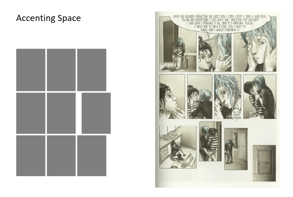
I call that an “accent,” and it’s a key tool when designing a comics page because it allows you to control what viewers will experience as the most important image and therefore narrative moment.
Once I established an unframed accent on the first page for another of my comics, I kept it up for subsequent pages too:
On the left page, the fourth panel is accented. On the right, it’s the first (if the directional flow of the recurrent figure convinces your eye to begin the page in that atypical spot).
Returning to my current comic-in-progress, I accent the last image by changing its background color:
And here the penultimate image draws the most attention because it breaks frame and extends into what would normally be the final frame — but instead the comic ends atypically in the bottom left corner (something Matt Baker did a lot in the late 1940s, but let’s not dive into that now):
I wrote a whole article about accents (“Undemocratic Layout: Eight Methods of Accenting Images“), and there’s a chapter section in Creating Comics too.
Here’s a quick rundown from my class slides:
Accents can combine strategies too:
The first combines size, tilt, and content (photographic in an otherwise cartoon context). The second combines shape, size, and content (red in an otherwise gray context).
But some combinations produce no accent because every image includes some highlighting element:
If we were in my class right now, we would pause for the following assignment:
Then we would move onto “phrases”: images grouped (often by an accenting technique) so viewers experience them as a unit within the larger page.
There are lots of approaches:
A page can have more than one phrase:
Returning to my comic-in-progress from above, the half-framed pattern creates two crisscrossing phrases:
Which brings us to the final slide:
That’s the end of the PowerPoint, the last I presented before we gave over the rest of spring term to individual studio work, but if you’re looking for more lessons, there’s plenty here:
- 1 comment
- Posted under Uncategorized
05/06/23 A Brief Cartoon History of the 2023 Debt Ceiling Crisis
I’m not a fan of political cartoons. Like journalistic op-eds and cable news commentary, they’re a form of political entertainment designed to please partisan audiences with simplified and exaggerated interpretations of complex issues. Simplified and exaggerated also defines cartoons, so adding politics blurs style and content.
I’ve been watching how national cartoonists have visually depicted the debt ceiling debate for the past several months. Early coverage was a kind of primer, since apparently not everyone knew about the issue:
Visual metaphors came early, with a clear favorite repeated:
The metaphorical bombs tended to be wielded by Republicans:
Though trucks and guns worked too:
This one was my favorite though, not just for its visual metaphors, but for the atypical detail of its black and white rendering:
Democrats received plenty of criticism too:
But as Biden and McCarthy got down to serious talks, McCarthy was the one most lampooned:
Once the deal was struck, McCarthy and the GOP drew even more criticism:
Republicans traded in their suicide bomber vests for red polka-dotted boxers:
Other cartoonists dolled out criticism equally:
And I even found one moment of faint praise:
So based on the cartoon polling, Biden came out well ahead. Will actual polling start to reflect that this week? We’ll see.
Tags: biden, debt ceiling, mccarthy, political cartoons
- Leave a comment
- Posted under Uncategorized


