Monthly Archives: September 2019
30/09/19 Big-Boy Philosophy

Somehow I never officially announced that my new book was published this month. It’s my second book from Iowa and my first with co-author Nathaniel Goldberg (our second is under review right now at another press). The early reviews at Good Reads and Amazon look strong (4.33 and 4.6, respectively, I mean, you know, if you care about that sort thing). And last week Bleeding Cool posted our op-ed about Stan Lee and Bill Maher, which was then highlighted at the philosophy website Daily Nous, hitting that tiny sliver of potential readers who like both superhero comics and philosophy:

Big-Boy Philosophy
Bill Maher, an American talk show host, insulted comic book legend Stan Lee and the Internet was outraged.
Now that the furor has died down, it’s become apparent that Maher didn’t actually insult Lee. He insulted his fans—the millions who, according to Maher, Lee inspired “to, I don’t know, watch a movie, I guess.”
Maher didn’t insult Lee’s comics either, which Maher read as a kid. Nevertheless, he explained, “the assumption everyone had back then, both the adults and the kids, was that comics were for kids, and when you grew up you moved on to big-boy books without the pictures.” He was right about that assumption. Maher was born in 1956. When he was reading them in the late 60s—a peak moments for Stan Lee and Marvel—comics were still targeted at twelve-year-olds. It wasn’t till the 90s that the average reader tipped past twenty.
Maher was thirty-six in 1992 when Art Spiegelman’s Maus won a Pulitzer. He said nothing about that. Neither did he insult the Booker prize committee after Nick Drnso’s graphic novel Sabrina received a nomination earlier this year. In fact, Maher wasn’t objecting to comics generally but to the subgenre of superhero comics specifically that Lee helped popularize. Nor is he alone. Alan Moore, the most critically acclaimed author of the genre, called most superhero stories “unhealthy escapism” and a “cultural catastrophe,” even though his Watchmen made Time magazine’s 100 all-time best novels list.
Maher saved his most pungent punch, however, not for the casual comic book reader but for academic authors writing about comics. He was annoyed at professors “using our smarts on stupid stuff.” Maher laments that “twenty years or so ago, something happened—adults decided they didn’t have to give up kid stuff. And so they pretended comic books were actually sophisticated literature. And because America has over 4,500 colleges—which means we need more professors than we have smart people—some dumb people got to be professors by writing theses with titles like Otherness and Heterodoxy in the Silver Surfer.”
Maher invented that title, but it’s not implausible—maybe not for a dissertation, but certainly for an article. Neither of the authors of this essay wrote doctorates on superhero comics, but we have co-authored academic essays with titles that Maher could have cited instead: “Dr. Doom’s Philosophy of Time,” “Economy of the Comic Book Author’s Soul,” ”Loving Lassos: Wonder Woman, Kink, and Care.” Worse, we even have a new book from a university press devoted entirely to explaining superhero comics and philosophy. There we ask perhaps the stupidest question of all: Was Stan Lee a philosopher?
For starters, other than etymologically as love of wisdom, “philosophy” is famously difficult to define. It’s a priori system building for some, conceptual analysis for others, or foundational to other disciplines (perhaps) because it’s the most general discipline, having been the Ur discipline, for others still. Whatever else it is, though, philosophy often trades in thought experiments.
Like empirical experiments, thought experiments involve testing a hypothesis in a controlled environment. In the case of philosophy, the environment involves holding other things constant while thinking internal thoughts rather than tinkering with external objects. Thought experiments introduce situations where a few key details are changed from how they ordinarily are to test particular philosophical views. What if an evil genius is tricking you into believing that the world around you is real when it isn’t? What if on an alternate Earth everything is identical but for one almost undetectable detail? What if trying to travel to the past transported you to a different universe instead?
Any of these fantastical plots could have been the premise of one of Lee’s superhero comic book. He sometimes gave artists at Marvel little more to work with. Except none of those thought experiments comes from comics. They’re all written by highly regarded academic philosophers: René Descartes (1641), Hilary Putnam (1973), David Lewis (1976).
The list of potential “What If?”s seems endless. What if someone from the future returned to his childhood and told his past self about the future? What if someone’s body slowly transformed from flesh into rock, but no one around to notice? What if a god were stripped of his memories and forced to live as a crippled human? Except these scenarios don’t come from academic philosophy. They’re all from superhero comics—The Defenders (1975). The Fantastic Four (1961), The Mighty Thor (1968)—and Lee had a hand in them all.
Admittedly, comics don’t explicitly treat their scenarios as thought experiments, and Lee certainly didn’t set out to experiment in thought in any meaningful way. Further, just as we’d expect, actual analysis is done better by academic philosophy than by comic books. Nevertheless academic philosophers can come up short. As Ross P. Cameron, himself a philosopher, explains, “a typical fiction tends to be much longer than your typical thought experiment and hence can present you with a more detailed scenario.” Likewise, Johan de Smedt and Helen de Cruz (philosophers too) argue that, though both typical philosophical thought experiments and fiction rely on similar cognitive mechanisms, fiction “allows for a richer exploration of philosophical positions than is possible through ordinary philosophical thought experiments.” The exploration is richer not only because it’s more developed, but also because readers of fiction are immersed in a way that readers of philosophy usually aren’t. Smedt and Cruz continue: “Regardless of whether they are outlandish or realistic, philosophical thought experiments lack features that speculative fiction typically has, including vivid, seemingly irrelevant details that help to transport the reader and encourage low-level, concrete thinking.”
These philosophers contrast typical thought experiments with the longer scenarios in novels, but their points apply even better to comics. Novels employ words to express ideas, while comics employ both words and images, and so reading a comic operates on an additional cognitive level. It can be both more immersive and more challenging due to its multi-media form. And Lee was so central to so many comic books over his long career that he had a hand in myriad thought experiments. So, yes, Stan Lee was a philosopher of sorts.
Of course, Maher could complain that philosophy involves “using our smarts on stupid stuff.” He wouldn’t be the first to do so. The liberal arts, and humanities particularly, have been called worse. The Athenians accused Socrates of corrupting the youth, and while Stan Lee’s Spider-Man or Fantastic Four comics are nowhere near as penetrating or erudite as Plato’s Socratic dialogues, comics have been accused of corrupting the youth too. Eventually, Socrates’ youthful students grew up. One of them was Plato. According to Maher, “adults decided they didn’t have to give up kid stuff” in the form of comics. Fortunately, Socrates’ youthful students didn’t give up philosophy either.
- 3 comments
- Posted under Uncategorized
26/09/19 Old People Sex
My review of Aimee de Jongh’s new graphic memoir, TAXI!!, went up at PopMatters.com earlier this week, and de Jongh tweeted back: “Whoa. This is such a beautifully written review. I don’t think I’ve seen a better analysis of my book, or my work in general, ever. Thank you, PopMatters!” She’s having a busy year. I’ve never written two reviews of the same artist within six months before.

I’m always grateful when European comics creators make their way across the Atlantic, so many thanks to the UK press Self Made Hero for delivering Blossoms in Autumn, a collaboration between the Brussels-born writer Zidrou and the Netherlands artist Aimee de Jongh. Even more rarely, their graphic novel features two retirement-aged protagonists, overcoming loss and loneliness to achieve their literally rejuvenating romance.
While it’s not news to me that old people like sex too, the best thing about Blossoms in Autumn is the sex scene. I say this despite usually cringing during movie sex scenes, annoyed by close-up body-double nudity and general story-halting gratuitousness. Most have nothing to do with plot tension or character development or anything but the titillation of what is apparently assumed to be a straight male audience. Often it seems even the director has hired a body double since the sex acts are shot and edited in a style out of sync with the norms of the rest of the film—slow-motion pans of landscape-like close-ups cascading in and out of overlapping dissolves. Oddly, it’s similar qualities that I appreciate in Aimee de Jongh’s double two-page spreads.
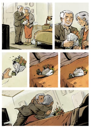
After a word-less, twelve-panel sequence in which her protagonists, Ulysses and Mediterranea (more on those names later), toss a bouquet of flowers and then themselves onto a bed, Jongh changes style radically. Instead of rows of rectangular, full-color panels neatly divided by unbroken white gutters, her unframed images spill across the pages in a cascade of shifting angles, bodies fading or cropped by the overlap of images, the wrinkled bedsheets merging multiple points-of-view into gutters of webbed lines. Instead of a painterly palette of realistic colors, Jongh suddenly limits herself to gray and white pencils and shape-filling overlays of soft browns. Where her line qualities previously vanished into story-world content, the lovers are now self-consciously drawn figures, composed of gestural lines with the shaded depth of artfully incomplete crosshatching. Eventually even the background of the bed vanishes, and the images float as freely as figures in an artist’s sketchbook. The effect is heightened by the book designer’s use of the same images for title page backgrounds, except intensified by enlarging and cropping, giving the thickened lines an even bolder and blunter energy.

While the sex scene, both in its norm-breaking style changes and in its double placement, is the thematic center of the graphic novel, Jongh includes little nudity, focusing instead on the incremental removal of clothing and the characters’ interlocking body shapes. Mediterranea’s slip remains on throughout. This is not paradoxical prudishness. Earlier, Jongh depicts Mediterranea’s body in intentionally brutal and panel-dissecting detail as the character examines her own sagging wrinkles in her full-length bathroom mirror (with a great, unspoken reference to the Snow White phrase, “Mirror, mirror on the wall, who’s the fairest of them all?”).
Though the gaze within the story is her own, and the artistic hand outside the story is female too, I still felt a primarily male presence controlling the two-page spread. An earlier scene features Ulysses also nude in his own bathroom, but the moment is expressed in a single panel, with the character’s gaze inward and no mirror present. Though Ulysses is fifty-nine, only three years younger than his love interest, his own aging body does not concern him or the larger story.
Mediterranea, however, is defined by her body, aging or otherwise. When the two characters first meet in a doctor’s waiting room, it takes her only six speech balloons to announce: “I used to be a model.” When they have lunch, she elaborates: “I mainly worked in lingerie, or nude. I had a pretty nice body when I was young.” She was featured on the cover of the French magazine Lui, which, according to Google, translates Him, and so the title is a reference to its readership not its subject matter.
Jongh provides several thumbnail sketches of Mediterranea’s cover issue and so tiny glimpses of her once pretty nice body. While the image suits the softporn norms it’s meant to evoke, the effect is peculiar because the lithe figure does not resemble the contemporary woman at all. In fact, the figure doesn’t resemble anyone within the novel’s story world. While the character has aged, her current sags and wrinkles do not account for the differences. It’s as if the two sets of images represent different species. With this one exception, Jongh draws her naturalistic characters on the edge of cartoon. Their feet and heads are just a little too large, their bodies a little too compressed. While not hobbits exactly, they have more in common with that stout wholesome race than they do with the alien species represented by Lui. Within the visual context of the novel, Mediterranea’s transformation is less about her current age and more about the warped and warping norms of erotic photography.

Four decades later, she still keeps a box of Lui copies because her proud father “emptied all the magazine stands and bookstores in the area to give them to all of his friends” until “he saw the pictures inside.” Ulysses is startled at first, but only because he grinningly admits: “When I was a kid, I’d swipe them from my dad! Given half a chance, I’d even jerk off to them.” This elicits a charmed grin from Mediterranea. When he purchases a copy of her cover issue from a used book store and offers it to her as a present, she asks if he masturbated to it, and though he does not answer, the two share a raucous laugh.
I have little difficulty accepting that Ulysses is a realistic portrayal of a fiftysomething French man—Zidrou after all is a fifty-six-year-old French man. And perhaps some French readers would interpret his behavior as charming. Ulysses calls Mediterranea “delectable,” likening her to the delicious cheese she sells in her shop, and later plants “Aged Mimolette” cheese flags in her hair before planting a kiss on her lips after declaring her name “an invitation to a voyage.” The sex scene would have followed, except his kiss apparently so inflamed her blood, it reverses menopause and reignites menstruation.

While I could question Zidrou’s grasp of female biology, his understanding of female experience is more concerning. Prior to meeting Mediterranea, Ulysses’ unhappy widower routines include stopping at a neighborhood apartment to pay a woman 100 euros for sex. He thinks how the unnamed woman “could be my daughter” but, because of her “sweet, kind smile,” he feels she treats him “as if she were my mother.” Freudian ramifications aside, I appreciate a non-judgmental view of a sex worker, which includes a family portrait of her with her husband and two children, but then the narrating Ulysses waxes poetic about his own condom: “Who could ever express the infinite sadness of a used condom?” The image of the naked woman kneeling at his crotch unintentionally answers that rhetorical question. Worse, any believability the character may have had is lost when near the end of the novel Ulysses arrives at her apartment to break the apparently bittersweet news to her that he’s met someone and won’t be needing her services any longer. She has to turn her back to him to hide the emotion on her face—because we are to understand this married mother of two gains deep emotional comfort from giving old men blow jobs for cash.
The age and power differences in Ulysses and his partner’s professional relationship also echo the relationship between the two authors. If this graphic novel followed the creative process of most two-author comics, the project originated with Zidrou, who penned a complete script before handing it to the thirty-one-year-old Jongh to illustrate. If so, the characters’ questionable charms and implausibilities trace back to Zidrou. He is the lui, the him, controlling the narrative and its unfortunate notions of gender. So while there is much to admire in Blossoms in Autumn, I am looking forward to only one of its authors’ future books.
And that book has just arrived:

[A version of this post and my other recent reviews appear in the Comics section of PopMatters.]
- Leave a comment
- Posted under Uncategorized
23/09/19 The Structure is Comics, Comrade

Architecture is an apt subject for comics, the way a page’s layout can resemble a grid of windows or a blueprint of flowing rooms. That visual parallel, however, is not what fuels Viken Berberian and Yann Kebbi’s architecture-driven graphic novel The Structure is Rotten, Comrade, a dystopic rendering of post-Soviet Armenia through the clouded eyes of a well-meaning but destructively naïve city planner.
Instead of traditional layouts of rectangular panels and uniform gutters, Kebbi renders a violently chaotic world consisting entirely of colored pencil lines, all charged with gestural energy in overlapping and often literally scribbled shapes. Where traditional commercial comics feature a penciled draft that is later inked for clarify and then colored in discrete forms, Kebbi combines the three production stages into a single visual structure that is intentionally at war with itself. His final pages often include and even highlight what appear to be the light lines of his initial sketches, with some sections left untouched. Other areas of the same pages are drawn over multiple times, often in multiple shades of pencil, producing a thickness at odds with the sparseness of adjacent and sometimes even intersecting images. Because no shape has authority over any other, figures seem transparent, the lines of streets and buildings visible through the unfilled sections of their bodies—even when other sections of the same body are carefully crosshatched.
Kebbi’s drawing style is at war with itself too. While obviously skilled in naturalistic norms of perspective and figure drawing, he is just as prone to toss those norms aside to create the impression a child crayoning. Even individual figures are stylistically contradictory, with a face and head precisely sketched but the rest of a body truncated into cartoonish proportions. The cartoon norm of blurgits—the drawing of multiple limbs to suggest one limb in motion—is oddly static here, as if Kebbi had sketched several limb positions and then couldn’t decide which to finalize. The combined product is a world teetering on carefully crafted incoherence—which is well suited to Viken Berberian’s script.
The first one hundred pages feature the young architect Professor Frunz leading his graduate students through the streets of Yerevan, the capital of Armenia, a country land-locked between Turkey, Iran, Azerbaijan, and Georgia, but, as part of the former Soviet Union, still highly influenced by Russia. As Frunz discusses the city’s architecture, both current and the vast plans he and his architect father are in the process of implementing, wrecking balls swing around them. The balls are literal—prompting one of the students to shout “Duck!” to her professor, while a man reading a newspaper on a stool is struck and dies in a puddle of his own blood—but also cartoonishly and satirically surreal. As the professor continues his tour, he drags homeless people clinging to his ankles.
This is not the actual city of Yerevan, but its reflection in Berberian and Kebbi’s political funhouse mirror. Frunz, the novel’s main character, is not its hero but the main object of its derision. The former homes of the homeless were bulldozed to make way for the father and son’s grand revisioning of the historic city—which means destroying the Soviet-era farmer’s market to build a solar-paneled supermarket, amid all of the new high-rises, even though, as one student points out, Yerevan is a seismic zone. If all goes on schedule (which it won’t), the homeless will be homeless for only five years. Meanwhile, they’ve each been compensated with a three-legged Alvar Aalto stool (which, according to Berberian’s architecturally-focused endnotes, is an actual thing).
Berberian provides his young professor a complex backstory, told in vacillating sections during his strolling lecture. The time divisions—like most other divisions in the graphic novel—are often hazy, but Kebbi wisely renders the past mostly in gridded layouts, as we follow Frunz through his Parisian childhood (his first word is “sea mint,” which his architecture-obsessed mother mistakes for “cement,” tragically shaping his later obsession), his Parisian university years (he and his girlfriend emotionlessly part ways after he drops out to work with his father), and his visit to Moscow (where Pussy Riot makes a memorable ten-page cameo as they storm a historic church, with one of the women screaming, “Fuck this. I should have studied architecture instead,” as she is handcuffed and kicked by police).

One of the novel’s running jokes is the absurdly large-breasted graduate student wearing a t-shirt with the phrase “Less Is More” (which, I was surprised to learn from the endnotes, originated as an architectural concept in the late 40s). By the end of the lecture tour, she is inspired to cross out “Less,” revising the phrase to reflect the Frunz parody-philosophy of “More is More.” The visual joke gets old though, since the woman and, more importantly, her cartoonish breasts appear more than thirty times in the first one hundred pages. Given the radical instability of Kebbi’s cartoon reality, did her breasts really have to be one of the few consistencies?

Though she and the other graduate students vanish after page 105, Berberian and Kebbi still have more than another two hundred pages in store for Frunz. After also abandoning their alternating flashback structure, they introduce a homeless antagonist, the same one previously glimpsed grasping at Frunz’s legs, only now he has his own lines of dialog (rendered as free-floating words on the open page, the balloonless style Kebbi uses for all of his dialog). Plenty more chaos follows, with rebels and military clashes and many many more wrecking balls.
I doubt it’s giving much away to reveal that young Frunz eventually learns the errors of his way—because, even if he didn’t, that parodic lesson is the DNA of the novel. It also means that the transformation isn’t especially relevant or convincing since his character is so intentionally two-dimensional, a cardboard placard for his authors’ political commentary. Still, the hints of a deeper character do filter through Kebbi’s scribbles and Berberbian’s absurdist dialog—enough that I was glad when Frunz escapes the chaos of Yerevan he helped to create and returns to Paris. Sadly, this is no longer the Paris of our own world—not because of Kebbi’s chaotic artistic style, but because Notre Dame remains intact and unburnt, a coincidental but haunting fact for a graphic novel about the destruction of historic architecture.
[A version of this post and my other recent reviews appear in the Comics section of PopMatters.]
Tags: The Structure is Rotten Comrade, Viken Berberian & Yann Kebbi
- Leave a comment
- Posted under Uncategorized
19/09/19 Pretty Dark

Some things you can’t unsee. They become afterimages, a kind of mental scar marring your visual memory. They haunt you. The sixth page of Fabien Vehlmann and Kerascoët’s Beautiful Darkness is currently haunting me: a child’s corpse lying on a forest floor. I’m a parent and so especially susceptible to the horror of the image, but it’s more than that. Poe misogynistically claims there’s no subject more poetic than the death of a beautiful woman, but since his wife was thirteen when he married her, “girl” would be the more accurate term. The girl of Beautiful Darkness looks about ten. Her hair is splayed around her head, and although her eyes are closed and her body could be relaxed in sleep, she is unquestionably dead. Over the course of the next few dozen pages, her body rots to bones.
Despite the mysteries and plot questions evoked by the opening image—Who is she? How did she die? Is there a killer? When will someone find out?—the novel ignores them all. Aurora (we learn her name from the notebook strewn beside her) is not the focus of the novel—or at least not this version of her. The authors focus instead on another Aurora, a lovely cartoon creature who lives in a fairy tale world of tea parties and princes. Or she did until the borderless panels of her first page darken into rigid gutters as a surging Blob-like goo forces her and her cartoon companions to flee the child’s dead body and emerge into the most horrifying world of them all: our own.
It’s rare to find such a horrifically eloquent concept executed so perfectly. Beautiful Darkness was originally published in France in 2014 as Jolies Ténèbres. Though Fabien Vehlmann receives solo writing credit on the cover, the title page credits Marie Pommepuy for original idea and co-story, translated in the Drawn & Quarterly edition by Helse Dascher. Kerascoët is the lone artist, and the juxtaposition of his two styles is the novel’s most pervasive and powerful technique. The characters vary in proportions, but all fit the exaggerated and simplified norms of cartooning, specifically children’s books cartooning. The setting, however, including the vegetation and the animals and the hill-like shapes of the corpse they fled from, is naturalistic with finely defined contours and painterly depth. The visual contradiction defines the graphic novel’s core: these things do not belong together.
The pairing produces horrors. How will these innocent fairy tale folk survive in a real-world wilderness? They won’t. It turns out there are a lot of ways to kill a cartoon: cat, bird, bee, toad, ants, poison ivy, kite, puddle, starvation. The first death is most startling, but the gruesome effect never lessens in part because the death of a cartoon violates the logic of cartooning itself. How many times has Wile E. Coyote fallen to his would-be death only to have his flattened but endlessly malleable body rejuvenated for the next scene? The absurd proportions of most cartoons would make the function of internal organs impossible. And yet when one of Kerascoët’s cartoon characters attempts to be fed like a baby bird, the force of the mother bird’s beak down his throat widens and buckles his neck in standard cartoon fashion—but then his face is blood-soaked as he staggers away apparently to die of internal wounds.

Though each death vignette is effective, the horror of Beautiful Darkness is more than the picking off of cast members as expendable as any in a Friday the 13th film. They are literally their worst enemies. It turns out methods for murdering cartoons include abandonment, cannibalism, and live burial. But that’s not the disturbing part. While the apparent existence of naturalistic organs inside cartoon bodies is discordantly upsetting, the psychological ramifications echo deeper. It’s one thing to find the flow of maggots across your feet ticklish. It’s another to yank off the legs of a ladybug for fun.
“Things are not as they appear” is the ur-plot of most stories, but it is especially true of horror: the corpse under Poe’ floorboards, the fangs retracted behind a vampire’s smile. Horror always waits just beneath a pleasant surface. It’s the difference between transformation and revelation. Did hunger make the giant baby doll eat one of her tiny friends or was the giant baby doll always capable of that crime? Worse, another friend protests before quickly returning to playing, the devoured friend apparently never a friend at all. The pleasant surface of these cartoons cover a moral abyss devoid of empathy and self-reflection. They are the novel’s only monsters.
And we’ve still not hit bottom, because the true plot question is whether Aurora, the kindest and most dutiful of all them all, will succumb—not to death but to the darkness revealed by the collision of her cartoon world against a naturalistic one. It’s no spoiler to say the nature of her character remains radically ambiguous. When she helps the others to build shelters out of the dead Aurora’s notebook, someone reads the name and asks, “Who’s Aurora?” Aurora answers, “I am.” At first I thought she was lying, maybe to prevent anyone feeling qualms about stealing (this is well before the first murder), but the answer seems much more complex.
Is the cartoon Aurora some kind of manifestation of the human Aurora? Is that why she cries at the sight of a fly hatched from her corpse? Was she and the others released by her death? Do all daydreams take physical forms when we die? Or is this a kind of afterlife? Has this cultural stereotype of childhood innocence died and gone to hell? This cauldron of questions are stirred most violently in a midpoint two-page spread in which the human Aurora wakes in sunlight, sits up from the forest floor, and wanders off—only for her motionless corpse to return after the page turn and the monstrous cartoon child who has burrowed into the cave of her skull to gasp awake, relieved that it was only a “nightmare.”
If you’re used to the blood splatter of slasher films or the simplistically evil monsters of supernatural thrillers, be warned: Beautiful Darkness covers an abyss of horrors far far deeper.

[A version of this post and my other recent reviews appear in the Comics section of PopMatters.]
- Leave a comment
- Posted under Uncategorized
16/09/19 These Are the Droids You’re Looking For
I’ve been hesitant to call myself a “comics artist,” but looking over my online publications of the last year, I think I may have hit critical mass, especially over this summer. Most immediately, my “Obscured Panels” just went live yesterday at Sequentials. These are the thumbnails:

But my favorite is a collaboration with my life-long collaborator, Lesley Wheeler. Our poetry comic “Made for Each Other” appeared at Split Lip last month. I made the images, Lesley wrote the words, which I converted letter-by-letter into my homemade font. Yes, those are the same robots in “Obscured Panels,” but we made “Made for Each Other” first. Here’s page one:

“the right of the people peaceably to assemble” appeared at Empty Mirror earlier this summer too. (Sorry, no robots though.)

And “Thought Bubbles” at Redivider:

I also made the cover of Two Cities Review (plus a five-image sequence “Don’t” inside the issue):
 Last winter was good to me too. “Expected Outcomes” premiered at Ilanot Review in January. I kept intending to promote it on this blog and then kept not (probably because it’s about my dead mother). The text is from the nursing staff of her assisted living facility as she entered the last stages of Alzheimer’s. The background image is a painting (I think by one of her cousins) of her college graduation photo:

“Muybridge Comics” appeared at Aquifier last December:
 Also, two more of my Muybridge adaptations, “Nude Woman Washing Face,” appeared at Sonder Review (which, frankly, I’m less thrilled about because the images aren’t gender-balanced; the batch I submitted included male nudes).

A year ago this month, “Queer Arrangements” appeared at Sequentials:

And a year before that, “This Is Not Marilyn“:

Somewhere in there “1917” appeared at Hair Trigger 2.0 (which features the Modigliani paintings that the robots cut up and recombine in the first comic):

I also have three visual poems forthcoming from Chronically Lit. I think that brings the total to twelve. Can I officially declare that the unofficial threshold for comics-authorness?

- Leave a comment
- Posted under Uncategorized
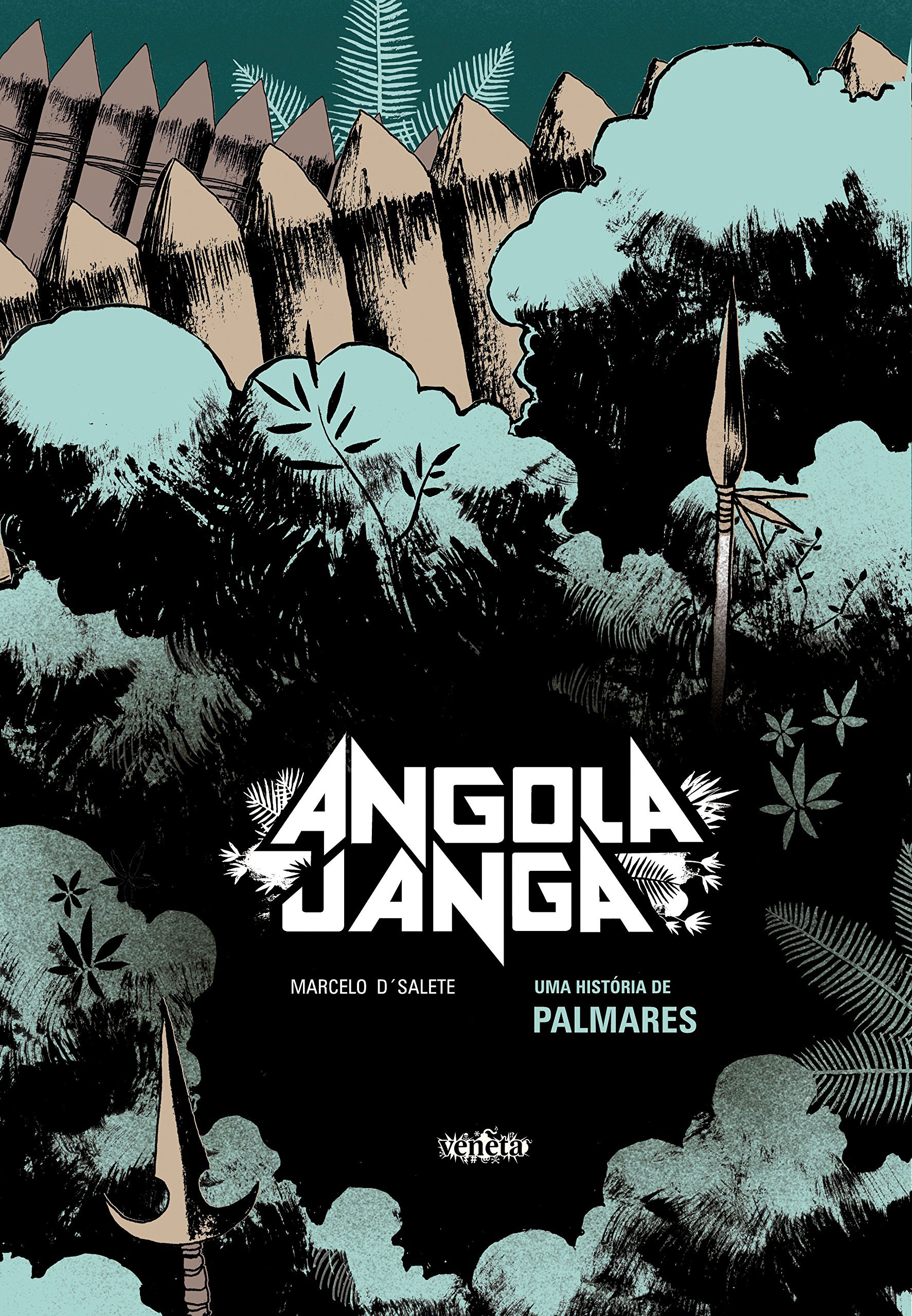
12/09/19 Kingdom of Runaway Slaves
I am not typically a fan of graphic novels that tackle historic subjects. Too often I find the visual approach faults toward the safely predictable—as though a rendering of historical events precludes the idiosyncrasies of an artist’s personal style. Thankfully, Marcelo D’Salete, author-artist of the historical graphic novel Angola Janga, avoids that pitfall.

Angola Janga (the title means “Little Angola,” the region of Africa from which many of its inhabitants were abducted) has the blunt visual power of black and white woodcuts. While D’Salete literally stays inside the lines of his rectangular panels and gutters, the energy of his images—the angled perspectives, the chiseled details, the abrupt close-ups, the streaked strokes of his shading—are a match for his equally powerful subject matter.

If you’re anything like me, you are woefully ignorant of Brazilian history, especially the late seventeenth-century history of Brazil’s escaped slaves. But at least we’re in good company, because D’Salete admits in his afterword that he didn’t either—even though Palmares (which means “victories” and names the region of villages established by fugitive communities in the forests of colonial Brazil) reached a population as high as 20,000, defying Portuguese authorities for decades.
Originally published in 2017 with the subtitle “History of Palmares,” the Fantagraphics edition, translated from Portuguese by Andrea Rosenberg, helpfully identifies its content for less knowledgeable English speakers with the subtitle “Kingdom of Runaway Slaves.” I presume Rosenberg preserved D’Salete’s verbal style by choosing colloquial phrases—“for crying out loud,” “pipe down,” “let’s not get ahead of ourselves”—despite their anachronistic effect. While slightly distracting, the alternative—faux-archaic diction and syntax—would be fatally worse. D’Salate himself wisely avoids captioned narration, limiting words to brief dialog and allowing the language of images to communicate the bulk of his story.
French comics scholar Thierry Groensteen gives a name to visual motifs specific to comics: tressage or “braiding.” I’m not a fan of unnecessary terms (why not just “visual motifs”?), but Angola Janga convinces me that Groensteen is on to something useful. He likens the repetitions to rhymes or internal quotations, ones that “enter into dialogue with panels not currently visible, establishing relationships among non-adjacent pages” and so producing “an enhancement, a layering, a deepening of meaning.”

If so, then D’Salete is a master of braiding. Some occur within a single page: a bird’s eye view of a round plate of food carried by a woman into a hut, a higher view of the round roof of the hut, and an ending close-up of the village leader’s round eye after he has consumed the—we soon learn—poisoned food. The wedge-shaped opening of the hut also suggests his open mouth as he eats. The combined effect, especially because the page is wordless, unifies the sequence and heightens the individual moments beyond what they convey in plot alone.

D’Salete’s other, multi-page braiding includes birds (how the points of their feathers visually rhyme with the carved points of trees in a fortress wall), whipping wounds (clusters of slashes juxtaposed with the tree branches of the surrounding forest), flies (both as victims of spider webs and later as visual metaphors for corruption), ocean waves (an idiosyncratic triangle pattern that later returns as scales on a snake), and flames (too many instances to mention).
But the first I noticed is D’Salete’s idiosyncratic smoke: the oddly dense shapes he draws curving from a plantation foreman’s cigarette as he eavesdrops on a dying slave owner’s promise to Soares (the novel’s main character) that he will be freed upon her death. A page later, in the same bottom left area of the page, the shapes repeat in the visual metaphor of a snuffed candle on her bedside when she is found dead in the morning. The foreman then ignores the dead woman’s will and keeps Soares enslaved. The image returns almost two hundred pages later in the smoke billowing from a village set afire by attacking soldiers—again in the bottom right corner panel. In each case, smoke is present in the story world—as it might also be if described in words in a prose-only novel—but the effect is different in the visual medium of comics, especially when rendered in D’Salete’s beautiful but unflowingly un-smoke-like smoke style, linking the moments at a more visceral level because the images are experienced directly as actual ink marks on paper. Written language can’t produce quite the same effect. Within the story, the events—Soares cheated of his freedom and years later a village of runaways destroyed—are no more related than any other of a range of similarly horrific events, but the braiding pulls the two into contact, suggesting that they, like the nearly identical smoke patterns, are nearly identical too.
Though 426 pages long, Angola Janga can be opened at random, and a viewer will be rewarded by some visual element that D’Salate has carefully crafted into his artwork. He approaches his history with a similar narrative exuberance, crafting characters and events to fit the massive gaps left by colonial documents (which he quotes to excellent effect at the opening of each of the eleven chapters). Zumbi, the Palmares leader who Brazil celebrates with a national holiday, receives an origin story as an orphan initially raised by a Franciscan monk, and the colonial strategy of dividing the fugitive community by partitioning a free town is embodied by the villainous traitor Zona. The book designers apparently would like us to believe that Andala, a female warrior featured prominently on the cover, is central too, but, I was disappointed to discover, she is only a minor character—despite D’Salete acknowledging in his afterword: “Women had a notable presence in Palmares.”

The collapse of Palmares is a historical fact D’Salete cannot avoid, giving his novel an inevitably tragic slant. But he copes with its reverberations well, drawing a brief, unexpected, and poignant leap into 21st-century Brazil in his final chapter, before concluding with an extended sequence featuring one of his most effective braidings: the star motif that literally unites the cosmos with the spiritual plight of the people of Palmares. Since this is the first work by D’Salete I’ve read, I look forward to buying his 2017 translated Run For It: Stories Of Slaves Who Fought For Their Freedom, while hoping that Fantagraphics releases more of his work, old or new, soon.
[A version of this post and my other recent reviews appear in the Comics section of PopMatters.]
Tags: Angola Janga, Marcelo D’Salete
- 3 comments
- Posted under Uncategorized
09/09/19 Picasso Athena
 First off, no, that’s definitely not a Picasso. And neither is this:
While moving my daughter into her first post-college apartment in West Philadelphia last week, I noticed a tattoo parlor down the block (part of the seedy influence of U Penn a few more blocks away) and asked her if she was thinking about getting one (or another one since she came back from her summer camp teaching gig with a strawberry on her leg). She said if she did, it would be a “Picasso Athena.” Since Picasso never did a painting or drawing of Athena, she clarified that she meant something iconically Athena in the style of Picasso, presumably his later-career line drawings, not his cubist work.
So I took that as my instructions. She also said my palette tends to be a little too dark for her decorative taste (her studio apartment wisely features lots of yellow), so I figured she wouldn’t like my usual black and red variants:


To be clear, I was thinking about a wall poster, not another leg tattoo. If you’re interested, here’s my process. As usual, I like the lunatic limitations of Microsoft Paint and the weird creative leaps they foster.
I started with some photo research, both Picasso’s line drawings and lots of Athenas:
 Once I found a pose I liked, I made a quick sketch using the mouse on my laptop, then overlaid it again and again and again, deleting areas, experimenting with color transparencies, and just sort of screwing around to see what emerged. It’s a haphazardly idiosyncratic approach that I’ve become inappropriately proud of. Laid out all together here, it’s also vaguely reminiscent of Picasso’s bull sequence process:


I also experimented with overlays from a Van Gogh (because yellow), but didn’t love the results enough:

I think the rawly digital red and yellow might be better:

I’m still trying to figure out a way to combine my favorites:

If you like any of these, and if your daughter has also moved into her first studio apartment, feel free to make a copy for her. (As with a previous post about my son moving out for his first year of college, it falls under the empty-nest fair-use clause of U.S. copyright law.)
- 1 comment
- Posted under Uncategorized
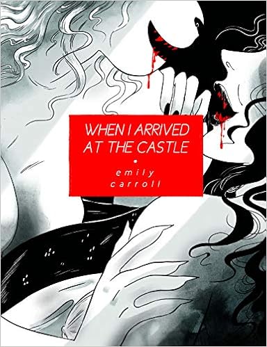
02/09/19 Lesbian Vampire vs. Trans Pussycat
I think of erotica and horror as opposite genres. When the image of a female body appears in a horror story, it’s usually scantily clad and in peril, making rape the subtext if not the overt threat. Vampires are romanticized rapists, their penetrating fangs barely a metaphor. They roofie victims with their charming looks and mesmerizing eyes, while werewolves and other clawed beasts consume without the pretense of a date. Either way, it’s rape, not sex, and so anti-erotic.
That’s horror. Erotica is also about excess, but it’s the excesses of pleasure not pain and fear. When the two genres mix, the pornographic results are typically male-oriented and sadistic. Even when not sadistic, porn is most often created by and for men. The image of two female bodies sexually groping isn’t about (or for) actual lesbians but the doubling of female genitalia for increased male consumption.
Which is a long way of saying how startled I am to have enjoyed Emily Carroll’s When I Arrived at the Castle quite so much. Its overt genre is horror (the pair of blood-drizzling fangs on the cover declares as much), and while far from pornographic (there are only a few exposed breasts inside), the not-really-a-subtext is both erotic and lesbian (the cover’s tightly cropped embrace declares that too).
I didn’t know anything about Carroll’s own sexuality before reading the graphic novel (though I’ve since found her on a 2014 list of “Queer and Trans Women Comic Creators to Support this Holigay Season!”) 2014 is the year her first major book, Through the Woods, earned her much-deserved, international acclaim (she’s from Canada, yet more evidence of that nation’s excessive comics prominence). It compiled five of her webcomics into print form, soaking its pages in vibrant colors to pleasantly garish effects. Her new book is comparatively restrained: one story, less than half the pages, and only one color offsetting the black ink. Red.
Of course she picked red. And as much as I love all the blues and yellows and greens and purples of the earlier tales, the single color is better. Coupled with Carroll’s vacillating black and white lines and negative spaces, the pages are darker in a literal if not thematic sense.
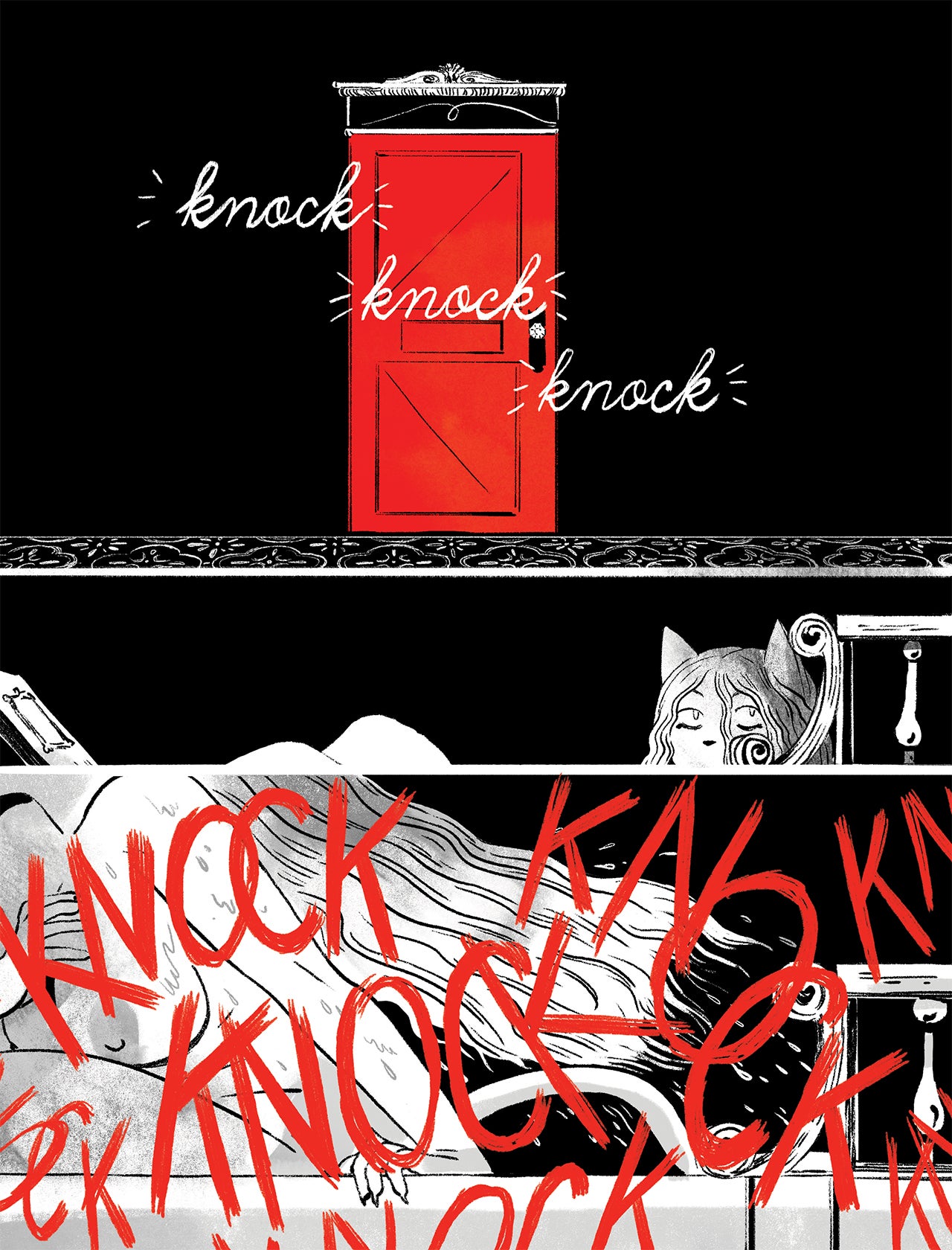
Otherwise Carroll’s style remains familiar: deceptively cartoonish figures that evoke a children’s picture book despite the puddles of blood oozing into the gutters. Not that there are many gutters. Carroll prefers ever-changing layouts that only rarely provide traditional panels or grids.

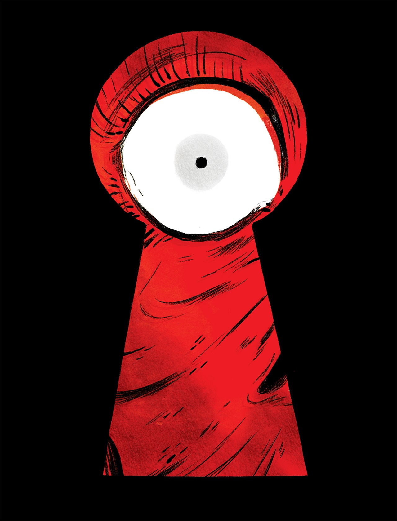
Instead, the objects and interior spaces of the story world shape each page design. As the protagonist winds more deeply into the castle’s labyrinth interiors, Carroll finds new ways to visually surprise—a sequence of keyhole-shaped page-panels, an image-less two-page spread of white text on red background, a sudden sparse white background with no punctuating red. She favors full-page images too, an effect literally heightened by the 10 ½ x 8 book dimensions.

Like the cartoon figures, the plot seems deceptively simple: the heroine has come to kill a vampire in her castle lair. Except, okay, the heroine is an anthropomorphic cat. Which might make sense if the vampire were an anthropomorphic cat-vampire, but she’s not, she’s human, or at least humanish—when she’s not stripping off her skinsuit or uncurling the lower snake half of her suddenly mermaid-esque body. Other times she’s aggressively two-legged and fleshy, as when she lounges barefoot in a cushioned chair, her naked calf angled invitingly toward her guest. Carroll draws one of her talk bubbles across her crotch, with the words “Your meekness” inside. While the vampire may be sincerely turned-off by her would-be killer’s timidity, Carroll is playing with a visual metaphor, or two of them at once: the vampire is calling the cat a pussy.
The sexual pun is the more important one. This would appear to be very much a lesbian vampire, and she wants the pussy to both kill her and die trying. If all the lip-licking and close-up cleavage and overflowing bathtubs don’t make the meaning clear, then the vampire’s ecstatic open-mouthed grin at the moment of her, um, plot climax probably won’t either. In which case, you’ve enjoyed a perfectly fun gothic romp, no harm done. I recommend you next read Christina Rossetti’s wholesome “Goblin Market” and admire the spiritual purity of sisterly affection.

But the rest of us are probably left even more unraveled, unsure where Carroll is drawing her line between erotic metaphor and blood-splattering literalness. And I lied about the climax. There’s a lot more yarn for this cat to untangle—including her own culpability, the origin of her feline identity, and the source of what at first seem like her misdirected talk bubbles. I also appreciate Carroll’s attention to body types. While the snakey vampire is supermodel thin, the cat has a deliberate plumpness that somehow avoids voluptuous clichés while also allowing the matter-of-fact folds of a large, strong body. Though I’m relieved not to live in an Emily Carroll world, I’m glad its inhabitants are more diverse than the superhero half of the comics multiverse.
While the page count is thinner, Carroll’s new tale is more than twice the size as any of the skinny vignettes found in Through the Woods or at her own wonderful website (if you click there, be sure to check out the “The Worthington”). When I Arrived at the Castle also unfolds over a tighter time span—just a single evening—amplifying the continuous scene’s tension through patiently prolonged suspense. Like the cat protagonist, we arrive at the castle with the first page turn, and we leave only after … well, I don’t want to give too much away.
[A version of this post and my other recent reviews appear in the Comics section of PopMatters.]
- Leave a comment
- Posted under Uncategorized


