Monthly Archives: December 2017
26/12/17 Best Graphic Novel of 2016
Yeah, I know it’s the last week of 2017, but I’m a little behind. After immersing myself for several years in the history of comics, I started reviewing new and recent graphic novels last spring. Things have come a long long way since Action Comics #1, but one of my all-time favorite creators is an artist who started in the superhero genre before leaping over formal and genre boundaries.
Comics fans likely know Dave McKean from his The Sandman covers, though his collaborations with Neil Gaiman began earlier with their 1988 Black Orchid mini-series and arguably peaked in 1989 with the graphic novel Signal to Noise. McKean also famously paired with Grant Morrison for Arkham Asylum the same year, before venturing into his solo series Cages. Black Dog: the Dreams of Paul Nash is an even more successful solo venture, one commissioned by the UK to commemorate 100-year anniversary of the First World War. Paul Nash enlisted at the start of the war, served two and half years, was injured, and returned home to become a Modernist painter renowned for his surreal battlefield landscapes. The Tate recently featured an exhibition of his four-decade career.
“If you want your work to have any value in such a chaotic world,” says a cartoonishly proportioned art critic at the onset of the First World War, “you’re going to have to engage with it. Comment, criticize it, take it apart, and remake it in your own image.” The words appear in a translucently white talk balloon—only one of the innovations Black Dog introduces to the graphic novel form as artist Dave McKean actualizes his character’s apocalyptic advice.
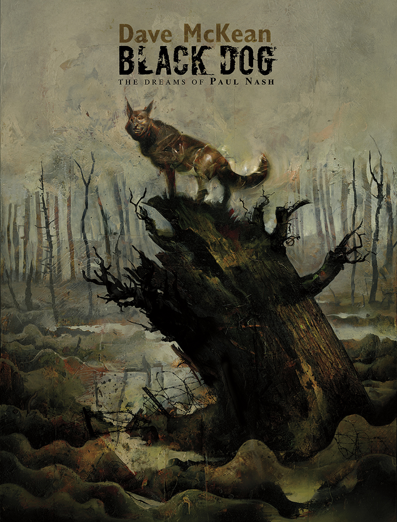
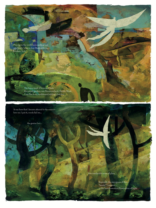
While no imitator, McKean shares kindred tastes, creating a fictionalized memoir and dream journal of Nash’s experiences. The fifteen chapters range from 1904 to 1921, pivoting in time between Nash’s childhood and the war years, while always opening with a photo-based frontispiece on the left-hand page. Though chapter lengths vary, they average five pages before later chapters intensify the use of two-page spreads. The orderly structure is welcome. McKean often follows standard comics layouts, but the effects of his arrangements are strikingly non-standard. This is partly due to the book’s twelve-by-nine inch dimensions—atypically large for a comic but common for an art book—as well as McKean’s eclectic approach to image-making. The novel incorporates pencil sketches, full-color paintings, paper cut-outs, photographs, digital art—often transforming at chapter breaks, but at other times with page turns, within a single page, and even within a single panel. When McKean writes “the scene shifts,” the literal fabric of reality shifts too. While expressing the world-altering chaos of the Great War, the continually changing multi-media styles also suggest Nash’s own search for the right materials to realize or at least evoke the otherness of his dreams.

The novel opens with a first-person account of Nash waking from his earliest dream and attempting to draw it as the impressions fade and are replaced by a succession of later sketches that inevitably both refine and distort. McKean’s images accordingly shift in levels of refinement and distortion too. After two opening chapters of finely textured gestural paint strokes and flat Matisse-like cut-outs, he shifts to a fittingly cartoonish mode as the third chapter begins with Nash’s father’s attempt at dream analysis (“Well, I should have thought it was obvious. YOU are the black dog”), as the two sport slightly enlarged heads and features. Human figures grow grotesquely disproportionate as German bombing interrupts Nash’s wedding and a two-page zeppelin morphs into a painterly precise fish above a cityscape devolving into gray-green abstractions. McKean’s figural exaggerations peak with a violent bully of a teacher who literally towers above the adolescent Nash before slapping him into a sequence of blood-red panels suggesting the war carnage yet to come. When Nash falls injured into a trench, his body combines cartoonish proportions with the fine detail of naturalism—a discord that defines the novel if not McKean’s style generally.

After a sniper attack, a young soldier’s corpse morphs panel by panel into Picaso-esque abstraction While McKean depicts the warfare along widely fluctuating stylistic spectrums, a middle chapter juxtaposes panels of warped but largely naturalistic images with the pure abstraction of watercolor strokes in adjacent columns. Because the superimposed text describes grass growing between the sandbags in the trenches, the otherwise non-representative green swirls and splashes evoke that new life. According to Nash’s narration, even nature “is dynamic, constantly changing, fluxing, complex chaos.”

While digitally rendered words are another of the novel’s media, Nash states in the second chapter: “words fail me,” suggesting that language cannot capture his nightmares either. The book’s words are also appropriately dwarfed by the artwork surrounding them, as if the pages but not their print expanded to fit the book’s dimensions. When he does not incorporate printed text directly into the art, McKean frames it in translucently colored talk balloons and caption boxes that do not fully block the images digitally layered underneath. While visually effective, the technique also suggests that even when literally forwarded, words are not the novel’s primary language. When Nash’s brother imagines the skull of a German soldier speaking to him, its talk balloons are computer-rendered outlines; when his brother dies and his jawless skull speaks to Nash, the outlines become roughly hatched circles; and when Nash next turns to look at a skull in a war-ravaged dreamscape, McKean gouges an empty circle above it, its paradoxical silence speaking volumes.
Some graphic novels read like illustrated narration, but Black Dog is comfortable with an eight-page wordless sequence, and though words appear on the vast majority of pages, their meanings mingle with the artwork, as when a roughly cross-hatched Nash balances uncertainly along a trench boardwalk and his narration describes “the artist’s balancing act” and the danger of tipping into metaphorical mud. When he later describes feeling “the texture of the air” in his childhood woods, the referent is also the imagined texture of the collaged image beneath the words.
McKean’s image-texts are examples of the “hybrids” and “collisions” that also describe Nash’s dreams. His pages often feature two worlds, two styles, colliding. When Nash dreams during his recovery, he wanders from the subdued greens of his hospital room into the thorny reds of an internal forest of capillary-like tendrils. When Nash recounts his first dream about his future wife Margaret, their figures are composed of different elements; though Nash’s cut-out self holds Margaret’s finely detailed hand, the image also suggests their separation, the impossibility of the two ever fully coming together. When Nash dreams of his estranged parents, McKean evokes their literal and emotional distance through an exponentially expanding chessboard, the black and white squares combining and dividing a puzzle of family fragments.

The novel creates the “sensory overload” that a war vet describes as “shellshock.” It is also its own cure, “expression as catharsis,” as when Nash’ brother takes up sketching to cope with life in the trenches. “When you draw,” he says, “or just look at the world with an artist’s eye, you detach, you abstract.” Ultimately Nash chooses to abandon the abstractions of his dreamscapes and awaken from a coma to rejoin post-war life. His reunion with his wife concludes the narrative well—but as narrative, Black Dog is less fully realized. Though we follow Nash through his vacillating dreams, as he in turn follows the black dog of his nightmares, an evolving metaphor for himself, the war, and his isolation, the cast of mostly unnamed characters do not achieve the psychological depth of narrative realism. That flatness arguably suits Nash’s broken psyche, while further emphasizing the novel as a tour de force of McKean’s artwork—that is a sequence of self-consciously constructed images on paper. I only wish that, for a work responding to a painter’s rich body of art, Black Dog included an afterword to discuss and reproduce several of Nash’s actual paintings.
Here’s his Spring in the Trenches, Ridge Wood, 1917:

And Wire from 1919:

And note how We Are Making a New World influenced McKean’s cover art:

- Leave a comment
- Posted under Uncategorized
18/12/17 Best Graphic Novel of 2017
Okay, the year’s not quite over yet, and, no, I haven’t read nearly all of the new graphic novels published this year, but from my personal perusal here’s by far my favorite.
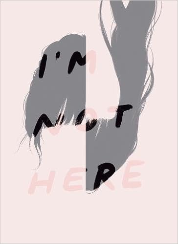
GG—the pseudonym of a presumably female, Asian-Canadian comics creator living in an undisclosed prairie city—is little known except to her community of followers on Patreon and visitors to her website ohgigue.com, which includes about a half dozen of her comics short stories, several also published in other venues. They range from the early sequences of rough, hand-drawn 8-pagers in her 2014 “Five Stories” to the sharply digital 48-page “I’m Crazy.” Her equally excellent 14-page “Don’t Leave Me Alone” appeared in the 2016 Best American Comics, but I prefer “Semi-Vivi,” another 14-pager that defines GG’s signature cropping effects and gutterless 4×2 grid. Judging from the content of her website alone, I would predict that GG will be a major comics voice of the next decade. And now she is already realizing that potential with her first full-length graphic novel I’m Not Here, released in September from Koyama Press.
The novel is one of the richest and gently disturbing I’ve read in recent years. It’s young female protagonist goes unnamed as she navigates the streets and hallways of her and her aging parents’ suburban homes and the memories of her second-generation immigrant childhood. No narrating voice grounds the story, so events move from the present to various moments of the past and possibly future without guiding explanations. By speaking only in dialogue, the main character seems to have no more insight about herself and her troubled situation than does the reader. We travel with her, suffering the same confusions that define her life. All we know for sure is the isolating distance she feels from her increasingly estranged mother.

I’m Not Here builds on GG’s earlier short works by approaching the long form in discrete, almost stand-alone units. The novel consists of eight closely linked vignettes, most between six and eleven pages, though the longest extends for twenty-four and the shortest five. Initially black and then gray two-page spreads divide all but the concluding vignette which is separated instead by two non-facing blank white pages. The movement toward white, though literally brightening, is paradoxical since GG’s use of white space within the narrative suggests loss as margins widen around the daughter’s isolated figure as she knocks at her mother’s door and the repeating image of the mother’s younger, cropped face fades until indistinguishable from the page. The novel also opens with two blank pages before a similar progression of panels darkens into grays and then eventually blacks. But if white is oblivion, black is no better. The dementia-suffering father concludes the second vignette by driving into the black of the margin, leaving the figure of his silhouetted daughter merging with the shadows of the street at night. The father never reappears.
The confining quality of the gray palette is reinforced by GG’s layout. Instead of her previous gutterless 4×2 panels, the novel’s physically smaller proportions suit her rigid 4-row grid of full-width panels. When the grid is not overt, it is implied, with the top two, middle two, or bottom two panels merged to create a double-sized panel. More often both the top and bottom panels merge to create two-panel pages. GG is especially adept at using her gutters in relation to the black and white shapes within panel images—the white frame of a photograph, the white rectangle of a bandage, the horizontal line of a grocery shelf, the vertical lines of a window pane—sometimes merging gutter and panel content to further augment her cropping effects.
Like the unframed panels, her internal images consist almost exclusively of opaque shapes with no contour lines separating them. Each shape is defined only by its internal and uniform gray gradation. The style produces a stark and simplified world devoid of not only color but texture too, with each figure and object precisely isolated—effects that express the novel’s overall narrative tone. Though often reduced to absolute simplicity in terms of image density, the contours of GG’s shapes also evoke real-world subject matter as if derived from photographic sources. The result is not the simplification of cartoons but a brutally stripped-down realism.

GG’s use of words is stripped-down too. She wisely ignores the conventions of thought balloons, talk balloons, and even conventional caption boxes. Words appear only at the bottom of panels in panel-wide strips. Sometimes the strips merge with the black of the panel or the white of the gutter, with words rendered in either black or white. GG never varies font or font style, and, since the novel includes no narration, she forgoes quotation marks for dialogue too. She draws no sound effects within images, but includes the “knock knock” of a door in her caption strips, marking it typographically with brackets. Voices on answering machines are bracketed too. When GG uses dialogue it is effective, but the majority of the novel is visual only. Fifty-six pages—over half of the novel— are wordless, and another dozen feature only one line of text. Like GG’s visual simplicity, the linguistic silence adds to the novel’s stark reality—especially during moments of literal silence, as the daughter and mother pass a wordless meal together.
GG’s austere realism plays well against the novel’s narrative content. While the situation of a daughter feeling estranged from her aging parents is realistic, GG disturbs that baseline reality with moments of inexplicable surrealism. After a comparatively mundane opening sequence of the daughter tying back her hair and preparing to go for a walk to take photographs, she finds her mother sitting in her bedroom with one of her arms detached. “Can you help me tape this back on?” she asks.

The daughter applies bandages to her mother’s back too, but GG draws no wounds or stumps, so it is intentionally unclear how the severed but apparently bloodless parts attach. GG’s stark style obscures the would-be details of her characters’ reality, flattening the world into dream-like imprecision. No like incidents follow this brief, unreal moment, but by placing it in the first vignette, GG colors the rest of the narrative with its potential. Is the father literally driving around the block in search of his house forever? Is this dementia or an afterlife variation on Sisyphus? Does the daughter literally become another woman or does the woman’s landlady simply mistake her when she lets her into the apartment and later hands her the lease? Is the daughter literally knocking at her mother’s locked door or is this a metaphor of her dreaming mind? GG leaves such reality-defining questions unanswered, leaving her main character drifting between realities too.

Like most graphic novels and stories in general, I’m Not Here could be reduced to a summary of its story content—though GG’s fractured plotting resists even that narrative norm. But aside from its surreal plotting and striking stylistic qualities, the novel is significant for GG’s way of expressing its content visually and so overcoming the limitations of script-based comics storytelling. I doubt GG began by describing her plot and panel content in words and then executing those descriptions in images. Instead, her story emerges from the images themselves, and so they and their intricate relationships cannot be simply summarized. The page, for example, of silhouetted tree tops and street lamp below a full moon and vast evening sky does not mean anything linguistically or even narratively, but its placement after the mother criticizes the daughter is emotionally evocative. Such images do not tell a story but are the story—a fact true of all comics but rarely so well achieved as here. And I’m looking forward to more such stories from one of the most exciting new voices of 21st century comics.
[The original version of this and my other recent comics reviews appear in the comics section of PopMatters.]
Tags: GG, I'm Not Here, Koyama Press
- Leave a comment
- Posted under Uncategorized
11/12/17 Not-Quite-Coming-of-Age in a Not-Quite-a-Memoir Comic

Kristen Radtke’s Imagine Wanting Only This explores the literal and figurative ruins of loss and mourning in a graphic narrative poised on the nonfiction boundary between memoir and essay. After the long-anticipated death of a beloved uncle, Radtke looks outward at the remains of abandoned towns and ancient cities as she inwardly copes with the same inherited heart condition that killed her uncle. The premise is artful in a way more typical of fiction, since Radtke’s attention to her literal heart parallels her emotional life as her mourning isolates her from meaningful relationships. Yet after depicting her break up with her boyfriend in an early chapter, Radtke abandons that personal plot for nonfiction reportage of historical locations and events, an approach that undercuts the expected coming-of-age closure.
The turn away from memoir, while still an indirect portrait of her emotional state, is narratively peculiar. When graphic novelist Anya Ulinich reviewed Imagine Wanting Only This for The New York Times, she felt “a lack of personal stake, of narrative tension” when the work “thins out into a travelogue” in chapter four. But that’s arguably the point. Radtke’s travels in Asia illustrate her escape from the personal. After leaving her boyfriend in the previous chapter for the “distractions” of brief sexual relationships with graduate school men she identifies only by their cigarette brands, she responds to her ambiguous heart diagnosis and disturbing autopsy dreams by organizing a desperate travel itinerary with her “best friend,” a character seemingly invented for the trip which contrasts Radtke’s previous European travels with her now ex-boyfriend. The chapter’s dwindling personal stakes and tensions are the inevitable product of her impossible goal: “to see as many countries as possible and be away from home for as long as possible. It felt like I had to see everything, as if it was the only way my life would count or matter.” Of course it fails. She is trying to flee herself.

Radtke next deepens her flight from the personal with another subtle formal shift. Where chapter four reduces the opening chapters’ intimate plot with the outward-focus of a traveler’s journal, chapter five steps further away by exploring incidents in the remote past. Radtke’s narration turns from travel guide to history guide. Her accounts of obscure sightings of the Virgin Mary, the explosive burning of a Wisconsin town in 1871, the WWII bombing of Dresden, and the invention of napalm are only sparsely punctuated with interactions with other living characters and memories of her uncle.

Chapter six then opens with Radtke again in flight, now leaving “Marlboro Reds” in bed as she plans her next trip, this time to the yet-more-remote regions of Iceland on a nominal quest to research a yet-more-obscure topic, “a pseudo-travel documentary told in letters.” In addition to providing Radtke her title, the film and the peculiarity of its genre echoes the peculiarities of her own. Though she longs to describe her latest travel experience with “someone I loved,” her trip culminates anti-climatically with a thinly attended conference panel presentation in which the words in her speech bubbles literally devolve into scribbles.
Next she’s researching an abandoned mining town, one she glimpsed years earlier while still with her not-quite-forgotten boyfriend. Of course traveling to interview one of its former residents provides no comfort, personally or narratively. Radtke’s briefly details how “Sometimes I met very polite boys with very neat hair who asked me to take walks with them along the river.” Her explanation is revealing in the nearness of its inaccuracy: “It’s not that I didn’t want to stand in a field and watch the air get dark around us as the sun moved across and beneath the Ohio River. It’s that I didn’t want there to be an Ohio River.” Radtke’s subsequent litany of the river’s faults cannot obscure her not-quite-articulated death-wish as its unacknowledged influence continues to push her into greater isolation. It’s that she didn’t want there to be a Kristen Radtke.

In the final sequence, Radtke lives alone in New York, imagining it empty and flooded as she evokes a universal but visually absent “we,” drawing together the intentionally disparate threads of her not-quite-a-memoir memoir. Though the anti-climax is appropriate, her plot and portrait remain incomplete, as if she has reached the end of her book but not its narrative. There’s also ambiguity in whether her faulty narrator—a troubled young women incapable of recognizing her downward spiral and its cause let alone cure—is a brilliantly crafted construction of the author or an accidentally revealing self-portrait.
Though her final sequence does not communicate the self-knowledge implied by the work overall, I choose to read Radtke as fully aware of the qualities of her drawn character—and therefore her actual character. The choice is justified by her skill in the comics form. Imagine Wanting Only This is no illustrated memoir, but a graphic narrative inseparable from its visual telling. Page after page exploit the nuanced relationships between text and image and the subtly disrupting closure effects of sequence. In terms of style, Radtke’s computer-generated lines are always precise, and when not overtly photo-based, evocative of photographic content reduced to minimal detail. Her backgrounds and interior shapes are typically solid shapes with no crosshatching, and she surrounds her limited graytones with wide white margins. The overall effect is a stark realism well-suited to her topic of death, both past and anticipated.
But Radtke’s topic is also herself, both narratively and visually, and so as the chapters follow her travels and reveries, her self-portraits people almost every page. As a result, her nearly constant visual presence contrasts her character’s expanding emotional remoteness. Also, aside from childhood flashbacks, her drawn representations do not change or evolve, creating a constancy that parallels her plot’s anti-climax. If the work is, as one of her back cover blurbers claims, a bildungsroman, it is one that reverses the coming-of-age genre’s most defining trait: personal growth.

The abundance of self-portraits also makes her author photo on the back flap oddly unsettling because it both clearly resembles and yet subtly contradicts the character in her artwork. The effect isn’t due to a lack of artistic skill, but highlights the nature of drawing in general. Radtke’s style inherently alters what it depicts, including and perhaps most especially her most central subject, herself. This is true of any graphic memoirist, but Allison Bechdel’s mildly cartoonish self-portraits in Fun Home and Julie Doucet self-parodically cartoonish self-portraits in My New York Diary emphasize differences between the drawn world and the actual. Radtke’s computerized naturalism instead travels the borders of the unreal valley’s not-quite-ness, a fitting stylistic location for her not-quite narrative.

[The original version of this and my other recent comics reviews appear in the comics section of PopMatters.]
- Leave a comment
- Posted under Uncategorized
04/12/17 How Not to Help Your Tenure Case
I turned in my tenure file last Friday. I’ve received enough compliments about my productivity, including from my chair and dean, that I may have some reason for confidence about the research portion of my case. My file includes a range of published works, plus works-in-progress, some book-length. But it does not include the 120,000-word manuscript I started composing early last winter. Almost exactly a year from my review due date, I began devoting an hour of daily writing and research to a project I knew would never help my tenure case.

Every day since December 4th, I wrote a letter to Bob Goodlatte, my Congressional Representative, and posted it on my “Dear Bob” blog. I teach creative writing and contemporary fiction, so the daily exercises in political rhetoric and their accumulating real-time history of the Trump presidency are well outside my job description. Even though my provost is a consistent advocate of academic freedom, I’m not sure what could have been a worse use of my limited time.
It was therapeutic at first. Having had some reason for confidence about the presidential portion of the election, I was unprepared for Donald Trump to take office. Writing letters channeled my energies, gave me something specific to focus on. The shortest are single paragraphs, the longest a thousand words. I had assumed I would run out of material, but my congressman provided plenty: his quarter-century in Congress despite running on term limits; his embrace of deficit-expanding tax cuts despite his sponsoring a balanced budget amendment for years; his refusal to allow his House Judiciary Committee to participate in any of the congressional investigations of the Trump administration after vigorously investigating the Obama administration over similar accusation of misconduct. Mr. Goodlatte also attended my school, Washington and Lee University, and opposes the removal of Confederate statues, so I had even more to write about since Charlottesville. Next year he will likely become a household name if the special counsel report justifies impeachment, a process he controls as Judiciary Chair.
When local newspapers and a TV station did features on my letter campaign, I received hate mail accusing me of insanity, criminal intent, professional incompetence, and, of course, subjecting my students to my liberal bias. The last one I was expecting. According to the Pew Research Center, 58% of Republicans think colleges have a negative effect on the country and 72% of Democrats think they have a positive effect. Dartmouth social science professor Sean Westwood explains the division: “Colleges are simply seen as a production facility for Democratic beliefs and Democratic ideology.”
But it’s one of my ideological beliefs that teachers should not abuse their positions by expressing their personal opinions to students who have no choice but to listen and would be wise to at least feign agreement with the person grading them. I was in high school when John Lennon was murdered, and my P.E. teacher was so opposed to Lennon’s politics that he devoted a period of Health class lecturing about how bad a person Lennon was and why no one should be upset by his death. I wasn’t a particular Lennon fan at the time (I was more upset by Led Zeppelin’s drummer asphyxiating on his own vomit), but I was offended that my teacher felt he had the right to inflict his opinions when the topic was unrelated to our course.
Instead of expressing my opinions, I spend most of my class time encouraging my students to express theirs, and then only on the course-related topics that are the focus of our discussion. I encourage them to support their opinions with evidence. I urge them to disagree and to be persuasive but also to be open to changing their minds when someone else presents ideas and evidence they hadn’t yet considered. Does that make my classroom a production facility for Democratic beliefs and Democratic ideology? Only if Republicans are ideologically opposed to conversation, open-mindedness, and the expectation that opinions must be supported.
Last semester a student in my first-year writing seminar liked to wear a “Make American Great Again” cap to class. I didn’t comment on it. He participated actively, listened closely to others, and enjoyed challenging others’ ideas as well as having his own ideas challenged. One of the hardest workers in the class, he was a gifted writer and achieved one of the highest grades. By the end of the semester, he was considering majoring in English, which I encouraged. I offered to be his advisor, but said he shouldn’t declare his major too soon. Part of the point of attending a small liberal arts college is trying a range of new courses and fields to discover areas of interest and talent you didn’t know you had. At the end of the semester, he told me how much he enjoyed our class and said he hoped to take more classes with me in the future. He also stopped wearing his Trump cap. I never asked why.
Did I indoctrinate him into my ideology? I hope so. I’m also realizing that my letter campaign models that same ideology. Researching and crafting letters requires the same skills I teach in my writing seminar: persuasive argumentation supported by research-based evidence.
In order to have any hope of persuading a conservative of a progressive viewpoint, I cited only Republicans when criticizing positions taken by President Trump. Obviously Democrats are criticizing the President. Why would Goodlatte care? When gathering evidence from news reports, I chose right-leaning publications. That’s because the majority of our mainstream media do have a slight but verifiable left-leaning bias. That’s a far cry from “Fake News,” but it does mean that if you’re a progressive, like me, you are better served by triangulating your news from multiple sources. And if you don’t have time, just read the Wall Street Journal. Like the New York Times, it gets its facts right, but with a slight tilt, and since that tilt is to the right, it protects you from your own left-tilting verification bias.
When I teach my first-year writing seminar again, I’m even considering remodeling it on my letter campaign. After a first assignment testing the bias of multiple media sources, I could have students identify their hometown Representatives and begin amassing voting records on whatever issues most interest them. They would draft and workshop letters, experimenting with a range of rhetorical approaches and testing each for its persuasive effects. And instead of handing in final drafts that only I read, they would mail actual letters, and their Representatives’ staffs would then likely respond with form letters, providing more text to analyze and reasons to write anew.
I stopped writing to Goodlatte last month after he announced he will be retiring after his current term. His staff had responded to roughly one of my every ten emails, before relegating me to a do-not-respond blacklist last summer. Our semester is only twelve weeks, so none of my students would likely achieve that unfortunate distinction. But they would look back over a semester of their letters and, like me, discover they have composed a personal history of a segment of vital national politics. Some may even keep writing after the course is over. If so, it wouldn’t help their grade.
Or their tenure case.

Tags: Bob Goodlatte
- 1 comment
- Posted under Uncategorized


