Monthly Archives: June 2018
25/06/18 Unferth and Haidle’s I, Parrot

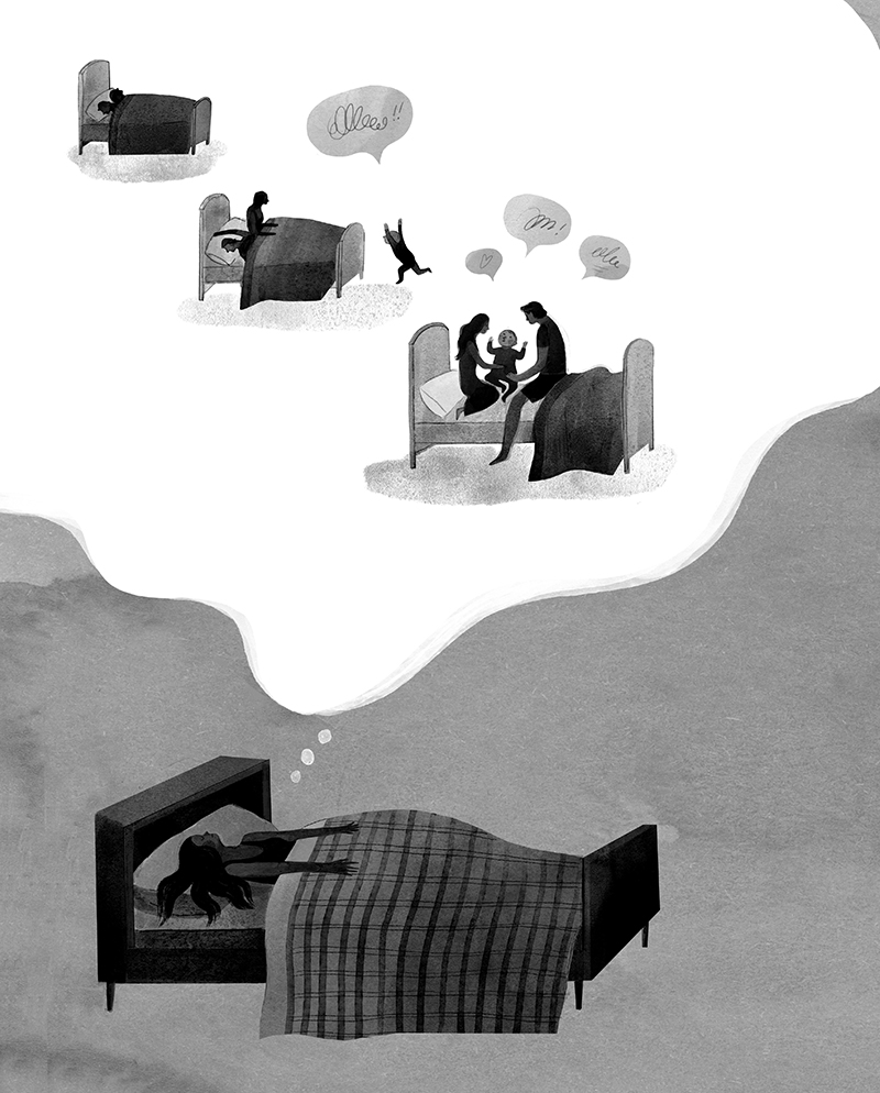
The graphic novel I, Parrot combines two unquestionable talents. Deb Olin Unferth is a major new literary voice, whose award-winning short prose has appeared in a range of top literary journals, and her book-length work includes two story collections, a novel, and a memoir, all published by prestigious independent presses. Elizabeth Haidle is creative director of Illustoria, a visual storytelling magazine for children, and she brings a smart, cartoon energy to Unferth’s writing. Together the two tell the story of their narrator Daphne’s struggles to win custody of her son, maintain her relationship with her boyfriend, and care for 42 exotic parrots. The three goals interweave since the parrots belong to her boss, and she is taking care of them to earn money to pay her lawyer, while also proving to the court that “inappropriate abusive men” are not “loitering the household,” a fact made increasingly clear as her boyfriend, Laker, takes on the positive role of step-father to little Noah. Despite dominos of mishaps, the fragmented family and their 42 adoptive pets pull through together.
Although Unferth’s family-oriented plot and Haidle’s style sometimes evoke children’s illustrated books, the occasional “fuck” in Laker’s dialogue clarifies the target audience. This is for grown-ups—and yet the intentionally simplistic rendering is more than surface details. While always expressive, Haidle’s faces are more geometric than human: circle cheeks, triangle noses, blocks of hair. The effect is counterweighted by the subtle gradations of her interior shading, which look brush-stroked in gray wash.

Her page layouts are playful and evolving, varying from traditional gutters to open panels to maze-like circles, with a recurring motif of diagonal divisions.


The overall effect creates the sense of a children’s world inhabited by adults—which also describes Daphne. The core of her life is not her job or her boyfriend but her son. Haidle’s art makes that fact palpable by rendering every element of Daphne’s story in a style most suited to a child. Even when Noah isn’t on the page, he is still his mother’s cartoon heart.

As the authors describe in a Comics Alternative interview, the project originated with Unferth’s stick-figure sketch of the novel, which earned her a contract with her publisher who then introduced her to Haidle. The two worked together long-distance, via email, Skype, Dropbox, and one extended visit. While most comics collaborations begin with a written script, Haidle instead adapted Unferth’s visuals, while Unferth in turn revised to include not only Haidle’s input but her personal experiences—including her own son’s insights into the character of Noah.
While the relationship of writer and artist is always complex, the complexity is even greater here. Typically an artist receives verbal descriptions only, often with complete control of layout. But any given image choice may or may not have originated with Unferth, with Haidle translating rather than wholly inventing visual qualities. I suspect this somewhat reduced Haidle’s role as author. It also implies that Unferth is the primary author, and Haidle her illustrator, a common credits division, which the cover and title page resists by listing both creators side by side and without attribution. It is Unferth’s first graphic novel, a form she said was different and harder to work in than she expected. She calls I, Parrot “a plot-heavy book,” something she strived for since her wide experience in prose writing gave her expertise in plot but not image. She also gives Daphne’s voice a sharp but believable eloquence from the opening page, describing, for example, “relentless errands over a churning earth” and “the roar of the unhappy mind.”
The novel is less successful at exploring the intersections of word and image that define the uniqueness of the comics form. Often a panel’s figures and its narrated or spoken language overlap in ways that duplicate each other rather than provide independent information that combines in unexpected ways. Page one, for example, opens with the narration: “I finally found a job,” followed by a smaller script statement, “That’s me, Daphne,” and an arrow pointing at a woman smiling and waving as if at the reader. Daphne as drawn includes additional information (she has long black hair, etc.) but the image-text relationship is rudimentary. When Haidle draws Daphne slumped in a chair, Unferth’s talk balloon “Sigh” adds nothing the image did not already convey. While the redundant style further implies a children’s book aesthetic consistent to the novel’s theme, Unferth and Haidle rarely challenge those visual norms and so don’t use other effects available to literary graphic novelists.
Since Unferth drafted the novel in sketch form and it is her first graphic novel, it’s not surprising that she hasn’t plumbed the form’s full potential yet. While I, Parrot is a solid entrance into the field, I predict Unferth’s future graphic work will go further.
[A version of this post and my other recent comics reviews appear in the comics section of PopMatters.]
Tags: Deb Olin Unferth, Elizabeth Haidle, I Parrot
- Leave a comment
- Posted under Uncategorized
18/06/18 A surreal exploration of narrative ambiguity—or maybe not
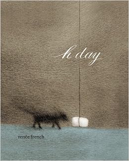
While wordless comics date back to the woodcut novels of Frans Masereel and Lynd Ward of the 1920s and 1930s, and Max Ernst’s 1934 A Week of Kindness, “A Surrealistic Novel in Collage,” revealed the non-naturalistic potential of sequential art, one of the most successful explorations of wordless surrealism in graphic form is the more recent H Day (PictureBox 2010) by Renée French. Though French also publishes children’s picture books under a pseudonym, H Day is hardly for children. There is no overtly violent or sexual content, and while the imagery sometimes evokes children’s genres—a cute dog, a round-headed main character—the sequence is quietly disturbing in tone, with a narrative logic that teeters provokingly on the inexplicable.
French divides the novel into seven sections or, as she subtitles all but the first, “stages.” The shortest is five pages, the longest twenty-four. After an initially and especially ambiguous introductory set of single images, each stage consists of full-page images paired on facing pages. The pages are atypically small, 6” x 7”, and so well suited to single images. (French worked with even smaller pages for her earlier Micrographica.)
The spine divides the novel in half both physically and narratively. left-hand pages feature unframed white spaces with a recurrent human figure composed almost entirely by outline. Its only interior marks are dots for nipples, a curved line for ambiguous genitalia, and occasional curved lines for knees. The figure has no ears, hair or facial features. It appears on roughly eighty pages. For the first thirty, the figure stands in empty white space, interior and exterior defined only by its outline. Shortly before the novel’s midpoint, French draws a lone bed, and on the subsequent page, the figure reappears and soon lies across it, where it remains until the sequence’s penultimate page in which the figure stands to leave, after which the bed is featured alone again in the concluding image.

The figure, both while standing and lying, undergoes a range of surreal metamorphoses. An undefined circle appears within the figure’s head on its second page. Though composed of the same kinds of lines that indicate exterior body features, the circle suggests a physically interior element, as if the head, unlike the rest of the body, is viewed in cross-section—an effect created by the absence of facial features. The circle might also be understood as metaphorical, until it takes on overtly physical qualities, soon expanding beyond the outline circle of the head itself. The figure punctures the circle with its hand and extracts a ribbon-like object that possesses more interior shading lines than anything else on the page. The ribbon retracts soon, leaving a pucker mark from which a straw extrudes, wrapping itself around the head-replacing object. A range of even more extreme transformations follow: pillowy worm-like objects grow from the head and crawl about the bed; cage-like tendrils wind from the head to form a lattice of ropes with the headboard—all while the figure remains otherwise motionless. Because the setting is also stationary, the left-hand pages create a partial flip-book effect, with each metamorphosis occurring incrementally.

Right-hand pages feature a radically different narrative, both in content and style. Where left-hand pages use stark open space, all right-hand pages create fully defined rectangular panels. Though frameless, the panels establish borders through meticulous pencil shading that also defines rich spatial environments of ocean, sky, clouds, curving hills, and, most prominently, a city-like landscape of uniformly shaded building-like monoliths creating street-like spaces between them. Though this ambiguous world is initially peopled by darkly shaded human figures, the protagonist of the sequence is a small, dark dog who possess the only facial features in the novel. It wanders alone, struggling against a set of antagonistic forces: swirling black smoke emitted by an industrial-sized chimney, swirling gray water emitted by a sewer-like drainage pipe, and swirling, ant-like dots that either swarm around dead bodies or emerge from them to merge with the smoke.

Though surreal, the narrative effect is still largely naturalistic as the dog makes various attempts at escape. But French at times undermines even this quality when figures, including the dog, transform between pages into similarly shaped objects that appear to be formed of wound string—with no contextually implied explanations. “stage 5” also abandons the dog and its environment entirely to depict a sequence of transforming birdcage-like objects with no earlier presence in the right-hand sequence. “stage 6,” however, returns to the surreal worldscape as a new monolith sails toward the dog to open a door-like passage and extend a plank which the dog walks to vanish within the monolith’s unknown interior before it sails away.
The final right-hand page features a version of the bed from the left-hand sequence, only rendered in the more finely detailed style of the right-hand drawings and with cross-hatched walls and floor of a more fully naturalistic space. The effect is not only a surprising merger of the two otherwise unrelated sequences, but it retroactively suggests a metaphorical link between them throughout. Because the bed does not appear earlier on right-hand pages, it is understood to be the left-hand bed, which, given its concluding primacy, refigures the entire righthand sequence as an expression of the left-hand sequence. The dog and its worldscape are not “real,” but are figurative representatives of the transformations of the left-hand character. Though those transformations may themselves be understood as metaphorical, within the logic of the two-sequence pairing, they are the novel’s baseline reality and so are “real” in that sense.
 Despite all of the surreally ambiguous imagery, the two-fold narrative concludes clearly enough: the dog’s sailing away and the human figure’s leaving the bed are linked, positive outcomes. H Day has a happy ending. And while the imagery is open to interpretation—are the shapes that extrude from the human figure’s head visual embodiments of “thoughts” and the dog’s narrative the content of those thoughts?—French’s not-entirely-wordless novel does provide one unavoidable interpretation. The back covers states: “the artist illustrates her struggles with migraine headaches and argentine ant infestation.” While I appreciate the pleasures of a narrative hook, I wish the marketing team who wrote the summary did not include so reductive an explanation.
French has made similar statements in interviews; she told WOW x WOW: “My book, H Day (the version in France is called Céphalées, and it’s silent so that only affects the title) is an attempt to show what it’s like to have a migraine, from the outside and the inside. There’s an ongoing series of drawings on the left hand pages that take you through the pain part of it, showing a character who eventually merges with the bed in a pretty violent way. And then on the right hand pages there’s a story that I’d visualized for years, in order to distract me from the headaches. Even with that entire book, I still go back to that subject. Most of the portraits with things exploding out of the face or the skin warping around the head, are based on the migraines.”
But the back-cover summary, even aside from its erroneous emphasis on an ant infestation, does the novel a disservice. French’s decision not to include her explanation in an introduction or afterword establishes the novel as independent of the creative history that produced it. Yes, French suffered migraines and those migraines led to these images, but the novel is more than that personal chronicle. It both contains those autobiographical facts and exceeds them—an aesthetic effect undermined by the back cover.
And yet, while the title H Day is inherently ambiguous, the French title, Céphalées, means simply “headaches.” The difference of a single word—the novel’s only word—overwhelmingly defines its content. Where Céphalées is the impressionistic tale of a migraine attack, H Day is a surreal study in narrative ambiguity.
I recommend H Day.

[A version of this post and my other recent comics reviews appear in the comics section of PopMatters.]
Tags: H Day, Renée French
- Leave a comment
- Posted under Uncategorized
11/06/18 Creating Comics: Photo Research

I’m happy to report that Bloomsbury has green-lighted my and my co-author Leigh Ann Beaver’s book proposal: Creating Comics. It’s based on our hybrid creative-writing/studio-arts course, which we taught for the second time in spring. We’re busy drafting and illustrating now, plus we asked our students if we could include some their work in the book too. They said yes. So I’ll be happily posting work-in-process material on and off for probably the next year.
Working with Leigh Ann has been a massive learning experience for me, especially since I (like some of our more hesitant student) have uttered the dreaded sentence: “But I can’t draw.” So a lot of our first chapter is about building skill and confidence–mine included. Here’s the best trick:
Working from photographs, preferably your own, gives a comic real-world specificity. Comics creators from a full range of genres and styles begin by staging a photo shoot. Robyn Warhol describes graphic memoirist Alison Bechdel’s “practice of taking snapshots of herself posing for each of the characters in every frame, then draw from the snapshots … to get every bodily gesture, every wrinkle in the clothing, every angle just right” (7). Bechdel does not reproduce every wrinkle in her actual drawings—her style in Fun Home is relatively sparse—but the poses add realism to what might otherwise appear cartoonish in its simplicity. Working in the Kirbyan dialect and subgenre of horror fantasy, artist Bernie Wrightson created the premiere Swamp Thing episode in House of Secrets #92 (July 1971) by posing friends in the roles of villain, damsel, and hero-monster. Bechdel dressed in a man’s suit and tie looks a lot more like her father than Wrightson’s friend looks like a mud-encrusted swamp creature, but the photographs still provided the necessary gestures and angles to give the comic a naturalistic edge. For his comics adaption of the silent film classic M, Jon J. Muth takes the photographic approach to its extreme:
All of the scenes in M were enacted by people in character. I cast friends, family, and strangers, gathered clothes and props, and decided where each scene would be shot… After directing and photographing a scene, I would make my drawings from the photographs… If I took a poor photograph—one that was over- or underexposed or blurry—then I did a drawing of a poor photo. I didn’t correct anything…. When I duplicated a photograph by drawing it, the drawing extracted a different range of emotions than the photo. This happened though I tried to be as faithful to the photograph as possible… This was a discovery, and not by design.” (192)
And this is the kind of discovery possible only through image making. No script can produce it.
The above illustration demonstrates a range of photo research examples. Each includes an original photograph and a drawing made from it. The goal isn’t fidelity—unless that’s your particular style. Sometimes the drawn image varies significantly, referencing the photo for general ideas. Other times the references are exact but edited—like Leigh Ann’s sparsely arranged bricks. Some of the images are traced on a light board; others are freehand. Chris made the tree and fence in Word Paint. Some of the images add details—Leigh Ann invented those beach balls but copied Godzilla from a website. She also photographed a colleague to copy in brushwork, showing the differences of media too. Our student Anna pulled a photo from her phone to use in her memoir about running, and Mims snapped pictures of her own hands while in class to use for a character. The four-panel strip at the bottom was taken from a class photo shoot with students posed with instruments and in animal masks. Your camera is an invaluable drawing tool. You’ll use it to refine images as well as create original content through your own photo shoots.
Below is my process of turning a photograph into a comics panel (which I definitely won’t be including in the book). I started with an image Lesley forwarded me from her phone.

The part of the photograph I liked most was also the easiest and most fun to draw, so I started there:
 Those ground plants were my next favorite:
 And once I have a base pattern, it’s easy to manipulate and insert multiple times:
 Like everything else, the tree is just a crosshatch of intersecting straight lines:
 There’s no sidewalk in the photo, but I could picture it and liked how the lines interacted with the geometry of the fence:
 Another base pattern for the smaller tree:
 And drop it in:
 Fill in spaces in the bark for more texture:
 And why not expand the fence another lopsided wrung?
Sadly, the perspective on the cenral tree was off, so even though I like how the tree in the photo loops in and out of the fence, I rearranged:
 And I hoped some invented roots might help with perspective too:
 My image is hardly photorealism, but the differences are at least interesting:

- Leave a comment
- Posted under Uncategorized
04/06/18 Wally & Egon in Cafe Korb
Students in my spring term class “doodled” characters and then redrew them a few dozen times in different positions and actions untill their lines came almost effortlessly. I decided to follow my own lesson plan and created two characters while on vacation last week:

Our family vacation included Prague, Bratislava, and Vienna, so I Word-Paint doodled while in trains, airports, and early mornings in rental apartments. Central European art museums are crammed with Klimt and Schiele, and I think their distortions were a happy influence. I named the skeleton “Wally,” after Klimt and Schiele’s favorite model and Schiele’s lover, and the demonish character “Egon,” Schiele’s first name.
I’ve also been toying with the idea of placing cartoons inside photographed environments. Our last breakfast was in Vienna’s Korb Cafe, which had the most amazing basement:

The room was closed for breakfast, so I was able to snap a dozen unpeopled pictures on my phone–more than enough for Wally and Egon. I didn’t have a story, so I just started drawing, seeing what gestures and positions emerged. I didn’t have any dialogue in mind either, but I like talk bubbles as a graphic element, so I matched styles to each character. Wally’s body and bubbles are made of squiggly lines, Egon’s are straight-edged.
If you applied for a writing job at Marvel in the 1960s, you were handed four pages of a Fantastic Four issue with all the words removed and told to fill in the captions and bubbles. Feel free to do the same with these:


Personally, I’m not sure words are needed. David Byrne says, “Singing is a trick to get people to listen to music for longer than they would ordinarily.” Maybe words can be a way to get readers to look at pictures too, but I think in comics they can distract from the images. I may experiment with words later, but first here’s the one-page version:

- Leave a comment
- Posted under Uncategorized


