Monthly Archives: May 2023
29/05/23 Making Comics (Spring 2023)
Alan Haigler:
Elina Puri:
Lou Langhorne:
Sinclair Walker:
Kyle O’Shea:
Daniel Emmanuel Jakubowski-Lewis:
Isaac Barber:
Teresa Yoon:
Nisha Walvekar:
Lewis Morse:
James Eaton:
Colin Bridges:
Ronny Williams:
Tags: how to make a comic, spring term festival, washington and lee spring term
- Leave a comment
- Posted under Uncategorized
20/05/23 Warhol v. Goldsmith (2023)
I wrote a series of posts (one, two, three, four, plus codas five, six, and seven) about the Warhol v. Goldsmith case in 2021, before the second appeal went to the Supreme Court in October 2022 (which I discussed here and here).
I offered two guesses about the outcome:
“SCOTUS sides with Warhol, but fails to explain in a manner that will clarify infringement for potential future cases. Alternatively, the Court sides with Goldsmith and still fails to explain in a manner that will clarify infringement for potential future cases. Either way, I predict they dodge the needed work of determining a standard for meaningful transformation.”
The Court has now ruled:
Sadly, the 7-2 decision against Warhol proved my core prediction true: the majority dodged the needed work of determining a standard for meaningful transformation, failing to clarify infringement for potential future cases.
Instead of analyzing Warhol’s transformation of Goldsmith, the majority focused on the fact that both Warhol and Goldsmith sold their images to magazines. Sotomayor explains:
“As portraits of Prince used to depict Prince in magazine stories about Prince, the original photograph and AWF’s copying use of it share substantially the same purpose.”
Gorsuch penned his own concurring opinion, which Jackson joined, emphasizing the extremely limited focus of the decision:
“while our interpretation of the first fair-use factor does not favor the Foundation in this case, it may in others. If, for example, the Foundation had sought to display Mr. Warhol’s image of Prince in a nonprofit museum or a for-profit book commenting on 20th-century art, the purpose and character of that use might well point to fair use. But those cases are not this case. Before us, Ms. Goldsmith challenges only the Foundation’s effort to use its portrait as a commercial substitute for her own protected photograph in sales to magazines looking for images of Prince to accompany articles about the musician. And our only point today is that, while the Foundation may often have a fair-use defense for Mr. Warhol’s work, that does not mean it always will.”
Kagan and Roberts (a surprise given his skeptical questioning during oral arguments) dissented. Kagan writes:
“Like most artists, Warhol did not want to hide his works in a garret; he wanted to sell them. But as Campbell and Google both demonstrate, that fact is nothing near the showstopper the majority claims.”
Kagan continues:
“The silkscreen and the photo, the majority claims, still have the same “essential nature.” The description is disheartening. It’s as though Warhol is an Instagram filter, and a simple one at that (e.g., sepiatinting). “What is all the fuss about?,” the majority wants to know. Ignoring reams of expert evidence—explaining, as every art historian could explain, exactly what the fuss is about—the majority plants itself firmly in the “I could paint that” school of art criticism.”
She even employs my favorite philosophical strategy:
“A thought experiment may pound the point home. Suppose you were the editor of Vanity Fair or or Condé Nast, publishing an article about Prince. You need, of course, some kind of picture. An employee comes to you with two options: the Goldsmith photo, the Warhol portrait. Would you say that you don’t really care? That the employee is free to flip a coin? In the majority’s view, you apparently would. Its opinion … is built on the idea that both are just “portraits of Prince” that may equivalently be “used to depict Prince in magazine stories about Prince.” All I can say is that it’s a good thing the majority isn’t in the magazine business. Of course you would care!”
In short, Kagan concludes about the majority decision: “From top-to-bottom, the analysis fails.”
Though Sotomayor’s Opinion appears first, it includes quips at Kagan:
“The dissent thus misses the forest for a tree.”
“The dissent would rather not debate these finer points.”
“These claims will not age well.”
And Kagan quips back:
“I’ll be happy to discover that my “claims [have] not age[d] well.” But that would require courts to do what the majority does not: make a serious inquiry into the follow-on artist’s creative contributions. The majority’s refusal to do so is what creates the oddity at the heart of today’s opinion. If “newness” matters (as the opinion sometimes says), then why does the majority dismiss all the newness Warhol added just because he licensed his portrait to Condé Nast?”
Kagan’s dissent also employs visual arguments, including an expected comparison of Warhol’s transformative Marilyn to his transformation of the Prince photograph:
The inclusion of Francis Bacon is more surprising:
There’s also an atypical number of nudes:
Most importantly though, Kagan recognizes the larger issue:
“Still more troubling are the consequences of today’s ruling for other artists. If Warhol does not get credit for transformative copying, who will? And when artists less famous than Warhol cannot benefit from fair use, it will matter even more.”
Artists need to know what is and what is not adequately transformative when developing artwork from a source image. Without a standard, parameters for copyright infringement will remain ambiguous, and threats of lawsuits will continue to control artistic behavior.
Consider these examples.
I’m guessing that all of the far-right images are transformative enough to avoid infringing on any copyrights from the images on the far left. (Blanch v. Koons (2005) seems to establish that: “When, as here, the copyrighted work is used as ‘raw material,’ in the furtherance of distinct creative or communicative objectives, the use is transformative.”)
But I have no idea about the three in the middle column.
Or, if these three middle photographs were copyrighted, would the images on the left and right infringe?
Returning to Goldsmith, I have no idea if either of the two transformed images are sufficiently transformative to avoid infringement.
If a work is “transformative,” nothing else matters. A transformative work can’t infringe on the copyrighted worked it transformed, regardless of other factors. While focusing on Warhol’s “use” of his Prince image on a magazine cover, the majority is indirectly declaring that Warhol did not sufficiently transform Goldsmith. But they do not provide the visual analysis needed to explain why that is and, more importantly, to establish any sort of standard for future cases.
Recall that in 2014 Kienitz v. Sconnie Nation and Underground Printing, the circuit judges ruled in the opposite direction. The defendants downloaded a photograph from a city website to use for a t-shirt ridiculing Mayor Peter Soglin:
“Defendants removed so much of the original that, as with the Cheshire Cat, only the smile remains. Defendants started with a low resolution version posted on the City’s website, so much of the original’s detail never had a chance to reach the copy; the original’s background is gone; its colors and shading are gone; the expression in Soglin’s eyes can no longer be read; after the posterization (and reproduction by silk-screening), the effect of the lighting in the original is almost extinguished. What is left, besides a hint of Soglin’s smile, is the outline of his face, which can’t be copyrighted.”
That description also suits Warhol’s transformation of Goldsmith’s photograph:
Does the (scant) visual analysis of Warhol v Goldsmith now replace the visual analysis of Kienitz? Or is it true that the elements of original photographs that remain after a silkscreen process “can’t be copyrighted”?
Even without that unaddressed contradiction, the decision deepens the ambiguity. The Court states:
“To preserve the copyright owner’s right to prepare derivative works, defined in §101 of the Copyright Act to include “any other form in which a work may be recast, transformed, or adapted,” the degree of transformation required to make “transformative” use of an original work must go beyond that required to qualify as a derivative.”
And:
“Such transformations may be substantial, like the adaptation of a book into a movie.”
So where is the line between an owner’s copyright-protected derivatives and a second artist’s fair-use transformations?
Warhol v Goldsmith tells us nothing. This is what Kagan means when she sharply criticizes the majority’s refusal to “make a serious inquiry into the follow-on artist’s creative contributions.”
The majority skipped step one:
“Before today, we assessed “the purpose and character” of a copier’s use by asking the following question: Does the work “add[] something new, with a further purpose or different character, altering the [original] with new expression, meaning, or message”? When it did so to a significant degree, we called the work “transformative” and held that the fair-use test’s first factor favored the copier (though other factors could outweigh that one). But today’s decision—all the majority’s protestations notwithstanding—leaves our first-factor inquiry in shambles.”
Though I don’t agree with everything in the dissent, Kagan recognizes the central challenge that the majority ignored. Instead of providing clarity, the decision deepens confusion.
Tags: Andy Warhol, Kagan, Patricia Highsmith, Sotoymayor
- Leave a comment
- Posted under Uncategorized
15/05/23 Planning Your 12-page Comic Book
If you have three pieces of paper, you can make a twelve-page comic:
If that schematic is confusing, start with this one:
These are slides I made for the most recent iteration of my and Leigh Ann Beavers’ ENGL-ARTS 215: Making Comics class. I never lecture in any of my other classes (they’re all discussion-based seminars), but our comics course is closer to a lab: we explain a bunch of stuff, and then our students apply the concepts hands-on.
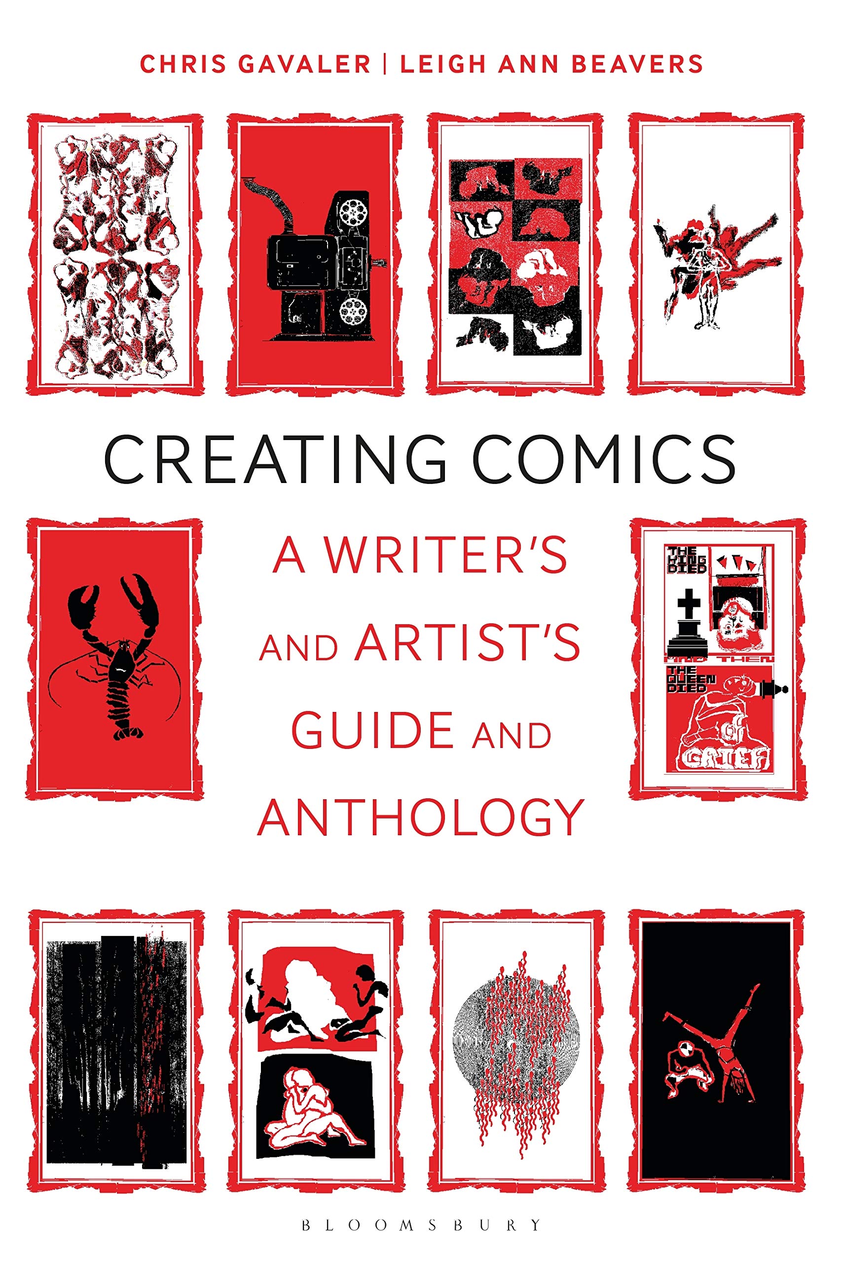
This presentation was titled “Multiple Pages” and followed homework reading “Chapter 4: Pages” in our textbook Creating Comics. It also followed the previous day’s presentation “Layout & Paths” (which I recently updated here). I’m also comics editor at Shenandoah, which we’ve been using as our online anthology.
The first question to ask when planning your own comic: will your pages follow the same layout?
Check out Rainie Oet and Alice Blank’s Wanting to Erase Her Share of the Darkness for an example of a five-page comic that never varies from a regular 3×3 grid:
Coyote Shook’s seven-page The Gospel According to Opal Foxx follows a regular 2-panel column — until the final page switches to three panels. I call that a “page accent” — a way of giving certain story content greater emphasis by breaking from an established layout pattern:
Grey Wolfe LaJoie’s eight-page Unfished Unfinished does something similar. The irregular 2×3 begins to breakdown on the sixth page:
Taku Ward’s six-page A Cheeseburger Sushi’s Experience instead varies every layout — though with a full-width panel starting each page, including the final full-page:
Fabio Lastrucci’s five-page From the Garden varies every layout with no repeated similarities:
Marguerite Dabaie’s twelve-page excerpt from her work-in-progress The Silk Road reveals all kinds of connections: pages 3 and 5 both use regular two-panel columns; pages 2, 6, and 7 are variations on a 2×2 grid; pages 3, 8, and 12 feature full-page images with ending (and usually opening) insets. I term those kinds of layout repetitions “page rhymes”:
Miriam Libicki’s 14-page excerpt from her work-in-progress Glasnost Kids instead reveals “page phrases”: consecutive pages grouped as a unit. The first five are connected by her green penciling; the next five emphasize red; the penultimate pair create a dark woodblock effect; and the final pair break the z-path rows with n-path columns.
We include a couple of examples in Creating Comics too, including a former student’s:
I term that a “page scheme” because it looks like a poem’s rhyme scheme: AB CD CD CD BA. The example also emphasizes the importance of paired paged. Unlike all of the above online comics, the physical twelve-page comics our students make are defined by two-page spreads:
That means that instead of thinking in terms of single pages, you need to have pairs in mind. I used my own own work-in-progress for an example. The layouts are the same for each pair, but vary between pairs:
Some use the gutter to create a mirror effect:
When planning, note that one 2-page spread stands apart. The middle is also the centerfold:
Middle positions are an important concept generally, but here the key difference is physical. Pages 5 and 6 are the only paired pages that share a side of a piece of paper. That means the two pages can be drawn as a single image. You can create a similar effect with other spreads, but the middle gutter will be a challenge when you combine pages in the physical comic book:
The next part of the class presentation focused on combining narrative sequences with page breaks, which I hope to return to later here too.
Meanwhile, we enter Week 4 of our four-week spring term today, and our students are done listening to me lecture and are focused on finalizing their pages by Thursday.
Wednesday Addendum (because we forgot until we printed the first test comic):
Meanwhile, if you’re looking for further instructions, there’s plenty more in the textbook:
- Leave a comment
- Posted under Uncategorized
08/05/23 Creating Comics (Spring Term 2023)
It’s strange teaching a class from your own textbook. Leigh Ann and I are co-teaching the fourth iteration of our ENGL-ARTS 215 right now. The first year we divided the course into creative halves, with students writing scripts first and then executing them second. Second year we reconceived an image-first approach (draw first, letting characters and stories emerge), while culling student art for illustrations as we simultaneously drafted the book. Third year we taught from Creating Comics for the first time, following our own lessons chapter-by-chapter. We’re using it again this year, but with adjustments: like assigning the last chapter first (because it helps to get an overview of all the creative options, not just image-first).
We also tweaked our “Using Photoshoots” exercise:
It’s still a good exercise, but instead of a producing a comic strip, partnered students made whole pages, combining photos of themselves with photos of tiny plastic toys. The new additions nudged the best results yet (and from only the third day of class!):
Moving “Exercise 4.4: Value Variations” to day two helped a lot too.
Week three begins today.
Tags: Creating Comics, how to make a comic, Leigh Ann Beavers, Washington and Lee Univeristy
- Leave a comment
- Posted under Uncategorized
01/05/23 Coloring Monica Rambeau
I teach Eve Ewing’s 12-issue 2018-9 run of Ironheart: Meant to Fly in my first-year writing seminar, so I’m especially pleased to see Ewing scripting the new Monica Rambeau: Photon series. Cover-dated February 2023, #1 was released last December, and the June #6 is already on stands now (I find the increasing gap between cover dates and release dates odd, but the fact that I still think in expressions like “on stands” is probably part of the problem).
I’m even more pleased to find that Carlos Lopez is coloring. Lopez is not a well-known name in comics, but I discovered the new series while googling him. He colored the 1994 Captain Marvel I discussed last week.
I assume the character has undergone significant revision during the three-decade gap (especially since the MCU Rambeau is now linked to the Carol Danvers Captain Marvel in ways that the 1982 character was not), but I’m more interested in changes in comics color technology and how they altered the decades-long norms for representing race and ethnicity in the comics medium.
A lot changed in the 90s as four-color processing gave way to experiments that culminated with Photoshop redefining coloring norms by the end of the decade. Though working with essentially the same limits as all of the previous colorists of Sons of the Serpent stories I’ve been looking at (1966, 1970, 1975, and 1991), Lopez’s work reveals changes in visual representation.
On the opening page, Lopez assigns two Chinese characters identical skin color, a light yellow-orange rendered in two tones to suggest naturalistic shading not indicated by the line art.
During the previous three decades, Asian characters were typically assigned the same skin color as White characters — an improvement over the literally yellow skin of the World War II and the Korean War periods. The characters are being chased by two Sons of the Serpent who, when arrested and unmasked, have paler faces.
Though at first Lopez appears to be continuing the norm of using skin colors monolithically as racial and ethnic codes, he instead emphasizes variations between Black characters.
Rambeau’s skin is a dark brown, but not as dark as FBI Agent Freeman’s.
Individual skin color is also not permanent. In a later panel within the same scene, Lopez assigns Rambeau a darker brown than Freeman, followed by Rambeau in the next panel with a brown identical to Freeman’s.
Lopez varies hair color too. Instead of the standardized blue for Black and Latino hair, Lopez assigns a dark red for the non-black areas of Rambeau’s cornrows, while an additional brown highlights or caps Freeman’s hair.
The intent is presumably naturalistic, as later described by colorist Ronald Wimberly changing a single character’s “hue depending on whim and light source” (2015). M. D. Bright and McKenna’s line art alters impressions of skin color too. Breaking with the more simplified style of the comic and the genre generally, one rendering of Rambeau’s face includes unusually detailed stippling that alters the shade of Lopez’s brown.
Lopez assigns Freeman’s nephew Ray Washington an additional shade, reminiscent of the non-human taupe used for Black characters before 1968. Washington’s hair is also blue, a further throwback to earlier racial coloring norms.
Because Washington is first introduced in a photograph, I considered whether Lopez was suggesting that the less naturalistic skin tone was a photographic distortion accented by Rambeau’s dark brown hand in the same panel. But a figure within the photograph has the same coloring as Rambeau, reducing the possibility.
Lopez later assigns Washington the same taupe in person, contrasting both Rambeau and an unnamed Black police officer.
Lopez also extends color variations to other racial and ethnic groups.
A crowd of students includes two shades of dark brown skin, but also two shades of orange skin, one repeating the Asian characters from the opening page, but the redder brown of two background faces are more ambiguous because of the absence of blue in their hair. The emphasis on visual differences within group identities aligns with McDuffie and Coye’s narrative of multi-cultural diversity growing stronger through “I’m of me” individualism.
McDuffie’s Milestone Comics, however, was already advancing further. “The company,” reports Justice A. Whitaker in his 2022 documentary Milestone Generations, “revolutionized the way comics were painted and printed by creating the Milestone 100-process to better represent the richness and variety of real-world skin tones.” Instead of acetate color separation, Milestone colorists such as Noelle Giddings used colored pencils and watercolors to create color art that was reproduced directly.
As co-founder Denys Cowan tells Whitaker: “there isn’t one Black skin tone” and “we were able to show the full range.”
Lopez appears to have had a similar goal — though Marvel’s color technology remained a barrier. I’m not sure if Lopez was limited to the 64 colors that Marvel had been using for decades. Marvel published their color chart in 1984:
Or if by 1994 Marvel had expanded to 124 colors — the range that had been available since 1973 but had largely gone unused since the darker colors printed poorly on comic books’ cheap paper stock. Eclipse had started using the wider range by 1983:
Neither was designed to represent the naturalistic tones of human skin. I’m guessing Lopez prefers the range of digital colors he’s using in Monica Rambeau: Photon.
Tags: Captain Marvel #1 (February 1994), Carlos Lopez, color separation, Dwayne McDuffie, Eve Ewing
- 1 comment
- Posted under Uncategorized


