Monthly Archives: August 2018
27/08/18 Word Containers
Probably the best known comics convention is the word container. It’s also the most wide-spread outside of comics. Look at your phone the next time you’re texting:

Those are talk balloons. Read as a panel from a comic book, it’s as if you’re standing just out of frame on the right and the other person is just out of frame on the left. Though are you really “talking”? Maybe the containers should be psychic thought bubbles instead?
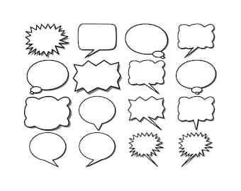
Conventionally, words of speech are arranged inside circular talk balloons, thought inside cloud-like thought bubbles, and narration inside rectangular caption boxes. Thought bubbles fell out of popular use in mainstream comics in the 80s, and so characters’ thoughts also often appears in caption boxes. Speech containers date to at least medieval manuscripts that include “speech scrolls” arranged near figures’ mouths:

Talk balloons usually have tails or pointers directed at the speaking character. For Doonesbury, Garry Trudeau often draws only single-line pointers with no container around the spoken words:

No word containers are necessary, but mainstream comics included them in part to make revision easier and so speed production. 1960s Marvel artists Steve Ditko and Jack Kirby would draw a large number of word containers per page, with only a general sense of the dialogue, thoughts, and narration that Stan Lee would later compose for a letterer to add.

If Lee composed less than the containers implied, the letterer could draw the words larger, creating the impression that a character was shouting—an effect independent of the drawn image. That’s because the containers, unlike the words, are an integral part of the artwork. Like sounds effects, they are a drawn element to be balanced in each panel composition. Speech bubbles rarely contain more than thirty-eight words. While entire comics and certainly sections of comics can be wordless, a word-heavy page might include as many as 230—though under 200 is more common.
Like word rendering, the lines and shapes of a word container are expressive. Jagged, smooth, rounded, angular—the visual qualities imply aural qualities, especially of speech. Dotted lines often indicate whispering, and thick jagged lines shouting. In 1925, Soviet graphic designer Aleksandr Rodchenko produced a now-iconic poster for a publishing house that featured a woman in profile cupping her hand to her mouth and shouting the Russian word for book, with the letters contained and shaped by a bullhorn-like triangle extending from her open mouth.

Since speech is a character-defining quality, just the shape of a talk balloon can establish a person’s personality. The speech of Marvel’s android character The Vision first appeared in white, oval talk balloons in 1968, but by 1972 later artists and colorists converted them to yellow, round-edged rectangles to suggest a robotic voice:

When designing text containers, artists consider whether the lines of the container match the lines of the words or if they meaningfully contrast. Does the container have a background color or texture that carries a connotation too? Is the container simply a framing line, leaving the background image visible—or does the container appear to be cut out of the image, exposing the white of the page beneath? And do all containers follow the same design, or do they vary according to type or character or situation or mood?
For Elektra: Assassin (1987), Bill Sienkiewicz and Frank Miller place the title character’s narration in white rectangles with sharp corners and her partner’s in blue rectangles with flattened corners. When Elektra assumes the persona of an innocent romantic, her rectangles are pink with bubbly corners. In Red Winter (2018), Anneli Furmark contrasts her typical oval talk balloons with rectangular ones with zigzag lines for voices on the phone. The talk balloon around a voice on the television is oval, but its frame cuts off parts of the words, making the container into a kind of window into a different plane. When two characters speak the same words simultaneously in Asterios Polyp (2009), David Mazzuchelli draws their two talk containers, an oval and a square, overlapping with the shared words in their centers:

Though they are not composed and set as lines of poetry, words lettered inside containers resemble stanzas. The containers function like pages in prose texts, forcing arbitrary line breaks, but the units are brief compared to a page of prose, so the containers also create units distinct from sentences and paragraphs or lines and stanzas. They create rhythms unique to comics, and so a writer needs to weigh how to group words into container phrases. Jennifer Egan’s story “Great Rock and Roll Pauses” in A Visit from the Good Squad (2011) was composed in Powerpoint and consists of typeset words and word containers—and so might be considered a comic:


These last three examples use human figures as word containers for three different types of text.
Narration (“You have the right to remain silent”):

Speech (“SHUT UP!”):

Thought (“You don’t know what I’m thinking”):

Though word containers are comics best known convention, there doesn’t have to be anything conventional about them.
- Leave a comment
- Posted under Uncategorized
20/08/18 The Art of Words
Characters are printed symbols made of letters, of letterforms, which exist as ink on paper or pixels on screen. In this sense, words are images, no different from any other kind of image. The fact is easy to overlook when reading a prose-only book where letters are typeset in a single font and color with uniform margins. Chapter titles might be larger, bolder, and isolated within a larger area of white space, but then the typesetting reverts back to its undifferentiated norms. That uniformity tells readers that word rendering doesn’t matter. And since it communicates no meaning, it becomes invisible.

Words are also characters in the sense that Black Panther, Charlie Brown, Doonesbury or any comics character is a character. Each is represented by a specific set of lines in a sequence of panels, but each also exists beyond those images as a concept or cluster of ideas in a reader’s head. That’s how we typically understand words, as free-floating definitions and connotations that are triggered when an image of a word appears on a page.
Because prose writers focus on words as concepts and ignore words as images, they lack the range of possibilities open to comics creators. “What we are looking at when we read,” explains Mendelsund, “are words, made up letterforms, but we are trained to see past them—to look at what the words and letterforms point toward. Words are like arrows—they are something, and they point toward something” (322).
Prose-only writers attend only to what words point toward, the network of meanings that a word’s history of usage accrues. Since they leave word rendering to typesetters and printers, word rendering doesn’t matter. Comics script writers don’t render words either, and so they sometimes adopt a similar attitude. “Lettering,” insists Marvel’s Brian Michael Bendis, “should be invisible. You shouldn’t notice it unless it is a determined piece of storytelling in graphic design” (2014: 43). Bendis is right, but only because words in a comic are always a determined piece of graphic design.
“To read,” continues Mendelsund, “is: to look through.… There is very little looking at” (334-5). William Faulkner challenged that norm by wanting to print The Sound and Fury in colored fonts to mark time shifts: “If I could only get it printed the way it ought to be with different color types for the different times in Benjy’s section recording the flow of events for him, it would make it simpler, probably. I don’t reckon, though, it’ll ever be printed that way” (Flood).
/https%3A%2F%2Fblueprint-api-production.s3.amazonaws.com%2Fuploads%2Fcard%2Fimage%2F82886%2FSAE_S_04.jpg)
Aside from an edition of 1,480 colored copies published long after his death, the words of the novel are printed in a uniformly rendered format, their black ink signifying nothing. If Faulkner had been a comics creator he would also have known that the different time periods could be signified by different fonts or font sizes or word containers or areas of the page. Any of these approaches could create additional meaning by drawing attention to how the words are also images on paper.
Henri Matisse takes word image to its most extreme. He begins his 1947 Jazz:
I’d like to introduce my color prints under the most favorable conditions. For this reason I must separate them with intervals of a different character. I decided handwriting was best suited for this purpose. The exceptional size of the writing seems necessary to me in order to be in a decorative relationship with the character of the color prints. These pages, therefore, will serve only to accompany my colors, just as asters help in the composition of a bouquet of more important flowers. Thus, their role is purely visual.
Matisse frames each two-page print with two to four pages of text, treating his hand-drawn letters as paint strokes. The words’ visual qualities don’t add meaning to the text—they replace it. Matisse likens the content to the unread court decisions he filled with fables as a law clerk because the importance of a trial was marked by the volume of paper it produced, regardless of content. For Matisse, his letterforms are shapes only, images free of linguistic meaning.


Words in comics are not purely visual, but, like Matisse’s handwritten letters, they are compositional. They are part of the artwork.
They can also be the artwork, the ink objects we look at instead of through. Here are a drafts of some of my own words-as-image comics art, consisting entirely of letterforms. The first is Shakespeare’s sonnets 1-28:

The second repeats a passage from an Edgar Allan Poe story paradocially describing the cut-up technique a century before William S. Burroughs: “I anointed a sheet of foolscap with the white of a gander’s egg; then, shredding the thing to be reviewed as I had previously shredded the books- only with more care, so as to get every word separate- I threw the latter shreds in with the former, screwed on the lid of the castor, gave it a shake, and so dusted out the mixture upon the egged foolscap; where it stuck. The effect was beautiful to behold.”

And the third is a page from “Queer Arrangements” in the upcoming issue of Sequentials (due to go online later this month I think).

- 1 comment
- Posted under Uncategorized
13/08/18 How to Create a Comic Book Character
On the first day of our comics class, Leigh Ann told our students to draw a kangaroo in a rocking chair in front of a window. She said a kangaroo because people tend not to have a clear picture of one already in their heads, so they can’t draw a generic “idea.” The top half of the next illustration includes six of their first drafts, ranging from students with plenty of art studio experience to students who had never picked up a drawing pencil before. The bottom half are the same students’ revisions. It doesn’t matter what drawing experience you’ve had. Everyone can produce interesting art through revision:

Revising requires image research. Since we there were no rocking chairs and kangaroos in the art studio, students googled “kangaroo” and “rocking chair” on their phones and found images that appealed to them, studied them, sketched variations, redrew their first drafts, and inked them. Further revision is always possible, but they all became much more specific and so much more interesting. A comics artist can follow this process with all of her panels, identifying objects, researching images, and revising for specificity.
Now unless you’re making a comic about a kangaroo in a rocking chair, this assignment won’t help you create a character. But the process will. The next illustration breaks it into five steps:

Begin by “doodling.” Draw anything in any style anywhere on the page. Let your hand do what it wants. This can teach you some of your own preferences for both style and subject matter. What do you like to draw? If the shapes of fish or robots come easily off your pencil tip, fish or robots probably belong in your comic. If you doodle flowers or geometric shapes, that might tell you something about your settings.
Our students doodled for fifteen minutes before stopping and looking over their pages. They all included rough drafts of their first characters. Some included many characters, but everyone chose one to develop. Henry began by drawing a fantastical semi-human creature with wings and bird feet. He added more reality to that fantasy by going online and selecting related images: bird talons, bat wings, a male torso. If you drew a fish, search for fish—and study their tails and gills and fins and mouths. If you drew a robot, search for machines and study their hinges and wheels and bolts and wires.
Now draw your character again, using your research to give more specificity. Experiment with distortion and detail—how little, how much, where and where not. Once you’re satisfied with the general arrangement of the image, revise it, giving the specific details more depth, more value, more line variation. When you’re satisfied, pen over your pencil marks to finalize the image.
You now have a character. You’re going to be spending a lot of time with them, so you need to know them well. Our students drew them fifty times in fifty different poses and angles and activities.
What does yours look like from behind, from the side, from above, from below? How do they look sitting, jumping, walking, running, falling, swimming, diving, flying, sleeping, crouching, dancing, punching, kicking, slouching, yawning, stretching, shaking, laughing, screaming, whispering, kneeling, crawling, climbing, eating, sneezing, squinting? Include objects if you like: tennis racket, unicycle, ten-ton weights. Or partial environments: cliffside, jail bars, operating table. Zoom in for close-ups of their face and hands at different moments. Draw them big—filling in new details because of the extra internal spaces that creates. Draw them tiny—what are the minimal details that distinguish them from a distance? And draw them with different expressive lines: light, dark, thin, thick, fast, slow, long, choppy, bumpy, straight. Let the lines create their personalities.
Look over your drawings. What do the images say about your character? What information do they convey? What possibilities about their lives and pasts and preferences and goals might they suggest? Write a list of possible facts about them. If you were working from a script, this list might have been your starting point, but now all of this character content can originate from the images themselves.
We asked our students a range of specific questions and learned facts not only about each character, but their larger world and life story too. Begin with these questions, responding in bullet points or in a steam-of-consciousness paragraph, expanding and moving between questions however you like:
Describe your character’s appearance.
What are their most striking physical characteristics?
How does it feel to be their body?
How old are they?
What physical activity do they most enjoy?
What activity do they avoid?
What is their full name?
What does their signature look like? Sign their name as they would.
Do they have parents and siblings?
Name a fact about a grandparent.
Describe their worst fight with a family member.
Describe an odd childhood memory, one they’re not even sure why stays with them.
Do they have any birthmarks, scars, tattoos, injuries, or recent wounds?
Where do they live now? What sort of dwelling? Do they own or rent it?
What do you smell when you walk in?
Do they live alone or with others?
Do they have a pet?
What sort of animals do they come in contact with?
What sort of bed do they sleep in? What is their sleeping position?
What is on the bedside table or near them when they sleep?
Describe a fragment from a dream they had last night.
Name five items in their medicine cabinet.
What clothing do they own other than what they’re currently wearing?
What is their clothing made of? Describe their shoes. Do they wear underwear?
Where do they get their clothes?
Do they wear a ring or other specific piece of jewelry? Where did they get it?
What do they eat? Do they cook? What is their favorite food? Where do they get it?
What is the best meal they ever had?
How would neighbors describe their personality? Would the neighbors agree?
Are there any people or places they avoid?
When they want to be alone, where do they go?
When they want to be with others, where do they go?
List ten actions they perform daily.
What happened yesterday at work?
Describe their workplace—the physical structure, the quality of light, the noise level. How do they feel when they’re there?
What is the last lie they told?
Name something they lost and how they lost it.
Describe a secret they’ve told only once.
Name two of their regrets, one big, one small.
What is the most violent event they ever witnessed or experienced?
What was the highpoint of their week?
Describe an odd way they have of killing time and the first and most recent times they did it.
Describe a smell, taste or texture they hate and why.
Describe the last time they laughed.
Describe something contradictory about them.
Describe an ambition they no longer have.
When they close their eyes, what do they picture?
Name two things they worry about, one small, one big.
What is one of their biggest goals? Name something specific they would sacrifice to achieve it. Name something they would not sacrifice. Name something they’re not sure they could sacrifice or not.
What do they think will happen to them when they grow older?
They have a nagging feeling that they forgot something. What was it?
Reach into one their pockets and pull something out.
What are they doing right now? Describe the location.
Are they having a good time?
What do they most want at this moment?
Describe your character in one sentence.
- Leave a comment
- Posted under Uncategorized
06/08/18 Words Are Images
The appearance of a word affects how a reader understands its meaning. Even typeset fonts aren’t neutral. Each differs in line thickness, shape, and ornamentation, evoking an overall tone or personality. If the words are character speech, font is voice, whether in dialogue, thought, or narration. Even if words are not linked to a character, their style still communicates information. A caption box that includes only a time stamp and a location has to be rendered in a certain style and so with certain visual connotations. The most generic, no-frills, corporate-looking font communicates exactly those qualities. Retype that same information in Bauhaus or Broadway or Brush Script and feel the differences.
For Wonder Woman #20 (1988), George Pérez draws his narrator’s text in a font similar to courier news, because the narrator is a reporter seated at a typewriter in an opening panel. Dialogue and third-person narration still appear in standard hand-lettered style, differentiated from the character’s first-person narration as he types.

When a character in Can’t We Talk About Something More Pleasant? (2014) reads aloud the ingredients listed on a bottle, Roz Chast switches from curving lines of hand-drawn letters to typeset words arranged in choppy lines.
Comics lettering, whether hand-drawn or mechanical, typically features letterforms with no serifs and consistent line thickness. While sizing and spacing are usually uniform, typesetters can add bolding and italics to suggest the rhythms and emphases of speech. Comics lettering tend to use bolding more often, and letter sizes vary—as an inevitable aspect of hand-drawn imprecision, but for targeted emphases as well. Typesetting creates the impression of invisible lines holding the evenly spaced words and letters in uniform rows, an effect that can clash on a page that otherwise consists of hand-drawn images. Unless you have a targeted aesthetic reason to typeset, draw your letters.
In Skim (2008), Mariko and Jillian Tamaki’s main character passes a road sign announcing a town named “Scarborough,” and her narrating self respells it “Scarberia” in a gothic font unlike any other word in the graphic novel:

Word style can vary for a range of such story reasons. Should a narrating character “speak” to the reader in the same font as she does in her dialogue with other characters? Should characters’ words differ too, perhaps echoing their visual qualities, so that the lines of their bodies and their lines of their words visually relate? Or if characters share a single font, perhaps their words differ in color or sizing or some other characteristic?
Mainstream comics traditionally include sound effects, usually onomatopoeia words drawn in expressive lines, shapes and sizes that visually suggest the quality of the sounds they’re evoking: Ka-Pow! ZAP! Even when there’s a separate lettering artist, these words are drawn as part of the initial artwork. In Walking Dead #1 (2003), Tony Moore renders the words of his sound effects, BOOM! and WHUMP!, in sharp lines and shapes that contrast the looser style of his other images, a stylistic difference that parallels their physical difference in the story world:

Mariko and Jillian and Tamaki play with the sound effect convention by placing drawn words within images even though the verbs aren’t always sound-related: “clench” beside toes, “stir” and “stab” beside a straw, and even “apply” beside a bar of deodorant a character rubs in her armpit. In their second graphic novel collaboration This One Summer (2014), the words “Slut. Slut. Slut. Slut.” trails behind a character’s flip-flops as she walks. The insult is in her thoughts after hearing older boys use it to flirt with older girls, so rather than a sound identical to all listeners, it’s filtered through just one character’s unmarked consciousness.
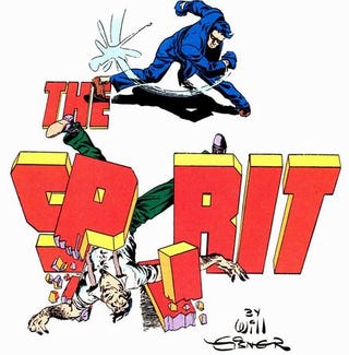
Sounds effects, like most letters on a comics page, are paradoxical because from the perspective of a drawn character they don’t exist. A character can’t “see” a “BOOM!” even though the lines of its letters might overlap with the lines of her own body. But she can see words tattooed on her arm or glowing on a computer screen because they are part of the story world. The division isn’t always clear. Will Eisner established a splash-page norm of words that playfully merge with the story world. The letters of The Spirit might be blocked by a passing ship, or form from the smoke spewed from chimneys, or appear on a card held by a character, or provide an object for characters to climb.
Because it breaks the baseline naturalism of most mainstream genres, such effects are usually limited to opening titles—but not always. After a young woman agrees to go out with the main character in American Born Chinese (2006), Gene Luen Yang draws the repeating word “YES.” in a column above the narrator’s bed, with the last “YES.” shaped to the contours of his bed. In Hannah K. Lee’s Language Barrier (2017), the letters of the one-page “You Don’t Owe Anyone Anything” consist of variously stretched, yellow smiley faces:

In “Student Loans,” the letters of the second word are darker, thicker, and drawn in front of and blocking the letters of the first word. The artistic potential of words has been explored outside of comics too. Glenn Ligon’s How It Feels to be Colored Me (1989) and Kay Rosen’s The Ed Prints (1998) are paintings that consist entirely of rendered words.


However a word is rendered, evaluate how that style relates to the word’s meaning. Does the style support the meaning or does it contrast it? Imagine the word “thin” drawn in thin letters and then in thick ones. Imagine the word “red” in red ink and then in blue ink. Comics titles are often drawn in letterforms that reflect the title character: Bob Wiacek and Todd McFarlane’s design for The Incredible Hulk #340 (1988) appears to be constructed from blocks of stone; Bernie Wrightson and Gaspar Saladino’s letters for Swamp Thing #1 (1972) might have grown from an actual swamp. The title design for the film Hulk instead uses metallic lettering, and after the character of Swamp Thing is revealed to be a kind of universal god, the lettering changed accordingly:

The appearance of letterforms can contradict word meaning too, as with this dilapidated billboard:

Browse magazine ads and cover designs for other examples of word rendering outside of comics. Lolita: The Story of a Cover Girl (2013), includes over a hundred variations on Nabokov’s novel, many consisting only of letters:

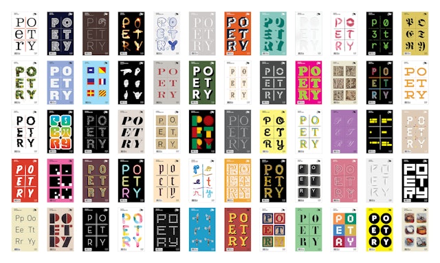
Beginning with its January 2018 issue, the covers of Poetry magazine include only the six letters of the word “poetry” arranged in a 3×2 grid and rendered in a different style each month.
Any word can be designed in countless different styles:

- Leave a comment
- Posted under Uncategorized


