Monthly Archives: April 2024
29/04/24 Paper is Skin
In an interview with Hilary Chute, Allison Bechdel said “paper is skin” (Chute 2011: 112). Since she also said ink is blood, the metaphor doesn’t seem to be intended racially. Bechdel’s not saying white paper is White skin. However, her approach to color in her 2021 The Secret to Superhuman Strength both literalizes the “paper is skin” metaphor and illustrates its racial complexities.
Bechdel’s first memoir, Fun Home, includes shades of blue added to her black line art, creating gradations without denoting hues. The effect is similar to grayscale art, since everything colored blue isn’t meant to be actually blue in the story world.
Her second memoir, Are You My Mother?, combines grayscale and shades of red, again leaving actual hues unknown, while emphasizing thematic connotations: the previous blues for her father are replaced by pinks in her mother’s story.
For her third memoir, Holly Rae Taylor, Bechdel’s personal and artistic partner, painted Bechdel’s line art in a range of mostly primary colors that appear to directly represent the colors of their subject: Bechdel’s red shirt, for example, is both discursively and diegetically red.
The same is not true of skin.
Taylor uses a light blue for facial shadows but otherwise leaves skin areas the unmarked color of paper. Because she applies the norm to all characters regardless of race, page whiteness represents all skin colors. While that’s a norm in black-and-white comics, the approach is unusual in color art, giving page whiteness the ability to represent multiple diegetic colors only when representing skin. Other instances of unmarked negative spaces within images represent only white or lightly colored objects.
Bechdel’s cast of characters is predominantly White, so the representational tension is rare and occurs only when depicting potentially dark-skinned characters.
At roughly the midpoint of the narrative, Bechdel’s narrator describes feeling “a hand grope my butt” in a subway entrance, later describing the “young man” as someone who “had clearly been [fighting] all of his life” after he returns Bechdel’s ineffective punch with a literally colorful “SOCK!” (109-110).
Setting aside the potentially racialized assumption about a life of violence, the two-page sequence includes six recurrent images of the “young man” whose features contrast Bechdel’s style of representation for herself and Taylor.
Where Bechdel typically draws mouths as single straight lines and sometimes dots, the man’s mouth consists of three lines, each conveying more realistic shapes of his lips. Rather than a variation on Bechdel’s simplified two-sided nose triangle, the curving lines of his nose also suggest nostrils, and his hair is tightly curling black lines in contrast to Bechdel’s solid black hair shape. Bechdel represents his Afrocentric features naturalistically and so in visual opposition to her slightly more simplified and exaggerated cartoon style.
That contrast is contradicted by the figure’s non-naturalistically paper-white skin, which viewers presumably interpret as representing a different color than Bechdel’s and Taylor’s paper-white skin.
Before his entrance, page whiteness could be understood to represent only light colors, including not only White skin but Taylor’s indeterminate but apparently light hair color, which, like her skin, she leaves uncolored.
The rule is violated during the two-page scene if his skin is understood to be some darker shade of brown, which Bechdel’s rendering of Black phenotype suggests. Understanding his skin to be a beige similar to Bechdel’s disrupts that phenotype, making his character not only racially ambiguous but contradictory.
Whether or not Bechdel and Taylor intend that effect, it’s produced by the white paper.
After drafting this post as a chapter subsection for my work-in-progress, The Color of Paper, I noticed a further complication of the color art:
Taylor visually casts the “young man” as the protagonist.
For almost all other scenes, Taylor paints Bechdel in red and blue, beginning with the opening pages. But in the subway sequence, Bechdel enters in a very light pink, and the “young man” in her standard colors.
Keeping in mind that the memoir is titled The Secret to Superhuman Strength, this is standard superhero differentiation. Stan Goldberg, Marvel’s primary colorist during the 1960s, told an interviewer:
“I always used red, yellow, and blue for the super-heroes. Green, browns, shades of red, and purples were the colors I saved for the villains. It was a formula, and it worked. The colors I picked for the villains made for a better contrast with the heroes. I certainly didn’t want to use the same colors for the villains that I used for the heroes, because when they came in contact with each other, it’d have been harder to visually separate them” (16-17).
Taylor doesn’t paint Bechdel as a green or purple villain, but her colors do disrupt the usual dichotomies during the center scene of the memoir. The literally white-skinned Black man who groped and then punched Bechdel’s White and literally white-skinned character is visually separated by the same Superman-evoking red-and-blue color design previously assigned only to Bechdel.
Tags: Allison Bechdel, Hilary Chute, Holly Rae Taylor, Stan Goldberg, The Secret to Superhuman Strength
- Leave a comment
- Posted under Uncategorized
22/04/24 Retconning Law
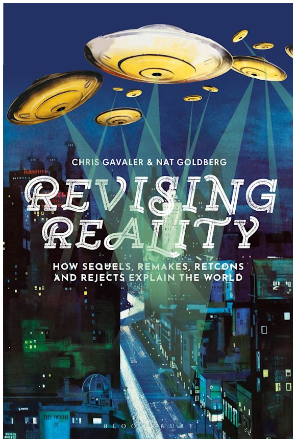
I spent seven hours in England earlier this month, zooming to the “Literatures and Laws Online Symposium” at Bournemouth University. I had the pleasure of presenting an extremely condensed chapter from Nat Goldberg’s and my forthcoming book, Revising Reality. Fifteen minutes is tight, but I covered the basics of how the term “retcon” has recently entered the U.S. legal system and how the concept of retconning has always existed in it. In other words, “Rectonning Law” retcons retconning into law.
Instead of writing my talk, I’m uploading my slides — which I think is the same thing. To me, the challenge of presentation slides is streamlining them to the sweet spot of succinct and sufficient: a viewer should almost be able to follow the whole argument without the distraction of my yammering voice. Almost. In this case, let me explain the color coding: retcons are in green, and rejects (of retcons) are in red. Sequels are also in red because retcons are often rejected because they’re read as sequels.
The virtual Q&A is ongoing, so contact me anytime.
Any questions? Email or read the long version, AKA “Chapter 5,” in Revising Reality, due out next month.
Tags: "Literatures and Laws Online Symposium", Bostock v. Clayton County, Bournemouth University, Columba v. Heller, Dan L. Burk, Dobbs v. Jackson Women's Health Organization, Gogel v. Kia Motors, Ilya Somin, Jeffrey Zeman, Mapp v. Ohio, Marbury v. Madison, Nat Goldberg, Northeastern Freethought Society v. Lackawanna Transit System, Norton v. Shelby County, Revising Reality, Robert Thomas, Russell Sandberg, U.S. v. Bryant
- Leave a comment
- Posted under Uncategorized
15/04/24 Blue May No Longer Be the Warmest Color
I checked my old syllabi, and Jul Maroh’s Blue is the Warmest Color is tied for my most-taught graphic narrative. Beautiful Darkness will likely move to a lone number one slot next time I teach Intro to Graphic Novels though, because my current class has convinced me to retire Blue is the Warmest Color.
First, a quick author update:
The novel was first published in 2010, and Maroh revealed that they are non-binary in (I think) 2022. Their various publishers are still catching up — most distressingly their English-language publisher, which means Maroh is still being dead-named on some of their covers.
If you’re curious, you can track the evolution of their first name from its original appearance, to its contracted abbreviation at their former blog, to its current non-abbreviated “Jul.”
The author’s gender identity doesn’t excuse the catastrophe of the 2013 film adaptation by Abdellatif Kechiche.
I show the trailer in class, while discussing Laura Mulvey’s 1975 classic essay on the male gaze.
I share Maroh’s critique too:
“It appears to me this was what was missing on the set: lesbians. I don’t know the sources of information for the director and the actresses (who are all straight, unless proven otherwise) and I was never consulted upstream. Maybe there was someone there to awkwardly imitate the possible positions with their hands, and/or to show them some porn of so-called “lesbians” (unfortunately it’s hardly ever actually for a lesbian audience). Because — except for a few passages — this is all that it brings to my mind: a brutal and surgical display, exuberant and cold, of so-called lesbian sex, which turned into porn, and me feel very ill at ease.”
I also share Maroh’s thoughts about the novel’s intended audience:
“I didn’t make a book in order to preach to the choir, nor only for lesbians. Since the beginning my wish was to catch the attention of those who:
“–had no clue
“–had the wrong picture, based on false ideas
“–hated me/us”
And that’s when class discussion moved in an unexpected direction.
The room coalesced around three central critiques.
First, the age difference between the characters begins their relationship with an imbalanced power dynamic. When they meet, Clementine is 15, and Emma is in college. They have sex for the first time when Clem is 17. Someone googled “age of consent in France” (it’s 15), but that defense felt (literally) legalistic.
I thought discussion of the second half of the novel would soften the criticism. I was wrong. Yes, they’re older (Clem is 30 by the end), but the room felt the relationship remained fundamentally co-dependent. They were described as addicts, and when Clem is without Emma, she becomes literally addicted to a (substitute) drug.
Third critique: the relationship seems much more about physical sex rather than emotional depth. Given the “explicit sex” content warning I put on my syllabus, it’s hard to argue against that.
I suggested that all of the critiques may have more to do with rejecting romance genre tropes (love at first sight, I can’t live without you, etc.), but that only reinforces the fact that Maroh employs them. I also pointed out that a lot has changed since 2010. But, again, that only reinforces the fact that it’s 2024.
So now I have to ask myself: Why have I taught the novel so many times?
It may sound superficial, but I love its formal approach to layout. Not just in the abstract, but how Maroh employs layout effects to express her characters’ emotional lives, complexly merging form and content.
Also, it’s a lesbian romance.
The combination seemed ideal to me. Still does. Though now, yes, I also fully acknowledge that imbalanced power dynamics, emotional co-dependence, and an overemphasis on sex are all traits of an unhealthy relationship. They always were, but I previously ignored them as less significant genre qualities, content to focus instead on how the novel flouted the primary romance trope of heterosexuality.
After drafting this post, I reported the class discussion to one of my English department colleagues and visiting novelist Sarah Thankam Matthews (whose All This Could Be Different I’m dying to read as soon as I clear my digital desk of final papers and exams, but whose short story “Rubberdust” you should read right now). They were both describing similar class discussions, alarmed by what they called the legalistic reaction of students objecting to the sexual behavior of fictional characters on ethical grounds. I would need more data to speculate on how widespread the trend is or isn’t, but it sounded like they’d both been eavesdropping on my comics class.
But one more unexpected turn: on the last day of class I asked the room which novels they recommend I keep or replace, and several students (including two who were among the most adamant in their critiques) lobbied to keep Blue is the Warmest Color on my future syllabi. Yes, the relationship is problematic, but they found it engaging despite — and possibly because of — those problems. In short, they really enjoyed analyzing the novel so thoroughly, something its flaws encouraged.
Meanwhile, their top two must-keeps were happily the same as mine:
Tags: Blue is the Warmest Color, Jul Maroh, sarah Thankam matthews
- Leave a comment
- Posted under Uncategorized
08/04/24 The Expanding Speech Balloon
First a quiz.
Each of the following images includes one or more speech balloons. What do the images mean?
1.
2.
3.
4.
5.
6.
Before I give the answers, here’s a micro-history of the speech balloon.
In his unexpectedly canonical The Lexicon of Comicana (1980), cartoonist Mort Walker categorizes speech balloons as a kind of “fumetti” (Italian for “clouds” or “smoke” though Walker says “balloon”): “the things that float above a character’s head and contain what he’s thinking or saying.”
But the convention dates back at least to medieval manuscripts, AKA “speech scrolls.”
Standard-looking speech balloons predate the comics medium too, especially during the nineteenth century. Here’s an 1860 editorial cartoon featuring Abraham Lincoln:
The speech balloon took hold in the comics medium as the comics medium took hold in the 1890s. Richard Outcault’s Yellow Kid provides a transitional example, with the Kid’s shirt functioning as a speech container too:
The convention was so prevalent in 20th-century comics that in 2000 philosopher David Carrier used it as the key to his definition: “a narrative sequence with speech balloons.”
Carrier is wrong (some comics don’t include speech balloons), but the convention remains prevalent in comics and — the point of this blog post — increasingly outside of them.
And not just speech balloons, but their paradoxical sibling: wordless speech balloons.
Based on Walker’s definition, a wordless speech balloon should communicate only one thing: that a character is speaking. But Walker also illustrates how the lines that construct the balloon convey additional information.
Remove the words, and the images still convey much of the same meanings:
All of the examples from the opening quiz are wordless too, but their meanings are more complex. Each also illustrated an article from the New York Times.
1.
Gabriel Carr’s illustration for Art Cullen’s “We Were Friends for Years. Trump Tore Us Apart.”
2.
Nathalie Lees’ illustration for Catherine Pearson’s “It’s Tough to Talk to Your Partner About Sex. Here’s How to Start.”
3.
Doug Chayka’s illustration for Carl Zimmer’s “A.I. is Learning What It Means to Be Alive.”
4.
Brian Rea’s illustration for Courtenay Hameister’s “We Were the ‘Fat Couple’?“
5.
Nicolas Ortega’s illustration for Jancee Dunn’s “8 Things You Should Never Say to Your Partner.”
6.
Nicolas Ortega’s illustration for Jancee Dunn’s “How to Bargian Like a Kidnap Negotiator.”
While each image illustrates its article’s core idea well, all six speech balloons share two other qualities: they were all published between December 2023 and March 2024, and they’re all objectified.
I borrow the term from comics philosopher Roy T. Cook’s 2012 essay “Why Comics Are Not Films: Metacomics and Medium-Specific Conventions”:
“A balloon is objectified when it is placed in such a way as to force the reader to interpret the balloon as part of the physical universe inhabited by the characters and the objects depicted …”
I’m leaving out Cook’s final phrase, “in a particular panel,” because the above examples are from the New York Times, which is not a comic, and so the objectified balloons do not appear in comics panels.
The fact is significant because Cook also argues that speech balloons, when they appear in a medium other than comics (such as film), “are a non-standard feature, typically functioning as an explicit reference to comics.”
That was twelve years ago. Based on the six examples appearing within a very recent four-month period, the speech balloon may no longer be primarily identified as a comics convention.
Speech balloons may just be speech balloons.
The best evidence for that claim has been around since 2007 when Apple released the first iPhone. The designers used speech balloons for texting.
They added thought-balloon reactions in 2016.
Perhaps most definitively, the identifying symbol for texting is a wordless speech balloon:
Though it might be debatable whether a text screen is in the comics form, your phone is definitely not in the comics medium. I also seriously doubt you think at all about comics while texting.
That’s because speech balloons have expanded beyond them.
After drafting the above, the New York Times ran another more complex example. Erik Carter’s illustration for A. O. Scott’s “Like My Book Title? Thanks, I Borrowed It” includes animation as the three-panel row spins bodies behind Walt Whitman’s head and speech balloon.
Here are three snips, the middle one caught mid-motion:
Though in this case we can restore Cook’s phrase “in a particular panel,” I don’t think Carter’s panels evoke comics panels, which conventionally include a vertical gutter between them. The animation further reduces a sense of the image “functioning as an explicit reference to comics.” Though the balloons aren’t objectified with the same three-dimensional techniques as the first six examples, the animation does create the illusion of two surfaces, with the heads and speech balloons placed “above” the moving background, which means the overall image still creates a three-dimensional effect.
Now I need to post this before the speech balloon expands again.
Tags: Brian Rea, Doug Chayka, Erik Carter, Gabriel Carr, Nathalie Lees, Nicolas Ortega, Roy Cook
- Leave a comment
- Posted under Uncategorized
01/04/24 Resurrecting the Zombie Life
My zombies are back and coming to campus.
After a pandemic-related online preview in 2020, the play world-premiered at Richmond’s Firehouse Theatre in 2021, was restaged in Williamsburg with a new cast in 2023, and now appears in Lexington on April 6 for the first time before returning to Williamsburg for a performance the following weekend.
I loved the first performance (and wrote about it here and here), but I love the current production even more — in part because we condensed the zombies from a horde of five to a cohesive team of four, and this round we really figured out who the therapist leading them is all about. The action scenes are tighter too:
A local reporter asked me some questions about the show, which I’ll share:
- What is The Zombie Life about?
A therapist is presenting a series of seminars encouraging people to become zombies because it’s the best way to avoid the emotional pain of living. As evidence, he tours with a team of trained zombies that he enables to speak and explain to the audience their reasons for converting. Although disturbingly well-intentioned, it’s all a terrible idea – which becomes increasingly obvious as an unplanned convert struggles but fails to adjust to the zombie life on stage during the seminar.
- Why zombies?
The play began as a short story titled “The Zombie Monologues” and consisted of a dozen or so long paragraphs, each from the perspective of a zombie. Zombies are nominally alive but mindless and emotionless, which I imagined could feel like a kind of reprieve from the hard work of living. The point though was that each explanation was gut-wrenchingly wrong, revealing the necessity of struggling as the only way to find any meaning.
I began turning that disconnected series of textual monologues into a play with my sister, who is a dancer, dance instructor, choreographer, and now director. We first had to figure out why the free-floating monologues existed, which made us invent the new character of the tragically wrong-minded therapist. And the necessity of plot made us create the audience member who unexpectedly steps forward and converts at the start of the play.
At a personal level, our mother had recently died of Alzheimer’s. I’d been visiting her Williamsburg nursing home almost monthly for several years, which also kept me in touch with Joan. I was worried that we would drift apart without the struggles of taking care of our fading mother keeping us connected. A play collaboration was my solution. Probably any play would have been fine, but maybe it’s more than coincidence that we settled on one about grief.
- It’s being performed at a college — where a lot of people struggle with their mental health, especially after the pandemic. How might your play resonate with students?
My anxiety is that the therapist’s surface message – which is essentially an endorsement of suicide – could be mistaken as sincere and actually convincing. The goal is overwhelmingly the opposite. Each zombie has made the most horrific and irreversible mistake possible, and though they think their reasons justify their giving up, the point is to reveal the absolute need of struggling despite all the pain it requires. It’s an anti-suicide message presented as a horrifyingly flawed pro-suicide message.
- What do you hope the audience will take away?
I want them to feel uncomfortable while watching the play. I want that discomfort to release itself in laughter, tears, and occasional flinching while in the theater. Afterward, I hope the discomfort lingers and haunts in productive ways. Maybe they will keep thinking about the characters’ rationalizations. Or maybe just the emotions of the experience will continue to resonate as they reenter their lives just a little less zombie-like.
I wasn’t asked, but I’m also really happy about my redesign of the poster art:
My original version was fun, but also cluttered and less clear in tone:
Apparently, the more you work at something the better it gets. And that’s not a bad description of our zombies either. Unlike TV zombies (though, yes, I’m somehow still watching The Walking Dead spin-offs), our zombies get a second chance at life.
Tags: Aura Curiatlas physical theatre, Firehouse theatre, Joan Gavaler
- Leave a comment
- Posted under Uncategorized


