Monthly Archives: January 2020
27/01/20 Happy Confusion
I may have odd taste in graphic novels. If forced to choose between formal experimentation and clarity of storytelling, I’d go with experimentation every time. It’s just more fun. Comics are an inherently odd, hybrid form that merges the alien DNA of words and pictures, and so I enjoy the idiosyncratic ways each artist slices and sutures those visual materials on the surgical table of the page. But sometimes that inherent oddness gets flattened under the reflexive clarity of conventions: the same panels, the same gutters, the same reading paths, the same word containers, the same drawing styles, the same cartooning norms.
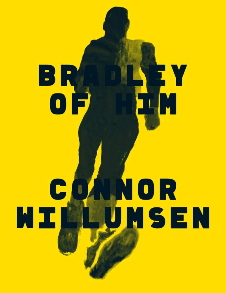
Happily, Connor Willumsen doesn’t make me choose. His Bradley of Him delivers an engagingly idiosyncratic visual approach that challenges comics conventions while still providing the pleasures of a vividly told visual tale.
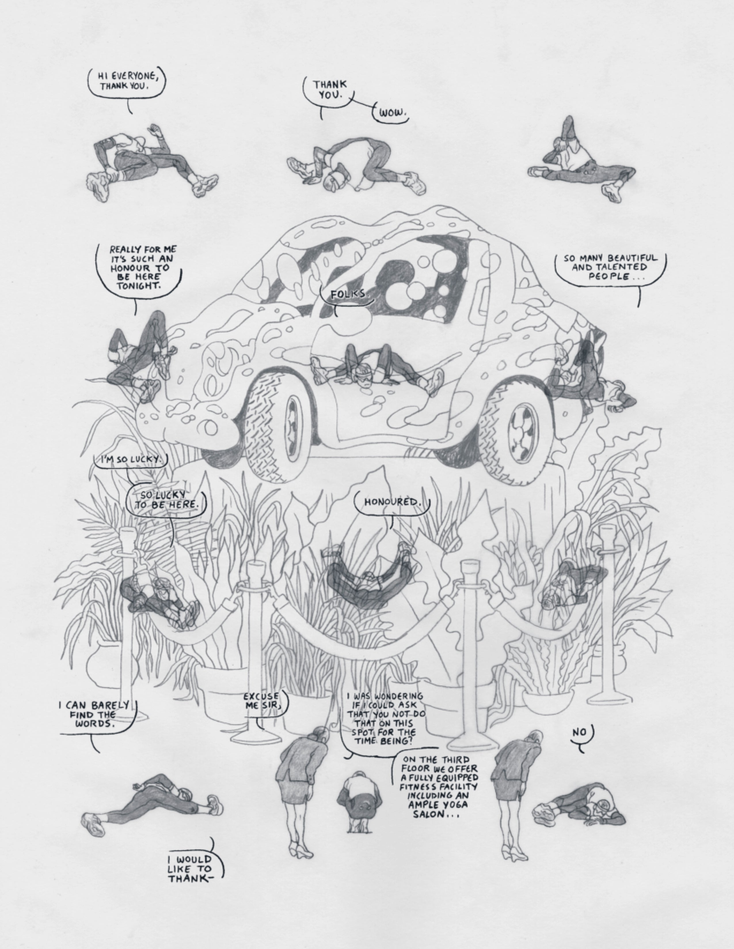
Here’s a basic comics expectation: the words in a panel and the image in a panel both refer more-or-less to the same thing. It’s so basic most readers might not even register it as an expectation, until it’s broken—which Willumsen dose on page one. I would say panel one, but there are no panels, not in the traditional sense of framed rectangles separated by the non-space of a gutter. Instead Willumsen draws a twelve-image sequence of a free-floating figure in running clothes performing warm-up stretches. Though his location is undrawn, his multiple images are superimposed over a psychedelic car, a grove of potted plants, and a row of velvet rope stanchions at the center of the page. If that’s not odd enough, according to the words trailing from his speech bubbles, he’s giving an awards-ceremony acceptance speech, though clearly he is not. In the bottom row, a woman leans over him, politely asking if he could use the fitness center instead. He says no.
What the hell is going on?
As I said, I may have odd taste, but I find this level of ambiguity delightful. For those who prefer storytelling clarity over experimentation though, don’t worry, Willumsen soon pulls it all together for you: the main character is mentally rehearsing an acceptance speech while also preparing for a run by stretching on the lobby floor of the Las Vegas hotel he’s staying at where the weird car, plants and ropes are on display. The initial confusion seems banally simplistic in retrospect, the equivalent of a slightly misaligned camera.
That describes Willumsen’s aesthetic generally. Turn a page and you’re likely to feel an initial moment of visual narrative confusion that soon resolves into some retroactively pleasant clarity.
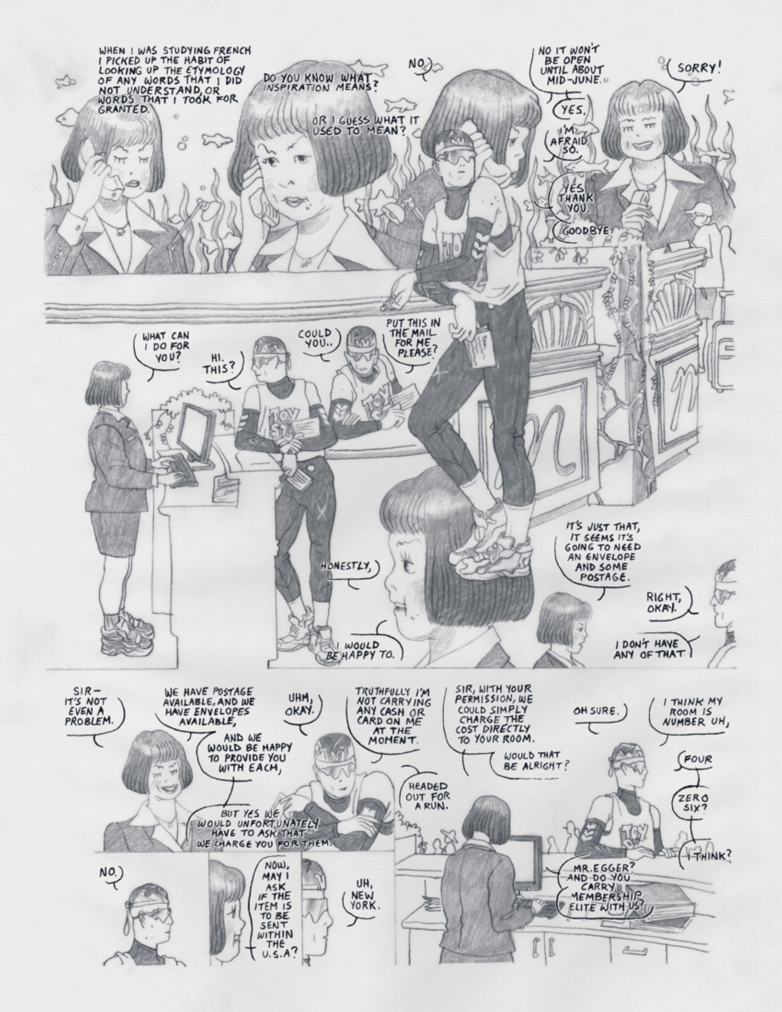
Take page four. It opens with an image of a woman (the same one who was at the bottom of page one it turns out) with a phone to her ear with words freely floating above her head (Willumsen never uses caption boxes). According to comics conventions, the words should be the voice in her ear. Willumsen knows that but toys with us further by having the women answer “No” as if in response to a narrated question. Yet she’s actually responding to the unheard (and unprinted) voice on the phone while the main character waits to mail a letter before leaving for his run. The words floating above her head are words from the letter. Willumsen was just misaligning image and text for a playful but quickly-resolved moment of visual tension.
Willumsen maintains the approach. Turn to page eight and suddenly a father is sitting in a stopped car with his daughter in the backseat stressing about some animal he’s struck. Who are these people? How are they related to any of the narrative threads we’ve been following? They aren’t. Or they aren’t until our main character jogs past, refusing to stop and aid them. Page eighteen and we’re in the back of an ambulance listening to the unrelated banter of two EMTs. Why? Because, it soon turns out, they’re following our main character after (we have to infer) the cops shown on a previous page contacted them because our main character is apparently deranged and refusing to stop despite the dangerous heat and distance of his run.
While I find these visual and narrative sleights-of-hand entertaining in themselves, this isn’t just experimental self-indulgence. Willumsen’s misalignments serve a deeper purpose. They reflect his main character’s misaligned mind. I’ve been avoiding naming the “him” of the title because there’s more than one identity in play here. At the surface level “he” might be the real-world athlete Lance Armstrong. On page twenty-eight, we learn that the award ceremony includes the equally real-world Bradley Cooper, a Best Actor nominee for his performance in the film “Stronger: The Story of Lance Armstrong.” So is the jerk who won’t stop jogging to help a distressed driver the actor or the character he’s playing? And then there’s the still more ambiguous “Murray,” whose sister and niece are searching for him in his empty apartment. Is the main character actually Murray pretending he’s Bradley pretending he’s Lance?
Honestly? I don’t know. More oddly, I’m not that worried about it. Since the novel is about misalignments, a simplistic narrative resolution would betray that aesthetic. We’re supposed to be a little confused. Bradley-Lance-Murray is a little confused too. The world is a confusing place. A comic about a confusing world should be confusing.
Willumsen’s inventiveness doesn’t stop there. The looping time structure is equally engaging, making me question whether the award ceremony flashbacks are flashbacks at all. And who exactly is the women he’s writing that letter to? There’s a lot to unpack. Another comics artist might have filled in all these intriguing gaps by expanding the story beyond sixty-four intensive pages. Happily, Willumsen keeps his narrative as lean and off-balance as his maybe-deranged main character.

[A version of this post and my other recent reviews appear in the Comics section of PopMatters.]
- Leave a comment
- Posted under Uncategorized
20/01/20 Four Modes of Visual Representation
This is the first illustration I made for my next book, The Comics Form: The Art of Juxtaposed Images. I signed a contract with Routledge in December, and have to submit the complete ms by next December, so you can guess how I’ll be spending the rest of my sabbatical. Chapter 1 is already spinning a little out of control at just over 20,000 words. Fortunately it divides into pretty manageable subsections. Below is a draft of “Modes,” which explains this freaky self-portrait: While style can be analyzed as a range of separate qualities, those qualities can be combined into patterns that categorize an artist’s overall style or a group of artists’ shared customs. Joseph Witek calls such comics customs “modes” and identifies two, naturalism and cartoon, which can be distinguished by their degrees of simplification and abstraction. The terms “simplify” and “abstract,” however, have multiple, overlapping usages.
Lefévre refers to line quantity as “detail,” meaning “the amount of details versus the degree of simplification” (2016: 75). “Simplified” in this sense refers to a representational image that reduces the amount of detail of its source material. While all but photographic and photorealistic images are simplified, comics artists tend to simplify significantly. The verb “abstract” shares a similar meaning. An abstracted image extracts details from its source subject and so is therefore simplified. An abstract image, however, usually refers to an image that represents no source material and so cannot abstract details from it. As discussed above, I prefer the adjective “non-representational,” and use “abstract” to describe style, but even when limited to style, abstraction is an ambiguous term since it also refers to non-realistic alterations in optic experience that are not “simplified” in the extracted sense.
The uses of “simplify” are similarly problematic. In Understanding Comics, McCloud draws an “iconic abstraction scale” that illustrates five styles, ranging from a photocopied photograph of a face to a drawn face comprised of an oval, two dots, and a straight line (1993: 29). He claims that all of the faces to the right of the photograph simplify it by “eliminating details” (30). While this is largely true of the second, “realistic” face and the middle face containing only “outlines and a hint of shading” (29), the later faces differ in more than line quantity. The qualities of their details change too. Though McCloud concludes that the end result is “stripped-down” (31), each step to the right of his scale illustrates two kinds of changes: each contains fewer lines, and those lines alter the contours derived from the originating photograph. McCloud also refers to each face as “more abstract” than the previous, further conflating extracted and altered (29). Witek introduces a similar confusion by citing two drawings of Bob Hope to illustrate the cartoon mode and the naturalist mode, even though both are composed of an essentially identical amount of detail. Stuart Medley prefers the term “distillation” over simplification, meaning “some removal of realistic detail,” but also treats abstraction and simplification interchangeably (2010: 53). I will only refer to simplification as the reduction of details. While abstraction can refer to the alteration of details, Lefévre instead describes a drawing’s degree of “deformation” as measured against “normal proportions” (75). The verbs “distort” and “warp” are also applicable, as is the more common term “exaggeration,” which visually refers to lines that magnify or compress the shapes of their source material.
McCloud’s final face then is both “simplified and exaggerated,” what Witek identifies as the two stylistic qualities of the cartoon mode (31). McCloud also identifies the final face as “the cartoon,” differentiating it from the middle face which he says reflects the “style of drawing found in many adventure comics” (29). Comics art then might be divided into resemblance-based naturalism and custom-based cartoons, but Witek and McCloud both acknowledge overlap. Witek’s two modes are “by no means mutually exclusive; comics combining both modes are extremely common” (28), and McCloud claims that “nearly all comics artists apply at least some small measure of cartooning” (42). Cohn refers to the same simplified and exaggerated combination as the “Barksian” visual dialect, named after Scrooge McDuck artist Carl Barks, though its customs predate Barks. Unlike Witek, who identifies the naturalistic mode as “the preferred approach for stories of adventure and domestic romance,” Cohn does not consider the Kirbyan dialect to be naturalistic and does not place the Barksian dialect in opposition to it.
Because customs are socially constructed and maintained, few artists outside of comics traditions would consider the reduction and alteration of details as “cartooning,” but many twentieth-century artists simplify and exaggerate to similar effect. Don Arr correctly notes that Picasso’s 1920 Portrait of Igor Stravinsky “would be a cartoon if in a comic book” (1982: 1). And in what formal sense is Picasso’s 1955 ink drawing Don Quixote not a cartoon? Or Matisse’s equally famous 1952 cut-out Blue Nude II? Or any of Schiele’s dozens of drawings from the 1910s? None are called “cartoons” because the term is traditionally understood as specific to comics as a publishing tradition well outside of fine art. The style may also have a biological basis. According to Stuart Medley, the human “visual system apprehends the world” according to “simple propositions that the mind prefers,” duplicated in how “most comics artists tend to draw and ink their worlds – some degree of abstraction away from realism, clear outlines, flat colours, reliance on closure, a tendency towards caricature” (2010: 68).
“Cartoon” originates from the French and Italian words for the cardboard-like paper used for preliminary sketches in the 1600s, and it acquired its satirical connotation from Punch magazine in 1843. It is often used synonymously with “caricature,” which dates to the 1700s and denotes a style of drawing that selectively alters a subject’s features for comic effect or, according to Jack Hamm, “the art of distorting by exaggeration a person so he still retains his identity” (1927: 33). Drawing from the root term “caricare” (“to load”), Buhon Lynch calls caricature “overloaded representation” (1927: 1), and Johnson “exaggerated resemblance” (). Edward Lucie-Smith considers cartoon and caricature synonyms (1981: 9, 13), but caricatures often but do not necessarily reduce the amount of detail. Contemporary political artist Jason Sieler creates caricatures that are both highly exaggerated and highly detailed, as are many of José Miguel Covarrubias Duclaud’s 1930s and 40s magazine illustrations. Hogarth’s 1743 Characters and Caricaturas is a visual argument against caricature, an Italian style then newly introduced to England, emphasizing grotesquely detailed exaggeration over Hogarth’s equally detailed naturalistic approach. Defining caricature by exaggeration alone would add many more non-comics artists to a purely formal application of the term. Modigliani’s portraits, with their definingly long necks and facial features, are clearly exaggerated but also highly detailed.
Instead of Witek’s two modes, the combined elements of simplification and exaggeration instead suggest four. Cartoons remain clearly opposed to the detailed, optically accurate style of naturalism, but two additional modes emerge from a crisscrossing spectrum. Some caricatures are not cartoons because they are exaggerated but not simplified. This style has no term, and so rather than coining one, I will refer to it descriptively as detailed caricature. Images that are simplified but not exaggerated are similarly unnamed. Where detailed caricatures are often aligned with cartoons, viewers sometimes regard unexaggerated simplifications as a form of naturalism. Comics artist GG works in this style, and reviewers Sean Rogers of The Globe and Mail and Alex Hoffman of Sequential State described her graphic novel I’m Not Here as “photorealist” and “photorealistic.” The claim is peculiar considering that most of GG’s images are composed of opaque shapes lacking interior detail of any kind. They are highly simplified, but their contours also appear realistic, suggesting photographic source material, which apparently triggered the reviewers’ erroneous responses.
In Superhero Comics I offered an “Abstraction Grid” that divides exaggeration and simplification each into a five-point scale and then combines the scales into twenty-five sections (2018: 238). Since the two spectrums can be scaled into any number of subdivisions, only the four defining regions are necessary to indicate the overall range. The four sections of my self-portrait corresponds to each mode: 1) the bottom left corner is an actual photograph, and so it is neither simplified nor exaggerated; 2) the bottom right corner is adapted from the same photo by erasing everything but the minimum lines needed to represent a face, and so it is simplified but not exaggerated; 3) the top left corner is adapted from the same photo by variously expanding and rearranging details, and so it is exaggerated but not simplified; and 4) the top right corner is drawn using roughly the same number of lines as the image below it and with roughly the same degree of distortion as the image beside it, and so it both simplified and exaggerated.
Routledge will only allow black and white illustrations, so it will look like this in the book:

- Leave a comment
- Posted under Uncategorized
13/01/20 Emotionally Stunted Stuntman’s Last Stunt
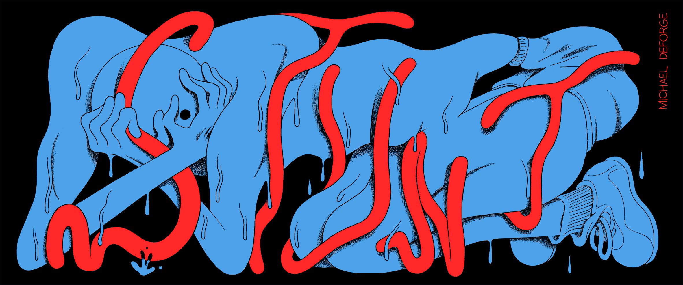
Michael DeForge’s recent graphic novella (Stunt is too short to call a novel) is a compelling combination of excess and restraint. Except for the red letters snaking cage-like around the main character in the cover image, DeForge limits his palette to blue and white on black backgrounds. The dimensions of the physical book are unusually limited too, about 3” x 8”, making each page a small, wide rectangle that DeForge consistently grids into single panels or two equally sized square ones. The book could have been printed in a more standard shape, arranging three rows down each page, but the resulting 24-page comic would be less engaging. Like the title letters, the physical format creates a kind of “stunted” cage holding the main character inside rigid panels made even more unescapable by the ever-present page edges surrounding the black margins.

And that form is a good match for its story. DeForge’s narrator is a suicidal stunt double trying to escape the confines of his existence. He fantasizes about plunging to his death while shooting a skyscraper scene. He literally dreams of crashing a car into an exploding oil tanker, but even then he survives due to a filming mishap that placed the actual star at the steering wheel. The stunt double (he goes unnamed except for one severely cropped panel of his imagined “in memory of” death credit at the end of the film) is terrible at dying. Even his actual suicide attempts by razor and pills fail, leaving him still boxed inside DeForge’s panels.

While the book’s structure coordinates well with its subject matter, DeForge’s drawing style deepens those connections further. Like most cartoons, the stunt double’s body is impossibly malleable. His rubbery muscles enclose only the vague idea of a skeleton as the lines of his body curve to exaggerate his actions. Sometimes the exaggerations are loosely naturalistic, as when DeForge draws him from extremely foreshortened angles, but the effects run much deeper, altering the fabric of the story reality. His hair could be a fifth limb. His blue skin sweats blue droplets as if his whole figure were in the process of oozing apart. When he imagines his fatal impact, his body seems to splash across the sidewalk. When he imagines being consumed by blue flames, the lines of the flames are indistinguishable from the lines of his body, as if emerging from him.

Instead of windows into a film-like story world, sometimes the panel edges serve as barriers that his body contorts to fill. When his suicide attempts fail, he imagines exercising himself to death, literally wringing his body out: “Nothing left of me but knotted muscle and pools of sweat.” DeForge draws the visual metaphors of a twisted towel and puddle—but are they metaphors? Is this a naturalistic story drawn in a distorted style, or is this an actual cartoon world that obeys different laws of physics? DeForge exploits that ambiguity well.

The world is absurdist. The narrator doubles for an actor named Jo Rear, providing the dreamed death headline joke: “Rear, Ended.” Fortunately, DeForge mostly avoids that kind of comic excess, instead emphasizing the surreal plot development of Jo hiring his double to impersonate him in his so-called “real” life. Starting with innocuous commercial photoshoots, the arrangements escalates to TV interviews and then personal dates. Together the two attempt a kind of career suicide, turning “Jo Rear” into a self-destructive, relationship-ending, contract-breaking, conspiracy-theory-espousing, public-urinating performance piece. The “stunt,” however, only makes the persona more popular, spurring a viscous cycle of increasing degradation and humiliation.

But who is declining? Is it the actual Jo giving the look-alike main character his instructions? Is it the double literally embodying the role? Is it some third, technically non-existent entity who exists only in performance? Is it all of the above? None of the above? The interrogation of identity extends to Jo and the narrator even when alone together and so not performing for the public. Their bodies seem not only increasingly interchangeable, but the two figuratively and literally merge as they have sex in the walled privacy of Jo’s mansion. Though homoerotic, DeForge’s images are too surreal, too formally abstract to create any prurient effect. These aren’t two human bodies having sex. It’s barely even cartoon sex since so many of the curves and blue shapes are indistinguishable. Out of context, the last two panels of the sex scene wouldn’t even register as representational images.
I won’t give away how DeForge concludes his metafictional comics stunt, but it is a fitting ending to both his narrator’s personal plot as well as his own visual experimentation. Since Koyama Press is closing down soon too, Stunt may also be a fitting ending to DeForge’s multi-book career with the publisher.

[A version of this post and my other recent reviews appear in the Comics section of PopMatters.]
Tags: Koyama Press, Michael DeForge, Stunt
- Leave a comment
- Posted under Uncategorized
06/01/20 The Art of Framing
Let’s say you’re drawing a comic about a character named Philip. In the first image, he’s sitting in bed reading as his boyfriend steps into the room. The point of view is the boyfriend’s, so all you have to draw is Philip. If Philip were also a real person, you could take a photograph of him and use it as your panel–or at least use it as the basis for a drawing. But no matter how photorealistically or cartoonishly you draw Philip and the bed, you also have to decide how the panel will frame them.
First consider centering. Do you want Philip in the middle of the frame? If so, he’s likely to seem more significant than if he’s closer to an edge, making him literally but also figuratively “marginal.” You can even crop Philip partially or entirely out of frame, literally reducing his presence in the image and suggesting his reduced role in the story’s power dynamic. Or (introducing a technique not available to photographers) Philip’s body could break the frame and extend either into the margin of the gutter between images or into the drawn content of an adjacent image. If so, Philip will likely seem more powerful, able to break through the boundaries of his visual container even though within the story world he’s just sitting there.
Also consider how fully Philip fills the image. Does he take up most of the two-dimensional space and so figuratively dominate too? Or does the positioning and angling of the bed make it more powerful, turning Philip into its tiny occupant? If so, the bed may take on metaphorical meaning too, suggesting perhaps the couple’s relationship overall. Or both Philip and the bed may just be elements in an expansively framed bedroom. The more expansive the framing, the less space Philip occupies and the less powerful his character will seem.
Unlike photography, the frame of a comic panel can be any shape. There’s no default form. So you have to decide the shape relationship of the frame to the content it encloses. To emphasize Philip, draw the frame to match his body. Sitting up in bed probably gives him a roughly upright rectangular shape, which the frame can duplicate and so produce a panel shape that reflects its content. To emphasize the bed instead, draw a frame that matches it, probably a longer, vertical rectangle, one not dominated by Philip. You can also extend panel dimensions to contrast content. If that first frame is a thinner, taller rectangle, it will either end up cropping Philip or include more content above or below him, making him seem less important even if he’s still centered. And panels needn’t be rectangles at all. Design a shape that suits the needs of the image.
Students in our spring term course used a wide range of framing effects, but there are two main approaches.

The first section features images with frames that match the subject’s proportions. That tends to be the default setting. We tend to draw tall figures in tall frames and wide figures in wide frames. That’s fine, but the uniformity can get boring. So find interesting contradictions, ways that the frame and the subject can be mismatched instead. If the figure is wide, what happens when you use a tall frame? Either you have to crop the subject or you have to shrink it, creating additional space within the frame to fill with additional subject matter, expanding background or surrounding content. You can misalign too, using the frame to crop content that could be centered but isn’t.

The second section includes a range of intentionally mismatched framing choices. They all appeared in our students’ comics, so they are mismatched for specific reasons—often to convey a negative connotation in the story situation. A centered, proportionately framed subject creates an impression of balance and control. De-centered, cropped, and disproportionately framed subjects seem less balanced and less in control. Choose accordingly. Take one of your figures and frame it multiple times creating multiple effects. Weigh the connotations of each effect and brainstorm what story context each might be most appropriate for.
Finally, there’s the frame itself—which isn’t a frame but a drawing of one. Like the rest of the image, you control all of its qualities. A thick, ruler-sharp line carries a different connotation than a barely discernible, free-form line. In I’m Not Here (2017), GG includes no frame lines at all, allowing white areas within her images to merge with the white of the gutters. In Red Winter (2018), Anneli Furmark demonstrates the opposite extremes with wide frame lines that are thicker and blacker than any of the image elements they contain. As a result, Furmark’s characters seem trapped and GG’s seem to float in a ghostly world.
The next illustrations have frames and shapes that reflect their content: branches around a wooded scene, falling dominoes shaping a collapsing relationship, the legs of the character walking away, beakers holding beakers, coffee cups containing images of self-assembly.

Though not part of the story world, the frame can still reflect and reinforce story elements by duplicating style or visual motifs. What if Philip’s frame repeats the pattern in his comforter? Or the design of the book cover he’s holding in his hands? Is he metaphorically in control of the scene as if able to hold it all too? What if there’s no frame, just the lines of the image petering into the undrawn white of the page? That carries connotations too. Like all of the other connotations of image, you can only discover through the drawing process.
- Leave a comment
- Posted under Uncategorized


