Monthly Archives: July 2022
25/07/22 What Horror Has Magneto Wrought?
The first comic book I remember reading is The Defenders #15 (September 1974). I didn’t know it was #15. I didn’t know comic books were numbered. I just went to the 7-Eleven every week or so and looked for titles I liked with new covers in the spinning rack. They came out monthly, but I probably didn’t know that either. I wasn’t as young as I probably sound.
I did notice that Issues ended with previews. In the final panel of #15, Dr. Strange declares: “By the Ancient One’s Eyes! What horror has Magneto wrought?” And Marvel’s omniscient narrator promised in the bottom margin: “Afraid you’ll have to wait till next issue to learn the answer to that, Marvelite—but we strongly suggest you be here to meet … Alpha, the Ultimate Mutant.” And so I would have known to keep an eye out for a Defenders cover with that subtitle.
It wasn’t until I was at some friend’s house looking through his collection that I came across that next issue. This could be a year, maybe two, even three years later. I was startled and excited—and then embarrassed when it became clear that front cover numbers were a well-established publishing norm that only I had somehow not decoded.
I didn’t actually read #16 for more than three decades. Marvel published Essential Defenders Vol. 2 in 2006, but my copy says: “Xmas 2009, Love, Lesley.” I think I had just started teaching my first superheroes course and had asked Santa for a sock full of nostalgia. The reprint volumes are in black and white, so when I started drafting what I hope will be my next book, The Color of Paper, I ordered an original copy too. Alpha the Ultimate Mutant dominates the splash page:
Color artist Glynis Wein renders his skin a consistent pink (probably 25% magenta and 25% yellow), while his body and facial features transform radically. “With each discharge of my power,” Alpha explains near the end of the issue, “my evolution has progressed with incredible alacrity.” His first line on page two was: “UUNNHH! UUNNHH!” Another member of the Brotherhood of Evil Mutants calls him a “big hairless gorilla,” and the narrator calls him a “Neolithic mutant.” By the middle of the issue, Alpha’s head is indistinguishable from Professor X’s, and by the end he’s a variation of the standard bulbous-headed alien (as seen on the cover).
So Glynis Wein (her husband, Len, scripted the issue) makes a visual claim: skin color is unrelated to evolution. The Neolithic gorilla version of Alpha has the same 25M25Y colored skin as the Professor X and bulbous-brained versions. I don’t know if Len Wein is making the same claim, since gorillas have nearly black skin. Perhaps the evil mutant Unus’s comment was a reaction only to Alpha’s hairless physiognomy, which was sufficiently gorilla-like to override his contradictory skin color. Or perhaps while Len Wein was scripting the issue, he pictured an initially dark-skinned Alpha?
Like most comics scripts, the one that Sal Buscema used while penciling is lost. After the first four pages, Alpha teleports himself and the Brotherhood to New York’s United Nations plaza, where he reappears with not just Glynis Wein’s White skin but also with what I imagine most viewers would register as White facial features, what Len Wein’s narrator describes as “a somewhat different Alpha!” Buscema’s and inker Mike Esposito’s depiction of Alpha’s features during the first four pages are strikingly different: his cranium is small, his nostrils are proportionately wide, and his lips and jaw protrude. He’s a racist caricature of a Black man.
When the issue was reprinted in black and white, the interior areas of line art that demark Alpha’s skin are the color of the off-white paper. Though that color is as consistent as Glynis Wein’s 25M25Y, it does not have the same representational qualities. Viewers do not perceive Alphas’s skin as off-white because the interior areas of all line-enclosed shapes are also the same off-white. His skin color, like the color of most objects, is ambiguous. Viewers would have to determine it according to other non-color visual clues.
A viewer who has seen a color art representation of the Hulk will likely recall that his skin was green and apply that knowledge to his black and white representation in the Defenders reprint. The off-white interiors of his skin-shaping line art would be understood to represent green skin. The off-white interiors of White characters—which includes all nine other repeated characters—would represent the color of White skin. It’s possible that viewers would recall the specific rendering of 25M25Y from earlier artwork, but I suspect they would visualize in a more limited sense and simply understand the characters to have skin that falls in the range of White skin.
But Alpha is different. His appearance on the splash page of #16 is his first appearance anywhere, so prior knowledge of his skin color is not possible. Because Glynis Wein gave him the same color as the White characters, Alpha appears White. But with no color information, how would a viewer interpret his skin color based on his facial features?
I suspect the racist caricature would trigger an impression of dark skin—not because viewers agree with the racist caricature but because they would perceive that the artists are intending to represent a fantastical version of a Black man. Viewers may consider the caricature as an offensively inaccurate portrayal but still perceive the representational intent. If so, the color of the paper within Alpha’s skin edges is likely perceived as falling in the range of Black skin.
Glynis Wein’s color art blocks the possibility of that caricature-triggered perception of dark skin. Alpha’s White skin may also lessen the impression of his facial features. If so, the 25M25Y interiors alter the meaning of the black marks otherwise interpreted as racistly exaggerated Black physiognomy. The color art also presents a contradiction for viewers: is skin color or physiognomy the primary marker of race? If color defines Color, then Alpha is essentially (and consistently) White. If color doesn’t define Color, then Alpha begins as a Black super-gorilla and evolves into a White godling.
When Alpha teleports the Brotherhood to the United Nations, a man with a pointy goatee and a turban shouts: “By the eyes of Allah! It is … Magneto again!” Glynis Wein gives him redder skin, similar but darker than the skin of the figure next to him wearing what might be an orientalist robe and fez. Magneto removes another turbaned man from the podium before declaring his demands as the leader of “Homo Superior”: “produce a document granting mutants everywhere supreme domination over every civilized country in the world!” After battling the Defenders at Magneto’s command, Alpha eventually recognizes that Magneto lied about the Defenders being evil. Magneto explains:
“You were born an emotional infant! You couldn’t be expected to understand the reasons for our actions — — or the vicious persecution that forced us to them! Regardless of the deception, you are still a mutant – a mutant just like me! You must stand with us –with the others of your kind! It’s the only hope we have!”
Magneto, the Brotherhood, and the Defenders are colored identically. The only non-25M25Y-colored characters are the briefly glimpsed United Nation members. None appear Black, and Alpha’s evolved features no longer evoke caricatural Blackness either. Mutantkind then is apparently and exclusively White. Though the reference to “vicious persecution” could suggest a range of horrors in U.S. history, including the Jim Crow laws that ended a decade earlier, the exclusion of Black skin suggests otherwise. By blocking an understanding of Alpha as a mutant Black man, however racistly drawn, Glynis Wein’s color art defines Homo Superior as non-Black even at its most “Neolithic” stage.
I don’t recall my reaction to the Alpha artwork when I first glimpsed it c. 1976. I was about ten. I lived in an all or nearly all-White suburban neighborhood outside Pittsburgh. Since I hadn’t yet deciphered the complexities of numbering consecutive issues of comic book series, I doubt I registered the racial puzzle of Alpha’s appearance or the social context that heightened its meanings.
- Leave a comment
- Posted under Uncategorized
18/07/22 The Comics Form: The Conclusion
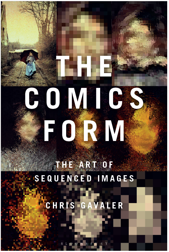
I am delighted to announce that Bloomsbury just officially published The Comics Form: The Art of Sequenced Images. My last three books were two-in-one team-ups, so it feels pleasantly strange to be solo authoring again. This is also a culmination of work I’ve been building toward for about seven years (a very very early version of a chapter subsection appeared as an essay in 2016). I’m humbly hoping to offer some helpful ways to rethink foundational ideas in comics theory, but others will have to determine just how helpful they are. The book is priced for institutions (hardback and ebook), so probably not something most folks will be buying for their own shelves, but I do hope that anyone with a deep interest in comics will nudge their nearest library to purchase a copy.
I also thought the clearest way to preview the content is to start at the end. That’s how you write a mystery novel, but in this case I mean it literally. Below is the actual Conclusion to The Comics Form. It condenses the preceding 206 pages into three very very dense pages. Rereading them now out of context hurts my brain a little, so good luck. Still, I hope there are enough intriguingly shaped fragments in there to pique your interest to explore the book. Raise your hand if you have any questions (ie, email me).
Conclusion
A poem consisting of fourteen blank-verse lines following an ABABCDCDEFEFGG rhyme scheme is a Shakespearean sonnet because it is in the Shakespearean sonnet form. A work in the comics form is formally a comic for similar reasons. Unlike Shakespearean sonnets, however, a comic may be defined by other than form. A work may be a comic contextually, stylistically, conventionally, or by other criteria independent of or non-exclusive to form. Though it may be a comic according to multiple sets of defining criteria, if the work satisfies one set but not another set, it is both a comic and not a comic. The apparent paradox is due to each set using the same term, even though each usage is distinct. A ‘comic’ is not a ‘comic’ is not a ‘comic.’
The Comics Form defines the comics form by extracting the two most common physical features from a range of comics definitions and combining them as ‘sequenced images.’ Sequenced images may or may not define comics generally, but if a work consists of sequenced images, the work is in the comics form and so can be analyzed formally as a comic. Although that may be sufficient for the work to be considered a comic, others might understand that a work must be, for example, a mass-produced replica or be created, produced, and purchased with the understanding that it is a comic. I refer to such media-defined works as the comics medium. A single-image cartoon in a newspaper comics section is in the comics medium, but because it is not in the comics form, it is outside the scope of this study.
The terms ‘discourse’ and ‘diegesis’ differentiate images’ physical qualities and representational qualities. All images have discourses and many also have diegeses. Since I derive ‘image’ from extant comics definitions, I also infer its discursive constraints: an image in the comics form is a visual, static, flat image juxtaposed with another. If it is also a representational image, it represents some subject matter: the diegesis experienced in the mind of a viewer interpreting its discourse. Like ‘discourse,’ ‘diegesis’ has other usages, but I adopt an expansive meaning: all representational content, either overtly depicted or implied, including the larger context of a world. Diegeses vary between viewers but also presumably overlap significantly. Non-representational images have no diegeses, only discourses—which must still be mentally experienced, but without the construction of a mental model with diegetic qualities understood to be separate from the discourse.
Analyzing representational images involves a range of approaches for relating their discursive qualities to the diegetic qualities they produce. Rather than focusing on unknowable authorial intentions or the illusion of intentions in characters, I focus on viewers’ experiences of intentionality in author-constructed narrators, focusing first on image-narrators, which communicate diegetic content through an image’s discursive qualities. An image’s style is in one sense discursive: an arrangement of marks on a surface. In another sense, style is diegetic: subjects depicted in a certain manner. Style may then be understood as semi-representational: discursive qualities that represent subjects non-literally and indirectly. Style may follow certain norms or modes, including cartooning and naturalism, as well as other combinations of exaggeration and simplification. Those norms are understood to represent subject matter through overspecified or underspecified details that are not aspects of the diegesis, except indirectly through connotations. Viewpoint and framing effects are similarly semi-representational.
To be in the comics form, a work must include more than one visual, static, flat image. Distinguishing multiple images from a single image with multiple units poses a challenge. Common terms ‘panels,’ ‘frames,’ and ‘gutters’ are metaphors to describe drawn qualities that are not determining. Unless images are physically divided—two framed paintings hanging on the same wall, for example, or two facing pages—image division is determined by viewer perception. A physically unified page or canvas of visual subunits consists of multiple images only if a viewer perceives it to be multiple images. Like style, a layout of gutter-divided panels straddles discourse and diegesis. The division of images is neither a discursive quality nor a diegetic quality in the same sense as the images’ subject matter, because the divisions are not part of that diegetic world. Where style seems diegetically transparent (subjects are drawn as if accurately reflecting their literal appearance in their world), image divisions seem discursive (images are drawn as if separated physically in the discourse). Distinguishing the two effects, style is semi-representational and layout is pseudo-formal. Because pseudo-formal qualities are not physical qualities like page dimensions and divisions, pseudo-form is a kind of diegesis, but one separate from the primary diegesis of the representational content, and so a secondary diegesis.
For images to be sequenced and so to be in the comics form, they must be juxtaposed in one of three possible ways: 1) contiguous: images appear simultaneously within a single visual field; 2) temporal: an image appears immediately after a previous image in the same visual field; or 3) distant: a non-contiguous image that does not immediately follow a previous image is mentally recalled while observing a current image. Contiguous juxtaposition describes the pages of most works in the comics medium in which viewers understand panels to be separate images. Temporal juxtaposition is the norm of films but occurs in static images when, for instance, a viewer turns a page. Distant juxtaposition is dependent on memory and so may be juxtaposition in only a metaphorical sense. A viewer of a sequence may at any time recall a previous image and relate it to a current image, discursively, diegetically, or both. Contiguous juxtaposition also includes braiding effects (with and without repetition) in which the discursive relationship of visual elements influences a viewer’s understanding of their corresponding diegetic qualities.
Juxtaposed images trigger inferences. The most fundamental inference is recurrence: marks in separate images are understood to be representations of the same subject. Recurrence is reinforced by a parallel phenomenon, diegetic erasure, in which discursive qualities that would produce diegetic contradictions are ignored. Juxtaposition produces ten additional types of inferences: 1) spatial: images share a diegetic space; 2) temporal: images share a diegetic timeline; 3) causal: undepicted action occurs between depicted moments; 4) embedded: one image is perceived as multiple images; 5) non-sensory: differences between representational images do not represent sensory reality; 6) associative: dissimilar images represent a shared subject; 7) semi-continuous: discursively continuous but representationally non-continuous images are perceived as a single image; 8) continuous: images are perceived as a single image; 9) match: otherwise dissimilar images share matching similarities; and 10) linguistic: images relate primarily through accompanying text. The first seven are diegetic only; the second two can occur both discursively and diegetically, or discursively only; and the last is not primarily a result of image juxtaposition and so arguably is not a type of juxtapositional inference. While the subtypes of diegetic inferences are only discernible through analysis of the story world, discursive inferences must be analyzed at the level of the page. Purely discursive inferences involve only discursive marks understood in terms such as shapes and values without reference to representational content.
For images to be sequenced, they must be juxtaposed, but the relationship between sequence and juxtaposition is ambiguous. The juxtaposed images of a sequence follow a specific order. The juxtaposed images of a non-sequence, or set, follow no specific order. Since a set can be juxtaposed contiguously, when, for example, organized into a book or gallery, order has two kinds: 1) discursive order: the successive but non-diegetic arrangement of images, reflecting only happenstance, convenience, and/or the needs of physical presentation; and 2) sequential order: the successive arrangement of the images, reflecting some diegetic quality of the representational content. Sequential order and discursive order are identical for sequences.
When images, whether sets or sequences, are contiguously juxtaposed in a visual field, viewing them produces a viewing path that is either: 1) directed: determined by the image order of the sequence; or 2) variable: indeterminate and so open to multiple discursive orders. Since image orders and image viewing paths are apprehended simultaneously, both are an additional type of juxtapositional inference in which a viewer determines relationships between contiguous images. If other inferences (recurrence, spatial, temporal, etc.) suggest a sequential order organized in a directed viewing path, the images are hinged. Unhinged viewing describes variable viewing paths of a set arranged discursively but non-sequentially.
The image qualities of content, relationship, order, paths, and hinges suggest a six-part typology: 1) representational sequence: two or more related and ordered representational images, with, if contiguously juxtaposed, hinges that produce a directed viewing path; 2) non-representational sequence: two or more related and ordered non-representational images, with, if contiguously juxtaposed, hinges that produce a directed viewing path; 3) representational set: two or more related but unordered representational images, that, if contiguously juxtaposed, are viewed in variable paths; 4) non-representational set: two or more related but unordered non-representational images, that, if contiguously juxtaposed, are viewed in variable paths; 5) representational arrangement: two or more unrelated and unordered representational images with no contiguous hinges; and 6) non-representational arrangement: two or more unrelated and unordered non-representational images with no contiguous hinges.
Representational sequences also provide a means to explain and constrict McCloud’s closure. Viewers make inferences about a diegetic world based on image content in combination with independent knowledge and assumptions about the depicted world. Those assumptions are usually mimetic, applying, for example, laws of physics to objects and human psychology to characters. The undrawn content that viewers experience through the juxtaposition of two or more representational images is the minimal content required by a viewer’s mental construction of a partially drawn but fully implied event, consisting of definable subunits. While anything could occur in the ambiguous lapse of time implied by paired images of discreet moments, viewers understand the images as parts of a unified event. According to event inferencing, any content that is not part of that event is not implied.
Though text is not a necessary quality of the comics form, many sequenced images contain text. An image-text is an image that combines linguistic and non-linguistic content, and sequenced image-texts are in the comics form. Since all text is necessarily images, there are two types: 1) word-image: an image with linguistic content; and 2) word-image art: a word-image rendered as graphic art. Since word-images and non-linguistic images function as though on parallel and independent paths, image-texts involve three kinds of narrators: 1) image-narration of non-linguistic content; 2) text-narration of linguistic content; and 3) image-text narration of combinational effects of linguistic and non-linguistic content, which produces embedded relationships including double referents.
These are the qualities of sequenced images, which together explain the comics form.
- 1 comment
- Posted under Uncategorized
11/07/22 How to View a Comics Page (Captain Marvel)
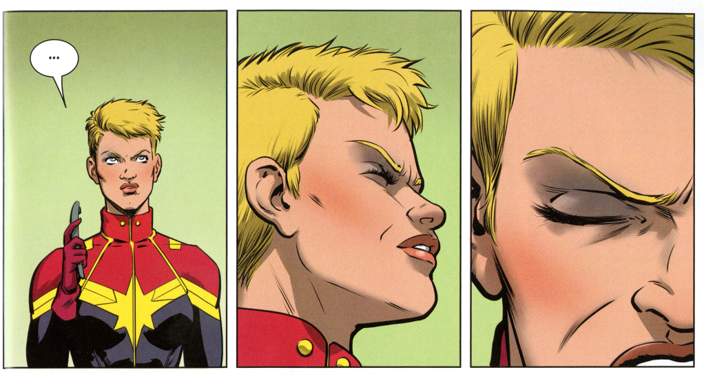
This a page from Dennis Hopeless and Javier Rodriguez’s 2016 Spider-Woman: Baby Talk. It’s another of my favorites, which is why I include it in The Comics Form: The Art of Sequenced Images. Or rather I include a gray-scale version of it. Though Bloomsbury gave me space for a quite a few illustrations, book publishing is always more limiting than blogging. While I couldn’t subdivided the page to talk about each juxtaposition there, I can here. The illustration appears at the end of Chapter 5’s discussion of juxtapositional inferences, and my analysis also draws on some terms from earlier chapters:
- Discursive: qualities of the physical image.
- Diegetic: qualities of the represented subject.
- Spatial inference: images share a diegetic space.
- Temporal inference: images share a diegetic timeline.
- Causal inference: undepicted action occurs between depicted moments.
- Continuous inference: images are perceived as a single discursive image.
- Semi-continuous inference: discursively continuous but representationally non-continuous images are perceived as a single image.
- Erasure: viewers do not register discursive elements that do not fit their diegetic understanding.
- Ocularization: image viewed as though from the angle and proximity of a character.
The character is Captain Marvel, but because she goes unnamed, I don’t mention her by name. Though the page features a 3×3 grid, five of the panels produce a unified image through continuous inferences. Numbered by Z-path viewing, panels two, five, six, seven, and eight are a single discursive and diegetic unit.
Because that unit is the dominant feature of the page, it likely encourages a viewer to apprehend the page as a whole first rather than beginning in the top left corner as the viewing norms of a 3×3 grid would prompt. The centered “KOOF” art in panel five also likely attracts a viewer’s eye to the center of the page and so to the center of the continuous unit first. Switching to Z-path viewing requires some loosening of the continuous effect to apprehend each panel individually. Even though it contains only an ellipse and so indicates no spoken sound, the presence of a speech container in the top left panel encourages a Z-path by drawing a viewer’s eye to its starting point.
In terms of spatial inferences, the setting is minimal and is represented only by an undifferentiated green background discernable in most panels. The green is likely perceived as transparently literal, even if its slight discursive variations are not. The discursively white background in the bottom left panel, however, is likely diegetically erased or, if noticed, understood non-transparently through non-sensory inference.
Since the substitution of white for green probably suggests nothing diegetically, it likely does not trigger associative inferences. The white then is only for discursive effect.
Spatial inferencing also explains the differences between each pair of panels as the result of the differences in the position of the implied viewer in relation to the central and unmoving figure. The first juxtaposition involves a change in the implied viewer’s proximity and angle. The second juxtaposition involves both, too, but while the proximity of the third image follows the trajectory of the first two images (the implied viewer is nearing the figure), the angle instead reverts back to the forward-facing view of the first panel. Because such movements do not correspond to the movements of an implied character, the spatial inference suggests no ocularization.
But the final image could be ocularized by either of the two characters present in the backgrounds of panels six and seven. Even if non-ocularized, the implied viewer has rotated 180 degrees, explaining why the central figure is no longer facing forward.
Alternatively, the figure has turned herself around as inferred through a causal inference. If so, she is now facing the two background characters, who, due to framing, do not appear in the image. I suspect most viewers would interpret the figure’s ending posture as speaking over her shoulder to the characters behind her, and so no causal inferences would be involved. If the figure did turn around, a viewer would experience a different kind of temporal inference, one indicating a slightly greater period of time to account for the implied action.
Temporal inferencing is also necessary for parsing the five-panel continuous unit. The unit, because it appears more than once in the linear panel progression, represents more than one diegetic moment despite being discursively recurrent. Calling the combined continuous unit “A,” the linear viewing sequence is: 1, A(2), 3, 4, A(5–6), A(7), A(8), 9.
First, note that temporal inference combines panels five and six into a two-panel continuous unit within the larger five-panel unit because the mid-air position of the flying fragments indicates the same moment. The space between panels five and six therefore divides neither spatially nor temporally.
The space between panels seven and eight does divide temporally because the placement of a speech container within each segments time.
Similarly, the space between four and five is temporal because of the action of the figure crushing the object (identified in the story as a phone). The change in the color of her glove from red to white is presumably the result of the electrical discharge from the crushed phone. The three changes (untightened to tightened fist, red to white glove, whole to shattered phone) all produce the temporal inference.
Temporal inferences also challenge the transparency of the apparent five-panel continuous image. Though panels A(2) and A(5–6) appear to represent a unified image and so a unified moment, panel four establishes that the phone is not yet broken during the moment of A(2), meaning the effect between A(2) and A(5–6) is not continuous but semi-continuous.
It only appears to be a single continuous image, but the corresponding position of her fingers during the moment of A(2) could not match. In the first panel, which is temporally closer to A(1) than to A(5–6), the figure has not formed a fist yet since one of her fingers is higher on the phone.
Temporal inferences produced by the speech containers also requires that A(7) and A(8) represent different moments from the rest of the apparent continuous unit, producing instead a semi-continuous unit of a single, stationary figure viewed from the same angle and proximity, but subdivided into four temporal units.
Finally, while panels two and five are not contiguously juxtaposed, viewers likely recognize them as diegetically continuous.
The chapter ends with discussions of four other pages too (from Black Panther, Batwoman, and Hawkeye). These close viewings (I avoid using the verb “read” for visual analysis that involves almost no actual reading) were some of my favorite parts to draft.
- Leave a comment
- Posted under Uncategorized
04/07/22 How to View a Comics Page (Hawkeye)
That’s a page from Matt Fraction and David Aja’s 2012 Hawkeye: My Life as a Weapon, one of my all-time favorites. I discuss it in The Comics Form: The Art of Sequenced Images, but the very reasonable limitations of book publishing prevented me from dividing the page into various smaller units to illustrate the point-by-point analysis.
That’s what blogs are for.
I really do try to avoid jargon, but I have some terms I find increasingly useful, so I’ll gloss them first:
- Discursive: qualities of the physical image (in this case that’s pixels).
- Diegetic: qualities of the represented subject (in this case that’s the world of Marvel Comics).
- Spatial inference: images share a diegetic space.
- Temporal inference: images share a diegetic timeline.
- Continuous inference: images are perceived as a single image.
- Semi-continuous inference: discursively continuous but representationally non-continuous images are perceived as a single image.
- Associative inference: dissimilar images represent a shared subject.
The characters here are of course Hawkeye and, well, Hawkeye, AKA Clint and Kate. Their names aren’t mentioned on this splash page, so I don’t refer to them by name either.
Here it goes:
Uniform vertical and horizontal negative spaces divide the page into twelve rectangular but otherwise irregular images. The presence of words from a continuous statement (“Okay—this looks bad … Don’t die.”) placed inside caption boxes in the top left corner and the bottom right area encourage a general top left to bottom right viewing, but the norms of either Z-path rows or N-path columns are disrupted by the image arrangement and image content, producing no clear viewing order or even a method for naming images discursively. If viewers do begin with the first captioned word, they likely switch to apprehending the page as a whole, focusing first on the largest panel and the dominant content of the two figures diving underwater as bullets speed past them. Because the bullets’ paths through the water follow the same lines as those in the top left corner, continuous inferences unite the panels as a single unit, even though they share only corners and no borders. After closer inspection, the bottom left panel likely joins the same continuous unit.
The bullet trajectory lines in the top right corner also follow roughly the same pattern, so a viewer’s eye may be drawn there next. Spatial inferencing establishes a more distant implied viewer since the bullet lines (which are through air rather than water and so literal only if understood as a kind of blur) and the figures are smaller. The contrast in distance blocks the continuous effect otherwise encouraged by the layout, since the top right panel content is also “above” the diegetic content of the larger panel below it discursively. Since the two are viewed from similar angles, it is only the difference of proximity that divides them diegetically. That almost continuous effect is further suggested by the near alignment of the pool edges in the top corner panels, which is itself heightened by the placement of a horizontal negative space between the middle panels in the same row, creating the discursive illusion of an intermediary step between the differing representations of the pool edge.
The second panel along the left margin also features a similar pattern of bullet trajectories, but spatial inferencing again divides the panel from the continuous unit, this time through an implied viewer placed in contrastingly close proximity to the bullets.
Two other panels in the top left region stand apart discursively because of the accenting use of yellow. The two are also diegetically linked because they feature the guns firing the bullets.
Diegetically, the second panel along the top margin belongs above and to the left of the first panel—a mental rearrangement that a viewer experiences through spatial inferences. The content of the second yellow-dominated panel is also diegetically “below” the discursively higher panel, but with the same change in proximity of the implied viewer as the panel abutting it, so that the bullets in the water and the bullet shells in the air are similar sizes. The two yellow panels also produce their own two-panel viewing path that cuts diagonally across the opposite diagonals of both the paths of the bullets and the reading path of the captions.
The seven panels described so far could occur simultaneously. The smallest remaining panel, the lone square positioned near the center of the page but grouped with the close-up panels, appears to represent a similarly close view of churning water and so is also likely understood to occur at the same moment.
Four images remain. Two are ambiguous because their content is not overtly related, and the other two produce temporal inferences distinct from the rest of the page.
First, the figure in a bikini from the top right panel recurs in a lower left panel; instead of being struck by a bullet and falling from a standing position, the figure is floating face down in the water. The diegetic trajectory of the figure’s previous falling posture aligns spatiotemporally with the body’s later position in the pool, producing a causal inference. The juxtaposition also requires a new implied viewer position situated on the other side of the pool and so opposite the implied viewer of the other images. The apparent stillness of the figure and the water suggest a similar temporal leap to a later moment well after the action depicted in the surrounding images.
The recurrent figure also creates a two-panel viewing path that echoes the right-to-left path between the two yellow-dominant panels that appear discursively “before” them if a viewer is attempting a general top left to bottom right direction. The second pair of panels are more discursively distant to each other than the first pair, but in the same diagonal relationship, and so their placements also echo the widening trajectories of the bullets in the continuous unit.
The final image in the bottom right corner features the recurrent figure of the diver discursively above it, producing the spatiotemporal inference that he is no longer descending into the water from the force of his dive but has now slowed. Though his arms are framed out of the image, they appear to be at his sides. The temporal inference would divide the two images by roughly seconds. This means that the “last” discursive image on the page is not the “last” diegetic image because the previously described panel containing the floating corpse would follow it temporally.
Finally, two of the panels feature graphic designs surrounded by uniformly black areas that seem disconnected from the diegetic events, in part because they do not suggest the illusion of three-dimensionality. Viewers with prior subject knowledge will recognize the higher panel’s spiral pattern as the symbol of the story’s villain featured on his hat, producing an associative inference. Viewers without prior knowledge will be introduced to the symbol and character six pages later, applying the associative effect retroactively. The juxtaposition of the spiral icon beside the image of the firing guns may suggest that they are being fired either by the villain or, since there are multiple guns, on his behalf.
A lower left panel contains another ambiguous icon, also later revealed to be associated with another villain employed by the first for similar foreshadowing.
Something I don’t mention in The Comics Form but that I’ll address here: Aja’s art works against Fraction’s tone and superhero genre norms. Hawkeye’s internal narration is comic and contrasts the dire situation. But it’s considerably less comic for the words “Okay—this looks bad … Don’t die” to appear between images of bystanders being struck by stray bullets and a floating corpse. Worse, because the deaths go unnoted by the heroes later, it suggests their indifference.
I assume that wasn’t the intention. Fraction’s script likely didn’t mention any deaths because Aja invented the incident while drawing. The heroes are unconcerned about dead bystanders because there were none. Or at least there were none as originally written by Fraction. The comic, however, is not the script.
- Leave a comment
- Posted under Uncategorized


