Monthly Archives: January 2018
29/01/18 Blue is the Warmest Color
When my university store misordered some of my winter books, I had to rethink my 21st Century North American Fiction syllabus. I originally intended to include a graphic novel, but then I added three new novels (Station Eleven, Mongrels, The Underground Railroad) and thought that was plenty. So when Allende’s Zorro didn’t come in, I figured the comic book gods were intervening. I’d mentioned GG’s I’m Not Here as my favorite new novel, graphic or otherwise, on the first day of class, but I needed one other to fill the syllabus gap. Though Julie Maroh is French, I went with her anyway, especially since I organized the counter-traditions course around issues of othering and was teaching no other gay authors.

Julie Maroh’s Blue is the Warmest Color (Arsenal Pulp 2015) was originally published in French in 2010 and English in 2013, the same year as the English film adaptation. Maroh sets the coming-of-age story in the homophobia of the 1990s, compounding the lesbian love plot with political reverberations that offset its otherwise intimate focus. While the Abdellatif Kechiche adaptation won the Cannes’ Palme d’Or award, its source material may be the more compelling work of art—one intricately crafted with features unique to the comics form.
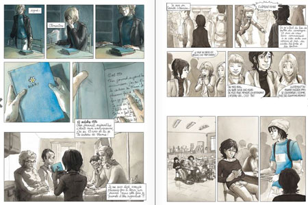
Morah’s use of color is its most immediately striking feature. As established by the title, blue is the central visual motif, one suggesting pleasure, usually romantic, often erotic—though a child’s balloon or a diary can possess the same glow. Initially Clementine’s adolescent world is a wash of browns and grays—until punctuated by her first glimpses of desire: first a boy’s blue shirt, then a girl’s blue hair. Unclothed though, Thomas, Clementine’s first boyfriend and almost lover, returns to his undifferentiated dank shades. Emma, however, literally haunts her dreams, her blue hands exploring Clementine’s white body.

The simple color binary breaks down in the framing story though, when the adult Emma is visiting Clementine’s now elderly parents. The contemporary world is a colorful one. Emma’s turtleneck is blue, but her hair has grown back blonde, Emma’s mother wears a red sweater, and oranges and greens permeate the bed and walls. Though Clementine’s old diary is still blue, the color no longer produces the same effect and meaning in the altered context. Despite the difficulties of Clementine’s identity-searching adolescence, its two-tone impressionism was a product of her own inexperience. After her father disowns her and she is forced to leave her childhood home, a naked but now realistically skin-toned Clementine curls as if three-dimensionally above the panel layout. She turns thirty a page later. Her worst moment, a brutal break-up fight with Emma after Clementine confesses to adultery, Mahor infuses with the novel’s most vibrant watercolors. Though the greens of Clementine’s hospital deathbed scenes are both literally and metaphorically darker, the effect is muted by Emma’s renewed devotion. When Emma stands alone looking into a gray ocean, the final image is the novel’s largest and most realistic watercolor.
For all of Mahor’s attention to color, her skill with panel effects unique to the comics form is arguably greater. By establishing a book-length norm of three- and four-row layouts of one to three panels, Mahor creates opportunities for variations. Atypically wide horizontal gutters suggest a scene-breaking time leap or, when placed within an otherwise continuous scene, a psychological break—as when Clementine first glimpses Thomas from her cafeteria seat. When they first kiss, Mahor eliminates frames and so gutters entirely, instead floating the two figures in an implied full-width panel at the bottom margin of the page. Their unframed background communicates the momentousness of her first kiss by placing it in the same timeless white as the gutters. But when Clementine later flees back home after nearly having sex with Thomas, her two darkened panels instead float unaligned in one of the novel’s widest expanses of white space. Mahor repeats the two-step narrative technique with Emma, but in reverse and with intensified effects. After hanging up angrily on Emma, the lone figure of Clementine and her phone float in even wider unframed white space, and after the two have sex for the first time, their two unaligned panels float too, only now suggesting their time-escaping joy in a still wider expanse.
Mahor is equally masterful with juxtapositional effects between panels separated by standard width gutters. While Mahor varies her left-to-right reading paths with brief, two-panel sub-columns on roughly a fifth of the novel’s 156 pages, in two cases the stacked panels do more than shift reading direction. At arguably the most significant moment in the narrative, when Emma and Clementine make eye contact for the first time, Mahor draws Emma’s face in what could be a single panel but instead is divided into two thinner strips with a centered gutter separating her eyes from her lower face.

The result is closer to the original meaning of visual closure, in which the two parts are perceived as a single whole. The framing not only emphasizes Emma’s eyes, but, by also fracturing a single moment in half, Mahor disrupts the flow of perceived time too. She repeats the technique at another pivotal moment. When her closest male friend reveals that her circle of friends are avoiding her because they think she’s gay, Mahor divides his face too, but here the emphasis is on his mouth and talk balloon: “Actually … I think it’s more about you.” The next three-panel row features the novel’s only metaphorical sequence, as the ground literally cracks beneath Clementine’s feet and she plunges into crosshatched darkness. Two pages later, even her panel frames collapse around her limp body.
Mahor also employs insets with the same thematic skill. While caption box insets appear on most pages, often breaking panel frames, Mahor draws only a total of six image insets, all within a 17-page, mid-story sequence, and all intimately framing Emma’s and Clementine’s hands or eyes. The first overlays panel content for a closure effect similar to the examples described above, but here, when Emma touches Clementine’s hair for the first time, the inset breaks the gutter alignment of both bordering panels, as if the moment cannot be contained by the standard rules of their world. A row lower and the inset of their clasped hands break four more borders. Two pages later Clementine’s inset eyes challenge Emma for never inviting her to her apartment. When she finally does, the next inset frames Clementine’s eye and a single, joyful tear as she has her first orgasm, while the next is still more explicit—Clementine’s hand between Emma’s legs for the first time. The final two, however, move from easy eroticism to harder emotions. When Clementine touches Emma’s hair, the inset, while misaligned with the closest panel border, fails to bridge the gutter to the adjacent image—including the next in which Emma pulls her hand away, followed by her breaking off their affair. The novel’s last inset reverses the pattern of intimate touch to show Clementine shoving away a plate of food that Emma is serving her—prompting Emma’s confession that she is keeping Clementine at an emotional distance to protect herself. When they overcome that distance, Mahor literally closes the door on their next sex scene, content instead with a visually more meaningful row of layout-breaking panels as the two move out of view.
The story’s nudity and sexual content would likely conjure an exploitive male gaze if the images were not drawn by a lesbian author—a quality that complicates the film adaptation. Mahor’s hand, however, is deft in so many ways, producing a visually and emotionally complex tale of coming-of-age love uniquely grounded in the comics form.
[The original version of this and my other recent comics reviews appear in the comics section of PopMatters.]
- Leave a comment
- Posted under Uncategorized
22/01/18 Ferris Bueller’s Missing Sex Scene
 First off, yes, there’s a sex scene missing from the 1986 teen film classic Ferris Bueller’s Day Off. Secondly, no, the scene isn’t posted here. It’s not posted anywhere. I seriously doubt it was ever shot. But I suspect it was written–or that it at least existed in writer/director John Hughes’ head while he was filming. I think the actors figured it out too, especially Mia Sara who played Ferris’s girlfriend.Mathew Broderick and Alan Ruck may have been clueless.
Since I’m co-teaching a “Making Comics” course this coming spring term again, as well as revising a requested book proposal on the same subject, I thought I ought probably to try my hand at making some comics of my own. I’ve been experimenting extensively with single-page comics, so I thought it was time to expand to multi-page. The working draft of “Ferris Bueller’s Missing (Sex) Scene” is currently nine. It’s an odd choice for subject matter, though since I started it the day after my mother died, I suspect it’s secretly about the deleted scenes of death and Alzheimer’s–or will be as I continue making it.
For now, there’s page one at the top of the screen. Or actually page two, since there’s a splash page I’m not including here. In fact, I’m not including anything here but this page. I’m more interested in the process of creating it, since that’s the topic of both the course and book I’m re-working. Last time I taught “Making Comics,” I had my students write scripts–a step I now think is antithetical to the comics form. Prose is made of words, and so prose writers draft on paper, thinking in and discovering their stories through words. Comics are made of images, and so the drafting process needs to be image-based. A comics creator needs to think on paper too, just not the same kind.
So here’s my drafting-in-images process:
1. Order the film online and snip three frames from the scene when Cameron is catatonic for fear of angering his father and Ferris is monologuing about how Cameron’s life will be ruined because he’s a virgin. Like the rest of the film, the actual scene includes a lot of close-ups of Matthew Broderick talking to the camera, but I focused only on the supporting cast. 
2. Paste into Word Paint and start digitally wood-cutting. Get weird with Sloane’s hair. 
3. Admire the pleasant oddness of the stripped down elements juxtaposed with the remaining photos. Spend a lot of time perfecting Cameron’s hair too.

4. Recall that a standard comics page has a 2:3 ratio and space accordingly. Add a talk balloon simply because it looks cool spatially. Fill it with blue sky, because that might look cool too.

5. Experiment with a movie poster overlay to suggest how annoying it must to be Ferris Bueller’s best friend and girlfriend. Decide against it.

6. Add a border, because, wow, that’s easier to keep track of live space, and then drop in the lines of Ferris’s monologue. To avoid a typeset look, drop each word in separately. Oh, also see what happens if Sloane’s weird hair design is in her talk balloon too.

7. Try several word arrangements. Also, overlay Ferris’s blown-up vest as font color, same as the border.

8. Drop in a very subtle subtext background.

9. Realize that sticking to the same font looks better, even if you did waste a half hour perfecting those hand-drawn spray-paint letters. Settle on a final arrangement, pleased by how the center of the “X” focuses attention on Cameron’s head in Sloane’s hands.
10. Reflect on how even the unwritten “script” in your head for this page would have produced nothing like this actual page. Which was really my only goal, and one I happily if idiosyncratically achieved. Yeah for me.
11. Start the next page.
(To be continued … ?!?)
- Leave a comment
- Posted under Uncategorized
15/01/18 Daishu Ma’s Not-so-dystopic Dystopia

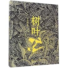
Artist Daishu Ma was born in China, studied in England, and lives in Spain. Her first graphic novel, Leaf, was published in China in 2014 and since in France, Sweden and recently the U.S. The wordless narrative explores the paradoxical role of nature in an urban setting as a nameless protagonist studies a mysterious, glowing leaf. Daishu Ma achieves this without using a single word—even though her images convey not only the fact that characters are speaking to each other but the content of their undrawn words too. She even conveys the content of a flashback story told by a leaf expert about the pioneering founder of the city.

Wordlessness aside, it is tempting to read the novel as a dystopia, but the genre would be both reductive and misleading. Though the labyrinths of buildings and machines might recall Metropolis at times, these city-dwellers are not dehumanized cogs in an industrialized underworld. Daishu Ma peoples her world with women and men of all ages, including playing children, doting parents, and smiling grandparents, all individualized through meticulously rendered patterns in the fabrics of their scarves, shawls, hats, and other clothes. None wear uniforms of any kind, and so the unnamed city is free not only of police and military but of any suggestion of government control. The most overt city employee—an older man who disposes of leaves and switches off the lights of a public art display—wears the most personalized clothing of any character.
Most of the population seems to be employed in a vast industrial complex where each sits in an identical cubicle operating control panels before an enormous map of their city. Though all wear their own individualized clothing patterns, together they form a larger weave, each part of the collective action. Though they lose their individuality in the process, they regain it at the end of the work day when Daishu Ma draws them once again in street-level activity as detailed and personalized as before. They are also free to leave the city and wander in the surrounding forests, which Daishu Ma establishes from the opening pages. Though city life is imperfect, it is maintained through individual choice.

When the protagonist gains access to a more foreboding industrial complex where leaves are incinerated, he faces no human opposition. He must navigate a maze of ducts and stairs and ladders, while opening heavy grates and decoding complex control panels to prevent the automated scoops from destroying his leaf, but no guards or people of any kind stand in his way. As a result, Leaf is a story without not only a central antagonist, but any antagonists at all. Even the leaf sweeper only briefly resists the protagonist before becoming his primary helper, revealing how the city machinery works and showing him how to access its hidden areas.
The novel’s dystopic expectations may be a connotation of Daishu Ma’s gray-based pencils. The precision of her layered crosshatching produces a dark tone, one contrasted by the wide white gutters and their regularity. The layouts fluctuate between 3×3 and 2×2 grids, sometimes implied by combined panels, producing a formal constraint that echoes the grays’ dystopic connotation. But Daishu Ma does not offer simple binaries between natural goodness and urban badness. Though the opening page depicts autumnal leaves falling from a soon-barren branch, the images are constrained by the same window-like grid as the city images. When the city dwellers wander back home, Daishu Ma merges natural and urban motifs with tree roots beneath leaf piles transforming into pipes. And the city includes trees planted along sidewalks, and the novel’s largest tree centers the city’s largest outdoor space.
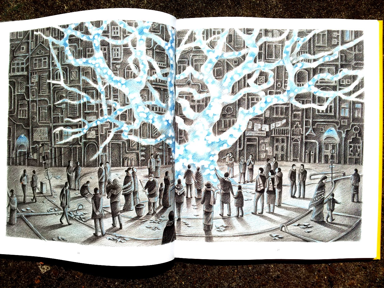
Despite the pencil grayness, the novel is most striking in its use of colors and its vying plot between blue and yellow pencil highlights. Again the two colors are not aligned along a simple nature/city dichotomy. The autumnal leaves are blue-tinged, and when the protagonist returns home the city is infused with blue light fixtures, blue windows, and once even blue open flames. But the protagonist has discovered and brought back a special leaf: one entirely blue but for white spots that appear to glow like light sources.

When he drifts asleep with it in his hand, he has a brief, one-panel vision of gray leaves with white glowing circles. It is Daishu Ma’s first use of yellow, and the color does not return until over twenty pages later when the protagonist glimpses a glowing yellow light fixture outside an apartment building. When he approaches, many other lights and windows are glowing similarly, including the candle on the table of the leaf expert he meets. When he pulls out his special leaf in these lighting conditions, it appears yellow too—though the circles remain white as before. After studying the leaf, the expert places it in a jar and transforms it into a yellow glowing circle, which recalls a photo album image of her father standing in a jungle among similar glowing yellow circles.
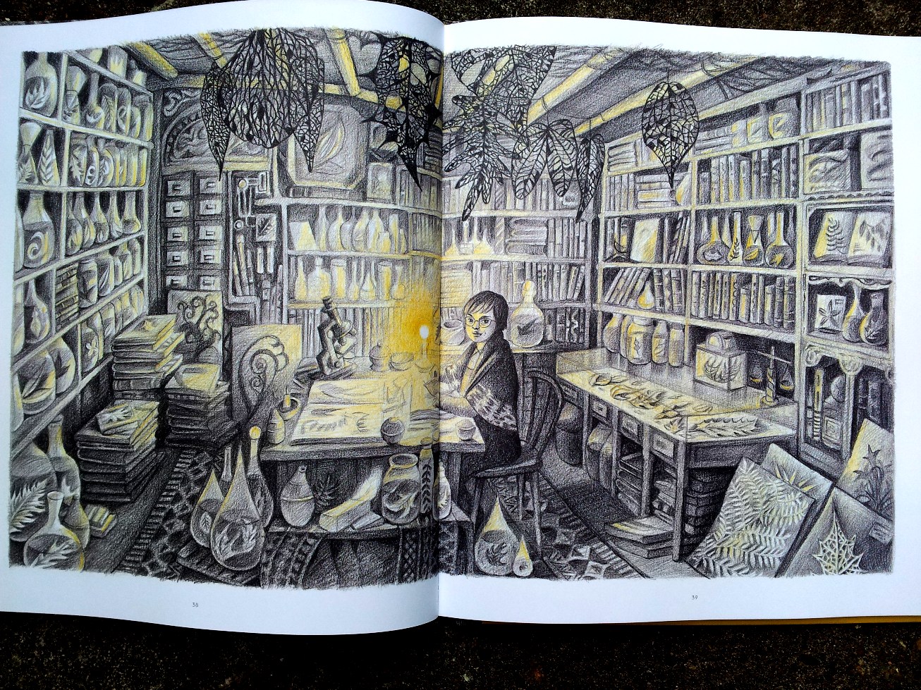
The next morning, the sun rises yellow, and the protagonist purchases leather straps to carry his glowing yellow jar everywhere with him. Now other sources of light are yellow too—until the jar shatters and the leaf is carried up the disposal duct. When its glow fades, the city is blue-highlighted again, including the night moon, city windows, and the flashlight the protagonist uses to track down the leaf to the enormous disposal compartment which is filled with not just leaves, but countless floating yellow circles. He eventually releases them all through the industrial smokestacks, and they float everywhere in the forests and city, including the leaf expert’s windowsill where she places a tiny potted tree. In the final image, a bird lands on the sill, surrounded by a budding branch, the city background, and the yellow circles.
Page two featured a bird departing its nest to fly away with its flock, so the last image is a return of spring and nature, but now in an urban environment. Clearly too yellow is the superior color, contrasted to the autumnal blue of the opening page. Yet blue is also associated with nature and light and even warmth and joy as the community gathered around the blue light of the city center tree. Again, the novel is not a simple tale of goodness and light triumphing over darkness and evil. Just as the tyranny- and victim-free community challenges dystopia norms, Daishu Ma’s color motif creates a more nuanced visual plot struggle. The absence of life-or-death consequences lowers the stakes while raising the novel’s quiet complexity. Her protagonist doesn’t save the world. He just improves it.
[The original version of this and my other recent comics reviews appear in the comics section of PopMatters.]
- Leave a comment
- Posted under Uncategorized
08/01/18 How to Make a One-Panel Feminist Comic

I’ve been drafting chapters for a comics craft textbook and also rethinking my co-taught ENGL-ARTS Making Comics course for spring term, both of which have me experimenting with image-text art. Not all image-texts are comics and not all comics are image-texts, but the overlap in the center of that Venn diagram is massive. I’ve been particularly intrigued by the possible ways words can be incorporated into images, which has led me away from most comics conventions (thought balloons, talk bubbles, caption boxes, sound effects) and into what I think of as poster art–or at least single-panel comics (which by some scholarly definitions, including my own, isn’t a “comic”). I created the above art over winter break. It’s titled “nevertheless” and combines three generations of feminist imagery. It’s hard to be sure, but I think that’s FEMEN leader Inna Shevchenko being arrested in the background.
In case it’s of interest to anyone, here’s my process:
STEP 1: Select a photograph of members of the Ukrainian activist organization FEMEN striking a 1940s Rosie the Riveter pose. 
STEP 2: Isolate one figure and white-out everything but outlines, then eyes, nose, and mouth. I work in Word Paint because I’m an idiot and also because there’s something appealing to me about its pixellated simplicity–the digital equivalent of wood-cutting.

STEP 3: Experiment with words. STEP 4: Experiment with the female symbol that represented feminism in the 70s and 80s.
![]() STEP 5: Flip the image (because the original Rosie faces right) and add the word “nevertheless” to evoke Senate Majority Leader McConnell’s silencing of Senator Elizabeth Warren last year: “Sen. Warren was giving a lengthy speech. She had appeared to violate the rule. She was warned. She was given an explanation. Nevertheless, she persisted.”
STEP 5: Flip the image (because the original Rosie faces right) and add the word “nevertheless” to evoke Senate Majority Leader McConnell’s silencing of Senator Elizabeth Warren last year: “Sen. Warren was giving a lengthy speech. She had appeared to violate the rule. She was warned. She was given an explanation. Nevertheless, she persisted.” STEP 6: Experiment with placement and negative space.


STEP 7: Try it in pink (because of the Women’s March)
 STEP 8: Try it with flag stripes (because America).
 STEP 9: Simplify.
And that’s probably where I should have stopped. I’d say that’s a fairly decent poster image, and if you like it, feel free to use it (I’ll even email you the artwork). But then I got another idea …
STEP 10: Try overlaying it onto protest photographs.


STEP 11: Go in a completely different direction.

STEP 12: Try historical photos instead. STEP 13: Think that you’ve settled on a “Votes for Women” c. 1904-14.
 STEP 14: But then have your artist friend Carolyn Capps look through your drafts and pick this one as the best. Carolyn liked how the flying background hair becomes the hair of outline face too, and how the cop’s hand seems to be on her neck, with his thumb pressing her throat. And how his holstered baton ends the image in the bottom right corner–which is how comics artists think too. Since comics juxtapose images, “nevertheless” is also a comic. But instead of placing images side-by-side, it combines its five elements in layers: Rosie the Riveter figure, female symbol, “nevertheless,” U.S. flag, and the photo background.
- Leave a comment
- Posted under Uncategorized
01/01/18 Judging My Book By Its Covers

That’s me Christmas morning beside the framed enlargement of my latest book cover. Definitely not my most photogenic moment, but thank you, Lesley, for taking the shot and, more importantly, conspiring with Santa and our local frame shop for the Christmas gift. It will join its siblings on my office wall as soon as it’s warm enough to carry across campus. As my kids noticed, apparently my name should always appear in a burst bubble on the right side of a cover design:

I owe many thanks to the graphic design folks at Bloomsbury for what turned out to be a brilliant save. Both the book title and cover were decided before I joined the project (long story) and so the original cover proof looked like this:

When I showed it to the superheroes class I was teaching that semester, they were not impressed by the anatomy–and not just those circular, weirdly insect-like hips. I emailed a friend (a fellow Bloomsbury author and the top name in superhero gender analysis) to say I was “concerned.” She responded something like: “Why, because each breast is the size of her head?”
It didn’t help that my chapter “The Gendered Superhero” critiques this sort of image, specifically “head, breast, waist and thighs drawn in similar proportion” (190). So I was thrilled when my editor forwarded the cropped version, a solution I never considered. The female face (despite still sporting what one of my students called “babydoll lips”) now seems to emphasize gender and the importance of female characters but without gratuitous sexualization. The detail isn’t clear enough here, but I also like how the close-up reveals some of the artist’s brushstrokes, implying (to me at least) that the book is all about close reading.
But before the revision, I used the problematic cover as an excuse to experiment with some designs of my own. This was over a year ago, so my attempts already look archaic to me, but I will share the mock-ups anyway. Happily, I wasn’t quite stupid enough to share them with my editor, because even I know publishers who employ graphic designers aren’t interested in authors who think they can design too. Still, I had fun trying.
The first focuses on simplified symbols, some specific to superheroes, some emblematic of time periods, again suggesting (to me at least) close analysis of genre:
![]()
Then I started thinking about simplified superhero faces, specifically female:

The Comics Code plays a significant role in the book (I use it to divide the genre into historical periods), so I manipulated some public domain images from the 50s next:

Next up, doctored photos of Olympic athletes (bonus points if you can name any):


And finally there’s “Punch,” which I used as an illustration inside the book–minus all of the tiny comic book covers that make-up the background. I didn’t work up a full cover design for this one, which is just as well since my fonts tend to look amateurish (not sure precisely why, which is probably the mark of an amateur):

So, as you can see, good thing Bloomsbury employs professional graphic designers.
Thank you, Santa.

- 1 comment
- Posted under Uncategorized


