Tag Archives: Blue is the Warmest Color
April 15, 2024 Blue May No Longer Be the Warmest Color
I checked my old syllabi, and Jul Maroh’s Blue is the Warmest Color is tied for my most-taught graphic narrative. Beautiful Darkness will likely move to a lone number one slot next time I teach Intro to Graphic Novels though, because my current class has convinced me to retire Blue is the Warmest Color.
First, a quick author update:
The novel was first published in 2010, and Maroh revealed that they are non-binary in (I think) 2022. Their various publishers are still catching up — most distressingly their English-language publisher, which means Maroh is still being dead-named on some of their covers.

If you’re curious, you can track the evolution of their first name from its original appearance, to its contracted abbreviation at their former blog, to its current non-abbreviated “Jul.”
The author’s gender identity doesn’t excuse the catastrophe of the 2013 film adaptation by Abdellatif Kechiche.

I show the trailer in class, while discussing Laura Mulvey’s 1975 classic essay on the male gaze.
I share Maroh’s critique too:
“It appears to me this was what was missing on the set: lesbians. I don’t know the sources of information for the director and the actresses (who are all straight, unless proven otherwise) and I was never consulted upstream. Maybe there was someone there to awkwardly imitate the possible positions with their hands, and/or to show them some porn of so-called “lesbians” (unfortunately it’s hardly ever actually for a lesbian audience). Because — except for a few passages — this is all that it brings to my mind: a brutal and surgical display, exuberant and cold, of so-called lesbian sex, which turned into porn, and me feel very ill at ease.”
I also share Maroh’s thoughts about the novel’s intended audience:
“I didn’t make a book in order to preach to the choir, nor only for lesbians. Since the beginning my wish was to catch the attention of those who:
“–had no clue
“–had the wrong picture, based on false ideas
“–hated me/us”
And that’s when class discussion moved in an unexpected direction.
The room coalesced around three central critiques.
First, the age difference between the characters begins their relationship with an imbalanced power dynamic. When they meet, Clementine is 15, and Emma is in college. They have sex for the first time when Clem is 17. Someone googled “age of consent in France” (it’s 15), but that defense felt (literally) legalistic.
I thought discussion of the second half of the novel would soften the criticism. I was wrong. Yes, they’re older (Clem is 30 by the end), but the room felt the relationship remained fundamentally co-dependent. They were described as addicts, and when Clem is without Emma, she becomes literally addicted to a (substitute) drug.
Third critique: the relationship seems much more about physical sex rather than emotional depth. Given the “explicit sex” content warning I put on my syllabus, it’s hard to argue against that.
I suggested that all of the critiques may have more to do with rejecting romance genre tropes (love at first sight, I can’t live without you, etc.), but that only reinforces the fact that Maroh employs them. I also pointed out that a lot has changed since 2010. But, again, that only reinforces the fact that it’s 2024.
So now I have to ask myself: Why have I taught the novel so many times?
It may sound superficial, but I love its formal approach to layout. Not just in the abstract, but how Maroh employs layout effects to express her characters’ emotional lives, complexly merging form and content.
Also, it’s a lesbian romance.
The combination seemed ideal to me. Still does. Though now, yes, I also fully acknowledge that imbalanced power dynamics, emotional co-dependence, and an overemphasis on sex are all traits of an unhealthy relationship. They always were, but I previously ignored them as less significant genre qualities, content to focus instead on how the novel flouted the primary romance trope of heterosexuality.
After drafting this post, I reported the class discussion to one of my English department colleagues and visiting novelist Sarah Thankam Matthews (whose All This Could Be Different I’m dying to read as soon as I clear my digital desk of final papers and exams, but whose short story “Rubberdust” you should read right now). They were both describing similar class discussions, alarmed by what they called the legalistic reaction of students objecting to the sexual behavior of fictional characters on ethical grounds. I would need more data to speculate on how widespread the trend is or isn’t, but it sounded like they’d both been eavesdropping on my comics class.
But one more unexpected turn: on the last day of class I asked the room which novels they recommend I keep or replace, and several students (including two who were among the most adamant in their critiques) lobbied to keep Blue is the Warmest Color on my future syllabi. Yes, the relationship is problematic, but they found it engaging despite — and possibly because of — those problems. In short, they really enjoyed analyzing the novel so thoroughly, something its flaws encouraged.
Meanwhile, their top two must-keeps were happily the same as mine:

Tags: Blue is the Warmest Color, Jul Maroh, sarah Thankam matthews
- Leave a comment
- Posted under Uncategorized
January 29, 2018 Blue is the Warmest Color
When my university store misordered some of my winter books, I had to rethink my 21st Century North American Fiction syllabus. I originally intended to include a graphic novel, but then I added three new novels (Station Eleven, Mongrels, The Underground Railroad) and thought that was plenty. So when Allende’s Zorro didn’t come in, I figured the comic book gods were intervening. I’d mentioned GG’s I’m Not Here as my favorite new novel, graphic or otherwise, on the first day of class, but I needed one other to fill the syllabus gap. Though Julie Maroh is French, I went with her anyway, especially since I organized the counter-traditions course around issues of othering and was teaching no other gay authors.

Julie Maroh’s Blue is the Warmest Color (Arsenal Pulp 2015) was originally published in French in 2010 and English in 2013, the same year as the English film adaptation. Maroh sets the coming-of-age story in the homophobia of the 1990s, compounding the lesbian love plot with political reverberations that offset its otherwise intimate focus. While the Abdellatif Kechiche adaptation won the Cannes’ Palme d’Or award, its source material may be the more compelling work of art—one intricately crafted with features unique to the comics form.
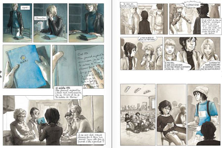
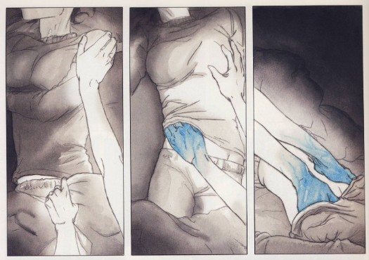
Morah’s use of color is its most immediately striking feature. As established by the title, blue is the central visual motif, one suggesting pleasure, usually romantic, often erotic—though a child’s balloon or a diary can possess the same glow. Initially Clementine’s adolescent world is a wash of browns and grays—until punctuated by her first glimpses of desire: first a boy’s blue shirt, then a girl’s blue hair. Unclothed though, Thomas, Clementine’s first boyfriend and almost lover, returns to his undifferentiated dank shades. Emma, however, literally haunts her dreams, her blue hands exploring Clementine’s white body.
The simple color binary breaks down in the framing story though, when the adult Emma is visiting Clementine’s now elderly parents. The contemporary world is a colorful one. Emma’s turtleneck is blue, but her hair has grown back blonde, Emma’s mother wears a red sweater, and oranges and greens permeate the bed and walls. Though Clementine’s old diary is still blue, the color no longer produces the same effect and meaning in the altered context. Despite the difficulties of Clementine’s identity-searching adolescence, its two-tone impressionism was a product of her own inexperience. After her father disowns her and she is forced to leave her childhood home, a naked but now realistically skin-toned Clementine curls as if three-dimensionally above the panel layout. She turns thirty a page later. Her worst moment, a brutal break-up fight with Emma after Clementine confesses to adultery, Mahor infuses with the novel’s most vibrant watercolors. Though the greens of Clementine’s hospital deathbed scenes are both literally and metaphorically darker, the effect is muted by Emma’s renewed devotion. When Emma stands alone looking into a gray ocean, the final image is the novel’s largest and most realistic watercolor.
For all of Mahor’s attention to color, her skill with panel effects unique to the comics form is arguably greater. By establishing a book-length norm of three- and four-row layouts of one to three panels, Mahor creates opportunities for variations. Atypically wide horizontal gutters suggest a scene-breaking time leap or, when placed within an otherwise continuous scene, a psychological break—as when Clementine first glimpses Thomas from her cafeteria seat. When they first kiss, Mahor eliminates frames and so gutters entirely, instead floating the two figures in an implied full-width panel at the bottom margin of the page. Their unframed background communicates the momentousness of her first kiss by placing it in the same timeless white as the gutters. But when Clementine later flees back home after nearly having sex with Thomas, her two darkened panels instead float unaligned in one of the novel’s widest expanses of white space. Mahor repeats the two-step narrative technique with Emma, but in reverse and with intensified effects. After hanging up angrily on Emma, the lone figure of Clementine and her phone float in even wider unframed white space, and after the two have sex for the first time, their two unaligned panels float too, only now suggesting their time-escaping joy in a still wider expanse.
Mahor is equally masterful with juxtapositional effects between panels separated by standard width gutters. While Mahor varies her left-to-right reading paths with brief, two-panel sub-columns on roughly a fifth of the novel’s 156 pages, in two cases the stacked panels do more than shift reading direction. At arguably the most significant moment in the narrative, when Emma and Clementine make eye contact for the first time, Mahor draws Emma’s face in what could be a single panel but instead is divided into two thinner strips with a centered gutter separating her eyes from her lower face.

The result is closer to the original meaning of visual closure, in which the two parts are perceived as a single whole. The framing not only emphasizes Emma’s eyes, but, by also fracturing a single moment in half, Mahor disrupts the flow of perceived time too. She repeats the technique at another pivotal moment. When her closest male friend reveals that her circle of friends are avoiding her because they think she’s gay, Mahor divides his face too, but here the emphasis is on his mouth and talk balloon: “Actually … I think it’s more about you.” The next three-panel row features the novel’s only metaphorical sequence, as the ground literally cracks beneath Clementine’s feet and she plunges into crosshatched darkness. Two pages later, even her panel frames collapse around her limp body.
Mahor also employs insets with the same thematic skill. While caption box insets appear on most pages, often breaking panel frames, Mahor draws only a total of six image insets, all within a 17-page, mid-story sequence, and all intimately framing Emma’s and Clementine’s hands or eyes. The first overlays panel content for a closure effect similar to the examples described above, but here, when Emma touches Clementine’s hair for the first time, the inset breaks the gutter alignment of both bordering panels, as if the moment cannot be contained by the standard rules of their world. A row lower and the inset of their clasped hands break four more borders. Two pages later Clementine’s inset eyes challenge Emma for never inviting her to her apartment. When she finally does, the next inset frames Clementine’s eye and a single, joyful tear as she has her first orgasm, while the next is still more explicit—Clementine’s hand between Emma’s legs for the first time. The final two, however, move from easy eroticism to harder emotions. When Clementine touches Emma’s hair, the inset, while misaligned with the closest panel border, fails to bridge the gutter to the adjacent image—including the next in which Emma pulls her hand away, followed by her breaking off their affair. The novel’s last inset reverses the pattern of intimate touch to show Clementine shoving away a plate of food that Emma is serving her—prompting Emma’s confession that she is keeping Clementine at an emotional distance to protect herself. When they overcome that distance, Mahor literally closes the door on their next sex scene, content instead with a visually more meaningful row of layout-breaking panels as the two move out of view.
The story’s nudity and sexual content would likely conjure an exploitive male gaze if the images were not drawn by a lesbian author—a quality that complicates the film adaptation. Mahor’s hand, however, is deft in so many ways, producing a visually and emotionally complex tale of coming-of-age love uniquely grounded in the comics form.
[The original version of this and my other recent comics reviews appear in the comics section of PopMatters.]
- Leave a comment
- Posted under Uncategorized


