Tag Archives: Will Eisner
March 11, 2024 Illuminating Layout
I began thinking about comics layout as products of trompe-l’oeil (literally “deceive the eye”) painting techniques in a post last October. I’ve since come across (and then interlibrary loaned) a book that’s taken me further down that rabbit hole. Here are my latest illustrated musings:

In Cultural Techniques: Grids, Filters, Doors, and Other Articulations of the Real, Bernhard Siegert interprets the trompe-l’oeil of seventeenth-century Dutch still life as a descendant of the “hybrid text-image medium” of “the illuminated manuscript page of the late fifteenth and early sixteenth century” (165).
In short, the approaches for painting three-dimensional illusions developed from illustrated books. The role of the surface areas between text, images, and surface edges is especially significant. In the “refashioning of the manuscript page,” argues Siegert, “the border is turned into a space connected to the real space of the reader and the miniature acquires an infinitely receding space of its own” (187).
Siegert’s analysis also describes comics layouts: the gutter is connected to the real space of the viewer, and the panel exists as a diegetic space of its own.
The comics medium did not evolve directly from either the trompe-l’oeil or illuminated manuscript traditions, but a comics page shares formally similar qualities with both. Since the comics medium exists in a larger visual arts context that follows and therefore is aware of the earlier traditions, direct influence cannot be ruled out, but parallel artistic evolution within historically unrelated book formats is at least as likely.
Either way, the trompe-l’oeil provides a lens for understanding the comics page.

Siegert begins by analyzing works by the mid-1600s Belgium painter Jan van Kessel. His oil-on-copper painting Insects on a Stone Lab depicts a vertical stone slab surrounded by plants and sky. Seigert terms it a “metapainting,” because a portion of the painting’s actual surface is demarked to represents a fictional surface: the “copper plate ended up as a stone slab,” and Seigert calls that area of the painting “a compromise between readability and visibility” because actual surfaces are read and represented surfaces are viewed.

Van Kessel merges discursive and diegetic surfaces similarly in his 1655 Insects and Fruit, but without a representational explanation for the dual surface. Seigert describes the painting’s “ground of opaque white” as “an ambiguous surface” because some of the drawn insects “sit on that ground as if it were a horizontal plane extending backwards into space” and so “are inhabiting the imaginary space within the painting,” while other insects “appear to be using it as a vertical wall” and so “are sitting on the real picture” (169).
Where the first oil-on-copper painting transforms “the ambivalent surface of the copper plate” into a representation, the background of the second painting remains ambivalent, fluctuating between being a diegetic space represented by a discursive surface and being a discursive surface only.
Seigert understands “this space as the result of a conflict between two cultural techniques—gazing and reading,” where the “disjunctive technique of viewing images on the one hand and reading text on the other” creates “a diaphanous zone” that reveals both (169). Regarding illuminated manuscripts of the previous century, Seigert describes the effect as a “self-conscious problematization of the coexistence of two-dimensional writing space and three-dimensional pictorial space” (180). Though van Kessel’s paintings include no text, his canvas surfaces vacillate similarly. The insects painted as if “on” the canvas highlight the actual surface where text would be printed, while the insects painted as if “within” the illusory space of a depicted scene obscure the actual surface.
A prototypical comics page also vacillates, usually with clearly demarked areas. Page surfaces within panel frames are drawn to depict three-dimensional pictorial spaces, and the unmarked areas outside panel frames are understood as actual page surfaces dividing panels as gutters. If text appears in an otherwise unmarked gutter area, the letterforms are understood to be printed “on” the page surface.
Seigert also analyzes earlier works by still-life painter and manuscript-illuminator Joris Hoefnagel.

His 1589 Still Life with Flowers, a Snail, and Insects features a trompe-l’oeil frame engraved with a title and artist name – though of course the words are painted on the canvas surface. The fictional frame appears to be “connected to the actual frame,” placing each still-life object “visually at odds with the painting’s surface” because “it is impossible to say on which level it is located” because it “resides in an impossible space between picture frame and vellum” (172-3).
Hoefnagel’s 1590 Miniature with Snail includes a similar trompe-l’oeil frame painted with roses that “possess a hybrid, metamorphic dimensionality,” because “their stems appear three dimensional, while their blossoms share the bidimensionality of the parchment surface” (171). Seigert sees these “protruding semi-two-dimensional and semi-three-dimensional objects” originating from Hoefnagel’s earlier work in illuminated manuscripts. The “ornate shape of the wooden frames,” he argues, “sprang from writing” as “a calligraphic ornament that has attained object status” (173).
Hoefnagel-like text-containing frames are common in the comics medium, especially for titles and credits. Winsor McCay provides an early example.

The October 22, 1905 edition of Little Nemo in Slumberland includes a drawn frame that appears to overlay the top row, dividing the image into three continuous panels with a title plaque nominally protruding into the viewer’s space. McCay’s drawing style is comparatively simplified, reducing the trompe-l’oeil effect while still establishing its visual logic.
Will Eisner’s The Spirit splash pages are especially well-known for their object-status titles.

Siegert’s “diaphanous zone” was widely popular in Marvel comics, where credits-text areas of splash pages routinely vacillated as on/within surfaces. John Buscema’s The Avengers splash pages from the late 1960s established the norm, both with text ambiguously incorporated into the story world, as well as credit boxes drawn as though physical objects placed on top of the page.

Siegert analyzes further examples.
Regarding Hoefnagel’s folio 37 of Mira calligraphiae monumenta, Siegert pays particular attention to one “tell-tale detail that conjures up the trompe-l’oeil effects and sheds light on the link between the objectification of writing and the ambiguity of the surface”; Hoefnagel paints the representation of a “slit cut out of the vellum of the page into which the stem of the flower has been stuck. This slit appears to turn the two-dimensional page of the book into a three-dimensional object. The two-dimensional writing surface is transformed into an illusionary three-dimensional object that, paradoxically, appears to be resting on itself. The vellum, that is, the carrier itself, into which the line has been inscribed, becomes a trompe-l’oeil: the image carrier steps out of itself to become an image object.” (173)
Hoefnagel’s example is atypical in illuminated manuscripts, and George Herriman provides an atypical example in the comics medium. His October 15, 1920 edition of Krazy Kat includes a tree drawn as though passing through five slits of the kind Siegert describes on Hoefnagel’s page.

Seigert analyzes an additional aspect of Hoefnagel’s folio 37. On the reverse side, the stem “appears to pierce the page and lie on the narrow vellum strip. The shadow of the strip as well as the dark edges of the hole and the small ‘visible’ piece of the stem are the only elements that have been painted on this side” (173).

I am unaware of a parallel example in the comics medium, but Pascal Jousselin does employ the reverse side of a comics page for related effects. Mister Invincible includes a villain able to pass through the physical page of the comic and step into the scene occurring in the reverse panel.

It’s easier to see with isolated panels, and if you image the pages pressed together back-to-back:

Siegert’s analysis of Hoefnagel applies equally to Jousselin:
“Hoefnagel transforms the page itself into an object whose topology oscillates between bi- and tridimensionality …. Not only does the trompe-l’oeil refer to the vellum as the real image carrier … but the very act of turning the page folds the illusion of the three-dimensional stem into the real tridimensionality of space. Here, the trompe-l’oeil invades the space of the observer in a real rather than merely illusory manner. The play of recto and verso enabled by objects such as book pages that can be turned creates an ambivalent threshold zone between imaginary of the image and the real of the reader/observer.” (173-176)
Seigert also describes an Austrian manuscript from the 1500s in which the borders of a double page are “a shelf construction erected on top of a chest,” “the lid of the chest and the shelf compartments are filled” with various objects,” the “miniature itself is a window in the shelf allowing a view into the distance,” and “the shelf’s center window serves a frame for the text” (187).
Shintaro Kago explores related effects five hundred years later:

Rows of rectangular panels generally can be understood as a kind of “shelf construction.”
And when panels are drawn as if overlapping, the page relates to Seigert analysis of the 1515 Grimani Breviary manuscript, by “treating the colored manuscript page itself, which constitutes the background for resting objects, as a flat picture object, the representation of a curvable parchment”; it “effectively turns the material image carrier into a picture of itself” (183), “integrating ontologically heterogenous elements into an apparently homogenous picture object” (187).

There’s plenty more to explore on this subject (Siegert’s casual “metapainting” aside begs for its own chapter), but let me wind down for now with a tentative conclusion:
Since a comics page, like any page or canvas, has no formal constraints but its actual edges, a general analysis must address that openness. Rather than approaching layout as a quality of an isolated medium, understanding comics within the broad field of art history reveals that comics layout shares key features with illuminated manuscripts and trompe-l’oeils. Formally, the prototypical comics page is a rudimentary trompe-loeil.
Tags: Bernhard Siegert, George Herriman, Jan van Kessel, Joris Hoefnagel, Pascal Jousselin, Will Eisner, Winsor McCay
- Leave a comment
- Posted under Uncategorized
January 27, 2014 Tibet, Superhero Tourist Destination of the World
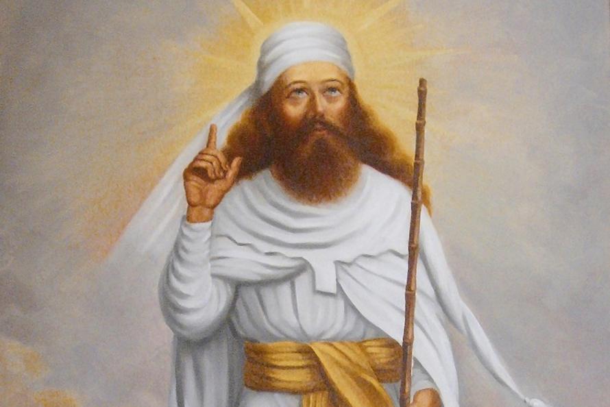
Zarathustra came down from the mountain in 1883. He’s Nietzsche’s reboot of the ancient Iranian prophet Zoroaster—which means the first Superman came down from a mountain in Asia. It’s been a popular continent for superheroes since. When DC rival Fox Publishing needed a Superman knock-off, artist Will Eisener sent Wonderman to Tibet where a turbanded Tibetan was handing out magic rings.

Wonderman couldn’t survive the kryptonite of DC’s court injunction, so for Wonder Comics No. 2 Eisner swapped the colored tights and briefs for a tuxedo and amulet-crested turban. Yarko the Great was one of a dozen superhero magicians to materialize in comic books over the next three years. Nine of them shopped at the same turban store—though Zanzibar the Magician got confused and grabbed a Turkish fez instead. Three of them imported Asian servants too.
The tights-and-brief crowd rallied and sent a half dozen new supermen East, three specifically to Tibet, with Egypt as a solid runner-up. My favorite, Bill Everett’s Amazing Man, is almost as naked as his earlier Speedo-sporting Sub-Mariner, but Amazing Man has the power of the Tibetan Council of Seven on his side. He could also turn into “green mist,” which must have annoyed the hell out of the Green Lama. Jack Cole threw in a Fu-Manchu supervillain too: the Claw attacks America from “Tibet, land of strange religions and mysterious customs.”
When Stan Lee’s boss gave him the same assignment (do what DC is doing), he bee-lined back to Tibet for his and Jack Kirby’s first (and mostly forgotten) attempt at a superhero, the 1961 Doctor Droom. Kirby even gives the formerly Caucasian physician slanted eyes and a Fu Manchu moustache as his lama explains: “I have transformed you! I have given you an appearance suitable to your new role!”
Droom flopped, so Kirby sketched an iron mask and Lee dropped the “r” and, voila!, the supervillainous Doctor Doom was born. The following year Doom was “prowling the wastelands of Tibet, still seeking forbidden secrets of black magic and sorcery!”Another year and Doctor Strange returns from Tibet as “Master of Black Magic!” Strange also picked up Wong, one of those handy manservants Tibetans hand out with their superpowers. The third Doctor emptied Lee’s Tibetan well, but Roy Thomas and Gil Kane’s Iron Fist kept Orientalism thriving at Marvel into the 70s.
Over at Charlton Comics, Peter Morisi’s Thunderbolt returned from his Tibetan adventures with the standard superhero package. Since Alan Moore’s Watchmen were borrowed from Charlton characters, twenty years later his Ozymandias not only “traveled on, through China and Tibet, gathering martial wisdom” but was “transformed” by “a ball of hashish I was given in Tibet” and next things he’s “Adopting Ramses the Second’s Greek name.” Even the 21st century Batman, as retooled in Christopher Nolan’s Batman Begins, hops over to the Himalayas to learn his chops from yet another monkish mentor. And you’ll never guess where director Josh Trank sends his teen superhuman for the closing shot of the 2012 Chronicle.
The 1930s mystery men loved the Orient too. Before Walter Gibson’s Shadow emigrated from pulp pages to radio waves, he first “went to India, to Egypt, to China . . . to learn the old mysteries that modern science has not yet rediscovered, the natural magic.” When Harry Earnshaw and Raymond Morgan conjured Chandu the Magician for film serials, they sent their secret agent to India to study from another batch of compliant yogis. And not only did Lee Falk’s comic strip do-gooder Mandrake the Magician pick up his powers in Tibet, his Phantom found his dual identity in the India knock-off nation of “Bengalla” (which magically wanders to Africa in later stories).
Before Doctors Strange, Doom and Droom (not a practice included in Obamacare) earned their degrees in Tibet, Doctors Silence, Van Helsing and Hesselius interned their first. You can add Siegel and Shuster’s pre-Superman vampire-hunting Doctor Occult to the list of eligible providers too. Like those turban-obsessed magicians, these world-touring physicians are armed with Oriental knowhow. Algernon Blackwood’s Silence was a 1908 mummy-battling best-seller, cribbed from Bram Stoker’s 1897 Dracula. Stoker’s Van Helsing is an expert on “Eastern Europe” and labels his vampire nemesis “a man-eater, as they of India call the tiger who has once tasted blood of the human.” Joseph Sheridan LeFanu’s 1872 Dr. Hesselius hunts vamps too, but his first patient is an English reverend driven to suicide by visions of “a small black monkey” caused by his addiction to the “poison” green tea imported from China, ever the land of strange religions and mysterious customs.
Since none of the doctors bother to mention their mentors, the ur-guru award goes to Rudyard Kipling’s 1901 Kim. While no superhero, Kim is the prototypical colonial adventurer, and Kipling supplies him with his very own “guru from Tibet,” one who conveniently needs an English boy (for some reason Asian kids won’t do) to achieve his life-long spiritual quest. Kim in turn treats the guru “precisely as he would have investigated a new building or a strange festival in Lahore city. The lama was his trove, and he purposed to take possession.” Which soon became official policy for all aspiring superheroes trawling the Orient for superpowers. Kim and his guru even prefigure Batman and Robin—only reversed, since Asian mentors are just like underage sidekicks.
Despite Kim’s Superman-like influence on the genre, even Kipling has his predecessors. The first superhero to pinch his powers from an obliging Oriental is Spring-Heeled Jack. The masked Victorian used to leap through a dozen plays, penny dreadfuls, and dime novels. I like the Alfred Coates 1886 version. Jack’s dad reaps his fortunes in colonial India, and Jack returns to England with the workings of a “magical boot” that “savoured strongly of sorcery.” Jack “had for a tutor an old Moonshee, who had formerly been connected with a troop of conjurers—and you must have heard how clever the Indian conjurers are. . . Well, this Moonshee taught me the mechanism of a boot which . . . enabled him to spring fifteen or twenty feet in the air.” That old Moonshee (Jack must mean “munshi,” an Urdu word for writer that the Brits decided meant all clerks) is the first incarnation of Wonderman’s turbaned Tibetan.
The endlessly exotic Orient, the planet-spanning ring of Britain’s 19th century frontier. A superhero is the ultimate colonialist, seizing his fortunes in faraway lands and shipping them home to maintain his nation’s status quo, its global supremacy. It used to be the British Empire, then the American, but superheroes are always the imperial guard.
While Eisner’s imaginary Tibetan was handing out magical treasure in 1938, real Tibetans were arguing national autonomy with China and rights of succession with warring regents. Unlike Nietzsche’s Zarathustra, the actual Zoroaster did not declare, “God is dead.”He was all about exercising free will in the service of divine order and so becoming one with the Creator. I’ve not read any of his surviving texts, and I seriously doubt Nietzsche did either. I’ve also never set foot in Asia—though I did gaze at it from a cruise ship docked in Istanbul once, and that’s a lot closer than most comic book readers ever get.

[For more on this topic, my related essay, “The Imperial Superhero,” appears in the new PS: Political Science & Politics, as part of an eight-article symposium on the politics of the superhero.]
Tags: Nietzsche, Orientalsim, Will Eisner, Wonderman, Zoroaster
- Leave a comment
- Posted under Uncategorized
October 17, 2011 How (Not) to Write a Comic Book
Panel one:
“For the splash page I’m seeing ‘Singulas’ launching himself from the craggy edge of his mentor’s mountain cave for the first time. Bird’s eye view, fists high, cape aflutter, and the bone-thin ‘Onlyone’ seated below, lotus-style, age-beaten face angled to watch his newborn pupil ascending. His mouth should be an ambiguous half-grin. That’s important later. Leave me a wide caption box to recap the origin. I’ll do all the words later.”
That’s the first paragraph of my short story “Script Outline, ‘The One and Only!’ Draft 1.” It appears in the new issue of The Pinch literary magazine. I just tore my complimentary author’s copy from its mailing envelope. (Something that, even after some thirty-odd short stories, still thrills.)
My superhero, Singulas, is invented, but my (unstated) narrator is Stan Lee just before Marvel hits it big in the early sixties. “The One and Only!” is his first superhero plot, one he’s describing to a freelance artist. I think it’s probably also a lesson in how not to write a comic book script.
Will Eisner in Comics and Sequential Art assures his students that there’s “no absolute ratio of words-to-pictures” in comic book writing, but his example scripts average 40 words of visual description per panel. My panel above is 75. The whole story runs about 4,500 words. I don’t think many of Stan Lee’s “scripts” filled more than a cocktail napkin.
Which was the point.
While DC editor Mort Weisinger was pounding his scripters with endless rewrites, Stan would dash off a verbal thumbnail for Jack Kirby or Steve Ditko to beat into shape. AKA, the Marvel Method. The laissez-faire approach had obvious benefits for an overworked editor. It might also help explain that office closet of unused and unusable story boards Lee hid from his boss in the late 1950’s. (When Goodman found them, he fired everyone but Lee, until the inventory was used up.)
The Lee of my story has more in common with Alan Moore. Surely the most verbose scripter in comic book history. The guy would mail poor Dave Gibbons reams of paper. Watchmen even includes Moore’s self-parody, a faux bio of a fictitious writer famed for “harassing the artist with impossibly detailed panel descriptions.” Moore can fill a single-spaced page for a one panel. More than ten times the Eisner ratio. Gibbons’ Watching the Watchmen includes only a glimpse of the original transcripts, but it’s enough to see the enormity of the artistic task. Gibbons had to code sentences with colored highlighters just to organize all the instructions.
Back in the sixties, Kirby and Ditko were handing their pages to Lee with the captions and talk bubbles empty. Which, paradoxically, is one of the reason why Marvel’s Silver Age comics are wordier than today’s image-centered graphic novels. The artists were careful to leave their boss plenty of room for his witty (though ad-hoc) dialogue.
But Moore’s Watchmen scripts were also personal letters to Gibbons. There are asides and exclamations wonderfully outside the conventions of any formal script outline. And that’s what attracted me to experiment with the form as a short story. The “One and Only!” is a personal letter, not only from editor to artist, but between ex-lovers. Lee and my fictitious freelancer are collaborators both on and between the sheets.
The story is also my first toe-wetting dip into the material I’m now expanding in my novel-in-process. (Working title? “The Patron Saint of Superheroes.”) I’m not handing the pages (136 so far) to any stressed-out artists with color-coded highlighters. Though sometimes it would be nice to scribble a few words on a napkin and watch them come back as full blown storyboards. Lee was no fool. But neither is Moore. I recommend aiming somewhere between.
(For anyone in Memphis on Saturday November 5th, I’ll be reading from “The One and Only!” at The Pinch launch party. Festivities start at 7:00 at Splash Creative, Inc., 2574 Sam Cooper Blvd @ Bingham St.)
Tags: Alan Moore, Dave Gibbons, Marvel Method, Mort Weisinger, Stan Lee, The One and Only!, The Pinch, Will Eisner
- Leave a comment
- Posted under Uncategorized


